








Designing a Cafe That Photographs Well Without Sacrificing Comfort
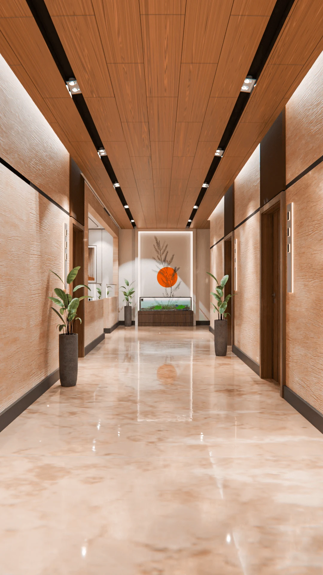
Every cafe owner who walks into our studio now opens the conversation with a phone full of reference photos, a green wall with hanging plants from one account, a pastel arch doorway from another, a neon sign spelling out something aspirational from a third, and almost without exception they want all of it compressed into a 600 to 800 square foot space that also needs to seat 30 people comfortably and turn tables often enough to cover rent in a New Town or Salt Lake retail unit. We understand the instinct completely, because a cafe genuinely does live and die by whether people photograph themselves in it and tag the location, that is free marketing no ad budget can replicate at the same cost, but we have also sat across the table from more than one cafe owner eight months after opening who is quietly asking us why their most photographed corner is also their least profitable one, and the answer nearly every time traces back to a design decision that prioritized the photo over the seat.
The Statement Wall Is Not the Problem, Its Placement Is
We are not against a bold accent wall, a textured plaster finish in a saturated color, or a well-lit corner built specifically for photos, because these elements genuinely do work as marketing and we design them into most of our cafe projects deliberately. The mistake we see repeatedly is putting that statement element in the best seating real estate in the room, typically a window-adjacent corner with the nicest natural light, and then surrounding it with stools or narrow benches that nobody wants to sit in for more than the six minutes it takes to get the photo. In a recent 650 square foot cafe fit-out we did in Action Area I, the client's original brief placed their signature mural wall directly behind the only banquette seating in the cafe, which meant the four best seats in the house were constantly being interrupted by guests standing up to photograph the wall behind occupied tables. We relocated the mural to a side wall near the entry, where it functions purely as a backdrop with a small two-seater positioned for the photo and nothing more, and moved the banquette to the window line where the light is still excellent for photos but the seating itself is now the kind of deep, cushioned, back-supported seating that holds a guest through a second flat white and a pastry order.
That single relocation increased average dwell time at those four seats by roughly 20 minutes per table based on the owner's own POS timestamps over the following quarter, which in a cafe format translates directly into a second item ordered per visit far more often than it used to. The lesson we now apply to every cafe project is to separate the "photo moment" from the "stay moment" as distinct zones rather than assuming they need to be the same square footage, because a guest who takes their photo standing up at a feature wall near the entry and then moves to a comfortable seat elsewhere in the room is a better outcome for you than a guest occupying your best table for six minutes of photography and zero minutes of ordering.
Seating Comfort Math for a Small Format
Cafe seating fails on comfort in Kolkata for a few very specific, very fixable reasons, and the first is chair height mismatched to table height, which sounds trivial until you have sat at one of the ubiquitous tall communal tables paired with backless stools for the 45 minutes it takes to actually finish a meal rather than just a espresso shot. We spec counter-height seating (around 28 to 30 inches) only for genuinely quick-turn zones near a coffee bar or window counter where a 10 to 15 minute stay is the actual expectation, and we reserve standard dining height (28 to 30 inch table, 17 to 18 inch seat) with a chair that has both back support and, ideally, some arm support for the tables where we want guests to open a laptop or linger over conversation. In an 800 square foot cafe, that usually works out to something like 60 percent standard height seating and 40 percent bar or counter height, weighted toward standard height specifically because a cafe's higher-margin ticket items, the pastries, the all-day breakfast plates, the second and third drink orders, come disproportionately from guests who are seated comfortably enough to stay.
Upholstery choice matters more in this climate than in cooler regions, because Kolkata's humidity means fabric that does not breathe becomes genuinely uncomfortable within twenty minutes of a guest sitting down, and we have started specifying performance fabrics with a looser weave or leather-look vinyl with a matte, non-tacky finish over the glossy vinyls that looked striking in photos but left guests peeling themselves off the seat on a humid August afternoon. None of this shows up in an Instagram post, but all of it shows up in whether that post's location tag turns into a second visit, which is really the metric that matters.
Lighting for Photos and Lighting for People Are Different Briefs
The corner built for photography wants strong, directional, often warm-toned light, sometimes literally a ring light or LED panel disguised as a pendant fixture, positioned to flatter faces and food from a specific angle, and we treat that as its own lighting zone with its own switch circuit so it can be dialed up during the day and toned down in the evening once the cafe's crowd shifts from daytime laptop-and-coffee traffic to evening dessert-and-conversation traffic. The rest of the room needs a completely different lighting logic built around even, comfortable ambient light that does not create harsh shadows on ordinary tables where nobody is trying to get a shot, layered with a lower, warmer accent light in the seating zones we want to feel intimate in the evening. We go into the layering logic itself, the ambient, task and accent distinction that applies as much to cafes as to full restaurants, in our dedicated post on how Kolkata restaurants use light to control mood and spend, and most of that logic transfers directly to cafe design even though the format and check size are different.
Acoustics in a Small, Hard-Surfaced Room
Cafes have a particular acoustic problem that full restaurants sometimes avoid simply by having more volume to absorb sound into, which is that a small room with polished concrete floors, exposed brick, and large glass storefronts, all popular finishes for the photogenic industrial-cafe aesthetic, will bounce sound aggressively once even a third of the seats are filled. We now budget for acoustic treatment in nearly every cafe project regardless of size, usually in the form of upholstered banquette backs that double as sound absorption, fabric-wrapped acoustic panels disguised as art on at least one wall, and, where the ceiling height allows it, exposed acoustic baffles that can actually look intentional and add to the industrial aesthetic rather than fighting it. Skipping this line item is one of the more common regrets we hear about from cafe owners who did their own fit-out or worked with a contractor who was not thinking about sound at all, because a cafe that sounds like a construction site once it fills up will lose the laptop-and-conversation crowd that makes up a meaningful share of weekday revenue for most independent cafes in this market.
Kitchen and Service Counter Flow, Scaled Down
A cafe's back-of-house is smaller than a full restaurant's but the flow principles do not disappear just because the footprint has, and we still plan a clear, uncrossed path between the espresso machine, the pastry case, the POS terminal and the pickup counter, because in a compact format any crossing of these paths creates a bottleneck almost immediately once there is a queue of more than four people. We cover the fuller version of this operational planning, seating turnover, kitchen ratios and ventilation, in our companion piece on restaurant interior design in Kolkata, which is worth reading if your cafe concept includes a fuller kitchen menu rather than a purely coffee-and-pastry program, since the ventilation and equipment load calculations shift meaningfully once you add even a compact panini press or induction cooktop to the counter.
Building for Mixed-Use Blocks
A growing number of the cafe fit-outs we take on now sit on the ground floor of mixed-use residential plots, where the shop or cafe occupies the street-facing level below apartments or offices, and if you are still at the stage of choosing or designing that kind of plot rather than fitting out a leased unit, our piece on Action Area II's mixed-use plot rules covers the specific building regulations that affect what a ground-floor cafe can and cannot do structurally, including frontage and setback rules that directly affect how much glass frontage you get for that all-important street-facing photo wall.
Let's Design a Cafe People Actually Stay In
If you have a cafe concept and a folder of reference photos and you want a space that gives your guests something worth photographing without turning your best seats into six-minute photo booths, bring us your floor plan and your Pinterest board together, because that is genuinely the brief we enjoy most. Get in touch through our contact page and we will walk through your seating zones, lighting plan and finishes with both goals on the table from day one, not as a trade-off but as two halves of the same design problem.