






Modular Kitchen Design Colour Combination: 8 Ideas
"Which colour should I pick for my modular kitchen?" Ask that in a laminate showroom and you'll leave with a shade you love and a kitchen that fights itself within six months.
The colour is rarely what goes wrong. Coordination does. A sage shutter that looked soft against a white sample board turns cold and grey beside the wrong countertop. A charcoal base that photographs beautifully becomes a dust map under a window that catches afternoon light. In compact Kolkata flats, whether a kitchen settles or ages badly usually comes down to three decisions made together: what goes on the shutters, what goes on the counter, and how much light the room gets.
Below are eight modular kitchen design colour combination recipes, each specified by placement rather than mood. Cabinet tone, countertop, wall or backsplash, hardware, and the humidity and wear cautions that matter in Indian homes. If you want a wider set of shade references before you shortlist, this collection of kitchen cabinet colour ideas for Dublin is worth browsing, though Irish light is not Kolkata light.
Table of Contents
- 1. Matte White with Warm Wood Accents
- 2. Two-Tone Kitchen with Light Upper and Deep Lower Cabinets
- 3. Sage Green with Brass or Gold Hardware
- 4. Monochrome Charcoal and Black with Light Countertops
- 5. Warm Greige with Terracotta Accents
- 6. Walnut and Cream Warm Neutrals
- 7. Navy Blue with White Quartz and Brass Details
- 8. Ivory Gloss with Grey Stone-Look Surfaces
- 8 Modular Kitchen Colour Combinations at a Glance
- From Palette to Built Kitchen
1. Matte White with Warm Wood Accents
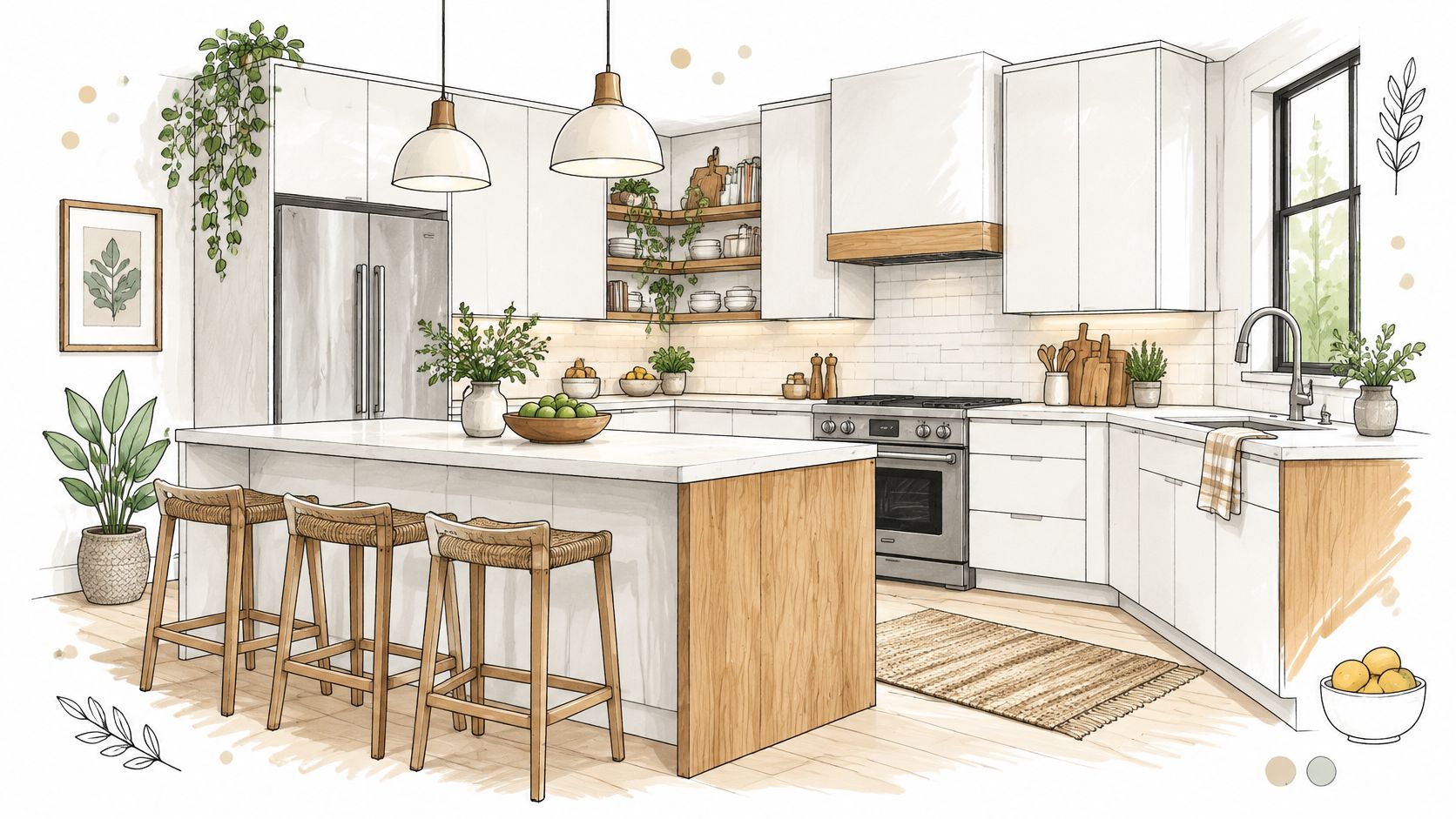
Matte white shutters with warm timber accents remain the safest combination in this list, and safe is not a weakness when a kitchen has to look right for a decade. White keeps a compact room bright and makes the kitchen read larger from the living room doorway. Timber adds the warmth that stops white from feeling clinical.
Where the Wood Goes
Restrict timber to tall units, a single feature panel, open shelving or the island. Run white on everything else. When wood spreads across uppers, lowers, shelves and flooring at once, the room loses its dominant colour and starts to look busy rather than warm.
- Warm white over blue-white: a white with a hint of yellow sits better beside oak or teak veneer than a stark blue-based white, which turns grey under cool LEDs.
- Moisture-first carcass: specify moisture-resistant laminate or a marine-grade plywood carcass for the monsoon months. Plain MDF swells at the edges once steam reaches it.
- Light the texture: an LED strip under the wall units pulls the grain out at night, when the room otherwise flattens into a white blur.
Budget reality. Standard modular kitchen projects in India typically cost ₹1.5 lakh to ₹4 lakh, while premium projects run ₹4 lakh to ₹12 lakh, according to Apex Influence. Confining real veneer to the island and using a matching laminate elsewhere gets most of the visual gain without pushing the project into the premium band.
Keeping white shutters clean over years is its own discipline, and these ways to keep an all-white kitchen looking clean in an Indian home cover the routine that makes the palette survive.
2. Two-Tone Kitchen with Light Upper and Deep Lower Cabinets
The most requested layout in Kolkata is not a colour at all. It's a split: pale wall units above, deep base units below. The upper half of the kitchen stays bright. The lower half absorbs the abuse, which is exactly where splash, drips and the scuff of a vessel pulled across a shutter land.
Choose the pairing by light rather than preference. A room with one small window wants ivory or warm grey above and charcoal, olive or dusty blue below. A kitchen that opens to a well-glazed dining area can carry navy on an island with light oak tall units beside it.
- Dark on the base only: full-height dark on both halves closes the room in, especially in a seven-foot-wide galley.
- Pale backsplash: a light tile behind the counter stops the dark base from reading as one heavy horizontal band.
- Task lighting under the wall units: dark worktops swallow shadow. The LED strip is not a luxury here, it's how you see what you're chopping.
- Satin over high gloss on dark shutters: satin wipes clean in one pass and keeps the streaks that gloss holds.
Practical rule: approve the exact laminate sample in daylight and again under your task lighting, because cool LEDs push greys and blue-greens more saturated than the showroom board suggests.
Specification goes well beyond colour names in a humid city. PVC or coated-steel components suit damp homes, moisture-resistant plywood or HDHMR suits a wood-look finish, exposed board edges below the sink need sealing, and matte or low-sheen laminates hide fingerprints better than gloss, as Kaff's kitchen cabinet buying guide sets out. A mid-grey or speckled worktop also tolerates turmeric, tea and oil marks that a stark white top will not.
3. Sage Green with Brass or Gold Hardware
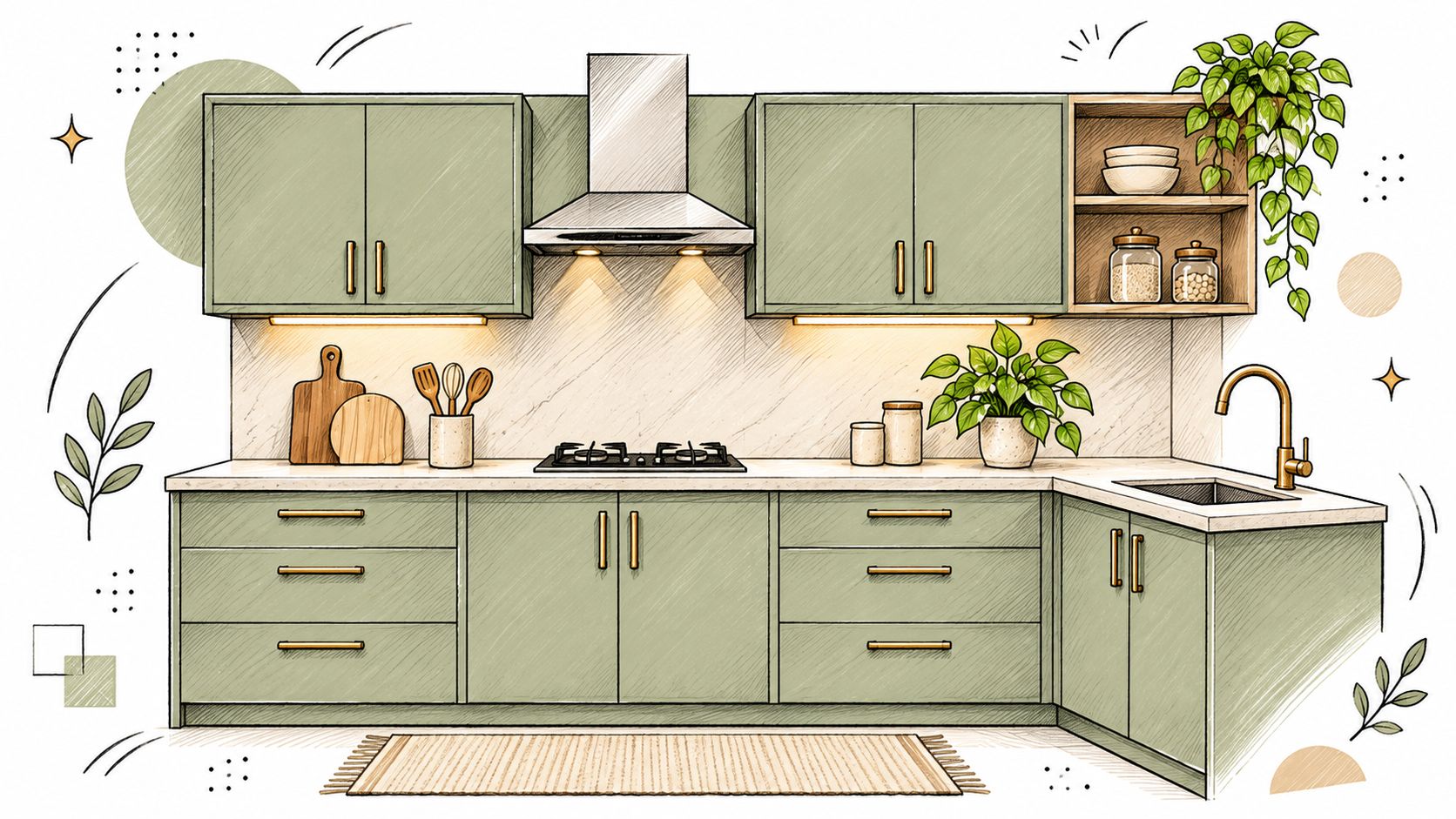
Sage is the colour homeowners arrive asking for after seeing it in a photograph, and the one most often sent back to the sample library because it lands too yellow or too mint. The usable zone sits between grey and green, muted and slightly desaturated, closer to a herb stem than a leaf.
Getting the Green Right
Place green on base and tall units, warm white or off-white on the wall units, a soft grey or marble-look engineered top, and brass on handles and the tap only. Brass repeated across light fittings, handles and the sink mixer in one run tips a calm kitchen into a hotel bar.
- Matte or low-sheen finish: gloss sage reads synthetic and shows every smear in a working kitchen.
- PVD-coated or lacquered brass: raw polished brass oxidises fast in monsoon air and dulls to brown inside a season.
- Test at two times of day: a green that looks grounded at 8am can turn grey by 6pm under warm artificial light.
A 2022 India-focused modular kitchen market report recorded that approximately 35% of kitchen renovations used soft pastels, muted greens or matte finishes, according to Research and Markets. Read that as directional context from a commercial summary rather than a national survey. Its use is narrower: muted green is no longer an unusual request, so you can stop worrying that it will date the house by resale.
For placement variations across compact and open kitchens, these sage green kitchen cabinet ideas for Indian homes cover the layouts that work when the room is narrow.
4. Monochrome Charcoal and Black with Light Countertops
Charcoal handleless units against a white quartz top is the most architectural combination here, and the one that punishes a badly ventilated room hardest. Dark surfaces hold a grease film, water spotting and heat ageing that a mid-tone would conceal.
If you want to see how a dark base behaves beside a pale top before committing, this walkthrough is worth ten minutes.
The climate numbers explain why. An Indian building study recorded monsoon relative humidity of approximately 80% to 100% and kitchen temperatures reaching 34°C during cooking, as reported in a building study of Indian kitchens. Moisture at that level settles on cool dark surfaces and dries into marks.
That combination of heat and humidity is what makes the usual advice to use dark matte cabinets incomplete. Deep textures trap grease and are harder to clean than a fine matte, so a heavily textured black panel near the hob is the worst of both.
The trade-off: a matte black kitchen needs a chimney with real extraction and a window that opens. Without both, the finish looks tired within two summers, and no amount of wiping brings the depth back.
- One large light source: a wide window or an opening to a lit dining room. With neither, this palette is the wrong choice for the room.
- Light wall tiles: a pale backsplash bounces light back into the dark cabinetry.
- Anti-fingerprint, fine-grained matte on shutters: resists showing every touch. Deep texture does not.
- Light countertop as the anchor: white quartz or pale grey carries the whole scheme.
Keep the dark to base units and tall units, and let the top and backsplash do the lighting work.
5. Warm Greige with Terracotta Accents
Greige is a blend of grey and beige, and it usually fails in Indian kitchens because nobody checked the undertone. A greige with a pink base turns peach under warm light. One with a green base turns sour beside terracotta.
Testing Greige Before You Buy
Sample three greiges on the actual wall, not on a showroom board, and look at them at 7am, at 2pm and under the kitchen's task lights. Say the room's only window faces north and the walls are painted off-white. The greige that read warm in the shop will read pink against that wall, and the terracotta splashback beside it will look orange rather than clay.
- One terracotta zone: confine the accent to the splashback, a run of open shelves or the pendant shades. Three accent zones and the room reads cluttered.
- Matte or lightly textured laminate on the cabinets: hides small marks and suits an earthy palette better than gloss.
- Glazed terracotta-look tiles near the sink and hob: real clay stains, and it is a poor choice where oil and water land daily.
- Seal real clay before installation: unglazed clay shelving drinks oil and never gives it back.
Greige works when it is the quietest thing in the room. The moment it competes with the accent colour, you've lost the calm you were paying for.
Keep hardware in the same warm family, brushed nickel or antique brass, and let the terracotta carry the only real colour in the space.
6. Walnut and Cream Warm Neutrals
Walnut and cream suits homeowners who want a kitchen that looks like it was always there. Deep brown timber on base units or an island gives a sense of permanence. Cream on the upper shutters and the walls keeps the room from closing in.
- Mid-tone walnut over near-black: a very dark walnut reads brown-black in a compact room and turns every edge into a shadow.
- UV-resistant laminate in direct sun: a west-facing window bleaches a cheap woodgrain fast. Ask for the laminate's lightfast rating before approval.
- Grain direction: vertical grain on tall units, horizontal on drawer fronts, consistent across adjacent doors. Mixed direction looks like a mistake even when nobody can name it.
- Coordinate with the floor: walnut cabinetry beside a red-toned wooden floor fights. Carry one undertone through both, or keep the floor neutral.
Cream is not white. A true white upper shutter beside walnut looks hard and thin, while ivory or a warm cream softens the transition and suits brass pulls.
The maintenance trade-off is real: a fine film of dust shows on dark timber faster than on grey, so plan a weekly dry wipe rather than a monthly one, and keep a microfibre cloth in the drawer for it.
If cream feels too safe, the mushroom cabinet colour trend sits in the same warm neutral family with more depth and less contrast against walnut.
7. Navy Blue with White Quartz and Brass Details
Navy shutters with a white quartz top and brass hardware give colour without shouting. Navy holds its depth under artificial light, which is where most Kolkata kitchens spend their evenings, and the white top stops the room from becoming a cave.
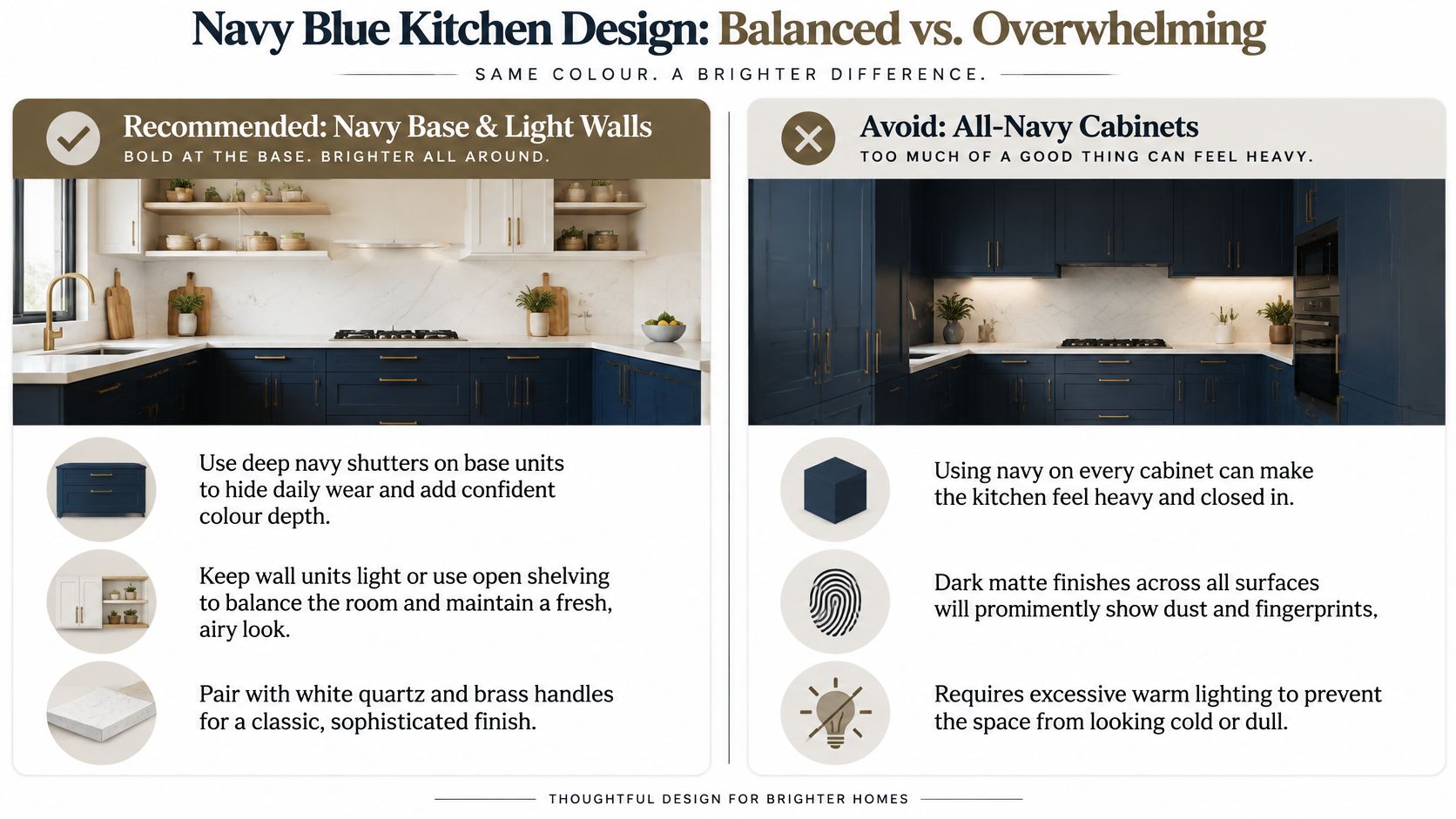
The comparison above is the entire argument in one frame. Navy on base units with pale uppers looks deliberate. Navy on every surface with a dark top looks like a room with the lights off.
- Base units only: keep wall units white, ivory or light oak. The room needs one pale plane to bounce light.
- A slightly warm navy: a cold navy with a grey base looks dirty beside white quartz, while navy with a hint of teal holds its colour.
- Warm LED under the uppers: 2700K to 3000K brings out the depth. A cool white strip flattens navy into near-black.
- Quartz over marble: a non-porous engineered top resists the oil and turmeric that stain real marble on contact.
Blue is not a niche choice here. A market study of modular kitchens in India reported that blue accounted for more than 37% of searches for modular kitchens, followed by green and red, reproduced in a market study of modular kitchens in India. Treat that as a signal of consumer attention rather than a count of finished kitchens.
For a compact room, these navy blue kitchen cabinet ideas that look anything but dark show how to keep the colour without losing the light.
8. Ivory Gloss with Grey Stone-Look Surfaces
Does a compact kitchen need more reflected light without looking stark? Ivory gloss on the cabinets paired with mid-grey stone-look surfaces gives the room brightness and a grounded counterpoint. The grey also softens the contrast between pale cabinets and darker cooking marks.
Keeping Gloss Presentable
Gloss reveals fingerprints around handleless edges, especially near frequently used drawers. Choose a soft microfibre cloth and mild, non-abrasive cleaner; abrasive pads can dull the finish. Satin gloss is a practical alternative in a busy kitchen because it reflects light with less glare and makes everyday marks less conspicuous.
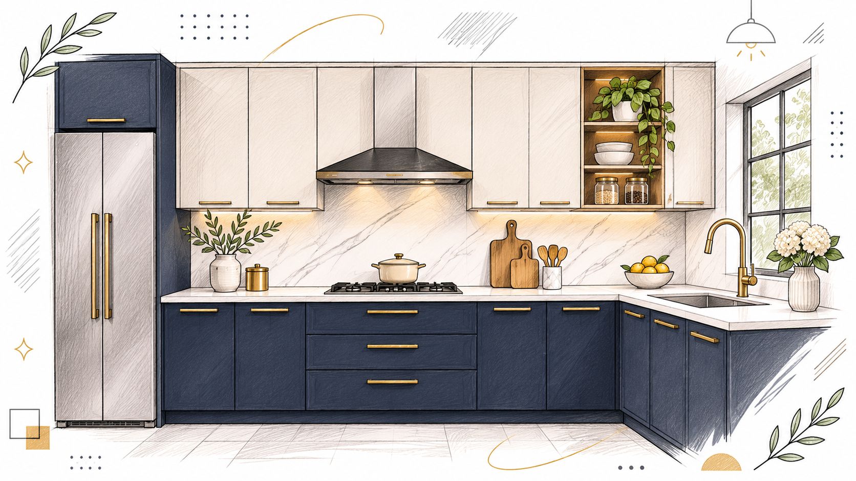
- Cabinets: Use ivory gloss on the main run, with a satin-gloss finish if fingerprints are a concern.
- Countertop: Choose mid-grey quartz for a defined contrast that is less stark than white.
- Backsplash: Carry the grey stone-look finish up the wall, using a washable, low-porosity surface near the hob.
- Hardware and lighting: Keep hardware visually quiet, and use integrated lighting to brighten the worktop without adding another strong colour.
Cooking smoke and poor ventilation can leave residue on glossy surfaces. A strong exhaust helps clear smoke; keep gloss away from the hob wall if the kitchen gets heavy daily use.
8 Modular Kitchen Colour Combinations at a Glance
| Combination | Best For | Maintenance Level | Coordination Recipe |
|---|---|---|---|
| Matte White with Warm Wood Accents | Bright kitchens that need warmth | Moderate; wipe white cabinets regularly and protect wood near water | Matte white cabinets, a light stone countertop, warm white walls and oak or teak accents |
| Two-Tone Kitchen: Light Upper Cabinets with Deep Lower Cabinets | Kitchens that need brightness and contrast | Moderate; fingerprints and dust can show on dark fronts | Light upper cabinets, navy, charcoal or deep green lower cabinets, a light countertop and restrained metal hardware |
| Sage Green with Brass or Gold Hardware | Calm, nature-inspired kitchens | Moderate; choose a durable brass finish, as humid conditions can affect unprotected metal | Muted sage cabinets, a light stone countertop, warm neutral walls and brass or gold hardware |
| Monochrome Charcoal and Black with Light Countertops | Contemporary kitchens with a bold palette | Moderate; dark matte fronts can show dust, water spots and fingerprints | Charcoal or black cabinets, a light countertop, pale walls and simple dark or metal hardware |
| Warm Greige with Terracotta Accents | Relaxed kitchens with an earthy feel | Moderate; keep terracotta away from persistently damp areas | Warm greige cabinets, a light neutral countertop, warm white walls and terracotta accents |
| Walnut and Cream Warm Neutrals | Warm kitchens with a classic feel | Moderate; protect cream finishes from strong sunlight and walnut surfaces from scratches | Walnut-finish cabinets, a cream countertop, warm neutral walls and muted metallic hardware |
| Navy Blue with White Quartz and Brass Details | Kitchens that need a polished, classic colour contrast | Moderate; dark matte fronts can show dust and fingerprints | Navy cabinets, white quartz, pale walls and brass hardware |
| Ivory Gloss with Grey Stone-Look Surfaces | Compact kitchens that benefit from reflected light | Moderate to high; gloss shows smudges and scratches | Ivory gloss cabinets, grey stone-look countertops, light grey walls and restrained metal hardware |
From Palette to Built Kitchen
How do you turn a promising colour palette into a kitchen that still looks right after daily use? Start by narrowing the options to two. Then judge each choice against the room's finishes, lighting and practical demands.
Read the quote, not just the colour code. Check that it names the carcass grade, hinge brand and countertop material. A specific laminate brand and finish code also helps distinguish the chosen shade from a similar-looking alternative. For the sink cabinet and shutters near the hob, ask how exposed edges will be sealed.
Coordinate the counter and shutters. A warm grey countertop beside a cool grey cabinet can look unintentionally mismatched. Keep the undertones in the same family, or use the backsplash to provide contrast. Compare the finishes together before settling on the combination.
Humidity and water exposure make the sink cabinet a practical priority. Sealed edges help protect vulnerable surfaces, while a suitable cabinet finish is easier to maintain than a colour choice alone. Dark or glossy finishes can also make fingerprints, dust and smudges more visible.
Studio Contour designs modular kitchens to the room's dimensions, with quotes that specify carcass grade, hinge brand and countertop material. Its residential interior design work can cover a single kitchen or a wider home project, with 3D visualisation and project supervision. For additional colour references, browse kitchen cabinet paint colors, then shortlist the combinations that suit your cabinets, countertop and walls.
Studio Contour can take a selected palette from 3D preview through supervised execution, helping carry the approved design into the built kitchen. To discuss a modular kitchen design, visit Studio Contour.