








What Makes Shoppers Walk In: Storefront Design Principles for New Town Retail Units
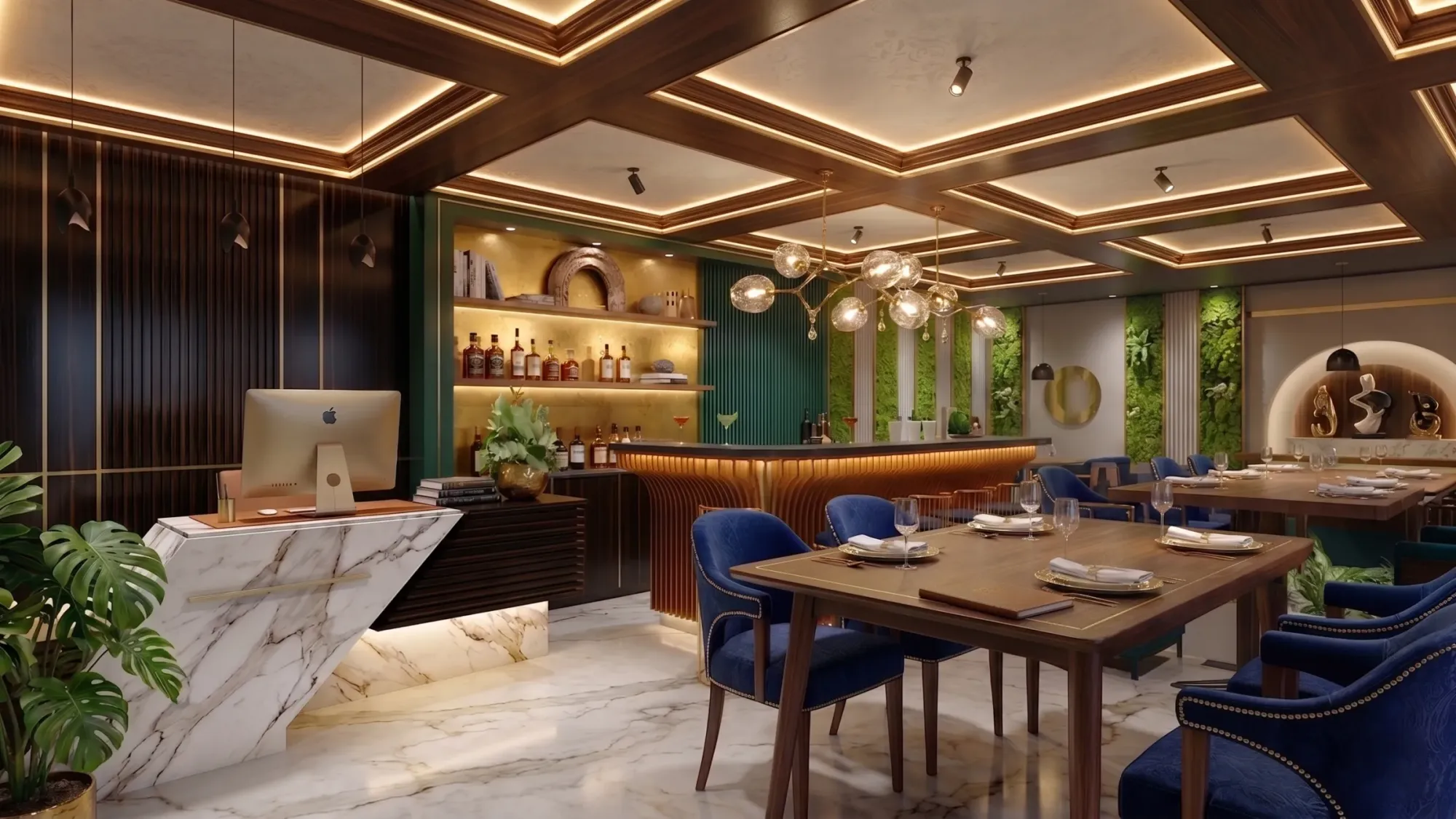
We have designed enough ground-floor retail frontages along New Town's commercial stretches now, from the shop-cum-office units near Eco Park to the retail strips along Major Arterial Road and inside the newer neighbourhood markets in Action Area I and II, to notice a pattern that most shop owners do not expect when they first come to us: the difference between a unit that pulls people in off the street and an identical unit next door that gets walked past has almost nothing to do with the interior fit-out and almost everything to do with four decisions made at the facade, before a single customer has crossed the threshold. Those four decisions are sightlines into the store, signage height and legibility from both vehicle and pedestrian approach, entrance width, and the colour temperature of the lighting visible from outside after dark. This piece is specifically about those four decisions, because we have found that shop owners spend a disproportionate amount of their budget on interior visual merchandising and display fixtures while treating the storefront itself as an afterthought, when the storefront is doing all the work of getting the customer to that display in the first place.
Sightline Psychology: What the Eye Catches From the Street
Human eyes moving past a row of shopfronts at walking pace, or worse, from inside a moving vehicle, do not read a storefront the way a designer looking at elevation drawings does. They catch depth and contrast first, and detail only if something has already made them slow down. This is why we push back hard on the instinct, especially common among clients doing a boutique clothing or accessories store, to fill the entire display window with product, because a window packed edge to edge with merchandise reads as visual noise from twenty feet away and gives the eye nothing to focus on. What actually stops foot traffic is a sightline with depth, meaning the customer can see past the window display into the store interior itself, catching movement, warm lighting, and a sense of scale beyond the glass, which triggers curiosity in a way a flat wall of product never does. For a typical 12 to 18 foot wide retail frontage, which covers most of the units we work with along New Town's commercial plots, we generally recommend keeping window displays to no more than 40% of the glazed area occupied by product, with the remainder left as clear or lightly dressed glass that opens a direct visual line to the till counter, a feature wall, or an anchor display roughly 15 to 20 feet inside the store. That depth cue is what separates a shop that reads as "open and worth entering" from one that reads as "closed off," even when both are technically unlocked and staffed.
Glazing height matters just as much as glazing width here. Full-height glass from roughly 600mm above finished floor up to the header, rather than a half-height display counter blocking the lower third of the window, keeps that sightline intact for shoppers of every height and for anyone glancing in from a car window at a slightly different eye level than a pedestrian. We typically spec toughened glass in the 10mm to 12mm range for ground-floor retail frontages given the load and safety requirements, and while this costs more upfront than a shorter storefront window with a solid kneewall below, the difference in walk-in rate we have observed across comparable units makes it one of the first line items we defend when a client is trying to trim the facade budget.
Signage: Designing for Two Completely Different Viewers
New Town's commercial stretches are unusual in Kolkata in that a meaningful share of potential footfall approaches by vehicle rather than on foot, particularly along the wider arterial roads where units sit set back from a service lane with parking in front, and this creates a genuine design conflict, because signage legible and appealing to a pedestrian standing six feet from the shopfront is often close to unreadable to someone driving past at 30 to 40 kmph fifty metres away, and the reverse is also true. Our approach is to treat these as two separate signage problems rather than trying to solve both with one board.
For vehicle-approach visibility, letter height needs to scale with viewing distance in a way many shop owners underestimate. As a working rule we use on New Town projects, legibility for a moving vehicle at roughly 30 to 50 metres requires letter heights of at least 300mm to 450mm, mounted as high as local signage regulations and the building facade allow, generally at or above the first-floor slab line where the unit has one, so the sign clears parked vehicles, street trees, and other shopfront clutter in the sightline. This is also why we favour illuminated channel letters or backlit acrylic fascia signs for the primary vehicle-facing sign, since contrast and brightness matter more than typographic detail at that distance.
For pedestrian-approach visibility, a second, smaller-scale sign element, whether that is window vinyl lettering, a hanging blade sign perpendicular to the facade, or door-level signage, does the work of confirming the brand and category at close range and can carry finer typographic and material detail, since a pedestrian who has already noticed the store from a distance is now reading for confirmation and personality rather than basic identification. Blade signs in particular, projecting roughly 600mm to 900mm from the facade at a height of 2.4 to 3 metres, perform well on New Town's wider pavements because they catch the eye of pedestrians approaching from either direction along the row, not just those walking directly toward the storefront.
Entrance Width: The Number Most Owners Get Wrong
We ask nearly every retail client the same question early in the brief: how many people do you expect to be standing at your entrance at once, browsing, entering, and exiting, during your busiest hour? Almost nobody has thought about this, and yet entrance width is one of the most consistent predictors of walk-in rate we have observed on comparable units. A single-leaf door of 900mm, which is standard for a residential entrance and common in cost-conscious retail fit-outs, creates a bottleneck that unconsciously reads as an invitation to hesitate rather than enter, particularly for a customer already unsure whether to browse. We recommend a minimum clear opening of 1,200mm for any retail unit expecting moderate footfall, and for units doing genuine high-traffic categories such as grocery, pharmacy, or quick-service food along a busy New Town stretch, a fully open storefront using folding or sliding glass panels that can retract to 2.4 metres or wider during business hours removes the threshold hesitation almost entirely, because there is no longer a discrete "door" moment the customer has to commit to crossing.
The transition zone just inside the entrance deserves equal attention and is something we plan explicitly as part of the layout, not left to chance. This is often called the decompression zone in retail design, the first 1.5 to 2 metres of floor just past the threshold where a customer is still adjusting from the outdoor environment and has not yet started actively shopping, and cramming a display fixture, a promotional stand, or a narrow aisle directly into that zone measurably suppresses how far customers penetrate into the store, a principle we go into in more depth in our piece on store layout and visual merchandising, which covers what happens once the customer is actually inside.
Lighting Temperature: The After-Dark Decision
Given how much of New Town's retail footfall happens in the evening, after office hours empty out into the residential and commercial mix around Action Area I, the colour temperature of light visible through the storefront glass after dark functions almost as a second signage system, and it is a decision we see get made by accident far too often, usually because the same fixture spec used for the interior sales floor gets extended straight out to the window display without a second thought. Warmer lighting in the 2700K to 3000K range, used for window displays and any fixture visible from the street, reads as inviting and residential-adjacent, which tends to work well for categories like home decor, apparel, cafes, and personal services where the shopper's decision is emotional and unhurried. Cooler lighting in the 4000K to 5000K range reads as clinical and efficient from outside, which is exactly the signal that works for pharmacies, electronics, and grocery formats where shoppers are approaching with a specific task in mind rather than browsing for pleasure, but the same cool temperature applied to a boutique storefront can make it look sterile and uninviting from the street, undercutting the exact sightline and signage work described above. We generally recommend a layered approach for the display window itself regardless of category, using warmer accent lighting on any mannequin, feature product, or focal display even within an otherwise cooler-lit store, because that warm pool of light is what draws the eye from twenty feet away in a way flat, even illumination does not.
Designing Your Storefront With Footfall in Mind
If you are planning a new retail unit along one of New Town's commercial stretches, or you already run a shop that gets browsed on Google but walked past on the street, we would rather start with a short site visit and a look at your specific frontage, its orientation, its approach traffic, and its glazing constraints, than hand you a generic facade package, and that conversation is the natural first step whether you are still finalising your unit or renovating an existing one; get in touch through our contact page with your unit's location and dimensions and we will walk you through what we would actually change.