








Store Layout and Visual Merchandising: How Design Decides What Customers Buy
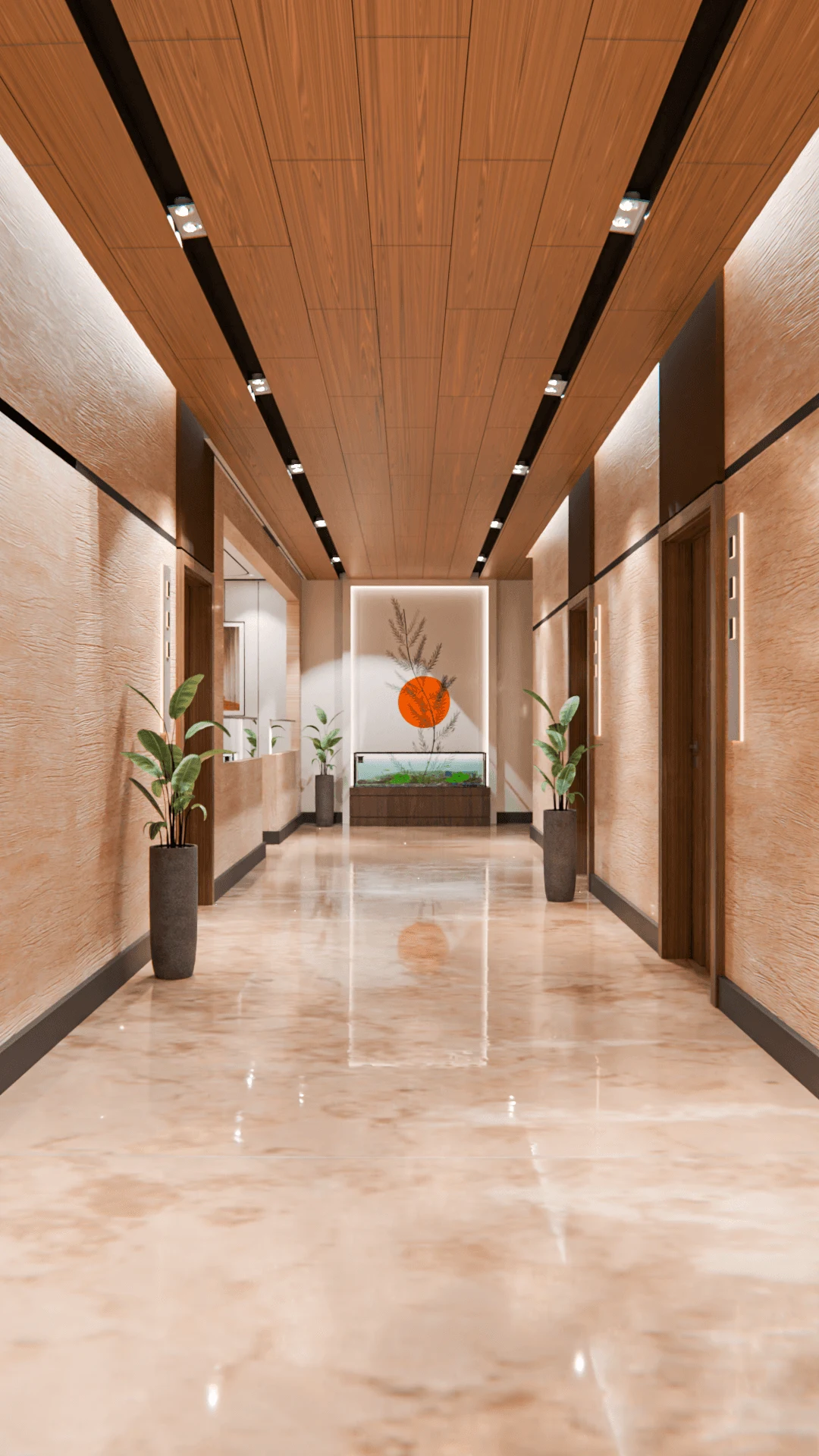
A retail client came to us a couple of years ago convinced her store's problem was product selection, because customers were walking in, browsing for a few minutes, and leaving with the cheapest item on the shelf while walking straight past the higher-margin pieces she had spent the most effort curating, and by the time we walked the floor with her it took about ten minutes to see that the problem was never the product, it was that her highest-margin display sat in a dead zone at the back left corner of the store, a spot that architecturally almost nobody's feet naturally carry them toward, while the discount rack sat front and centre in the first sightline every customer hit on entry. We rearranged nothing about her merchandise and everything about her layout, and her average transaction value moved within the first month. This is the part of retail design that has almost nothing to do with taste and almost everything to do with how the human body moves through a bounded space, and it is the piece we find most retail owners in Kolkata have never had explained to them in architectural terms rather than marketing terms.
The Decompression Zone: The First Five Steps Nobody Notices
Every retail environment, regardless of size or category, has a zone immediately inside the entrance where a customer is still transitioning, still adjusting their eyes from outdoor light, still shifting their pace from street-walking speed to browsing speed, and still mentally registering that they have entered a store rather than actively shopping it. Retail designers call this the decompression zone, and depending on the store's overall footprint we generally size it at somewhere between 1.5 and 3 metres of floor depth from the threshold, larger for bigger format stores and tighter for compact boutique units. The critical design rule, and the one most frequently violated in Kolkata retail units we are asked to fix rather than design from scratch, is that nothing important should be placed inside this zone, because customers passing through it are functionally not absorbing information yet. We have walked into stores where the owner placed their best seasonal display, a promotional table, or even the checkout counter directly in the decompression zone, and in every one of those cases the fixture was getting visually skipped by the majority of customers regardless of how well it was merchandised, simply because of where it sat relative to the door.
What we do instead is treat the decompression zone as pure transition space, kept visually open with a clear sightline to what lies beyond it, so the customer's eye is already being pulled deeper into the store before their feet have fully adjusted to indoor pace. The first meaningful merchandising moment, what retail planners call the power wall or the first stop, should generally sit just past this zone, at roughly the 2 to 4 metre mark from the entrance, positioned directly in the customer's forward sightline rather than requiring a turn. This is also where the storefront decisions we cover in our piece on what makes shoppers walk into New Town retail units connect directly to what happens after entry, because a storefront with genuine sightline depth into the store is effectively previewing this power wall moment to the customer before they have even crossed the threshold, which is part of why the two design problems need to be solved together rather than treated as separate briefs.
Racetrack Versus Grid: Choosing the Right Skeleton for Your Store
Once you get past the entrance zone, the fundamental architectural decision that shapes everything downstream is the circulation pattern, and in our experience most Kolkata retail units default into a grid layout simply because it is the easiest to fit into a rectangular tenancy, without anyone actually evaluating whether it is the right choice for the merchandise category.
Grid layout, with parallel aisles running perpendicular to the entrance and fixtures arranged in straight rows, maximises product density per square foot and gives customers an efficient, predictable path to find a specific item quickly. This makes it the correct choice for grocery, pharmacy, hardware, and stationery formats, essentially any category where the customer arrives with a task in mind and values speed over discovery. The tradeoff is that grid layouts, by their efficiency, tend to suppress the impulse browsing and extended dwell time that drive higher basket sizes in categories like apparel, home decor, and gifting, because customers move through a grid with purpose rather than wandering.
Racetrack layout, sometimes called loop layout, uses a defined circulation path, often a wider central aisle or a perimeter loop, that guides customers past a maximum number of product zones in a controlled sequence before looping back toward the exit, typically near the checkout. We have used this pattern successfully in several of the boutique apparel and home decor fit-outs we have done across New Town and Salt Lake, because the loop format naturally exposes customers to a curated sequence of displays rather than letting them beeline for a specific rack, and it is particularly effective at pulling customer flow past those higher-margin or newer product lines that would otherwise sit unnoticed in a corner. The architectural cost is that a racetrack format uses floor area less efficiently than a grid, generally needing 15 to 25% more circulation space to feel unforced rather than obviously funnelled, which is a real tradeoff for smaller Kolkata units where every square foot of leasable or owned retail space carries a cost.
A free-flow or boutique layout, with irregularly grouped fixture clusters and no dominant circulation spine, works only in smaller-format specialty stores, generally under 800 to 1,000 square feet, where the entire floor is visible from the entrance and the goal is an intimate, exploratory feel rather than efficient throughput; beyond that footprint, free-flow layouts tend to leave customers uncertain where to look next, which architecturally reads as disorganisation even when the merchandising itself is well curated.
Fixture Placement as a Silent Sales Tool
Within whichever circulation skeleton a store uses, the specific placement of individual fixtures, shelving units, and display tables does most of the actual work of steering customers toward specific products, and this is where the architectural and the commercial genuinely merge. Eye-level shelving, roughly 1.2 to 1.6 metres from finished floor for the average adult customer, consistently outperforms both the top shelf and the bottom shelf for product visibility, which is why we always ask retail clients which specific SKUs or categories they want to push before finalising shelving heights, rather than defaulting to a uniform grid of identical shelf spacing that treats every product as equally worth finding.
End caps, the fixture faces at the end of a grid aisle that are visible from the cross-aisle rather than requiring a customer to walk down the row, function as some of the highest-visibility real estate in any store layout, and we generally reserve these for promotional items, new arrivals, or precisely the higher-margin products a store wants to surface, because an end cap gets seen by nearly every customer who passes the aisle regardless of whether they turn into it. In the grid-format stores we have designed, moving even a single high-margin product line from mid-aisle shelving to an end cap position has produced a noticeable shift in what customers pick up first, simply because the fixture sits directly in the cross-traffic sightline rather than requiring an active detour.
Anchor displays and feature tables, freestanding fixtures placed at key decision points along a racetrack loop or at the transition between departments in a larger format store, work best when spaced so that no more than roughly 8 to 10 metres of aisle passes without a visual break, since customer attention measurably drifts on long unbroken runs of shelving, an effect we have observed directly on client walkthroughs of larger format stores where the far half of a long aisle simply got less foot traffic engagement than the near half, regardless of what was merchandised there.
Checkout Placement and the Final Sightline
Where the checkout counter sits is itself an architectural decision with commercial consequences that goes beyond simple convenience. Placing checkout near the exit rather than near the entrance, which sounds obvious but gets violated more often than expected in compact Kolkata retail fit-outs where the counter ends up wedged near the door for practical wiring or security reasons, means customers walk the full depth of the store circulation before reaching the point of payment, maximising exposure to merchandise along the way rather than truncating the shopping journey. The zone immediately around checkout is also prime territory for small, low-consideration impulse items, since customers standing in a queue or completing a transaction have a moment of idle attention that a well-placed small fixture can capture, though we generally advise keeping this zone tightly curated to genuinely small, low-price items rather than letting it sprawl into a secondary display that competes with the main merchandising story of the store.
For clients running food and beverage formats alongside retail, particularly the increasingly common cafe-plus-retail hybrid we are seeing more of in New Town and Salt Lake, layout and flow decisions get more complex still, since kitchen access, service flow, and seating turnover all interact with the merchandising path in ways a pure retail brief does not have to consider, a topic we have gone into in more depth in our guide to restaurant interior design in Kolkata. And for owners weighing whether a particular New Town sector still makes sense for a retail investment given how the area is developing, our breakdown of what the 2041 masterplan means for resale value by sector is worth reading alongside any layout planning, since the two decisions, where you locate and how you lay out, ultimately support the same commercial outcome.
Bringing Layout and Merchandising Together in Your Store
If your store's sales are underperforming your foot traffic, or you are fitting out a new retail space and want the layout itself to do some of the selling before a single product is even chosen, we would rather walk your specific floor plate with you and map where customer attention is actually going than hand over a generic fixture plan, and that walkthrough is where every retail layout project with us begins; reach out through our contact page with your store's size and category and we will tell you honestly what we would change first.