








Showroom Design That Sells: Product Display Architecture for New Town Showrooms
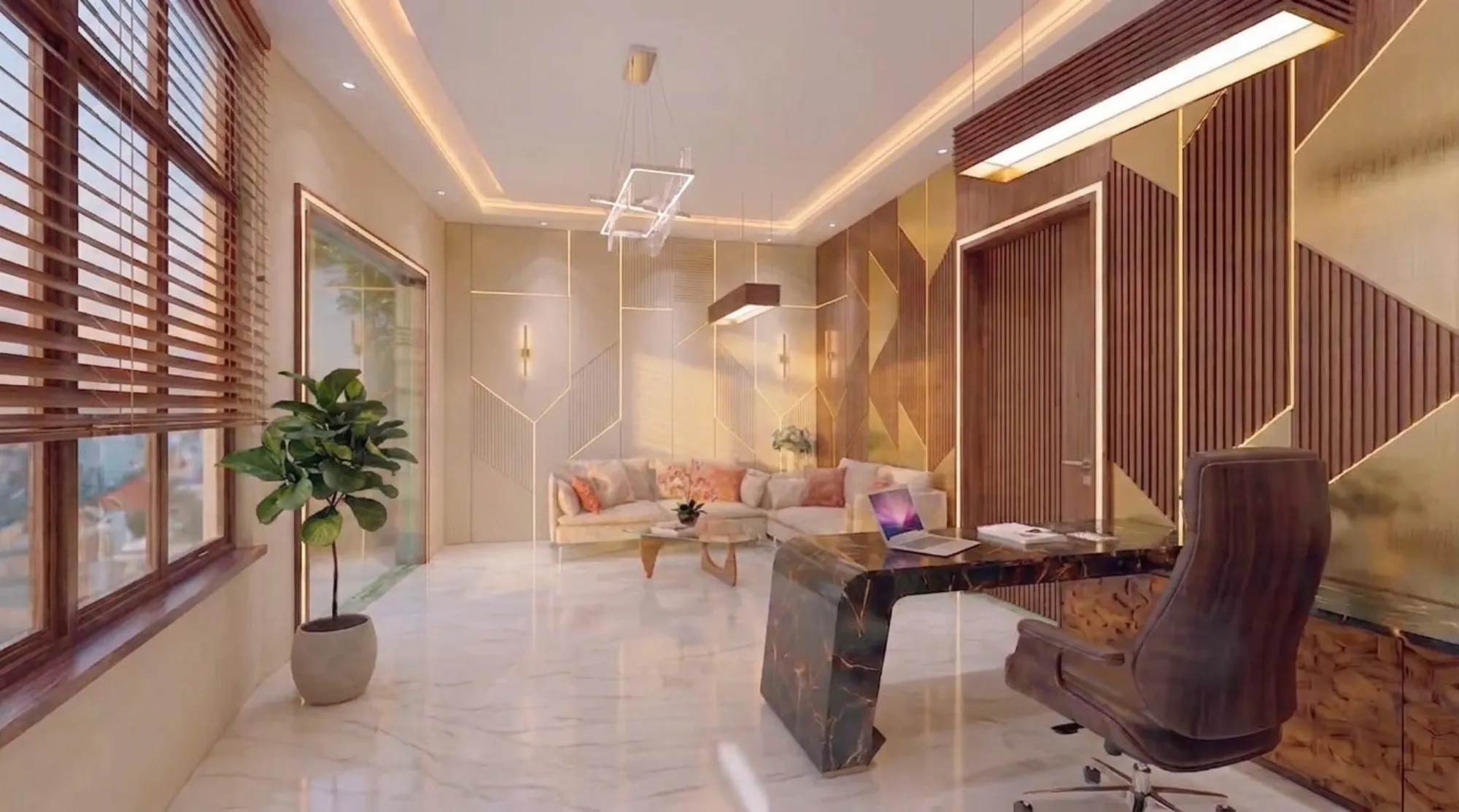
A showroom is one of the few commercial interiors where the architecture is doing the selling before a single salesperson says a word, because the customer's decision to walk in, to linger, to move toward the product they came for or discover one they did not, and to eventually feel comfortable enough to ask about price, is shaped almost entirely by how the space guides them, and we have watched this play out consistently across the furniture, automobile, and appliance showrooms we have designed along New Town's commercial corridors, where footfall from the wide arterial roads and the concentration of showroom inventory in a small radius means a poorly zoned space loses customers to the showroom next door before they have even finished their first lap of the floor. The mistake we see most often in showrooms that come to us for a redesign is treating the interior as storage with good lighting, meaning every product the business owns gets placed somewhere on the floor with roughly equal visual weight, and the result is a room where nothing actually stands out because everything is competing for the same attention, so before we talk about lighting or finishes, the real work of showroom design happens in three decisions made at the planning stage: how the floor is zoned, how the customer is made to walk through it, and which products get the visual authority of feature lighting.
Zoning by Decision Stage, Not by Product Category
The instinct in most showroom layouts is to zone by category, sofas in one corner, dining sets in another, or sedans on one side and SUVs on the other, and while that logic is not wrong, it misses the more important zoning question, which is where a customer is in their decision process when they enter a given zone. We design showroom floors around three zones that map to that decision journey rather than to inventory type alone, starting with an entry zone that has to do the work of orienting a customer within the first ten to fifteen seconds of walking in, which means it should showcase one or two genuinely striking pieces or vehicles rather than a wall of options, because a customer who is hit with the full breadth of inventory the moment they cross the threshold tends to disengage rather than explore, whereas a single well-lit hero piece gives them something to walk toward and a reason to keep moving into the space. Past the entry zone comes what we think of as the exploration zone, the bulk of the floor where the category-based organisation customers actually expect does belong, arranged so a customer can browse at their own pace with enough aisle width to stop and inspect a piece without blocking the path for anyone behind them, and in our furniture and appliance showroom projects we hold to a minimum clear aisle width of 1.2 to 1.5 metres in the primary circulation paths specifically so two customers can pass each other comfortably even when one has stopped to look closely at a product. The third zone is the consultation or closing zone, tucked slightly away from the main traffic flow, whether that is a seating area near a finance desk in an automobile showroom or a materials and swatch table in a furniture showroom, because the conversation that happens once a customer has decided they are seriously interested needs a degree of visual and acoustic separation from the browsing crowd, both for the customer's comfort in discussing budget and for the salesperson's ability to hold a focused conversation without the ambient noise of the open floor.
Getting this zoning right in a New Town commercial unit usually means resisting the tenant's instinct to maximise the number of display pieces on the floor, because a showroom that displays forty pieces of furniture with two feet of breathing room around each one consistently outperforms, in terms of actual conversion, a showroom that crams in sixty pieces with no room to view them properly, and this is a conversation we have with almost every showroom client at the planning stage, since the commercial pressure to show more inventory is real but works directly against the spatial clarity that makes customers comfortable enough to commit.
Circulation Loops That Cover the Floor Without Feeling Like a Maze
Once the zones are set, the path connecting them is the second major architectural decision, and the layout we return to most often for mid-sized New Town showrooms, typically in the 2,000 to 6,000 square foot range, is a loop circulation pattern rather than a grid of straight aisles, because a loop takes a customer past every zone in a continuous path that returns them naturally to the entrance or the consultation area without requiring them to backtrack, and backtracking is where customers tend to peel off and leave since retracing steps through a space they have already seen reads as a dead end even when it is not. We lay this loop out by first identifying the hero pieces we want maximum eyes on and positioning them at the outer curve of the loop where the sightline is longest, since a product visible from thirty feet away as a customer enters gets a different kind of consideration than one tucked into a side aisle they may never walk down. In an automobile showroom specifically, the loop has to account for the turning radius and clearance a customer needs to walk fully around a parked vehicle, open a door, and sit in the driver's seat without brushing against the neighbouring vehicle's display, which typically means allotting closer to 4 to 5 metres of clear floor depth per vehicle bay rather than the tighter spacing that works for furniture or appliance displays, and we have redesigned more than one automobile showroom floor plan where the original layout, done without this clearance in mind, left customers unable to fully open a driver's door for a proper seated demonstration.
Appliance showrooms bring a different circulation challenge, since the products are smaller and the temptation is to line them up shelf-style along the walls the way a big-box retailer would, but that arrangement flattens every appliance into the same visual plane and makes comparison shopping feel like reading a spec sheet rather than experiencing the product, so where the floor plate allows it, we prefer breaking large appliances like refrigerators and washing machines into small freestanding clusters set at slight angles to the main circulation path, which both slows the customer's pace enough to actually look and creates natural stopping points along the loop rather than a continuous scan-and-walk. Whatever the product category, we always model the circulation loop against the door swing directions, the register or billing counter position, and any back-of-house storage access the staff need, because a beautifully zoned showroom floor that forces staff to cut across the customer path every time they retrieve stock from the back undermines the calm, unhurried browsing experience the whole layout is trying to create.
Feature Lighting on Hero Products: The Detail That Separates a Showroom From a Storeroom
Lighting is where the zoning and circulation work either pays off or gets wasted, because even a well-planned floor with flat, even ambient lighting throughout reads as utilitarian rather than aspirational, and the fix is a layered lighting approach where general ambient lighting, typically held around 300 to 400 lux across the walking floor, is treated purely as base illumination while the hero products in each zone get dedicated accent lighting at three to five times that intensity, delivered through adjustable track-mounted spotlights or recessed adjustable downlights aimed specifically at the product rather than the surrounding floor. This contrast is what makes a customer's eye land on the piece the showroom actually wants them to notice first, and we specify a colour temperature of around 3000K for most feature lighting on furniture and appliances since warmer light renders wood tones, upholstery, and finished metal more flatteringly than the cooler daylight-mimicking light that can make the same materials look clinical, though automobile showrooms are the exception, where a slightly cooler 4000K to 4500K accent light tends to render automotive paint finishes and chrome trim with more visual punch and is closer to what customers expect from a car reveal.
Beyond the hero spotlighting, we also pay close attention to how light interacts with reflective and glazed surfaces on the showroom floor, since a badly aimed spotlight bouncing off a glass display case or a vehicle's windscreen creates a glare hotspot that actually obscures the product it was meant to highlight, so every lighting plan we produce gets checked against the specific reflectivity of the finishes and products going into that zone before fixtures are finalised, not just plotted generically across a reflected ceiling plan. Feature walls behind hero pieces do complementary work here too, and a textured stone or wood-panelled backdrop lit with a soft wash of light gives a single product the kind of visual context a flat painted wall cannot, which is a detail we have used to particularly good effect in furniture showrooms where a single sofa or bed placed against a considered backdrop photographs and sells noticeably better than the same piece against a bare wall. If your showroom sells furniture specifically, we go much deeper into the vignette-based display technique, arranging pieces into full room sets rather than isolated products, in Furniture Showroom Layout: Designing Vignettes That Sell Room Sets, Not Single Pieces, which builds directly on the zoning principles here.
Working Within New Town's Commercial Floor Plates and FAR Rules
Most of the showroom projects we take on sit within New Town's commercial corridors in Action Area I and Action Area II, where floor plates in newly built commercial complexes tend to follow a fairly predictable structural grid, and one detail that surprises first-time showroom tenants is how much a few extra square metres of usable floor area, purchased through HIDCO's premium FAR mechanism where applicable to the plot, can change what zoning and circulation options are actually viable, since the difference between a cramped 2,200 square foot unit and a properly loop-circulated 2,800 square foot unit is often exactly the margin needed to fit a consultation zone without compromising the browsing aisles. We explain how that extra-FAR purchase mechanism actually works, what it costs, and when it makes financial sense for a commercial tenant or owner in Purchasable Premium FAR in New Town: How HIDCO's Extra-FAR Fee Structure Works, which is worth reading before you sign a lease or finalise a purchase if the floor area feels tight against your product line.
Let's Design a Floor Your Customers Actually Want to Walk
If you are opening a new showroom in New Town or reworking an existing one that feels crowded or hard to navigate, we would like to see your floor plate and your product line before you commit to a layout, because the zoning and circulation decisions above are always specific to what you are selling and how much floor you actually have. Get in touch through our contact page and we will start with a walk-through of your space and a look at where your current best-sellers are getting lost in the crowd.