








Why a Single Tonal Palette Makes a Small Room Feel Bigger Than a 'Bold Accent Wall'
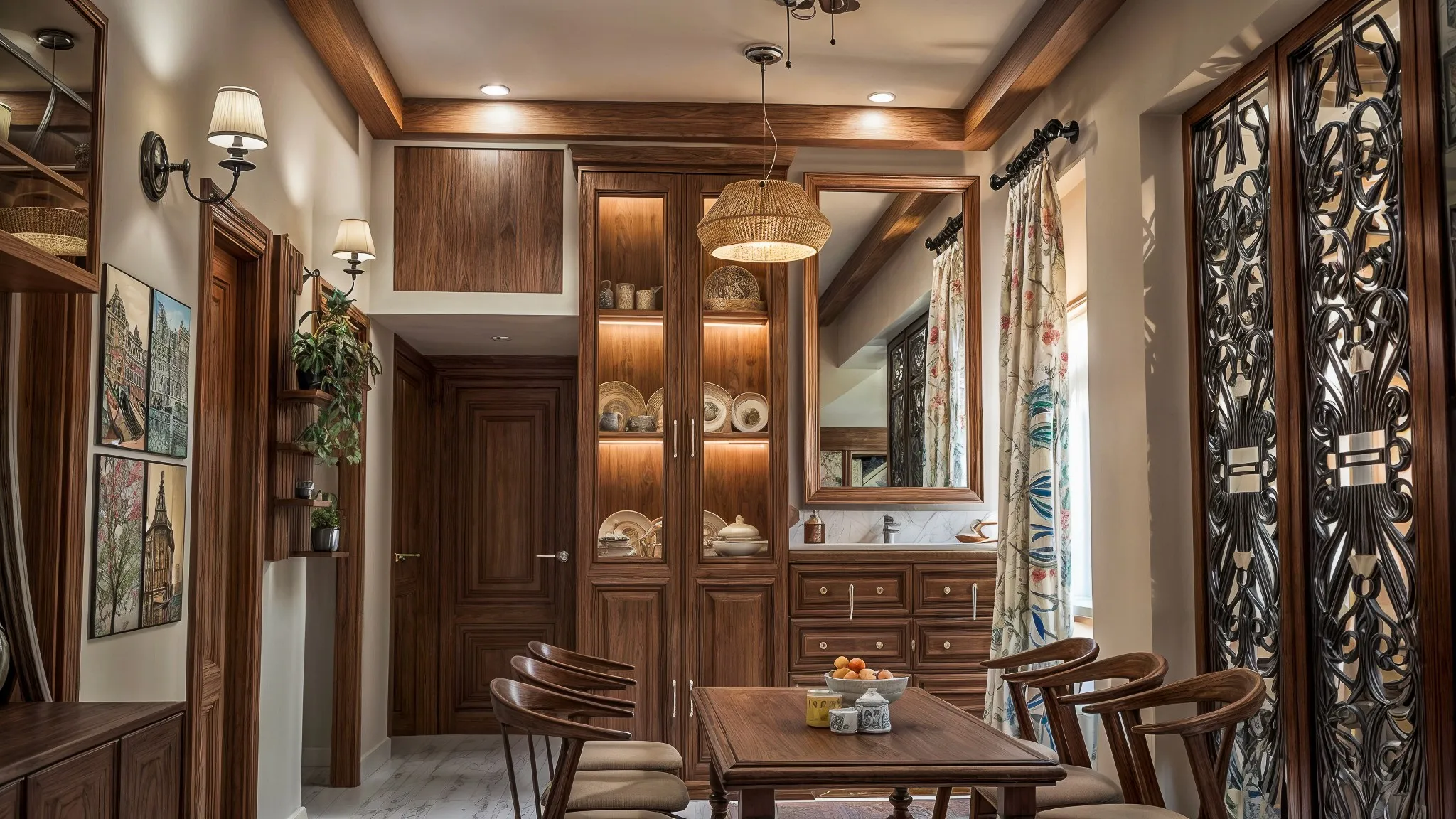
We have lost count of how many first-site-visits in New Town and Salt Lake start with a client pointing at a wall behind their bed or sofa and telling us it needs "something bold," usually a deep teal or a charcoal or a rust, because a design blog or a reel told them an accent wall is the fast way to make a room feel intentional, and we understand the instinct because a single striking wall does photograph well and does read as a decision rather than an accident. But in a genuinely small room, and we mean the 90 to 140 square foot bedrooms and study nooks that make up a large share of what we design in New Town's compact 2BHK and 3BHK layouts, an accent wall is very often the single decision most likely to make that room feel smaller once you're actually living in it rather than looking at a photo of it, because it introduces a hard visual stop exactly where a small room can least afford one. This piece is our case against the accent wall in small rooms specifically, and our case for the technique we use instead on almost every compact bedroom and living space we touch, which is carrying one tonal palette continuously across walls, ceiling, and trim so the eye never finds an edge to stop at.
What an Accent Wall Actually Does to a Small Room's Geometry
The visual logic behind an accent wall is built for larger rooms, where a contrasting wall gives the eye a focal point within a space that already has enough volume to hold that contrast comfortably, the wall reads as a feature because there is enough surrounding neutral area for it to sit against. In a small room, that surrounding area simply does not exist in the same proportion, so instead of a feature, the darker or bolder wall becomes a boundary, and your eye, which measures a room's perceived size largely by how far it can travel before hitting a visual interruption, stops at that wall rather than continuing past it. We have measured this effect directly on client walkthroughs: put a mid-tone charcoal accent wall behind the headboard in a 10 by 11 foot bedroom, and most people, without being told which wall is which, will estimate the room as noticeably shallower than its actual depth, often by a foot or more, purely because the dark plane reads as closer than it is. The three light, neutral walls around it don't compensate for this, because the eye doesn't average the four walls together, it locks onto the strongest contrast in the room and uses that as its reference point for scale.
There's a second problem specific to Kolkata flats that rarely comes up in the international design content most of our clients are drawing inspiration from, which is that our apartments typically get daylight from one or two windows on a single face of the room, so an accent wall opposite or adjacent to the window often sits in its own shadow for a large part of the day, and a dark bold color in low light doesn't recede the way it might in a well-lit reference photo, it just goes flat and heavy, and the room feels dimmer and more closed in for most of the hours you're actually using it.
The Alternative: One Tonal Family, Carried Everywhere the Eye Can Reach
What we do instead on almost every small bedroom, home office nook, or compact living area is choose a single hue family, not necessarily a single exact shade, and carry it across every surface the eye tracks continuously: all four walls, the ceiling, and the trim and door frames, varying only the tonal value slightly between surfaces rather than switching hue or introducing contrast. A common formula we use is a wall in a soft warm off-white or a pale greige, a ceiling one or two shades lighter again (never stark white against a tinted wall, since that white ceiling becomes its own hard stop the same way an accent wall does), and door and window trim painted to match the wall color rather than picked out in white or a contrasting wood tone. The effect, and we've had clients notice this within minutes of walking into a finished room, is that there is no single surface for the eye to lock onto as the room's edge, so it keeps traveling along the tonal gradient and reads the room as continuous and therefore larger than its actual footprint. We used exactly this approach on a 96 square foot second bedroom in a Rajarhat 2BHK last year, walls and ceiling both finished in a warm pale sand tone about two shades apart, trim painted to match rather than picked out in white, and the client's own words after the paint work was done were that the room "felt like it had grown," which is precisely the illusion tonal continuity is built to produce, even though not a single physical wall had moved.
This doesn't mean every small room has to be pale. Tonal continuity works at darker values too, provided the darkness is consistent rather than isolated to one wall, a small windowless study or a powder room can be done in a deep, warm charcoal or a muted forest tone across all four walls and the ceiling, and because there is no lighter surrounding surface to contrast against, the room reads as an enveloping, deliberately cocooned space rather than a small room with one aggressive wall closing in on it. The mistake isn't darkness itself, it's isolating the darkness to a single plane while surrounding it with a different value, which is exactly what a classic accent wall does.
Where the Trim and Ceiling Decisions Matter More Than the Wall Color Itself
Clients are usually surprised that we spend more time discussing the ceiling and trim treatment than the actual wall paint color, but in a small room these are the decisions that make or break the tonal continuity trick. A ceiling painted in a contrasting bright white against tinted walls creates a visible seam at the cornice line, and that seam functions as a second accent-wall-style stop, just a horizontal one instead of a vertical one, capping the room's perceived height even in a space with a genuinely reasonable 10 foot ceiling, which is fairly standard across New Town's newer residential towers. Bringing the ceiling color down to within one or two shades of the wall removes that seam almost entirely, and in rooms with exposed or boxed beams, we extend the same tone across the beam faces too rather than picking them out, since a picked-out beam is, again, functionally an accent wall on the ceiling. Door and window trim gets the same treatment: white or wood-toned trim against a tinted wall creates a strong rectangular outline around every opening that visually chops the wall into segments, whereas trim matched to the wall tone (even a shade or two off, it doesn't need to be an exact match) lets door and window openings recede into the wall plane instead of interrupting it.
Where a Genuine Feature Still Earns Its Place
None of this is an argument against contrast or personality in a small room, and we're not suggesting every compact space should be a flat monochrome box with no character, because that would trade one problem for another. What we're arguing against specifically is contrast used as a full-wall block of color, since a small, deliberate feature, a textured plaster panel behind the bed sized to roughly a third of the wall rather than the whole plane, a piece of framed art, a headboard in a contrasting fabric, or a run of cove lighting that adds warmth without adding a hard-edged color boundary, gives you the personality an all-tonal room can sometimes lack without reintroducing the boundary problem an accent wall creates. If lighting rather than paint is where you want that personality to live, our piece on false ceiling and cove lighting design covers how we build warmth into a small room through light temperature and placement rather than wall color, which is often the more forgiving lever to pull in a room that's already tight on daylight.
Where Paint Choices Meet the Room's Actual Constraints
Paint decisions in a small flat rarely exist in isolation from the room's other constraints, and we've written before about two of the most common ones we see in New Town apartments. If your small room also has plumbing or wiring runs that need boxing in, our guide to using a false wall to hide services without losing the room's depth is worth reading alongside this one, since a false wall built and painted in the same tonal family as the rest of the room disappears the way we want it to, whereas the same false wall painted as a contrasting block reintroduces exactly the boundary problem we've spent this piece arguing against. And if the room in question doubles as an entryway or opens directly onto one, which is common in some of the more compact New Town layouts we work in, our piece on solving shoe and entryway clutter in flats with no dedicated foyer covers the storage side of a problem that often shows up in the same small rooms we're discussing here. And for anyone dealing with a small room that also happens to open onto a balcony, our guide to shading devices that cut glare without blocking the view is a useful companion piece, since the light quality coming through that opening changes how any tonal palette inside actually reads over the course of a day.
If Your Small Room Still Feels Small After Painting It
If you've already tried the accent wall route in a compact bedroom or study and the room still feels tighter than it should, or if you're planning paint for a small space in New Town, Salt Lake, or Rajarhat and want us to walk through a tonal scheme suited to your room's actual light and dimensions before a single tin gets opened, get in touch with our team and we'll bring swatches, look at how your room takes light through the day, and build a palette that makes the room feel like it has grown rather than one that photographs well for a single wall and closes in on you the rest of the time.