








Choosing Wall Colors by Vastu Direction Without Making Your Home Look Dated
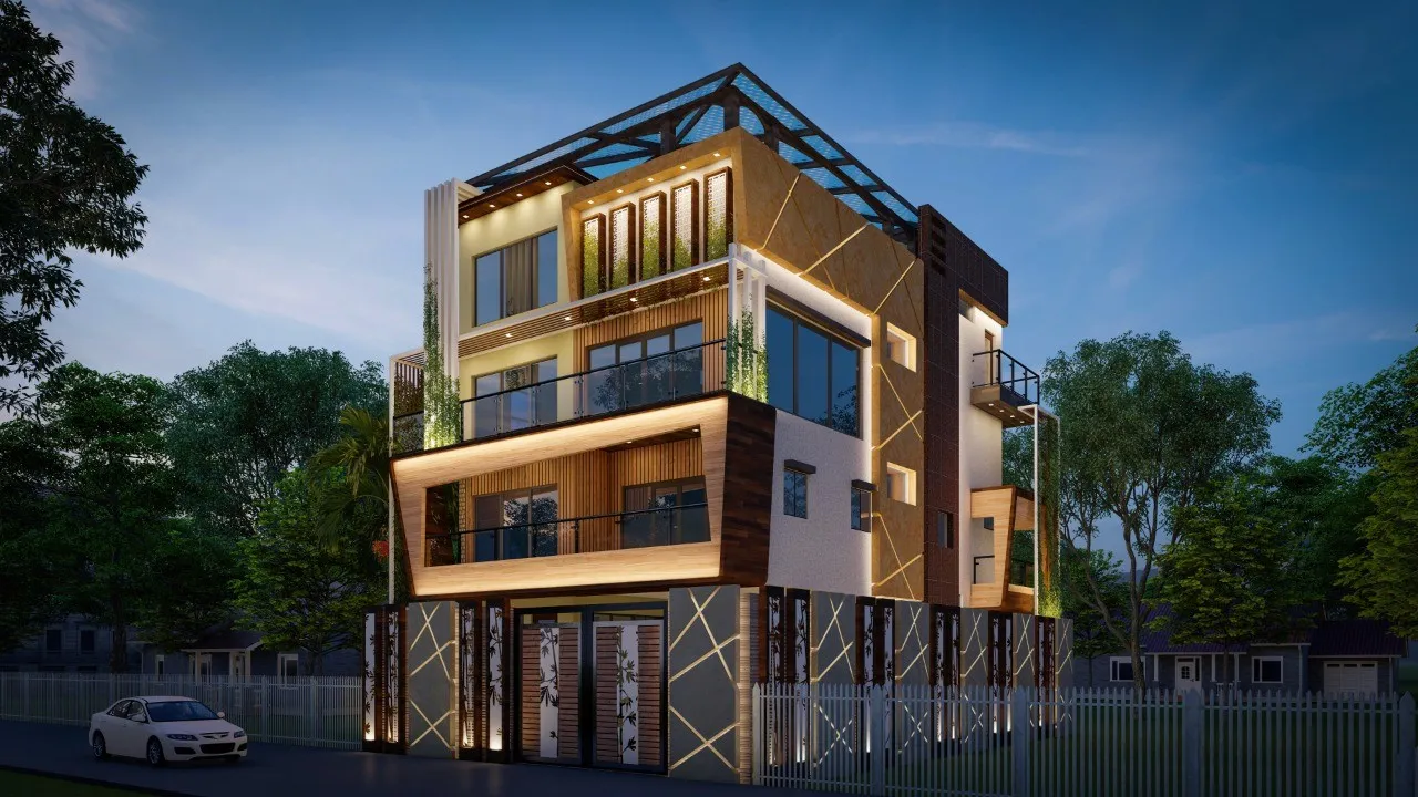
We get a particular kind of hesitation from clients when the conversation turns to Vastu-compliant colour schemes, because a lot of people walk in expecting to be told their south east kitchen needs to be bright orange or their north east pooja corner needs a loud royal blue, and they are quietly dreading it, since that is not the kind of home most of our clients in New Town, Salt Lake, and Rajarhat actually want to live in in 2026, when the prevailing taste across the residential interior design work we do has moved firmly toward muted, earthy, warm-neutral palettes with colour used in restraint rather than in declaration. The good news, and something we spend real time explaining, is that Vastu's colour guidance was never actually about saturation or brightness, it was about the element each direction is associated with, and once you separate the element from the specific shade, you have enormous room to satisfy the underlying principle in a palette that reads as considered and current rather than like a temple gift shop.
What the direction to element to colour chain actually says
Vastu shastra ties each of the primary directions to one of five elements, agni or fire, jala or water, vayu or air, prithvi or earth, and akasha or space, and the colour recommendations that get repeated in most guides are really downstream translations of those elemental associations rather than fixed rules about specific paint codes. The south east, ruled by the fire element and traditionally the recommended zone for the kitchen, is associated with reds, oranges, and warm pinks, since those are the colours most directly tied to flame and heat in the classical framework. The north east, ruled by water and considered the most auspicious zone for openness, worship spaces, and light, pulls toward whites, very pale blues, and soft creams, colours meant to evoke clarity rather than density. The south west, ruled by the earth element and associated with stability and weight, calls for browns, ochres, and deep earthy tones. The north west, tied to air and movement, suits greys and off-whites. And the centre of the home, or Brahmasthan, tied to space itself, is traditionally kept as light and as uncluttered as possible, which in colour terms usually means the palest neutrals in the whole scheme.
Once you lay it out that way, the striking thing, and the thing we point out to nearly every client who raises this topic, is how closely the elemental logic already overlaps with the muted, earthy, warm-neutral direction that contemporary Kolkata interiors have been moving toward anyway, because ochre, terracotta, clay, sand, and soft off-white are not a compromise version of Vastu colour rules, they are close to a literal reading of them, just without the saturation turned up to the level a lot of older interpretations assumed was necessary.
South east kitchens without the orange
Take the south east kitchen, which is probably the single most common room and direction pairing we deal with, since so many New Town floor plans put the kitchen on that corner of the unit. The classical instinct is to reach for orange or red, and we have seen kitchens painted in genuinely fire-engine tones trying to satisfy this, which tends to feel visually exhausting in a room you stand in for an hour or more at a stretch every single day. What we do instead, on nearly every south east kitchen we have designed in the last two or three years, is push the fire element into materials and accents rather than flooding the walls with saturated colour, so a terracotta or burnt sienna tile as a backsplash behind the hob, warm copper or brass hardware on cabinet handles, and a rust or clay coloured runner rug on the floor carry the elemental intent, while the actual wall colour stays in a warm off-white, a soft sand, or occasionally a muted terracotta at maybe a third of the saturation you would get from a straight-off-the-shelf orange. We did this for a client in a Salt Lake apartment last year, where the roughly hundred and ten square foot kitchen kept warm white walls with a burnt orange handmade tile backsplash spanning about eighteen square feet behind the counter, and the fire element reads clearly in the room without a single wall shouting about it.
North east living and worship spaces in soft neutrals
The north east zone is, if anything, the easier one to translate into current taste, because the classical recommendation for pale blues, whites, and light tones already matches almost exactly what most of our clients are asking for in their living rooms and pooja corners regardless of Vastu considerations. We typically specify a warm white or the palest possible dusty blue grey for a north east living room wall, sometimes with a single deeper accent, perhaps a muted teal or slate blue on one built-in shelving unit or a piece of furniture, rather than a full wall, since the water element calls for a sense of openness and calm that a heavily accented room works against regardless of which specific colour you choose. For pooja spaces sitting in the north east, which is the traditionally preferred corner for a home shrine, we lean into that same pale palette but add warmth through natural materials rather than colour, using a light teak or sheesham wood unit, brass fittings, and a soft, warm-toned light fixture, so the corner feels calm and clean without reading as cold or clinical, which is the risk when clients take "pale blue and white" too literally and end up with something closer to a hospital corridor than a warm worship nook.
South west and north west, the two zones that need the least translation
The south west, tied to earth and weight, is honestly the zone where classical Vastu guidance and 2026 Kolkata taste need almost no reconciling at all, because browns, ochres, and deep warm neutrals are already the backbone of the muted, earthy palette trend we see requested constantly in bedroom and master suite briefs across our residential projects. We have used deep clay, cocoa, and warm charcoal brown on accent walls in south west master bedrooms in at least half a dozen recent projects, often paired with a warmer wood tone on the bed frame and wardrobe fronts, and clients consistently respond to it as looking current and grounded rather than dated, which tells us this particular direction to colour mapping has aged extremely well against changing interior trends. The north west, tied to air, suits greys, and here the main caution we give clients is not to over-cool the space, since a stark, blue-toned grey in a room meant to represent air and gentle movement can tip into feeling sterile, so we tend toward warmer, slightly greige tones rather than a true cool grey, especially in a climate like Kolkata's where warmer undertones simply read better against the quality of daylight most of the year.
Building a whole-home palette that does not feel patchy
The practical worry we hear most often once a client accepts the direction to colour logic room by room is that following it strictly will leave the home feeling disjointed, with five or six unrelated colour families fighting each other across adjoining rooms, and this is a completely fair concern, because a home where the kitchen is warm terracotta, the living room is dusty blue, the master bedroom is deep cocoa, and the north west study is cool grey can very easily read as chaotic rather than intentional if each colour is treated as an isolated decision. Our approach is to pick one warm neutral, usually a soft sand, warm white, or pale greige, as the connective tissue that runs through hallways, ceilings, and trim across the entire home, and then let each room's Vastu-associated tone appear as a considered accent within that consistent base, whether that is an accent wall, a piece of furniture, a textile, or a tiled surface, rather than a full four-wall commitment to that room's elemental colour. This keeps the overall home feeling like one cohesive palette with regional variation rather than a house divided into five competing colour zones, and it is the same underlying discipline we bring to broader colour and material planning across our residential interior design work regardless of whether Vastu is part of the brief.
If you are working through this room by room, our piece on Vastu for corner balconies in New Town high-rises covers how direction should shape function and not just colour for outdoor-adjacent spaces, and if you are renting rather than owning, our guide on Vastu remedies for tenants in a rented Kolkata flat covers what is achievable through paint, textiles, and furniture alone when structural change is off the table. For anyone tackling a wet space specifically, our bathroom renovation cost breakdown is a useful companion, since bathroom tiling and fittings often get chosen alongside the same directional colour logic discussed here.
Let us build your palette room by room
Getting the elemental logic right without tipping into a garish result is exactly the kind of judgment call we make on every project, room by room and often wall by wall, and we would rather sit with your actual floor plan and your family's taste than hand you a generic direction-to-colour chart and leave you to interpret it alone. If you want a palette that satisfies your Vastu priorities and still looks like a home you would be proud to show off in 2026, reach out through our contact page and let us walk through it together.