








Designing Bank and NBFC Branches That Feel Secure and Trustworthy
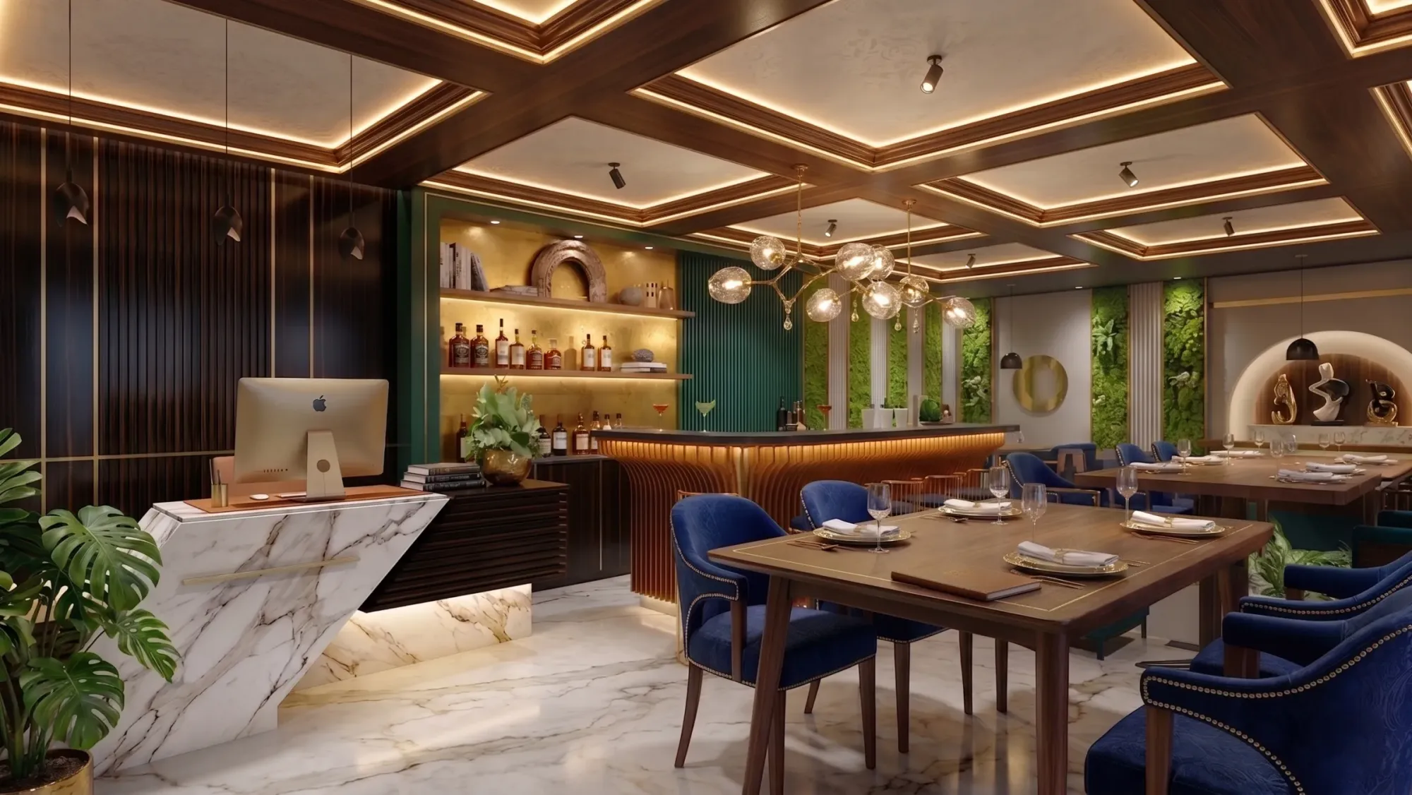
New Town has seen a steady rise in NBFC and small finance bank branches opening along its arterial roads over the past several years, a mix of gold loan companies, housing finance offices, cooperative bank branches, and private bank satellite outlets serving a population that has grown quickly around Action Area I, II, and III, and in working on a handful of these fit-outs ourselves we have come to see financial branch design as a genuinely distinct discipline from general commercial interiors, because the emotional job a bank branch has to do is narrower and more specific than almost any other commercial space: it has to convince a stranger, often carrying a fixed deposit slip, a gold loan document, or a lifetime of savings, to trust an organisation with their money within the same few minutes it takes to walk from the entrance to a desk. That is a different design problem from a retail store trying to sell a product or an office trying to look creative, and it draws on a fairly specific vocabulary of solidity, control, and privacy that we want to lay out plainly here, because we think a lot of NBFC branches in the secondary Kolkata market default to generic corporate interiors when they could be doing considerably more targeted work with the same budget.
Solidity as a Visual Argument, Not Just an Aesthetic Preference
The oldest trick in bank branch design, and still the most effective one, is using material mass and permanence as a stand-in argument for financial stability, because a customer cannot actually verify an NBFC's balance sheet by looking at its lobby, but they can and do read cues of physical solidity as a proxy for it, largely without realising they are doing so. This is why traditional bank branches lean so heavily on stone, marble, or a convincing large-format porcelain slab that mimics stone, on load-bearing-looking columns even when they are purely decorative cladding over a steel frame, and on a reception or teller counter with genuine mass and depth rather than a thin laminate-topped desk that could belong in any startup office. In the branches we have worked on, we generally specify a counter or welcome desk with a minimum depth of 600 to 750mm and a visibly substantial front face, often in a large-format stone-look porcelain tile or a wood veneer over a solid-core substrate rather than hollow partition board, because a thin, lightweight-looking counter undercuts the trust message no matter how good the lighting above it is. Colour plays into the same logic: deep navy, forest green, burgundy, and warm wood tones read as established and conservative in a way that bright, trend-forward colour palettes do not, which is exactly why almost every legacy bank brand in India still anchors its identity to a single deep, saturated colour rather than a palette that shifts with seasonal trends, and we carry that logic into NBFC branch interiors even when the brand's marketing materials skew more contemporary, because the physical branch is often the one touchpoint where a conservative, dependable visual register genuinely serves the business better than a fashionable one.
Controlled Sightlines: Letting Customers See Enough, Not Everything
A subtler and, in our experience, more commonly mishandled aspect of financial branch design is sightline control, which is the deliberate management of what a customer can and cannot see from different points in the branch, because both extremes damage trust in different ways. A branch that is too visually open, where a customer standing near the entrance can see directly into every back-office desk, every filing cabinet, and every staff member's screen, reads as chaotic and under-secured, even if nothing is actually wrong, simply because financial institutions are supposed to look like they compartmentalise information carefully. On the other hand, a branch that is too closed off, with solid partition walls blocking any view past the front counter, reads as opaque and slightly suspicious, because customers want to sense that there is real activity and real staff behind the counter, not wonder what is being hidden from them. The balance we aim for uses partial-height partitions, typically 1200 to 1500mm high in glass or a solid lower half with a fritted or frosted glass upper half, to separate the public banking hall from back-office processing areas, so a customer can see movement, activity, and a sense of a functioning operation without being able to read screens or documents from across the room. For the teller or cash counter specifically, we specify a counter height in the 1050 to 1100mm range on the customer side, tall enough to create a clear boundary and a sense of security around cash handling, paired with a lower transaction shelf so paperwork and cards can be exchanged without the customer feeling walled off entirely.
Private Consultation Zones: The Single Highest-Trust Element in the Brief
If there is one design element that does more for a financial branch's trust profile than any other, it is a genuinely private consultation room or zone, separate from the open banking hall, for conversations about loan applications, account details, or any discussion involving sums of money or personal financial history that a customer does not want overheard by whoever is standing three feet away in a queue. We have seen NBFC branches, particularly smaller gold loan and personal loan outlets working within tight floor plates of 400 to 600 square feet, skip this entirely and conduct all customer conversations at the open counter, and it is consistently the detail that undermines an otherwise well-finished branch, because a customer discussing a six-figure loan within earshot of strangers will simply trust the institution less, regardless of how polished the counter or how warm the lighting. Even in a compact footprint, we push hard for at least one enclosed or substantially screened consultation space, whether that is a proper 80 to 100 square foot cabin with a door, or, where floor area genuinely will not allow it, a semi-private booth using higher partitions (1800mm or taller) and soft acoustic panelling on the interior faces to dampen conversation carrying beyond the booth. Acoustic treatment matters as much as visual privacy here, because a glass-walled cabin that looks private but transmits every word defeats the purpose just as thoroughly as no cabin at all, so we typically specify a laminated acoustic glass or add a fabric-wrapped acoustic panel to at least one wall of any consultation room handling sensitive conversations. Lighting in these consultation zones should shift noticeably warmer and calmer than the main banking hall, closer to 3000K with a dedicated task light over the desk, because a consultation about a loan or investment product is a slower, more personal interaction than a queue transaction and the light should signal that shift the moment a customer steps in, an approach that echoes the same first-impression thinking we cover in The 90-Second Rule: Designing Reception Areas That Set the Right First Impression, except here the trust-building work has to continue well past the initial ninety seconds and hold up through a twenty-minute conversation about someone's finances.
Queue Management and Waiting Design Without Feeling Institutional
Queue design is a genuine tension in financial branches, because functional queue management, whether that is a token system, rope-and-stanchion lines, or simple numbered seating, is necessary for operational clarity, but done carelessly it tips a branch into feeling like a government utility office rather than a place someone chooses to bank with. We generally replace hard stanchion-and-rope systems with a seated waiting arrangement wherever floor area allows, using a token display screen paired with comfortable seating in the same material and colour language as the rest of the branch, rather than plastic chairs that look bolted on as an afterthought, because seated waiting reads as considerably more dignified than standing in a roped line, and it also gives us another chance to reinforce the solidity cues discussed earlier through upholstery choice and finish quality. Signage for queue and token numbers should be large, high-contrast, and placed where it is visible from every seat in the waiting zone, because ambiguity about whose turn is next is one of the fastest ways to generate visible frustration in a banking hall, which directly undercuts the calm, controlled atmosphere the rest of the design is working to build.
A Related Discipline: Calm Under a Different Kind of Scrutiny
It is worth noting that the underlying design skill here, using specific material, lighting, and spatial choices to manage how a stranger feels within a commercial space in the first few minutes, shows up again in a completely different register in Salon and Spa Interior Design: Creating Calm in a Commercial Footprint, where the goal shifts from projecting institutional solidity to inducing physical relaxation, but the design logic of controlling sightlines, acoustic separation, and lighting temperature by zone carries across both briefs in ways we find genuinely useful to think about together. And for NBFC branches specifically considering a New Town location, the practicalities of where the branch physically sits on its plot, how customers approach it from the road, and where service access and entry points fall, are worth reading alongside Service Lane Access Plots in New Town: The Setback and Entry Rules Buyers Miss, since a branch's street presence and entry sequence start shaping the trust impression before a customer has even reached the door.
Building a Branch Customers Actually Trust
If you are opening a new branch, or renovating an existing one, anywhere across New Town, Rajarhat, or the wider Kolkata financial corridor, we would like to walk the site with you and talk through where solidity, sightlines, and privacy are currently working for you and where they are quietly working against you, because in our experience a branch redesign focused on these three levers alone, without a full gut renovation, can measurably change how customers behave in the space within weeks of reopening. Get in touch through our contact page and share your branch's floor plate and current layout, and we can start mapping out where the trust gaps actually are.