








How Interior Design Becomes Brand Strategy: Translating a Logo Into a Physical Space
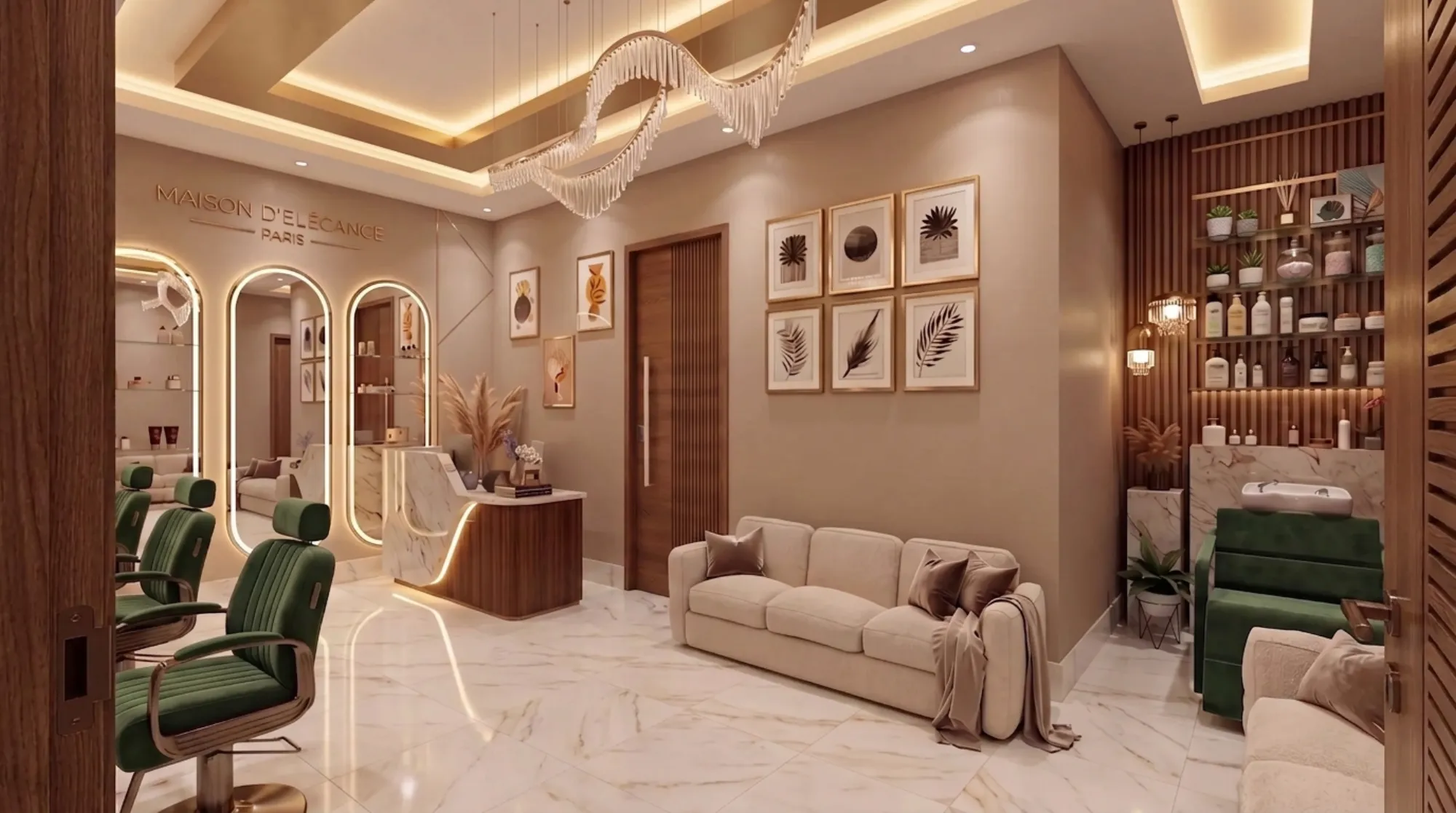
When a business owner comes to us with a commercial fit-out brief, they almost always arrive with a brand guidelines PDF tucked under one arm, a document that specifies the exact hex codes of their logo, an approved typeface, maybe a paragraph of brand values written by a marketing agency, and they hand it to us expecting that this is enough for a designer to simply apply it to a space the way you would apply a coat of paint. It never is, and one of the most valuable conversations we have with any commercial client, whether it is a restaurant in Sector 5 or a boutique retail brand opening its first physical location in New Town, is the one where we explain that a logo file is a two-dimensional symbol built for screens and letterheads, while a physical space has floors people walk on, materials people touch, acoustics people hear whether they notice it or not, and a sequence of rooms people move through in a specific order, and none of that is specified anywhere in a brand guidelines document. Translating a brand into architecture is a genuine design discipline with its own logic, and it is different work from simply picking furniture that looks nice, because every material and spatial decision either reinforces what the brand claims to stand for or quietly contradicts it, and customers register that contradiction even when they could not articulate what felt off.
The Gap Between a Brand Guideline and a Built Space
A typical brand guidelines document gives you perhaps four things you can act on directly: a primary colour and one or two secondary colours, a typeface family, a logo mark with its clear-space rules, and a paragraph or two of brand voice and values, words like "trustworthy" or "modern" or "warm" that read fine on a slide deck but say almost nothing about whether the reception counter should be timber or terrazzo. Our job starts by pulling apart what those words are actually supposed to mean once they leave the page. If a brand's guidelines describe it as "premium and understated," that is not a colour instruction, it is a direction about material restraint, about how few different finishes appear in a single sightline, about whether hardware is exposed or concealed, about whether lighting is layered and warm or bright and even. If a brand describes itself as "energetic and youthful," that might translate into saturated accent walls, visible structural elements left exposed rather than boxed in, and a faster, more open circulation path rather than a sequence of enclosed rooms. The guideline gives us the adjective, the interior design has to invent the vocabulary that makes a visitor feel that adjective within the first ten seconds of walking in, and that invention work, choosing which three or four material and spatial moves actually deliver on a brand word, is where the real strategic thinking happens rather than in the colour matching.
A Hypothetical Kolkata Case: Turning a Fintech Startup's Brand Into an Office
To make this concrete, imagine a Kolkata-based fintech startup opening its first proper office in Sector 5, roughly 3,500 sq. ft. across one floor, whose brand guidelines specify a deep navy primary colour, a warm gold secondary accent, a clean geometric sans-serif typeface, and brand values built around the words "trusted," "modern," and "accessible." Handed nothing but that document, a designer with no translation process might simply paint one accent wall navy, add gold-framed signage at reception, and call the brief satisfied, and the result would look like a brand-compliant space in photographs while feeling like an ordinary office with two extra paint colours in person. Our translation process instead starts by asking what each value actually demands spatially. "Trusted" for a fintech brand, we would argue, is not about colour at all, it is about material solidity and visual transparency, so we would push for stone or engineered quartz at the reception desk rather than a laminate that reads as temporary, and we would specify glass-walled meeting rooms along the client-facing side of the floor so visitors can see the business actually operating rather than being walled off from it, because opacity reads as evasive in a financial services context regardless of how reassuring the colour palette is. "Modern" gets expressed through restraint and negative space rather than through trend-chasing finishes, so we would keep the ceiling largely clean with a disciplined grid of recessed lighting rather than an elaborate false ceiling design, letting the architecture feel calm and current rather than busy. "Accessible" would shape the sequencing itself, meaning the reception-to-meeting-room journey stays short and legible, with clear sightlines and signage rather than a maze of corridors that makes a first-time visitor feel like an outsider navigating an insider's building. Only once those three structural decisions are settled do the navy and gold enter the picture, as a disciplined accent system, navy on select joinery and the reception fascia, gold as a thin metal inlay detail on door handles and signage lettering, rather than as broad expanses of paint, because a brand colour used as an accent against a neutral base reads as considered, while the same colour used as wall-to-wall saturation reads as a marketing exercise rather than an environment.
Material Palettes as a Vocabulary, Not a Decoration
The material choices a brand makes are doing communicative work whether the business owner intends them to or not, which is a subject we go into in much greater depth in a companion piece, choosing a material palette that says something about your brand, because the short version here is that raw concrete, warm oak, brushed brass and matte black steel are not interchangeable "nice finishes," each one carries a distinct set of associations that a customer reads intuitively within seconds of entering a space. A wellness brand built around calm and natural living has no business specifying glossy black granite and chrome, just as a fintech brand built around precision and trust has no business specifying reclaimed rustic wood and exposed rough brick, because those material languages belong to entirely different brand personalities and mixing them signals confusion rather than range. When we build a material palette for a commercial client, we typically narrow the options to no more than four or five core finishes across the whole space, one dominant surface material, one secondary, one accent metal, one textile family, and one lighting temperature, because a palette that tries to say everything ends up saying nothing clearly, and the discipline of restraint is usually what separates a space that reads as branded from one that just reads as decorated.
Signage, Wayfinding and the Small Systems That Carry a Brand Voice
Beyond the big material and spatial decisions, a surprising amount of brand translation happens in the small systems most business owners do not think to brief us on at all, things like how room names are labelled, what typeface and material the directional signage uses, how the reception desk greets a visitor before a human even does. We treat signage as an extension of the brand's typography guideline rather than a separate purchasing decision handled by a signboard vendor after the interior is finished, because a beautifully finished office undercut by mismatched, off-the-shelf acrylic signage in the wrong typeface is a common and entirely avoidable failure we see in commercial fit-outs that skipped this step. For a retail brand, the same logic extends to how merchandise is labelled, how price tags are designed, even how staff uniforms relate to the space's colour story, and while some of that sits outside a pure interior design mandate, we flag it early because a customer's brand experience does not distinguish between "interior design decisions" and "marketing decisions," they simply register a coherent or incoherent whole. The sequencing of spaces itself is a wayfinding and brand decision too, and how a customer's first ninety seconds inside a commercial space are choreographed is significant enough that we have written a dedicated piece on it, the 90 second rule for designing reception areas that set the right first impression, which is worth reading alongside this one if reception design is part of your current brief.
When the Brand Itself Needs Defining Before the Space Does
Occasionally a client arrives with strong brand guidelines on paper but an obvious gap between what the document claims and what the business actually does day to day, a "premium" brand with a fairly accessible price point, or a "modern" brand whose service delivery is still fairly traditional, and in those cases we push back gently before design work starts, because building an interior around brand words the business cannot yet live up to sets up an expensive mismatch that customers will notice the moment the experience inside the space does not match the polish of the space itself. The interiors we are proudest of are the ones where the brand guideline and the operational reality were already aligned, which let us focus entirely on translation rather than aspiration, and part of our early-stage discovery process for any commercial client is simply asking enough questions to find out which of those two situations we are actually in. This same translation discipline applies just as much to retail categories with very specific functional constraints layered on top of the brand question, and our piece on jewelry showroom interior design covering security, lighting and luxury in the same footprint is a good example of how brand expression has to bend around hard operational requirements without losing its voice.
Bring Us Your Brand Before You Bring Us a Floor Plan
If your business has a brand identity that has never quite made it off the screen and into a physical space that customers can walk through in Sector 5, New Town, or anywhere else in greater Kolkata, we would genuinely rather see your brand guidelines document before we see your floor plan, because the sequencing and material decisions we would propose depend entirely on what your brand is trying to say and to whom. Get in touch through our contact page with your guidelines and a rough sense of your square footage, and we will talk through what translating your specific brand into a built space could look like.