








Choosing a Material Palette That Says Something About Your Brand
Business owners briefing us on a new commercial fit-out almost always come prepared to talk about layout, square footage and budget, and almost never come prepared to talk about materials as a deliberate communication tool rather than a finishing touch decided near the end of the process, and that gap is usually where a commercial interior either becomes memorable or becomes forgettable. A customer walking into a cafe, an office reception, or a retail counter forms an impression of what kind of business they are dealing with within the first several seconds, well before they read a single sign or hear a staff member speak, and that impression is built almost entirely from materials, the coolness or warmth of the flooring underfoot, whether the counter in front of them is stone or laminate, whether the metal hardware on a door catches light with a matte or a mirror finish. This piece is written specifically for business owners sitting down to brief a designer for the first time, because the biggest single lever you have over how your brand reads in physical space is the four or five core materials you commit to, and understanding what each option actually signals will make your briefing conversation dramatically more productive.
Why Materials Carry Meaning Whether You Plan It or Not
Every material has accumulated cultural associations over decades of use in the kinds of spaces we all move through, and those associations do not disappear just because a business owner did not intend to invoke them. Raw, unfinished concrete has become shorthand for a certain kind of industrial-creative confidence, the aesthetic of galleries, specialty coffee roasters and design studios that want to signal they do not need to hide their structure behind decoration. Warm timber, especially in visible grain rather than painted over, signals comfort, craft and a slower pace, which is why you see it dominating wellness studios, artisanal bakeries and hospitality spaces that want a guest to feel unhurried. Brushed or antiqued brass signals a kind of understated luxury that has become the default vocabulary for boutique retail and fine dining because it catches warm light beautifully without shouting the way chrome or polished gold does. Polished marble and large-format stone signal permanence and expense, which is exactly why banks, jewelry showrooms and five-star hospitality lean on it so heavily, and exactly why the same material can feel oddly cold or corporate in a business trying to project approachability instead. None of these associations are laws of nature, they are learned through repeated cultural exposure, but they are learned strongly enough that fighting them without a very deliberate reason usually reads as a mistake rather than as originality, so the first question we ask a client is not "what do you like" but "what do you want a first-time visitor to assume about you before they have spoken to anyone."
Raw Concrete and Exposed Structure: The Confident, Unfussy Brand
When a business briefs us with words like "authentic," "no-nonsense," or "we don't need to impress you with decoration, our product speaks for itself," raw concrete and exposed structural elements are usually the right starting point, because leaving a ceiling slab exposed rather than boxing it into a false ceiling, or leaving a load-bearing column in its natural finish rather than cladding it, is a confident material decision that says the business trusts its core offer enough not to dress up the shell around it. We have used this language in project types ranging from specialty food and beverage outlets to creative studio offices, generally keeping the concrete honest rather than faux-finished, meaning we specify actual polished or lightly sealed concrete flooring in the 400 to 700 sq. ft. range for smaller retail formats rather than a printed vinyl imitation, because customers can tell the difference at close range even if they could not explain how. The risk with this palette is that it can tip into feeling unfinished or cold if it is not balanced with at least one warm counterpoint, so we almost always pair exposed concrete with a warm timber accent, whether that is a reception desk, a slatted wood ceiling baffle, or upholstered seating in a natural fabric, specifically so the space reads as considered industrial rather than accidentally incomplete.
Warm Wood and Natural Textures: The Comfortable, Human Brand
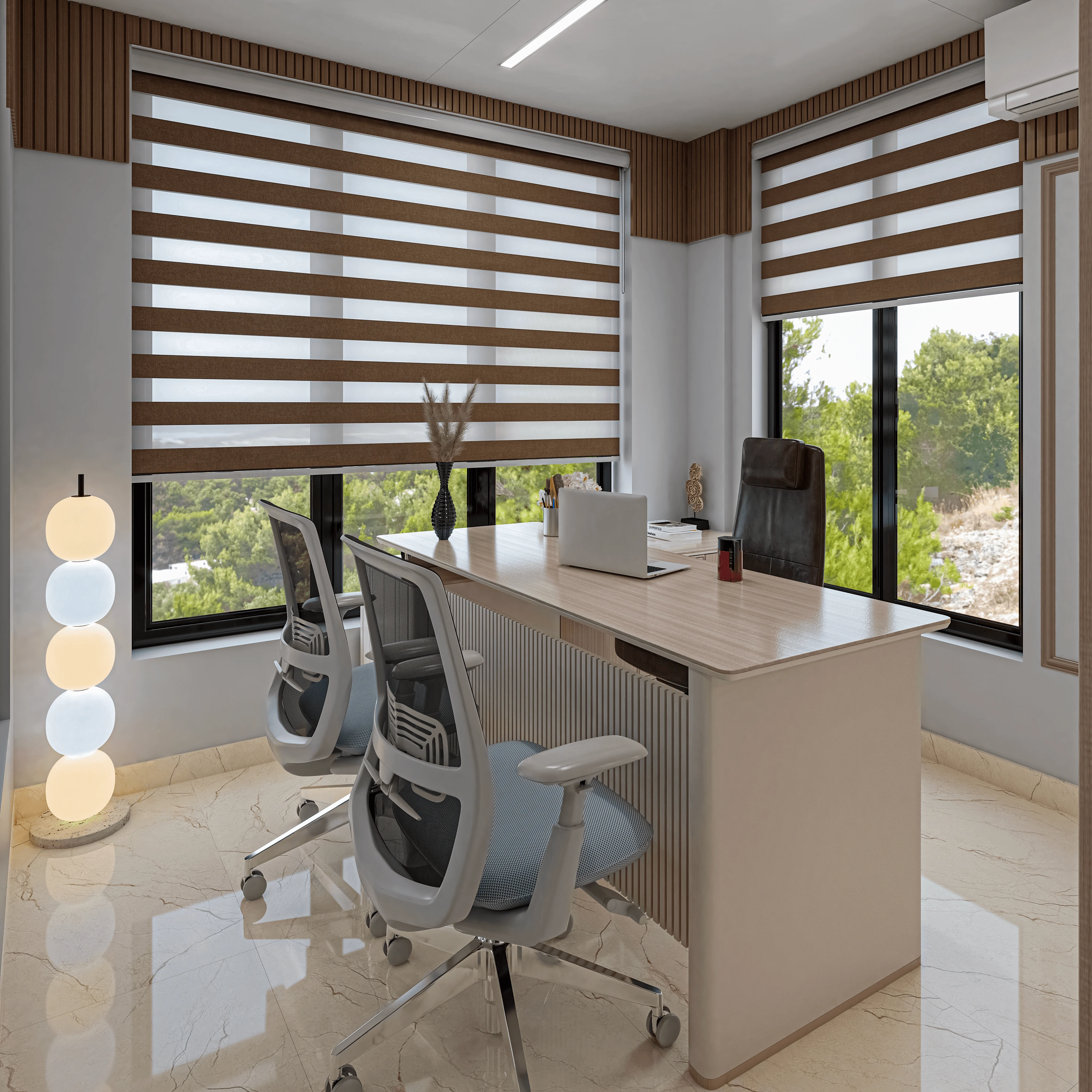
For businesses whose brand promise centres on warmth, trust, or a personal touch, whether that is a family-run restaurant, a children's education centre, or a wellness and spa business, warm timber tones combined with soft natural textiles are almost always the stronger choice over cooler materials like polished stone or brushed steel. We typically specify engineered oak or teak-toned laminate flooring for these briefs rather than raw solid timber, both for cost control and for the practical durability a commercial space needs under daily foot traffic, and we pair it with woven natural fibre textures on seating, linen or cotton-blend upholstery rather than synthetic leather, because the tactile softness matters as much as the visual warmth in convincing a visitor the space is genuinely comfortable rather than just photographed to look that way. Lighting temperature has to move in step with this material choice too, since warm wood tones under a cool white light source look flat and slightly grey rather than rich, so we specify 2700 to 3000 Kelvin lighting throughout wood-forward commercial interiors as a near-automatic rule. The trap to avoid here is over-warming a space until it feels dated rather than comfortable, which usually happens when wood tones, wall colour and lighting are all pulled toward the same warm register with no cooler note anywhere to create contrast, so we typically introduce one deliberately cool or neutral element, a matte black light fixture, a grey stone accent on a single feature wall, purely to keep the warmth from tipping into visual monotony.
Brass and Metal Accents: The Considered Luxury Signal
Brass, whether in a bright polished finish or, more often in our own project work, an antiqued or brushed satin finish, is the material that most efficiently signals "we have invested in this detail" without requiring an enormous material budget across the whole space, which is exactly why it works so well as an accent rather than a dominant surface. A single brass inlay running along the edge of a reception counter, brass door handles and kick plates, or a brass-framed mirror in a retail fitting room, does more to elevate a commercial interior's perceived value than doubling the marble budget would, because the eye reads metal detailing as evidence of finishing craft in a way it does not read large flat stone surfaces. We generally recommend clients think of brass and similar warm metals as seasoning rather than as a base material, meaning it should appear as trim, hardware, and small architectural details rather than as cladding across large surfaces, both because full-surface brass reads as showy rather than considered and because the material cost of doing so at scale rarely delivers a proportional return in how the space is perceived. This is a material language we lean on heavily in higher-stakes retail categories where perceived value is directly tied to sales conversion, and our piece on jewelry showroom interior design covering security, lighting and luxury in the same footprint shows how brass, warm lighting and restrained wall colour work together specifically to make merchandise, rather than the room itself, feel valuable.
Building Your Own Palette: A Briefing Checklist
When you sit down with a designer, whether that is our team or anyone else's, come prepared with answers to a short set of questions rather than a folder of inspiration images pulled from unrelated contexts, because inspiration images without a clear "why" behind each one tend to produce a mismatched palette that looks fine individually and incoherent together. Ask yourself what three adjectives you want a first-time visitor to associate with your business within the first thirty seconds, whether your price point and actual customer experience can support the luxury cues you are drawn to or whether a more restrained palette would build trust faster, and whether your business will still feel true to a material choice in five years or whether you are chasing a trend that will read as dated well before your next renovation cycle. We generally advise clients to settle on no more than one dominant surface material, one secondary surface, one accent metal, one textile family and one lighting temperature range before a single fixture gets specified, because a tightly bounded palette executed with discipline reads as considerably more expensive and more branded than a loosely bounded palette with six or seven different finishes competing for attention, even when the total material spend is identical. This kind of palette discipline is really the material expression of a much broader question about how a brand's full identity, not just its colours and materials but its spatial sequencing and signage too, gets built into a physical space, which we cover from the ground up in how interior design becomes brand strategy and translating a logo into a physical space.
Materials Have to Survive the Building, Not Just the Photograph
One practical note that gets missed surprisingly often in material selection driven purely by branding instinct is that a beautiful palette still has to survive the physical conditions of the site it is going into, and this matters more in New Town specifically than most business owners realise until it becomes a problem. Basement and semi-basement commercial spaces across New Town sit on a notably high water table, which changes what flooring, wall base treatments and even furniture materials can reasonably be specified without moisture problems emerging within a year or two, a constraint we go into in detail in basement parking in New Town and why high water tables change the design brief, and any material palette conversation for a below-grade retail or F&B unit in this belt needs to happen alongside that structural reality rather than after it.
Let's Build a Palette That Actually Sounds Like Your Business
If you are briefing a commercial fit-out anywhere in New Town, Salt Lake, or greater Kolkata and you have a strong sense of what your brand should feel like but no clear idea yet which materials will actually deliver that feeling, that gap is exactly the conversation we like to start with before any layout work begins. Reach out through our contact page with a description of the three adjectives you want your space to communicate, and we will help you translate that into a palette of specific, sourceable materials rather than a mood board of images that do not quite agree with each other.