








How Kolkata Interiors Traded Greys for Earthy Terracotta and Ochre Palettes in 2023
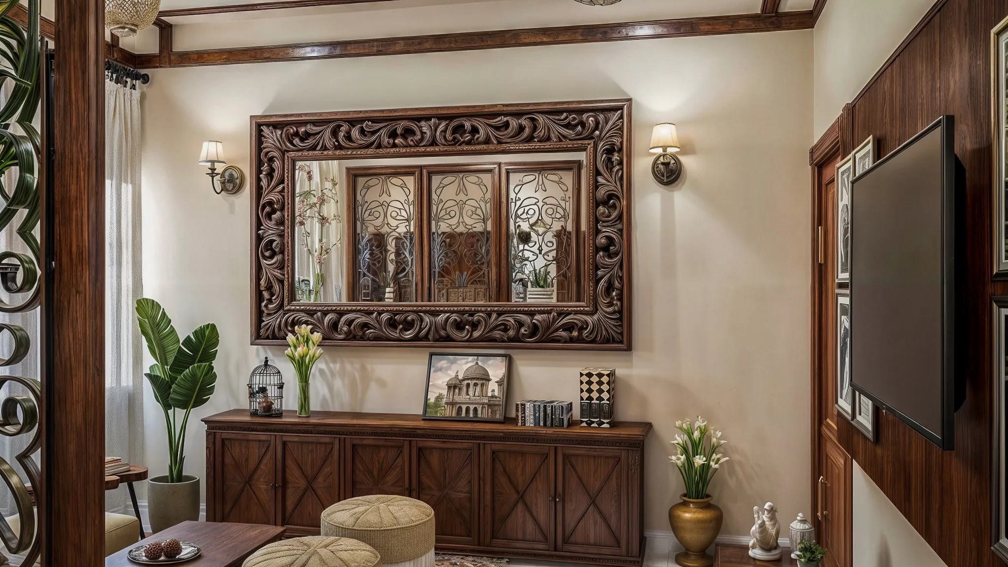
We can date this shift almost to the month, because we keep mood boards and material schedules from every project we run, and looking back through our 2022 and 2023 files there is a clear line where the requests change character. From roughly 2019 through the end of 2021, the overwhelming majority of our residential clients in New Town and Salt Lake asked for some version of the same palette: warm grey walls, often a shade close to Asian Paints Royale's "Silver Grey" or "Cool Grey" range, white lacquer or high-gloss laminate cabinetry, and either a pale oak or an almost-white engineered wood floor. It was clean, it photographed well, and it was, frankly, the palette every second Instagram interior account was running at the time, so it made sense that it dominated client requests too. By the second half of 2023, that same conversation had almost entirely turned, and understanding exactly what replaced it, and why, tells you something real about where Kolkata interiors are heading now rather than just repeating the word "trend" without evidence.
What the Grey Era Actually Looked Like
To be fair to the grey and white period, it was not without merit, and a good number of the homes we built in that palette still look sharp today, because a well-executed neutral scheme ages more gracefully than a badly executed bold one. The typical brief in, say, early 2021 asked for grey-toned walls across the living and dining zones, a white or off-white modular kitchen with either a matte or gloss laminate finish, and accent walls in a slightly deeper charcoal, usually confined to a single feature wall behind the television unit or the bed headboard. Flooring leaned toward light oak-effect vitrified tiles or, in the higher budget projects, actual engineered oak in a driftwood or whitewashed finish. It was a palette imported almost wholesale from Scandinavian-influenced global interior media, and it suited a certain kind of New Town apartment, especially the smaller 2BHK units where a light, cool scheme genuinely helped a compact space feel less closed in.
The Turn: What We Started Seeing in Client Briefs From Early 2023
The first signal we noticed was small: clients began forwarding reference images that were unmistakably warmer, terracotta floor tiles from heritage properties in Rajasthan, exposed lime-plastered walls in a burnt sienna tone, ochre-painted verandas from older Kolkata houses in areas like Bhowanipore and Kalighat that many of our younger clients had grown up visiting as grandchildren rather than owners. By the middle of 2023, this had moved from reference images into direct material requests, and across the residential projects we scoped in the second half of that year, close to half specified a warm, earth-toned palette as the starting point rather than grey, a proportion that had been close to negligible eighteen months earlier. The specific colours our clients gravitated toward clustered fairly tightly: burnt terracotta and rust for accent walls and sometimes full living room walls, ochre and mustard as a secondary tone usually confined to soft furnishings, cushions, and occasionally a lacquered cabinet front, and a deep clay or brick red used sparingly, almost always in a single statement location like a study nook or a powder bathroom rather than spread across an entire home.
On the paint side, we found ourselves specifying Asian Paints' "Tuscany Terracotta" and "Burnt Sienna" from their Royale Health Shield range far more often through late 2023 than we ever had before, alongside Berger's "Rustic Clay" and "Ochre Yellow" tones from their Silk range, both of which took over as the default recommendation for any client asking for "something warm but not overwhelming." For clients wanting texture rather than flat colour, we leaned on lime plaster finishes, either true Italian-style marmorino applied by specialist contractors we work with in Kolkata, or a more accessible textured emulsion finish that approximates the same mottled, sun-warmed look at a fraction of the labour cost. On flooring, the shift was equally visible: terracotta-effect vitrified tiles, particularly in a matte, slightly uneven "handmade" finish rather than a perfectly uniform gloss, became the most requested option for balconies, verandas, and increasingly for kitchen and utility area flooring too, a trend that runs directly alongside the artisanal tile movement we cover in more depth in our piece on the handmade tile revival in Kolkata bathrooms and kitchens.
Why the Shift Happened When It Did
Three things converged in 2023 that we think explain the timing better than simply calling it a fashion cycle. First, there was a broad fatigue with the grey and white palette specifically because it had become so ubiquitous by 2022 that it stopped reading as design and started reading as default, and clients who wanted their home to feel distinct from every other freshly renovated flat in their building complex began actively steering away from it. Second, the earthy palette carries a genuine emotional association with older Bengali homes, the kind with lime-washed courtyard walls and terracotta roof tiles that many of our clients associate with family, warmth, and a slower pace of life, and in the years following the isolation of the pandemic that association carried real weight in how people wanted their own homes to feel rather than just look. Third, and more practically, earthy tones are considerably more forgiving of Kolkata's dust, humidity staining, and the general wear that comes with monsoon months, since a rust or ochre wall shows less visible marking over eighteen months than a pale grey or white one does, which is a durability argument our clients increasingly bring up themselves rather than something we need to pitch.
How We Apply the Palette Without It Reading as a Fad
The risk with any strongly seasonal palette is that a home decorated entirely in one year's colour language starts to feel dated the moment the next shift arrives, so our approach through 2023 and into 2024 was to treat terracotta and ochre as an accent language layered onto a still-neutral base, rather than repainting every wall in a saturated earth tone. A typical project from that period kept walls in a warm off-white or a pale sand tone as the majority surface, then concentrated the terracotta and ochre into one or two feature walls, the soft furnishings, a run of open shelving, or a single piece of custom furniture, which is also where our in-house furniture design work tends to carry the palette most directly, since a rust-lacquered console or an ochre bouclé sofa can be replaced or refreshed far more cheaply than a wall of specialist lime plaster if the client's taste moves again. This is the same reasoning that shapes how we think about colour choices generally in relation to Vastu-oriented briefs, where wall tone in certain zones of the home carries additional considerations beyond aesthetics alone, a topic we go into directly in our piece on where Vastu and modern architectural preference sometimes disagree.
Where the Palette Stands Now
By early 2026, the pure grey and white scheme has not vanished from our intake entirely, some clients still specifically want it, particularly for smaller apartments where a cool, light palette genuinely does the most to open up a compact floor plate, but it has settled into being one option among several rather than the default assumption every brief starts from. Terracotta and ochre, meanwhile, have moved from novelty to a stable, recurring request, no longer the newest thing on the mood board but a settled part of how a meaningful share of Kolkata homeowners want their interiors to feel, and we expect that to hold for a while yet given how closely it ties to material durability and to a genuine emotional resonance with the city's own older architecture, rather than resting on novelty alone. If you are curious how these decisions get made at the very first sit-down with a client, we cover that process directly in our piece on how AI mood boards changed the first client meeting at Kolkata design studios, which explains how we now test a palette like this against a client's actual rooms before a single tin of paint is opened.
Bringing This Palette Into Your Own Home
If terracotta, ochre, and rust have been showing up in your own saved images and you are wondering how far you could take that palette in your specific apartment without it feeling like a passing trend, that is exactly the kind of question we like discussing at a first meeting, tone by tone, wall by wall, against your actual light and layout. Get in touch through our contact page and we can start putting together a palette that suits your home rather than just the current mood.