








How Wall Colour and Reflectivity Quietly Change How Much Daylight You Need
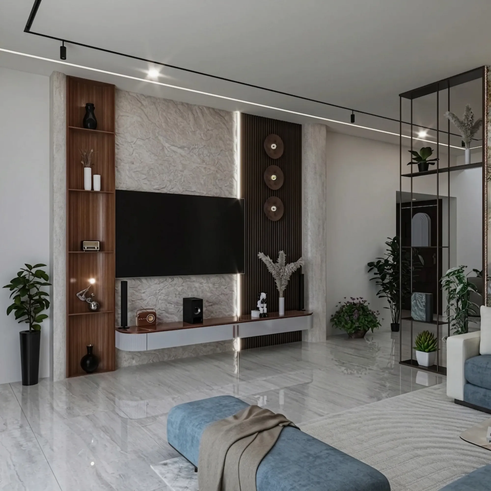
We get called into a lot of New Town and Salt Lake apartments where the client's real complaint is not about the window at all, it is about the room feeling gloomy by four in the afternoon even though the balcony outside is still flooded with sun, and nine times out of ten the culprit turns out to be sitting on the walls rather than the glass. Most homeowners think about daylight purely as a function of window size and orientation, and while those two things absolutely set the ceiling on how much light can enter a room, what happens after that light crosses the threshold is decided almost entirely by the colour and finish of the surfaces it lands on next. A wall painted in a deep charcoal or a matte terracotta will absorb most of the light that hits it and simply stop it there, while the same room finished in a soft off white or a warm greige with the right sheen will take that same beam of daylight and throw a meaningful portion of it back into the space, bouncing it toward the ceiling, across to the opposite wall, and eventually into the corners that the window itself could never directly reach.
Why Reflectivity Matters More Than People Assume
Light reflectance value, usually abbreviated as LRV, is a number between 0 and 100 that tells you what percentage of light a painted surface bounces back rather than absorbs, and it is one of the most underused pieces of information on a paint swatch. A pure black surface sits near an LRV of 2 to 4, meaning it swallows nearly everything that touches it, while a bright white can sit anywhere from 80 to 92 depending on the exact formulation, and most of the mid tone colours that Kolkata homeowners gravitate toward, the sage greens, the dusty blues, the warm beiges, land somewhere in the 40 to 65 range. The difference between a wall at LRV 30 and a wall at LRV 70 in the same room, with the same window, at the same time of day, can be the difference between needing a lamp switched on by early afternoon and comfortably reading a book by window light alone until early evening, and we have watched this play out repeatedly in narrow flats across Rajarhat and New Town where the depth of the room, often 14 to 16 feet from the window wall to the far corner, makes every bit of bounced light count.
The physics of it is straightforward once you see it laid out. Direct daylight entering a window falls off in intensity roughly with the square of the distance from that window, which is why the zone right at the sill can feel almost too bright while a spot ten feet further in feels dim even at midday, and reflected light is what fills that gap. When a wall, ceiling, and floor all have high reflectivity, the light that enters near the window keeps bouncing between those surfaces multiple times before it fully dissipates, effectively carrying illumination further into the room than the direct beam alone ever would. This is why professional daylighting studies for offices and hospitals almost always specify ceiling finishes above LRV 80 and wall finishes above LRV 50 as a baseline, not because anyone particularly loves white ceilings, but because the ceiling plane is usually the single largest unobstructed reflective surface in any room and it does an enormous amount of quiet work redirecting light downward and outward.
The Rooms Where This Matters Most
In our experience, this becomes a genuinely practical design decision rather than a theoretical one in three specific situations. The first is any room with a single window, which describes a huge share of secondary bedrooms and study rooms in New Town's typical apartment layouts, because with only one light source there is no cross illumination to compensate for a light absorbing wall scheme, and every percentage point of reflectivity you lose is a percentage point you cannot get back from anywhere else. The second is deep rooms, meaning anything where the distance from the window to the far wall exceeds roughly twelve feet, since that is typically the point where direct daylight intensity has fallen enough that the room becomes dependent on reflected bounce to feel evenly lit rather than having a bright strip near the glass and a dim cave behind it. The third is north facing rooms, which are common in several Action Area I and Action Area II blocks depending on tower orientation, where the light entering is already softer and more diffuse than the direct sun a south or east facing room receives, so there is less raw daylight available to bounce in the first place, which makes every reflective surface proportionally more valuable.
Our general recommendation for daylight starved rooms is to keep the ceiling at or above LRV 85, which in practice means a true white or the very palest of off whites, because painting a ceiling in even a light pastel can drop its reflectivity by ten to fifteen points and you will feel that loss in the room's overall brightness even if you cannot immediately say why. For the walls themselves we typically steer clients toward LRV 55 to 75 tones, which still gives plenty of room for warmth and character, colours like a soft warm white, a pale sand, or a muted dove grey all sit comfortably in that range, and we reserve genuinely deep or saturated colours for a single accent wall placed on the side or rear of the room rather than on the wall directly facing or flanking the window, since that is where reflectivity does the least amount of light bouncing work anyway and the visual drama of a bold colour matters more than its optical performance. Flooring plays a role too, and light toned vitrified tiles or a pale engineered wood floor can add another few points of bounce that a dark stone floor simply will not give you, though we would never recommend choosing flooring purely on this basis when durability and maintenance matter just as much.
Sheen Level Changes the Equation Again
Colour is only half of the reflectivity story, because the finish or sheen of the paint changes how that light bounces even at the identical LRV. A matte or flat finish scatters reflected light diffusely in many directions, which softens the room and avoids glare but also means the reflected light disperses quickly and loses intensity as it travels. A satin or eggshell finish, which is what we specify in the overwhelming majority of our residential projects for exactly this reason, reflects light in a more directional, less scattered way while still avoiding the harsh mirror like glare of a high gloss surface, and this middle ground tends to carry visible brightness further across a room than a pure matte does for the same underlying colour. We generally avoid full gloss on large wall areas in daylight sensitive rooms specifically because it can create hot spots of glare near the window that are uncomfortable to look at directly, even though the overall light transmission is technically higher, so satin remains our default recommendation whenever a client asks us to help a dim room feel brighter without touching the window or spending on additional fixtures.
None of this is a substitute for good glazing and thoughtful window placement, and it will not turn a genuinely undersized window into an adequate one, but for the very common situation where a room has a perfectly reasonable window and still feels dimmer than it should, correcting the wall and ceiling reflectivity is often the single highest leverage, lowest cost change available, well before anyone needs to talk about adding light fixtures or running extra electrical points. It also has a real energy dimension, because a room that stays comfortably lit by daylight two or three hours longer into the afternoon is a room where the lights simply do not need to come on as early, and across a full year that adds up in a way that most homeowners never think to calculate until we point it out during a site visit. If you are also managing heat and glare from a west facing balcony alongside your daylighting concerns, our piece on shading devices that cut glare on a balcony without blocking the view covers the complementary half of that problem, and if you are building fresh on an independent plot rather than fitting out an apartment, our guide to rainwater harvesting for an independent house plot in New Town is worth reading alongside your material and finish planning since both decisions get locked in around the same stage of construction. For commercial spaces the same reflectivity logic scales up considerably, and our breakdown of the CRI and colour temperature numbers that actually sell products in retail lighting shows how these principles extend well beyond residential daylighting once artificial light enters the picture too.
Getting Your Wall Colour Scheme Right From the Start
We walk through this exact reflectivity assessment on nearly every residential project we take on, because it costs nothing to think about at the design stage and it is genuinely frustrating to have to repaint a finished room six months later once a client realises how much darker it feels than they expected. If you are staring at a room in your New Town, Salt Lake, or Rajarhat home that never quite catches the light the way you hoped, or you are still finalising a colour palette for a project that has not started yet, bring us your floor plan and your window orientations and we will map out a wall and ceiling scheme that actually works with the daylight you have rather than against it, reach out through our contact page and we can start with a quick site visit.