








The Maximalism Comeback: How 2025 Brought Bold Colour and Pattern Back to Kolkata Homes
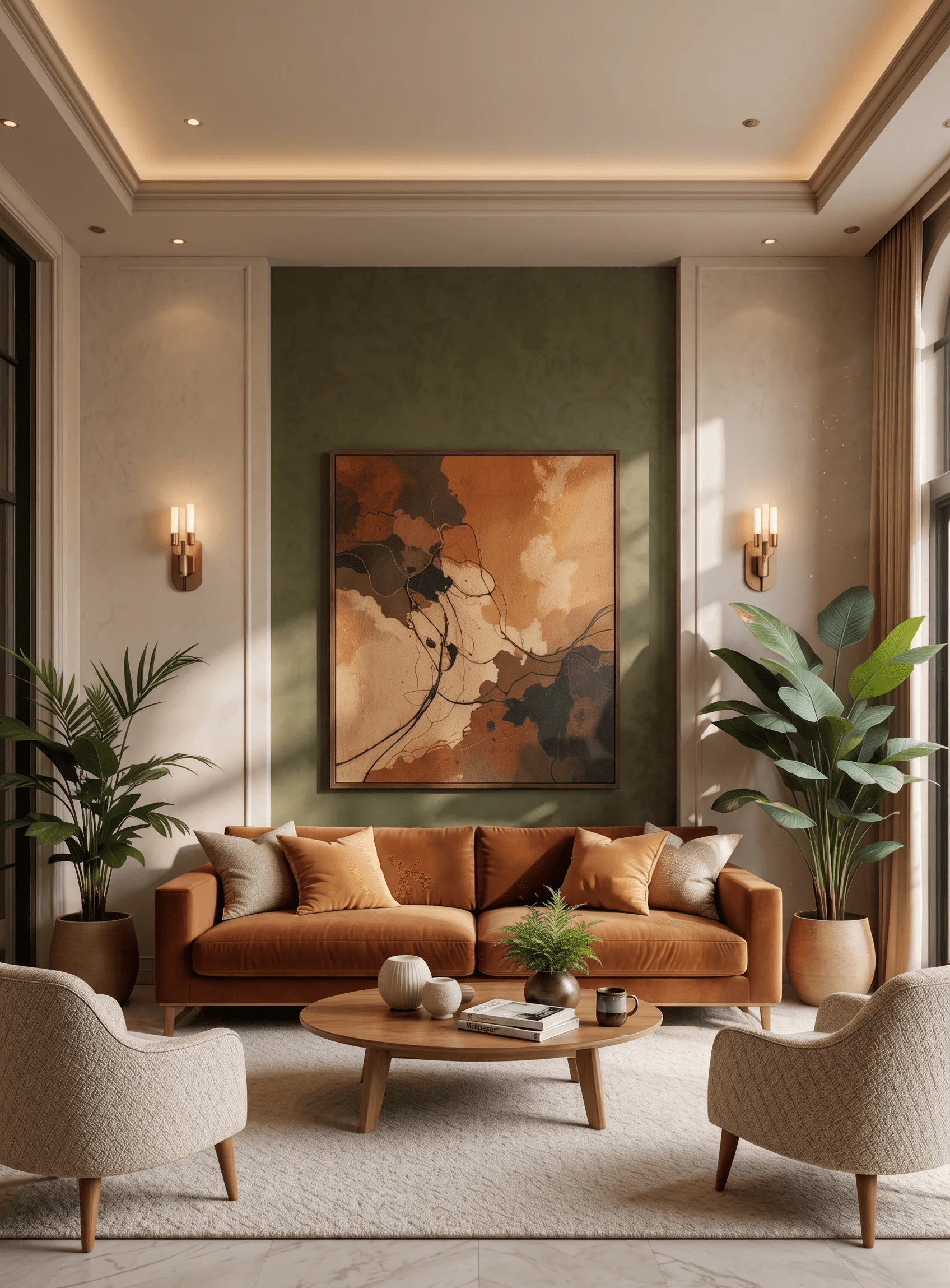
Somewhere around March 2025, the tone of our first client meetings began to shift in a way we noticed within a matter of weeks rather than months, and it has held steady ever since, because for the better part of a decade our design briefs from New Town, Salt Lake, and Rajarhat had circled the same request in slightly different words, which was a clean, quiet, largely white or greige home with maybe one accent wall if the client was feeling adventurous, and then quite suddenly we had three separate families in the same month asking us, almost apologetically at first, whether it would be "too much" to paint a dining room a deep emerald or to bring back the patterned Athangudi-style tiles their grandparents once had in an Alipore courtyard house. It was not too much, and we told them so, and by the end of 2025 we had executed more saturated, pattern-forward interiors than in the previous four years combined.
What Actually Changed in the Brief
The shift showed up in three very specific, repeatable ways across our 2025 project intake, which is worth being precise about because "maximalism is back" can sound like a trend headline rather than something we can point to on our own drawing boards. First, wall colour requests moved decisively away from the safe whites, warm greys, and pale sage tones that dominated 2019 through 2023, and into deep jewel tones such as bottle green, ink blue, aubergine, and a rust terracotta that we ended up specifying in four different living rooms across Rajarhat and New Town alone. Second, flooring and tile briefs started asking for pattern rather than uniformity, meaning clients wanted geometric or floral encaustic-style tiles in entryways and powder rooms instead of the large-format, single-tone vitrified tiles that had been the default for a decade. Third, and this is the one that surprised us most, clients started actively requesting gallery walls, meaning curated, layered arrangements of framed art, family photographs, mirrors, and small sculptural objects on a single wall, rather than the one oversized abstract canvas that had become almost a cliché of the minimalist living room.
A New Town client we worked with in mid 2025, a 1,850 square foot four bedroom apartment in Action Area I, is a good illustration of how far the pendulum swung. When we first met the family in 2021 for a smaller renovation, the brief was firmly minimalist, all whites and light oak. When they came back to us in 2025 for a full interior overhaul of the same flat, the same couple asked for a deep teal accent wall in the living room, a patterned cement-look tile runner down the central corridor, and a gallery wall of roughly eighteen framed pieces in the family lounge that we built out over three planning sessions just to get the spacing and hierarchy right. Nothing about their taste in furniture quality or craftsmanship had changed, only their appetite for colour and pattern, and that is the pattern we kept seeing project after project through the year.
Why We Think This Happened in Kolkata Specifically
Part of this is a broader Indian and global swing away from the flat, pared-back aesthetic that dominated interior media for the better part of a decade, and design commentary elsewhere has been calling out a maximalist correction since roughly 2023, but we think there are reasons this landed with particular force in Kolkata homes specifically. Kolkata has never fully been a minimalist city in its bones, and even through the years when our own clients were asking for the palest possible palettes, the city around them, its Durga Puja pandals, its old North Kolkata mansions with their coloured glass and ornate ceiling work, its markets and textile traditions, stayed visually rich and unapologetically layered. What we saw in 2025 read to us less like clients discovering something new and more like clients giving themselves permission to bring interiors closer to a visual language that was culturally comfortable all along, after roughly a decade of following a minimalist template that was largely imported from European and North American design media.
There is also a practical, generational piece to this. A meaningful share of our 2025 maximalist briefs came from clients in their thirties who grew up in the maximal, pattern-heavy homes of their parents and grandparents in older parts of Kolkata, and who spent their twenties reacting against that with stark, minimal first apartments, only to find a decade later that the stark look felt cold and impersonal once they had children, in-laws visiting for extended stays, and genuinely more possessions worth displaying rather than hiding. One Salt Lake client put it to us directly during a 2025 consultation, saying the all white flat they built in 2017 photographed well but never felt like it was actually theirs, and that the version they wanted now, with a patterned accent wall behind the bar unit and a wall of curated art in the study, felt more like a home they had actually lived a life inside.
How We Approach Maximalism So It Does Not Become Clutter
The distinction we draw constantly with clients, and the thing that separates thoughtful maximalism from a home that simply feels chaotic, is that every saturated colour, every pattern, and every object on a gallery wall needs to be a deliberate compositional decision rather than an accumulation. In practice this means we are still doing the same disciplined space planning we always have, controlling sightlines, keeping structural elements like ceiling heights and window proportions clean, and choosing one or two dominant jewel tones per zone rather than letting every room compete for attention. A jewel-toned wall works because the trim, ceiling, and adjacent surfaces are kept restrained enough to let that one wall read as a considered statement, and a gallery wall works because we plan the layout on paper or with a template on the actual wall before a single frame goes up, mapping out sightlines from the sofa and the entry point so the arrangement reads as curated rather than accidental.
Material choices matter here too, and this is where our post on Terrazzo's 2023-24 Takeover: Why Kolkata Flooring Moved Past Marble and Vitrified Tiles connects directly to what we are describing, because the terrazzo and terrazzo-look tile wave that preceded this maximalist swing was really the first sign of clients wanting texture and visual interest underfoot again after years of flat, uniform vitrified flooring. Several of our 2025 pattern-tile projects built directly on that terrazzo groundwork, layering an encaustic-pattern runner or a bold geometric tile field into entryways and powder rooms that had already moved away from plain vitrified in 2023 and 2024. We also found that clients who came to us fresh off a biophilic phase, the kind we wrote about in 2024's Biophilic Shift: Why Kolkata Homeowners Started Designing Around Plants, Not Adding Them After, transitioned into maximalism unusually smoothly, because a home already organised around layered greenery and natural texture has a head start on the kind of considered abundance that good maximalism needs, rather than starting from the visual blank slate of an all white flat.
Layering Bold Colour Without Losing Vastu Compliance
One question we fielded repeatedly through 2025, and it is a fair one given how many of our clients across New Town and greater Kolkata build with Vastu principles in mind, is whether jewel tone walls and pattern-heavy schemes sit comfortably within Vastu guidance on colour and direction. The short answer, which we go into at more length elsewhere, is yes with some care, because Vastu associates specific colour families with specific directions and functions rather than prohibiting saturation outright, so a deep green in the northeast or a warm terracotta in the south can actually align well with traditional guidance rather than fighting it. This becomes especially relevant in the increasingly common open-plan living-dining-kitchen layouts we are asked to design, where a single sweep of wall touches multiple functional zones, and we have written specifically about how to reconcile that layout with Vastu compliance in Can an Open-Plan Living-Dining-Kitchen Ever Be Vastu Compliant?, which is worth a read if colour zoning across an open floor plan is part of your own brief.
None of this means every client needs to go all in on saturated colour to have a home that feels current, and we still design plenty of restrained, pared-back interiors for clients whose taste genuinely runs that way, because the point was never that minimalism was wrong, only that it had become close to the only option on offer for the better part of a decade. What 2025 gave our clients, and what we hope continues into 2026, is a wider palette of honest choices, where a family in a Rajarhat apartment can ask for a sapphire blue accent wall and a wall of family photographs without feeling like they are going against the grain of what a "good" interior is supposed to look like.
Bringing Colour and Pattern Into Your Own Home, Thoughtfully
If the idea of a jewel-toned wall or a proper gallery wall has been sitting in the back of your mind while you scroll past yet another all white living room online, we would genuinely enjoy talking it through with you, because getting maximalism right is much more about proportion, restraint in the right places, and a clear compositional plan than it is about simply adding more, and that is exactly the kind of planning our team has been doing across New Town, Salt Lake, and Rajarhat homes all through 2025. Reach out through our contact page and tell us which room you keep imagining in colour, and we will start there.