








Office Color Psychology: What Wall Colors Actually Do to Focus and Mood
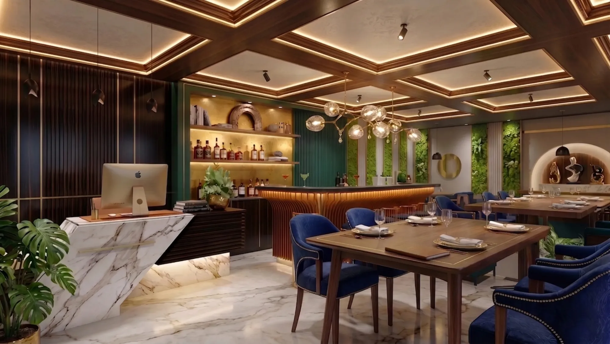
Every commercial client who comes to us with a colour question asks it the same way, which is "what colour should our office be," as if an office is one room with one job, and the honest answer we give back is that the question itself is the mistake, because a modern office contains at least three distinct cognitive tasks happening in different zones, focused individual work, active collaboration, and genuine decompression, and each of those states responds differently to hue, saturation and light temperature. We have specified colour schemes for enough commercial fit outs across New Town and Salt Lake now to have a working, evidence-grounded view of which tones actually support which kind of work, rather than which tones simply look good in a rendering, and that distinction is the entire subject of this piece.
Why "Just Pick a Nice Colour" Fails in a Workplace
The instinct on most commercial briefs is to choose a brand colour and apply it everywhere, or to default to a safe off-white because nobody wants to be blamed for a wrong colour choice, and both approaches ignore what colour actually does physiologically. Colour affects arousal, which is the technical term for how alert or stimulated your nervous system is, and it does this partly through hue and partly through saturation and brightness, which matters because a saturated red and a saturated blue sit at opposite ends of the arousal spectrum even though both are "colourful" in the everyday sense. Warm hues, reds, oranges and yellows toward the saturated end, raise physiological arousal and have been shown in workplace and lighting studies to correlate with increased alertness and even measurably higher blood pressure and heart rate in occupants exposed to them for extended periods, which makes them poor choices for a room where someone needs to sit still and concentrate for two hours but genuinely useful in short bursts, entryways, break rooms, anywhere you want energy rather than calm. Cool hues, blues and greens in particular, have the opposite effect, lowering arousal and supporting sustained attention, which is precisely why we default to them in any zone built for solo focus work.
The other variable that gets ignored entirely in most colour conversations is saturation and value, meaning how intense and how light or dark a colour is, independent of the hue itself. A muted, desaturated blue-grey behaves very differently from a saturated cobalt blue even though both would be called "blue" on a paint chip, and in our experience the desaturated, mid-value end of any palette is what actually works for sustained occupancy, because highly saturated colour on a large wall surface creates visual fatigue over an eight-hour workday regardless of which hue you picked. This is the single most common mistake we correct on commercial briefs: a client falls in love with a bold accent colour in a small sample swatch, and we have to explain that the same intensity across a 12-foot wall in a room someone sits in all day reads completely differently than it does on a 2-inch chip.
Focus Zones: Cool, Desaturated, and Slightly Cold-Leaning
For individual workstations, private cabins, and any zone we are designing explicitly for deep, sustained concentration, our default palette runs through soft blues, sage and muted greens, and cool neutral greys, generally kept in the lighter-to-mid value range, roughly matching Munsell values in the 6 to 8 band if you want the technical reference point, because that range reflects enough ambient light to keep the room feeling bright without tipping into the stark, clinical whiteness that several occupant-comfort studies associate with eye strain and lower reported satisfaction. Blue in particular has a consistent research association with lowered heart rate and reduced cortisol response compared to warmer hues at equivalent brightness, which is exactly the physiological profile you want in a room where people need to stay calm and attentive for hours rather than energised and reactive.
We do add caution here because we have seen firms overcorrect into an entirely blue-grey office and end up with a space that reads as cold and faintly depressing rather than calmly focused, so we always pair the cool base with a warm neutral, timber tones, a warm-white trim, or a single controlled accent wall in a muted terracotta or ochre, to keep the room from tipping past focused into flat. On a recent commercial fit out for a New Town professional services office, we used a soft sage green (roughly matching a mid-value, low-saturation green in the 60 to 65 LRV range for anyone specifying paint) across the workstation bay walls, paired with warm oak veneer on storage units and a single ochre accent wall behind the reception desk, and the brief explicitly asked us to avoid the sterile all-white look their previous office had, which this palette solved without sacrificing the calm-focus effect the cool green base provides.
Collaboration Zones: Where Warmth and Energy Actually Help
Meeting rooms, huddle spaces and any area built for active discussion benefit from a different physiological target entirely, because you want moderate arousal and social warmth rather than calm isolation, and this is where we introduce warmer hues deliberately, though still with saturation kept in check. Muted oranges, warm terracottas, and golden yellows at moderate, not high, saturation have a documented association with increased sociability and open communication in workplace colour studies, and we typically use them as a dominant accent wall or a ceiling and joinery treatment in collaboration zones rather than covering every surface, because full-room saturation in a warm hue tips from stimulating into agitating faster than most people expect, particularly in a meeting that runs past 45 minutes.
Yellow deserves a specific caution here because it is the hue most often chosen for "energetic" spaces and most often overdone: in small, low-natural-light meeting rooms, a saturated yellow can read as visually aggressive and has been associated in some occupant studies with increased reported irritability rather than the intended optimism, so where we do use yellow, it is usually a muted mustard or ochre rather than a bright lemon tone, and confined to a single wall or joinery element rather than a full enclosure. If your office runs frequent video calls in these rooms, the wall colour behind the camera matters for an entirely separate, practical reason beyond mood, since a saturated or patterned wall colour causes visible colour cast on camera and distracts from participants' faces on screen, a detail we cover in more technical depth alongside table shape and AV planning in Designing Meeting Rooms That Actually Work: Acoustics, AV and Table Shape.
Calm and Break Zones: Softer, Greener, More Natural
Break rooms, wellness corners and any pause space in a commercial fit out get a palette closer to the focus-zone family but pushed further toward green and further toward natural material pairing, because the physiological goal here is genuine recovery rather than sustained attention, and green in particular has the strongest and most consistent research association with restoration and reduced mental fatigue of any hue in the workplace colour literature, likely tied to its association with natural, biophilic environments. We typically pair a soft, desaturated green wall treatment with substantial natural material, timber slat ceilings, cork or jute textile elements, and where the floor plan allows it, direct sightlines to any greenery or planted balcony, because the colour palette does more work when it is reinforced by actual biophilic elements rather than standing alone. If your office sits on a New Town plot, this is one of the rare cases where a statutory requirement and a genuine design benefit line up neatly, since the mandatory open space and greenery norms that apply to most New Town plots can be planned into sightlines from exactly these calm zones rather than treated as a compliance afterthought, a topic we cover in Mandatory Open Space and Greenery Norms on New Town Plots: What Counts and What Doesn't. A boutique fitness studio's cooldown or stretch corner follows almost identical logic to a break room in this respect, and we go into the flooring and equipment-zoning side of that specific brief in Fitness Studio Interior Design: Flooring, Mirrors and Zoning for Boutique Gyms.
Light Temperature Changes the Colour You Actually Chose
No colour scheme survives contact with the wrong light temperature, and this is the variable most commercial clients forget to plan for until the paint is already on the wall. A cool blue-grey palette under warm 2700K lighting reads muddy and greenish rather than calm and crisp, while the same palette under 4000K to 5000K daylight-balanced lighting reads exactly as intended, which is why we always specify lighting colour temperature as part of the same decision as the paint colour rather than as a separate downstream choice. As a general rule we pair focus zones with cooler light in the 4000K to 5000K range to reinforce the alertness the wall colour is already supporting, and we pair break and collaboration zones with warmer 3000K to 3500K light to soften the room, a pairing logic we go into in more detail on the fixture and layout side in our piece on false ceiling and lighting design.
Getting Your Office Palette Right the First Time
If you are planning a new commercial fit out or repainting an existing office and want the wall colour in every zone to actually be doing something for your team rather than just looking presentable in a walkthrough, we would genuinely rather map your floor plan zone by zone with you before a single litre of paint gets ordered, because the fixes are cheap before the work starts and expensive after. Our studio has been specifying commercial colour schemes across New Town, Salt Lake and Rajarhat since 2014, and this is exactly the kind of detail we like sitting down over a floor plan for, so get in touch and let's work out which zones in your office actually need which palette.