








Sage Green and Butter Yellow: How Pastel Kitchen Cabinets Took Over Kolkata in 2025
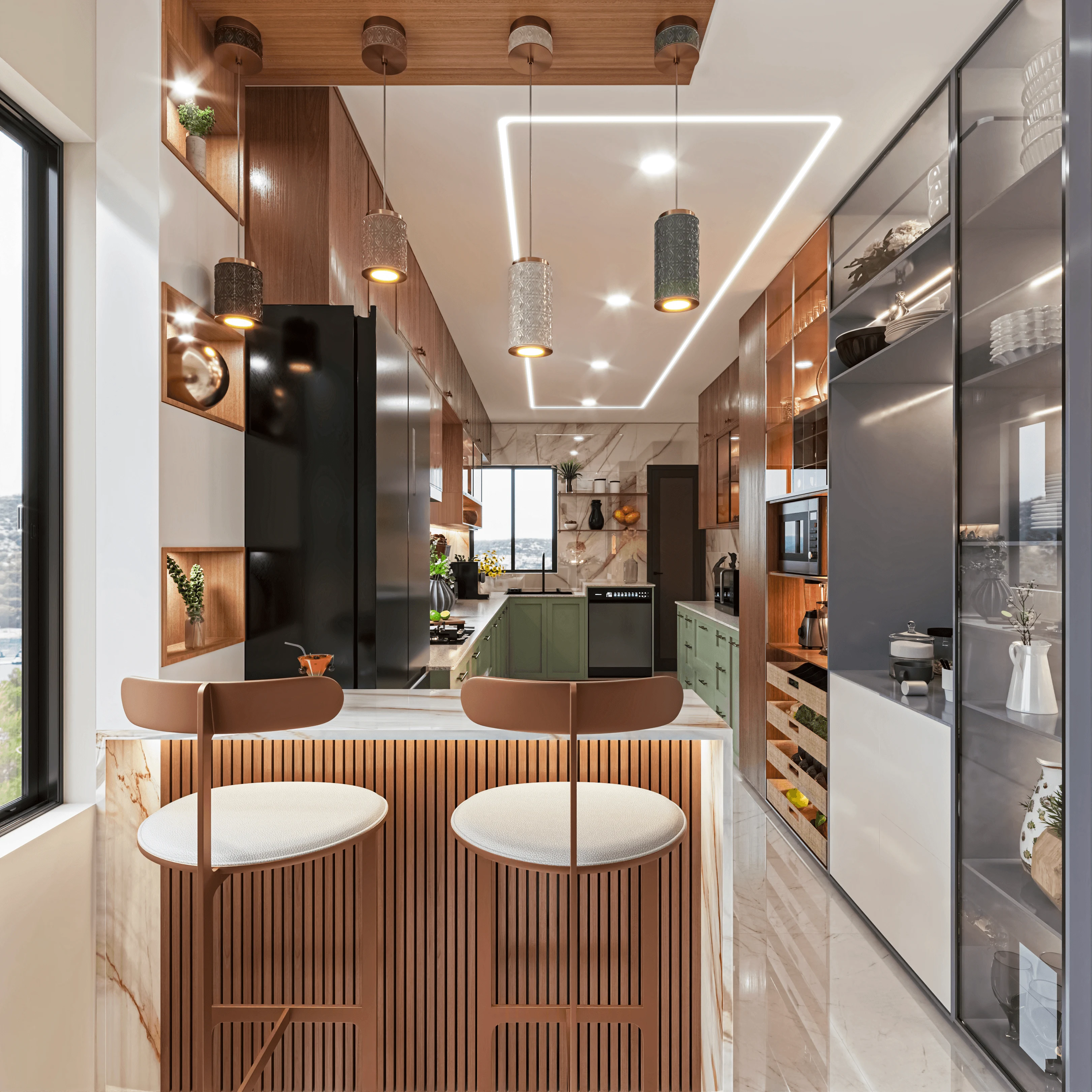
Somewhere around March 2025 we noticed a pattern in our kitchen consultations that was consistent enough to stop being a coincidence, and by the middle of the year it had become the single most requested colour direction across our residential projects in New Town and Salt Lake, which is that clients were walking in with reference images of sage green and butter yellow cabinetry instead of the white lacquer or walnut laminate finishes that had dominated almost every brief we took on between 2019 and 2024. We track these requests informally through our own project notes rather than any formal survey, but the shift was sharp enough that by August 2025 roughly six out of every ten new kitchen enquiries we received specified a pastel shutter colour by name, usually sage green, sometimes a softer olive, and increasingly butter yellow paired with brass or matte black hardware, which is a real departure from the safe, resale-friendly white and wood-tone palette that had been the default recommendation from most Kolkata designers for the better part of a decade.
We think it is worth being precise about what actually changed, because "pastel kitchens are trending" is the kind of vague claim that shows up in every design roundup this year and tells a homeowner almost nothing useful about what to actually order for their own flat. The shift we saw was specifically in the shutter finish and colour, not in layout, not in carcass material, and not really in hardware style beyond a lean toward warmer metals. A typical 2023 kitchen brief in our archive reads something like "white handleless shutters, quartz counter, walnut open shelf accent," and a typical 2025 brief reads "sage green matte lacquer base cabinets, butter yellow or off white upper cabinets, brass handles, same quartz counter as before." The bones of the kitchen, the L-shape or straight-run layout that fits most 2 and 3 BHK apartments in New Town's residential blocks, did not change at all. What changed is that clients stopped being afraid of colour on a surface they used to treat as strictly neutral.
Why Sage Green and Butter Yellow Specifically
There is a reasonably clear explanation for why these two colours in particular took hold rather than, say, dusty pink or powder blue, both of which we did see requested occasionally but nowhere near as often. Sage green reads as calm and slightly earthy rather than saturated or playful, which matters enormously in a Kolkata kitchen because most of these rooms get significant natural light for only part of the day and a colour that looks fresh in morning light needs to still look intentional under the warm 3000K LED strip lighting almost every kitchen here now runs under its wall cabinets. Sage green, being a muted, grey-leaning green rather than a bright grass green, holds up under both. Butter yellow does something slightly different, which is that it reads as warm and optimistic without tipping into the kind of saturated yellow that can feel overwhelming across ten linear feet of cabinetry, and we found it worked particularly well as an upper-cabinet or island accent against a paler base rather than covering an entire run, because a full butter yellow L-shaped kitchen can start to feel like a lot of one thing by the third week of living with it.
The other practical driver, and this is the part that often gets left out of trend pieces, is that lacquer and matte PU paint finishes in custom colours have become genuinely accessible in Kolkata's modular kitchen supply chain in a way they were not five years ago. In 2019 or 2020, asking a local fabricator for a custom RAL-matched sage green PU finish meant a longer lead time and a real cost premium over a standard laminate, often 25 to 30 percent more on the shutter cost alone. By 2025, several vendors we regularly work with in the Kolkata and Howrah supply chain were stocking closer to a dozen standard pastel shades in their PU and lacquer ranges, which meant the cost gap between a stock white laminate and a custom sage green matte lacquer narrowed to something closer to 10 to 15 percent, and for many of our clients that gap became small enough to stop being the deciding factor.
What We Actually Specify When a Client Asks for Pastel Cabinets
When a client brings us a Pinterest board of sage green kitchens, the first thing we do is separate the colour decision from the finish decision, because the two interact more than people expect. A high-gloss lacquer in sage green photographs beautifully but shows fingerprints and water spots aggressively in daily use, which is a real problem next to a sink or hob in a household that cooks daily rather than occasionally. We steer most clients toward a matte or satin PU finish for exactly this reason, and in our 2025 projects that used sage or olive tones, the matte PU finish outnumbered high-gloss by roughly four to one once clients understood the maintenance trade-off. For butter yellow, we more often recommend a semi-matte laminate over a full lacquer system, partly on cost and partly because laminate in a yellow tone tends to hold its colour more consistently over years of kitchen heat and steam than some pigmented lacquers, which can show subtle yellowing or fading around the hob area over three to four years if the pigment quality is not carefully specified.
We also pay close attention to where the colour goes rather than assuming it should cover every shutter in the kitchen. Our most successful 2025 projects, including a 340 square foot open kitchen in a New Town apartment near Action Area I where we did sage green base cabinets under a warm white quartz counter with plain white upper cabinets and open oak shelving above the hob, used the pastel as a lower third or an island accent rather than a full wraparound. This does two things: it keeps the kitchen from feeling like a single-note colour statement that might feel dated sooner than a more balanced palette, and it manages cost, because base cabinets typically make up 55 to 65 percent of total shutter area in a standard kitchen, so concentrating the premium finish there while keeping uppers in a standard white laminate controls the budget increase to something manageable, usually adding 12,000 to 25,000 rupees to a mid-range kitchen quote rather than 60,000 or more.
How This Interacts With Vastu and Open-Plan Briefs
An interesting side effect of this colour shift showed up in how it intersected with two other things happening in our 2025 and early 2026 briefs, which is the continued push toward open-plan living and kitchen spaces and the fact that a meaningful share of our clients still want their layouts to respect Vastu principles for the cooking zone. We wrote about how we have been reconciling open floor plans with Vastu directional requirements in detail in our piece on Vastu and open-plan design, and the short version relevant here is that when a kitchen opens directly into a living or dining area, which is now the default layout in most New Town 2 and 3 BHK towers we work in, the cabinet colour becomes a much more visible design decision than it was in a closed, separate kitchen, because it is now part of the sightline from the sofa. That visibility is very likely part of why clients suddenly cared so much about the colour rather than defaulting to safe white, and it is also why we spend more time than we used to discussing how the kitchen palette should relate to the adjoining living room's colour scheme, something that was a non-issue when kitchens were closed rooms behind a door.
The other overlap worth mentioning is storage planning. As apartment sizes have compressed, particularly in the 900 to 1,200 square foot 2BHK segment that makes up a large share of New Town's newer inventory, kitchens have had to absorb functions that used to live elsewhere, and we have written separately about how the standalone pooja room has given way to integrated alcoves in many of these same floor plans, sometimes built directly into a kitchen-adjacent wall unit. When a pastel-coloured cabinet run includes an integrated alcove or a taller cabinet section for a home office nook or pooja space, matching the lacquer or laminate finish across that unit and the main kitchen cabinetry becomes a coordination point we now flag early in the design process, because ordering pastel shutters in two separate batches months apart carries a real risk of a visible colour mismatch if the vendor's pigment batch shifts even slightly.
Will This Hold Through 2026?
We are cautious about calling any single colour trend permanent, because kitchen finishes are a long-term commitment, typically the last major surface a homeowner replaces in a ten to fifteen year renovation cycle, and colours that feel fresh in a Pinterest board do not always feel fresh a decade later. What gives us more confidence that sage green and butter yellow have staying power beyond a single year's news cycle is that both colours sit close enough to neutral that they do not fight with the terrazzo, warm stone, and brass finishes that are simultaneously trending in flooring and hardware, which we cover in more depth when we look at terrazzo's move onto Kolkata kitchen countertops. A sage green cabinet against a terrazzo counter with warm-toned chips reads as considered rather than trend-chasing, and that kind of material coherence tends to age better than a colour choice made in isolation. Going into 2026 our own project pipeline still shows pastel requests running well ahead of where they sat in 2024, and we expect the mix to hold, though we would not be surprised to see a third shade, likely a dusty terracotta or clay tone, join sage and butter yellow as the year progresses.
Thinking About a Colour Shift for Your Own Kitchen
If you have been staring at your current white or wood-finish kitchen and wondering whether a sage green or butter yellow refresh would actually suit your space rather than just following what everyone else in your building seems to be ordering, that is exactly the kind of conversation we like having before any drawings get made, because the right answer depends on your kitchen's light, your adjoining rooms, and how you actually cook and clean day to day, not on a colour chart alone. Reach out through our contact page and we can walk through your layout together and tell you honestly whether a pastel shift is the right call for your home.