








Wayfinding and Signage Design: The Overlooked Layer of Commercial Interior Design
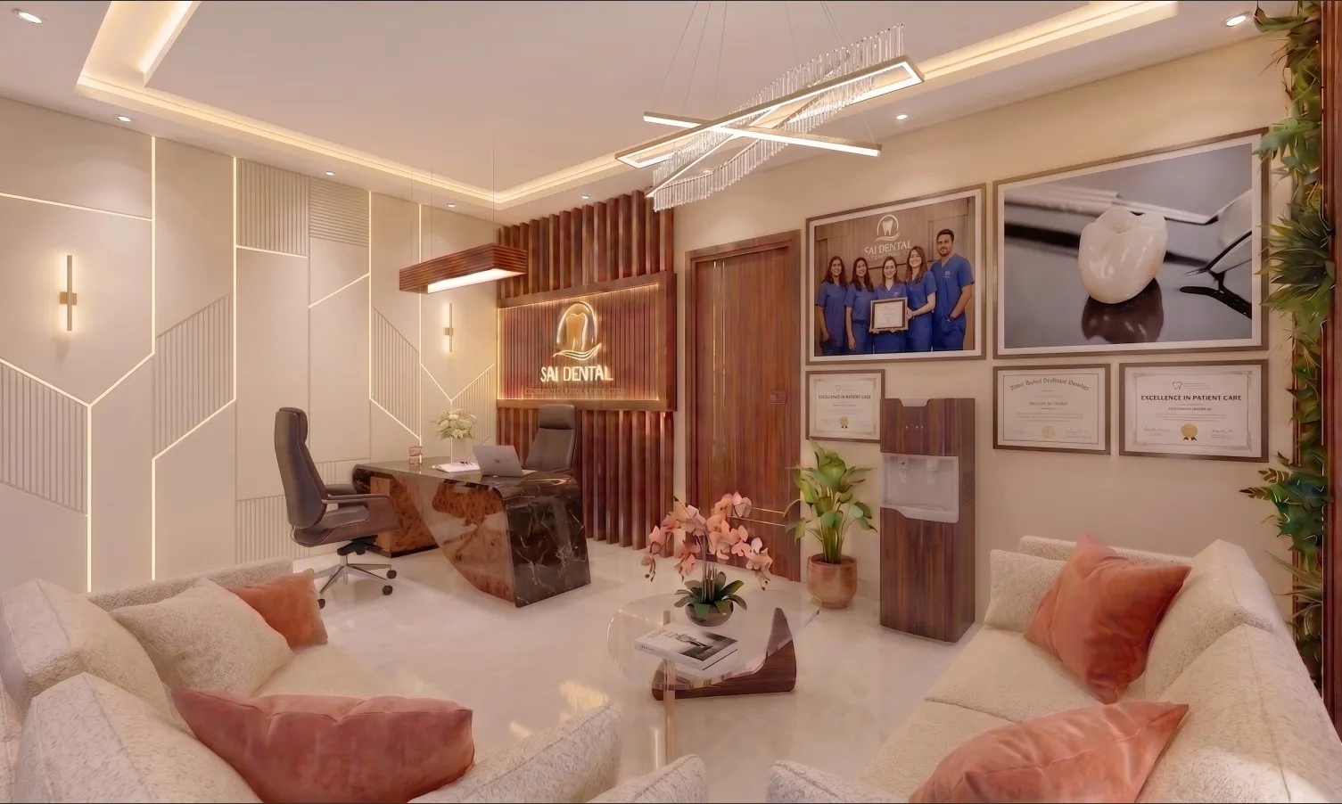
There is a specific moment in nearly every commercial project we have delivered when the client's attention, which has been laser focused on flooring, false ceiling design, and furniture selection for weeks, suddenly turns to signage, and it almost always happens far too late, usually somewhere between final finishing and handover, when someone walks the completed space and realises there is nothing on the walls telling a visitor where reception is, where the washrooms are, or which lift bank serves which floor. We understand why this happens, signage does not photograph as dramatically as a feature wall or a statement light fixture, and it rarely makes it into the mood board conversations that dominate the early design phase, but in our experience across office fit-outs, retail interiors, and mixed-use commercial buildings around New Town and Salt Lake, a weak wayfinding system is one of the fastest ways to make an otherwise well-designed space feel confusing and unfinished, and a strong one is one of the cheapest ways, relative to the rest of a fit-out budget, to make a space feel considered and professionally run. This piece is about treating wayfinding as its own design discipline, with its own hierarchy, material logic, and placement rules, rather than as a line item you hand to a signage vendor in the last week of the project.
Wayfinding Is a Sequence of Decisions, Not a Collection of Signs
The mistake we see most often, even in fit-outs that got almost everything else right, is treating signage as a list of individually necessary items, a reception sign here, a washroom sign there, a fire exit sign because the code requires it, rather than as a connected sequence that answers a visitor's questions in the order they actually ask them. When someone walks into a multi-tenant commercial building in Sector 5 or a New Town office park, their first question is almost never "where is suite 402," it is something closer to "am I even in the right building, and which way do I go from here," and a wayfinding system that jumps straight to granular directional signage without first answering that orientation question leaves visitors anxious and second-guessing themselves from the moment they walk in. We plan every commercial signage system in three tiers, and skipping any one of them is where most fit-outs go wrong.
Identification signage answers "where am I," and this includes the building's main identity signage at the entrance, floor identification at every lift lobby, and suite or unit numbering at each tenancy door. This tier needs to be visible from a reasonable distance and legible at a glance, because a visitor should never have to walk right up to a sign to confirm they are on the correct floor.
Directional signage answers "which way do I go," and this is the tier most fit-outs underinvest in, the arrows and directional panels placed at decision points, meaning anywhere a corridor splits, a lift lobby connects to more than one wing, or a visitor has more than one plausible route to their destination. The rule we follow is that directional signage belongs at decision points and nowhere else, because scattering directional signs along a straight corridor with no branching adds visual clutter without adding information, while an actual decision point with no signage at all is where visitors stop, hesitate, and often guess wrong.
Regulatory and informational signage answers "what am I allowed to do here," and covers washroom signage, fire and life safety signage, accessibility signage, and any statutory notices the building is required to display under KMC or Bidhannagar Municipal Corporation building regulations depending on jurisdiction. This tier is often treated as pure compliance, bolt it on wherever code requires and move on, but we design it with the same hierarchy discipline as the other two tiers, because inconsistent statutory signage, different fonts, different mounting heights, different materials scattered through a building, undercuts the polish of everything else in the space just as much as missing directional signage does.
Getting the Hierarchy Right on a Multi-Tenant Floor
Multi-tenant commercial buildings present a specific wayfinding problem that single-tenant offices do not have to solve, which is that the building owner controls the common area signage, lift lobbies, corridors, shared washrooms, while individual tenants control the signage inside their own leased suites, and if these two systems are not designed with a shared visual logic the building reads as fragmented no matter how nice each individual tenant's fit-out looks. We always recommend that a building's common area wayfinding be locked in as a master system, one typeface family, one consistent colour and material palette, one consistent mounting height and sign size grid, before any individual tenant begins their own fit-out, because retrofitting consistency after five or six tenants have each installed their own signage in their own house style is a losing battle. Within that master system we still leave room for a tenant's brand identity to show through at their suite entrance, their logo, their brand colour on the door signage, but the underlying grid, the pictograms used for washrooms and fire exits, and the directional arrow style should stay uniform across the whole building, because visitors moving between floors or between a common corridor and a tenant space should never have to relearn the visual language.
Material Choice Is a Durability Decision, Not Just an Aesthetic One
Signage takes more physical abuse over its lifespan than almost any other interior element, it gets touched, bumped by trolleys and furniture during moves, exposed to direct sunlight near entrances and exposed to humidity in Kolkata's climate for a good part of the year, and yet we regularly see signage specified purely on visual appeal with no consideration of how it will hold up eighteen months into occupancy. For exterior-facing and entrance identification signage we favour materials like brushed stainless steel, powder-coated aluminium, or acrylic-backed LED letters, because these hold their finish against Kolkata's humidity and monsoon exposure far better than painted MDF or vinyl-wrapped substrates, which is where we see the most premature signage failure, peeling vinyl and water-damaged edges within a year or two of installation. For interior directional and identification signage, laser-cut acrylic on a metal or engineered wood backing gives a clean, durable result that is also relatively easy and inexpensive to update, which matters because tenant turnover in a multi-tenant building means suite numbering and directory signage will need periodic revision, and a system that requires the entire sign panel to be remade for a single tenant change is a needless recurring cost. Washroom and regulatory pictogram signage, which gets the most physical contact of any category, we specify almost exclusively in engraved or laminated acrylic rather than printed vinyl, because printed finishes wear visibly within months in high-touch, high-humidity locations like washroom entrances.
Placement Logic: Sightlines, Not Just Rules of Thumb
Building codes and general design convention give you baseline mounting heights, typically signage centred around 1500 to 1700 millimetres from finished floor level for most wall-mounted identification and directional signs, but code compliance is the floor, not the ceiling, of good placement, and we always walk a completed shell before finalising a signage layout to check actual sightlines rather than relying purely on a plan drawing. A directional sign that is technically at the correct height but is mounted on a wall a visitor's peripheral vision naturally skips past, because a more visually dominant feature wall or a bank of lift doors is pulling the eye elsewhere, will get missed regardless of how correctly it was specified on paper. Overhead or ceiling-suspended directional signage, which we use increasingly in larger multi-tenant lift lobbies and long corridors, solves this problem well because it sits within a visitor's natural forward sightline rather than competing with wall-level design elements, though it needs to be coordinated carefully with false ceiling and lighting design so it does not clash visually or physically with light fixtures and HVAC diffusers already occupying that same ceiling zone.
Why This Matters More in Hospitality and Retail Than People Expect
Wayfinding discipline is not exclusive to office buildings, and in fact some of the clearest failures we have seen have been in hospitality settings, where a beautifully designed lobby leads guests into a corridor maze with no clear cues toward guest rooms, the very problem we address in Boutique Hotel Lobby Design: Creating a Memorable Arrival Sequence on a Small Site, because a strong arrival sequence that is not followed by equally considered directional signage just relocates the guest's confusion a few metres further into the building rather than solving it. The same logic applies inside offices that have moved to activity-based, non-assigned seating, which we cover in detail in Space Planning for Hybrid Work: Redesigning Kolkata Offices for a 3-Day Week, because when desks are no longer permanently assigned to individuals, wayfinding has to do double duty, not just directing visitors through the building but helping employees themselves locate booking-based zones, quiet rooms, and collaboration areas that were fixed and familiar under the old assigned-desk layout. And if your building is planning rooftop solar as part of a broader sustainability upgrade, worth reading alongside your signage planning is our piece on Installing Rooftop Solar in New Town: The NKDA Sanction Step Most Owners Skip, since any rooftop access changes often affect the identification and directional signage needed for maintenance personnel and fire safety routes.
Getting Your Building's Wayfinding Right From Day One
If you are fitting out a commercial building, whether it is a single office floor or a full multi-tenant common area, and signage has not yet made it onto your drawings, now is the right time to bring it into the conversation rather than after the walls are finished and painted, because a wayfinding system designed alongside your interior layout will always read cleaner and cost less than one bolted on afterward. Talk to us through our contact page about your building's layout and tenant mix, and we will help you build a signage hierarchy that actually gets used instead of ignored.