






Dark Colour for Wall: 8 Ideas That Balance Light and Space

The advice that dark walls shrink a room is only half true, and the half that's wrong costs people rooms they'd otherwise love. What shrinks a room is a dark surface with no plan for where light lands on it. A charcoal wall opposite a balcony window reads as depth. The same charcoal behind a sofa lit by one 4000K ceiling bulb reads as a cave. The colour isn't the variable. The light is.
A dark colour for wall surfaces also changes character through the day. North light keeps blues honest and pushes greens slightly grey. West light, especially in Kolkata's pre-monsoon afternoons, warms browns toward orange and cools teal toward steel. Under a 6500K LED, oxblood looks like dried brick. Under a 2700K lamp, it looks like wine. Choose the shade first and the bulb second and a good colour will fail in a well-built room.
The eight shades below come with their working conditions attached: which orientation they tolerate, what colour temperature keeps them rich, how much ceiling to leave pale, and which furniture finishes stop them turning heavy. Four variables decide the result, light direction, colour temperature, ceiling treatment and furnishing texture. Judge each entry against your own room before you buy a sample pot.
If you're correcting an earlier dark scheme rather than starting fresh, painting over dark wall colors is a job of primer and patience, not one heroic coat.
Table of Contents
- 1. Charcoal Black (Off-Black Matte)
- 2. Midnight Navy
- 3. Deep Forest Green
- 4. Hague Blue (Deep Teal-Blue)
- 5. Espresso Brown
- 6. Oxblood Red (Deep Burgundy)
- 7. Graphite Grey
- 8. Deep Aubergine (Dark Plum)
- 8 Dark Wall Colours Compared at a Glance
- From Swatch to Finished Wall, Making the Colour Work in Your Home
1. Charcoal Black (Off-Black Matte)
Charcoal sits at the softest end of black. A warm off-black with grey undertones reads as a deep neutral rather than jet, which is why it survives on a large plane where a true black goes flat and chalky by the second coat.

The obvious placements work. Behind a sofa or a bed in a room with a white ceiling and pale flooring, the wall recedes and the furniture steps forward. As a media wall it also kills screen glare. Both are controlled moves with a clear job.
Where charcoal stops working
It fails on all four walls of a room with one window and a single ceiling point. Depth turns into a box, and every surface starts borrowing light from the same lamp.
- Test on two walls: paint A4 patches on adjacent walls, not one, and check them at 8am, 2pm and after dark. Charcoal swings from grey to near-black across that cycle.
- Buy scrubbable: a washable or scrubbable emulsion in living rooms and bedrooms, because dark matte records every handprint near a switch plate.
- Prime for humidity: through Kolkata's monsoon, a mould-resistant primer and cross-ventilation during and after painting matter more than the topcoat brand.
- Hold the ceiling pale: keep ceiling and trim at least two shades lighter, or the room loses its lid.
Exteriors are a separate decision. The composite climate simulation study reports that replacing a white exterior with dark grey can increase cooling load by approximately 4.3% in one commercial-building scenario and about 4.7% in another, while cream improves performance by around 2.6%. Charcoal belongs on interiors, shaded walls, entrance features and joinery, not on a west façade taking afternoon sun. The guidance on paint finishes for Salt Lake and New Town apartments covers sheen and substrate choices room by room.
2. Midnight Navy
Midnight navy is the dark that behaves like a colour. In dim light it reads near-black; in daylight the blue lifts and the wall looks rich instead of heavy. It gives a dining room formality without a museum feel, and it flatters brass, leather and warm white trim.
The walkthrough below shows how a deep navy holds together across a full room rather than one accent panel.
Navy has commercial momentum behind it. For 2025, Building Material Reporter identified navy, inky blue and teal as increasingly appearing on Indian homeowners' wish lists, particularly for accent walls. That matters less for taste than for supply: more brands now cut these shades consistently, so a second tin six months later is easier to match.
The bulb decides this colour
A deep blue under a cool 6500K downlight turns grey-blue and slightly dirty. Under 2700K to 3000K it stays saturated and reads as intended. If the room runs on a cool-white tube light, budget for new lamps before you buy the paint, or the wall will look like a mistake.
- Use warm bulbs: 2700K to 3000K for the main layer, with one lower warm source at table height.
- Prime with tint: a tinted primer close to the final shade gives even coverage in two coats instead of three.
- Swatch larger than you think: small chips look darker than the finished wall because the sample sits against white.
- Bring in texture: linen, jute, cane and timber stop a navy room feeling like a showroom.
Say a dining room has a six-seat timber table, a warm pendant at 2700K and one north window. Navy on all four walls works there. In a 9-foot-wide bedroom with a single window, one navy wall behind the bed plus pale walls does the same job without the weight.
3. Deep Forest Green
A bedroom with oak furniture and linen bedding is where deep green usually starts, and it's a fair test. The colour brings greenery indoors without wallpaper, and it softens the hard edge of a large window or balcony door because it sits close to the foliage outside.
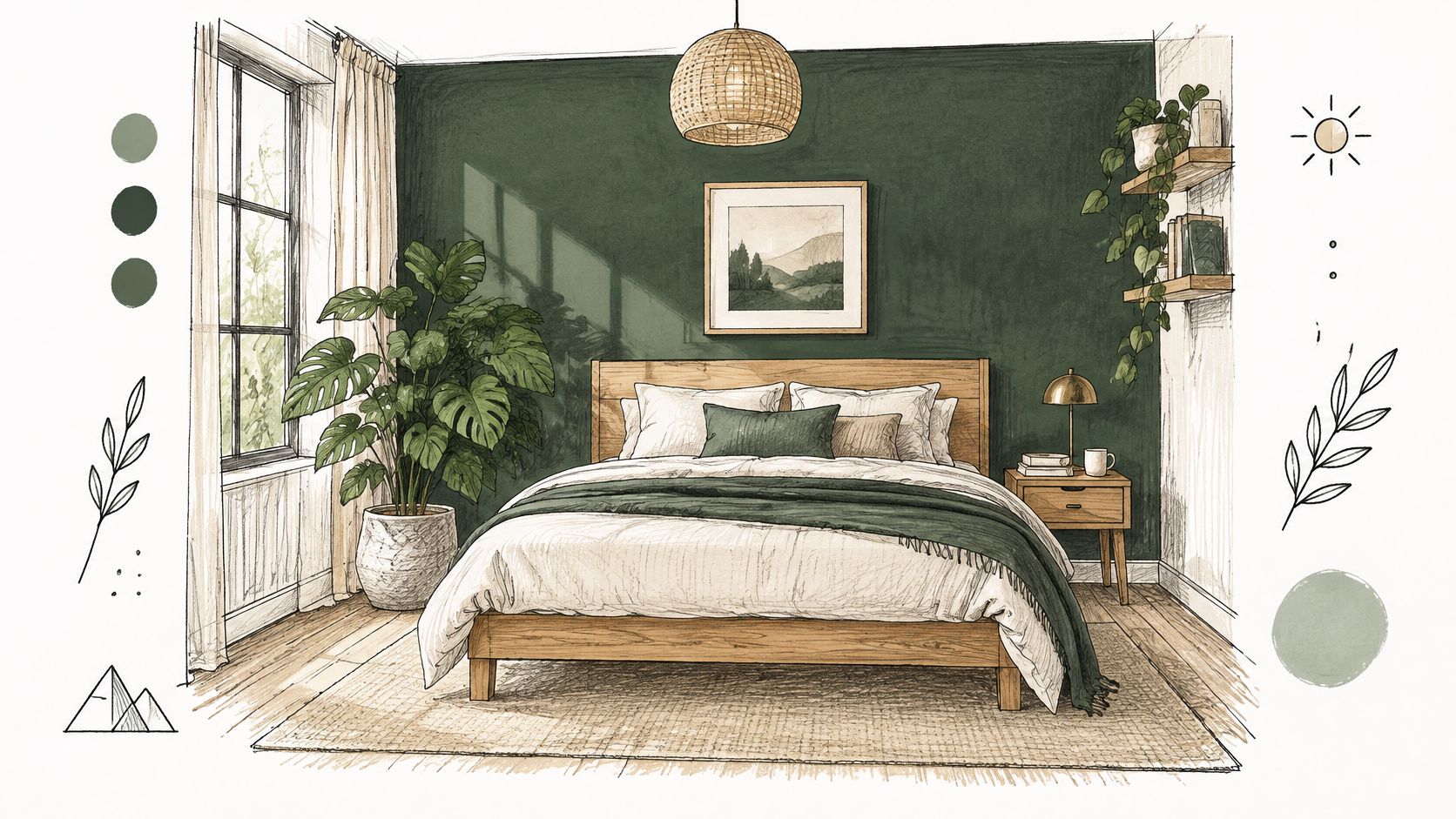
Pick a green with a little warmth in it. A green with a cold blue base turns grey and institutional in a room that gets diffused monsoon light for weeks at a stretch. Hold a sample against a piece of your own timber before committing; the green will either pull the wood's warmth out or fight it.
Green in a humid climate
Deep green is also the shade people most often want in bathrooms and balconies, which is where it needs specification care. A breathable, mould-resistant system with proper extraction beats a premium topcoat over a poor substrate every time. If the wall has leaked before, fix the source first; paint is a finish, not a waterproof membrane.
- Layer lamps: three warm sources at different heights (pendant, bedside, floor) bring the colour up at night.
- Keep one pale ceiling: white or off-white, always, in a room with limited daylight.
- Match the cabinetry: green cabinetry with brass hardware in a kitchen needs a lighter wall green or the room goes flat.
- Test the sheen: matt reads velvety, eggshell wipes clean. Kitchens need the second.
Explore more local palettes in the interior paint colour ideas for New Town apartments, which sets greens against the light conditions those flats get.
4. Hague Blue (Deep Teal-Blue)
If charcoal feels too stark and navy too safe, this is the shade that carries character without drama. Hague Blue sits between teal and deep blue, distinctive in daylight and almost black after dark, which makes it unusually good value across two very different lighting states.
Test a teal-blue on the actual wall in the morning, then again at 7pm with the lamps on. If you like it in both, it's your colour. If it only works at night, you'll resent it by February.
It suits living rooms, entry halls and powder rooms. The entry hall is the smartest use in an Indian apartment, because that's the wall every visitor sees and the one that gets the least direct sun.
Keep the treatment restrained
- Prime to match: a tinted primer, not white, or the first coat will look patchy and you'll over-order paint.
- Add warm metal: brass, aged bronze or copper pulls the coolness back toward neutral.
- Limit the run: in a large living room, one wall plus the return is enough. Four walls of teal-blue in a 400 sq ft room is a commitment, not a decision.
- Watch the joinery: white built-ins against this shade look sharp; cream ones look muddy.
Interest in dark walls is real but conditional. A Dulux India survey reports that 13% of respondents said they would like to paint their walls black, while more than 33% of people changing homes expressed interest in brighter colours. That split is the argument for one strong wall rather than a whole-room conversion, particularly in compact flats and deep-plan rooms where daylight is already stretched.
5. Espresso Brown
Espresso is the dark shade that nervous clients agree to, and for good reason. A rich coffee brown with cream, beige and warm metallics feels grounded rather than moody, and it hides more than black does on imperfect plaster. It's a natural fit for bedrooms and reading corners, where the aim is enclosure and rest rather than drama.
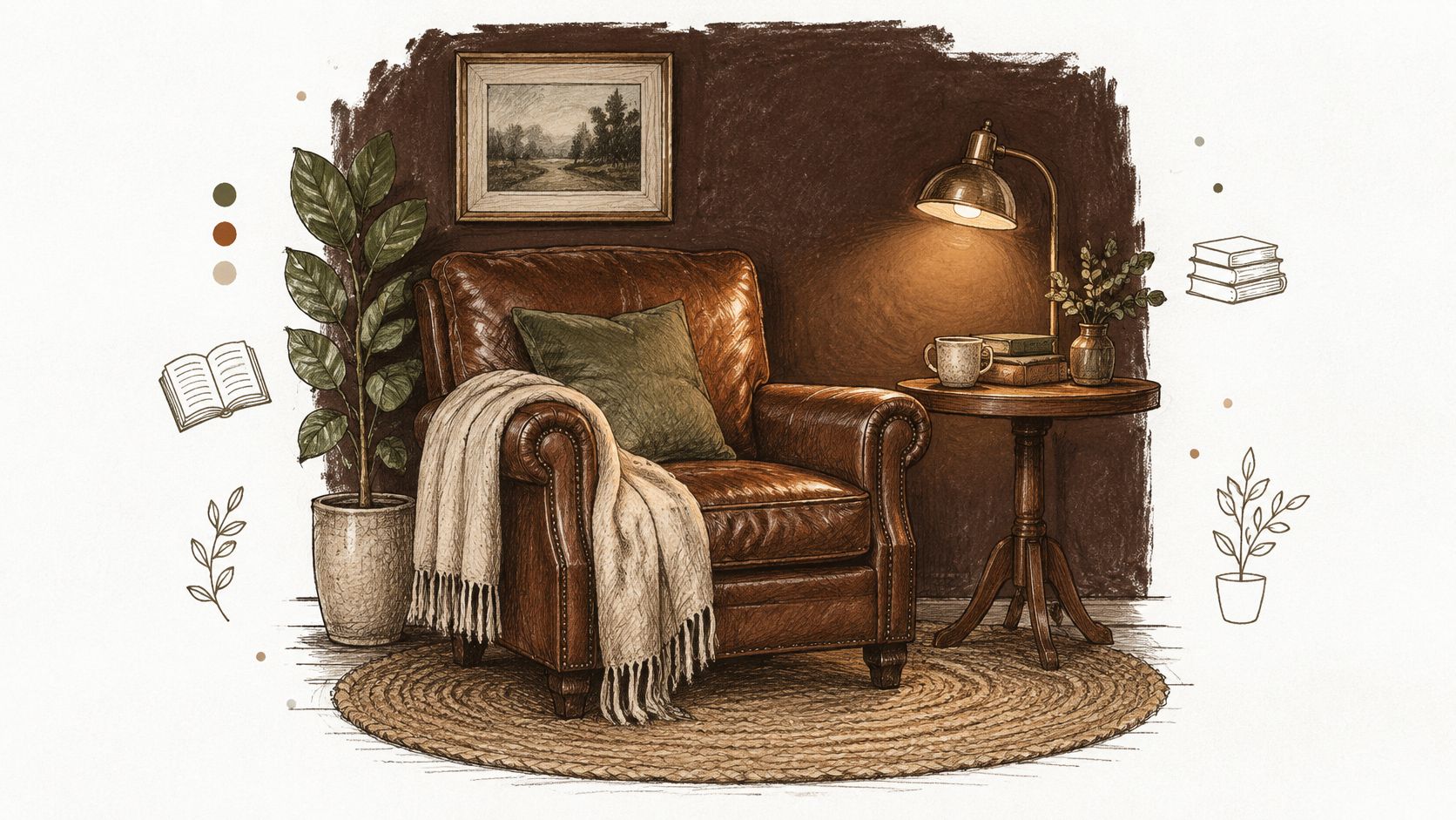
The catch is undertone. A warm red-brown against a cool grey floor fights it. A cool grey-brown against warm teak looks dusty. Decide the undertone by the flooring, then match bedding and curtains to that decision, not the other way round.
When the room is already short of light
Espresso is often proposed for rooms that can least afford it: small bedrooms with one window facing a neighbouring block. Daylight research on Indian homes reports uneven illumination in rooms such as kitchens and bedrooms, and notes that warm-humid homes require a higher minimum window-to-floor ratio of about 16.66%. Darker, less reflective surfaces reduce perceived brightness in a room that's already underlit, so check the window size and what's outside it before you commit.
- Check the numbers first: measure window area against floor area. Below that ratio, keep two walls pale and make the brown the accent.
- Keep trims light: a pale skirting and ceiling line stops the wall closing in.
- Use warm light: 2700K to 3000K, with a reading lamp at shoulder height.
- Watch damp air: brown pigments can shift slightly in humid conditions, so test on the actual wall through a wet spell.
For rooms with limited daylight, the wall colours for Salt Lake homes with small windows and low light outlines which shades to keep and which to move to a single panel.
6. Oxblood Red (Deep Burgundy)
Oxblood is the most material of the dark shades. A deep earthy red with wine and brown in it reads as timber, leather and old books rather than as a painted wall, which is why it belongs in dining rooms and libraries and looks strained in a hallway.
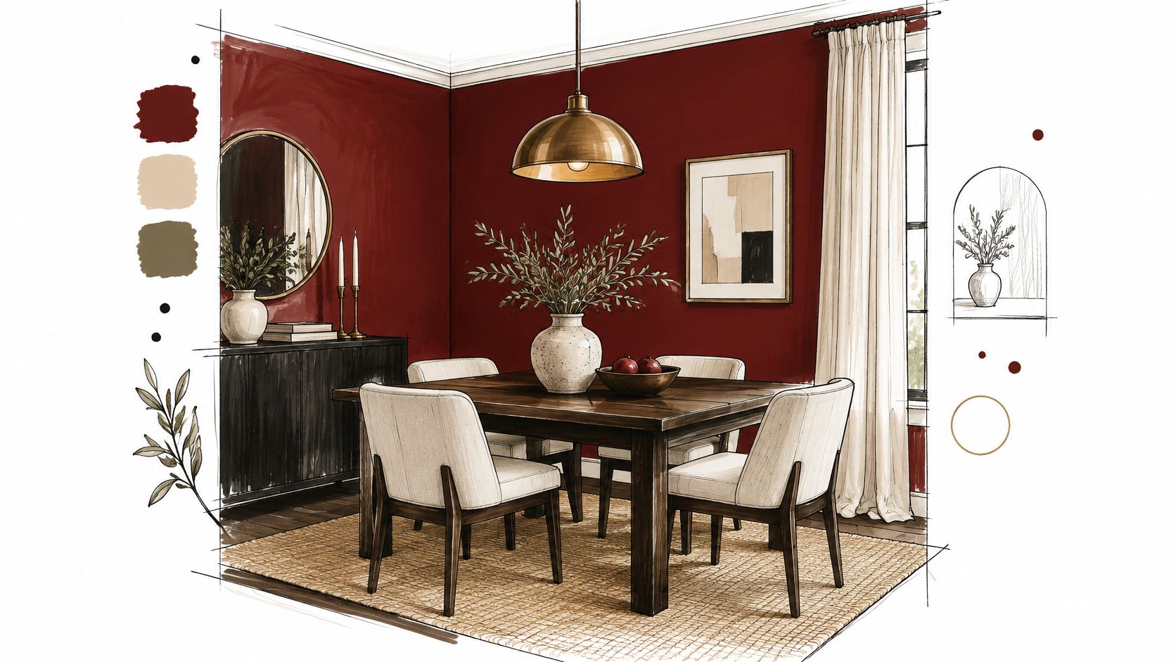
A dining room with a dark timber table, a brass chandelier and white upholstered chairs is its best setting. The white chairs do the work that pale ceilings do elsewhere: they give the eye somewhere to rest.
Practical rule: oxblood on built-in shelving only. A wall of deep red joinery gives you the colour in measured doses and lets you change your mind with a paintbrush rather than a plasterer.
The heat question
West-facing rooms need the most thought. A region-specific interior-design comparison identifies Kolkata's humidity and strong seasonal light shifts as key constraints, recommending warm whites and muted greens while cautioning that dark, heavy tones can absorb pre-summer heat and make rooms feel airless, and it advises avoiding dark colours on west-facing rooms exposed to afternoon sun. Colour isn't the only factor in comfort, since wall construction, insulation, glazing, shading and ventilation all count, but a heavy red on a sun-hit wall is doing you no favours.
- Warm bulbs, always: cool light gives oxblood a purplish cast that looks like a bruise.
- Balance with cream: off-white ceiling, cream or white textiles, pale floor.
- Tint the primer: two tinted coats beat four white-primed ones.
- Skip it in a kitchen: red under food lighting changes how the meal looks.
7. Graphite Grey
Graphite is the dark shade that commercial clients accept without a fight. A cool grey with slate depth, it does the work of black without the theatre, and it holds up against white, concrete, laminate and metal, which is most of what an office contains.
A home office with a graphite wall behind the desk and a white desktop in front of it is the standard application, and it works because the pale furniture edge draws the eye instead of the wall. In a contemporary living room, graphite on the TV wall plus warm timber flooring keeps the room from going cold.
Dark surfaces and heat
The physics changes once dark colour moves outdoors. A thermal-block study from India describes Trombe-wall systems where a black-painted outer surface is used deliberately to absorb solar energy, storing heat during the day and releasing it gradually, with average outside-to-inside temperature differences of approximately 3 to 4°C for east- and north-facing concrete blocks and about 6 to 8°C for modified blocks facing west and south. Dark exterior surfaces take in more solar heat than pale ones, so keep graphite for interior walls and shaded facades rather than sun-struck exteriors.
- Warm it up: brass, walnut or cane, or graphite reads as a server room.
- Choose washable: commercial and high-traffic areas need a scrubbable finish, no exceptions.
- Test under both lights: daylight and the office's own fittings, since grey shifts more than people expect.
- Ground it with pale flooring: light tile or pale oak keeps the scheme from floating.
8. Deep Aubergine (Dark Plum)
Aubergine is the shade that rewards a small room and punishes a large one. A deep plum with an eggplant character reads dramatic in a powder room and uncertain across a whole living room, because there's less daylight to keep the purple alive.
A powder room with aubergine walls, a gold mirror and one warm fitting is the classic use: the room is used briefly, in artificial light, at close range. A media room with a plum feature wall behind a charcoal sofa is the other reliable setting, since the wall is only ever seen in low light anyway.
Will a dark wall hide damp, or show it?
Darker colours reveal more than they conceal. Pale efflorescence, chalking, roller overlaps and mould contrast sharply against deep plum, and a patchy repair that vanished under white will announce itself. Indian paint trend coverage reports growing use of dust-resistant and moisture-shield emulsions in metros where pollution and monsoon humidity overlap, alongside a move toward one deeper feature panel rather than covering every surface. Both trends point the same way: fix the wall, then choose the colour.
- Diagnose before painting: condensation, plumbing leaks and rainwater ingress each need a different fix, and paint alone waterproofs nothing.
- Go low sheen: a washable, low-sheen, moisture-tolerant coating handles cleaning without highlighting every ridge in the plaster.
- Light it warmly: 2700K keeps plum rich; anything cooler turns it grey.
- Stop at two walls: one feature wall plus joinery is enough in a bedroom.
8 Dark Wall Colours Compared at a Glance
| Colour | Undertone | Best Rooms | Pairs Well With | Lighting Requirement |
|---|---|---|---|---|
| Charcoal Black (Off-Black Matte) | Warm black with grey undertones | Living room feature wall, media wall, bedroom accent wall | Brass, white, natural wood | Test in different daylight; keep ceilings light |
| Midnight Navy | Deep blue with a hint of black | Dining room, study, bedroom | Brass, gold, cream, leather, warm white | Warm lighting; can feel cold in north-facing rooms |
| Deep Forest Green | Dark, earthy green; muted olive or bottle-green | Bedroom, living room, kitchen cabinetry | Timber, rattan, terracotta, plants, natural fabrics | Warm lighting; may look dull under cool white LEDs |
| Hague Blue (Deep Teal-Blue) | Strong blue-green | Entry hall, powder room, living room feature wall | Warm wood, terracotta, mustard, warm metallics | Test in morning and evening light |
| Espresso Brown | Rich, warm brown | Bedroom, reading nook, living room | Cream, beige, camel, brass, wood, leather | Warm lighting; may feel heavy in low-light rooms |
| Oxblood Red (Deep Burgundy) | Dark red with brown and wine undertones | Dining room, library, living room feature wall | Brass, timber, cream | Warm bulbs; balance with light ceilings and textiles |
| Graphite Grey | Dark, cool grey | Home office, commercial workspace, living room accent wall | White, concrete, metal, warm wood, brass | Test in natural and artificial light; warm lighting helps |
| Deep Aubergine (Dark Plum) | Deep purple with muted, earthy undertones | Powder room, media room, bedroom feature wall | Gold, brass, cream, neutral textiles | Warm lighting; cool lighting can make it look dull |
From Swatch to Finished Wall, Making the Colour Work in Your Home
Work through this before the painter arrives, in order.
- Test large, test twice: A4 patches on the wall, viewed at 8am and again at 8pm with the lamps you own. Chip-sized samples lie.
- Set the colour temperature: 2700K to 3000K for deep blues, greens and plums. Cool white light will grey them out, and no amount of repainting fixes a bulb.
- Keep ceilings light: a pale ceiling and pale trim give a dark wall something to reflect into.
- Add one warm material: timber, brass, leather or cane. A dark room with none of these reads cold regardless of the shade.
- Plan the light before the paint: where the downlights land, whether there's a cove, and what the wall will look like after dark.
- Fix the substrate first: damp, efflorescence and blown plaster all show up more, not less, under a deep colour.
Lighting design and colour choice are the same decision made twice. For living and dining areas, cove lighting done well uses a warm colour temperature in the 2700K to 3000K range, which is also the range that keeps deep shades from turning grey. In a New Town living room with daylight from a balcony or bay window, we often design a ceiling that stays mostly flat with a single perimeter cove, so the dark feature wall reads rich rather than heavy. That integrated approach showed in the DE Block residence in New Town, where the interior package extended from kitchen and storage work into custom furniture and lighting design.
The room-by-room approach is when most projects succeed or fail. Choosing finishes one room at a time during construction often causes budgets to increase by 20 to 30%, which is why a palette agreed on beforehand, along with the lighting plan, usually costs less than the paint it saves. If you're repainting a dark scheme rather than starting one, Painters North Shore colour ideas is a useful second read on how finishes behave under different light.
Studio Contour works on room-specific colour and lighting planning from its New Town studio, and remotely for homeowners in other Indian cities. Bring your floor plan, your window orientations and a photograph of the room at 4pm, and the shade conversation gets much shorter.
A dark wall is a lighting project as much as a paint purchase, and the two are best planned together. Studio Contour, an architecture and interior design practice based in New Town, Kolkata, builds colour, lighting and material decisions into one process, from a single room to a complete home, and works remotely with clients in Mumbai, Delhi, Bangalore and other Indian cities. Visit Studio Contour to discuss which dark shade suits your room, its orientation and the light it receives.