








Wall Colours for Salt Lake Homes With Small Windows and Low Light
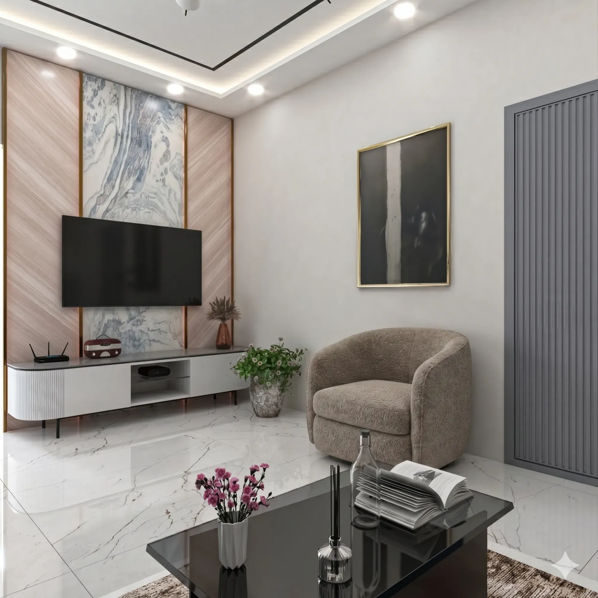
If you have ever stood in the living room of a Salt Lake DA or CA block flat around four in the afternoon and reached for the light switch even though it is broad daylight outside, you already know the problem this article is about. Salt Lake was planned in the sixties and seventies on a plot-and-block grid that never anticipated the density it has today, and a lot of the housing stock, especially the older cooperative buildings in the AA to CK blocks, was built with windows sized for a lower-rise, less crowded neighbourhood. Add a newer G+3 or G+4 built right up against the boundary wall next door, and you get rooms that were never dim by design but have become dim by circumstance.
Wall colour will not fix a structurally dark room, and we say that upfront because a lot of colour advice online treats paint like a magic wand. What colour actually does is change how efficiently a room uses the light it already has, and in a city where the monsoon alone knocks out strong daylight for three to four months a year, that efficiency matters more than most homeowners realise. This piece covers which colours genuinely help in low-light Salt Lake rooms, which popular choices quietly make things worse, how ceiling and trim colour interact with wall colour, and where paint stops being enough and you need to think about the window and the lighting layout instead.
Why Salt Lake rooms go dark faster than you'd expect
A few things stack up against Salt Lake interiors specifically. The block layout puts buildings close together, so a lot of ground and first floor rooms lose direct sun for most of the day and survive on reflected light bouncing off the building opposite. Older flats, especially ones built before the major renovation wave of the 2000s, tend to have single windows per room rather than the corner or double-aspect openings you see in newer New Town construction, so there is only one direction light can enter from. And then there is Kolkata's sky itself, which for a good stretch of the year is overcast, hazy, or actively raining, so even a well-placed window is working with a weaker light source than the same window in, say, Rajasthan.
The honest fix, in order of impact, is usually window first and colour second. If a renovation is on the table, enlarging a window, converting a section of wall into a glass block panel, or adding a light well where the structure allows, does more for a room's brightness than any paint choice ever will, and it is worth reading up on daylighting principles before you assume the window size is fixed. But most Salt Lake owners are not knocking down walls, they are repainting a flat they already live in or have just bought, and for that situation colour strategy is the lever you actually have.
The colours that actually work in low light, and why
White is the obvious answer and also the least interesting one, so let's get specific instead. In a room with genuinely weak daylight, what you want is a colour with a high light reflectance value that still reads as warm rather than clinical, because a stark cool white in a dim room tends to look grey and flat rather than bright. Warm off-whites with a slight cream or ivory undertone reflect nearly as much light as pure white while avoiding that grey cast, and they photograph and live noticeably better under the warm LED bulbs most Salt Lake flats use, since those bulbs sit around 2700 to 3000K on the colour temperature scale and a cool white wall under warm light can look oddly muddy.
Soft pastel tones, pale sage, dusty blue, the lightest end of blush, also work better than people expect in dim rooms, because unlike stark white they don't need much light hitting them to look intentional. A pure white wall in a poorly lit room can look tired and institutional if the light isn't strong enough to make it pop, while a pale sage in the same room reads as a considered design choice regardless of how much sun it's getting that day. This is one of the more counterintuitive things we tell clients during residential interior design consultations in Salt Lake, that the safest colour on paper isn't always the one that looks best in the room you actually have.
| Works in low-light rooms | Struggles in low-light rooms |
|---|---|
| Warm off-white / ivory | Cool stark white (looks grey and flat) |
| Pale sage or dusty blue | Deep charcoal or navy feature walls |
| Soft cream ceiling | Matte black ceiling accents |
| Satin or eggshell finish | Full matte on all four walls |
The mistakes we see repeatedly in Salt Lake flats
The single biggest mistake is a dark accent wall in a room that was already struggling for light, usually because the client saw it in a Pinterest board shot in a bright, double-height space and assumed it would translate. In a Salt Lake bedroom with one modest window facing a neighbouring building, a deep charcoal or navy accent wall absorbs what little light there is and makes the whole room feel smaller and heavier, not more dramatic. If you want that moody look, it works far better as a small feature, a niche, a headboard wall lit with its own dedicated fixture, rather than a full wall competing with weak ambient daylight.
The second mistake is finish, not colour. A lot of homeowners fixate on the shade and ignore that matte paint absorbs light while satin or eggshell finishes bounce it back into the room. In a bright room this barely matters, but in a genuinely dim one, switching from a flat matte to a low-sheen finish on the same colour can visibly lift the room, because you are getting the light that does enter to work twice as hard. The third mistake is painting the ceiling the same off-white as a default without checking whether it is actually helping, when in a low-ceiling dark room a slightly brighter ceiling than the walls, even by a shade, pulls the eye up and makes the whole volume feel taller and less closed-in, an old trick from smaller interior design practice that still holds up.
- Confirm the room's true light direction before choosing a shade, not just at noon but late afternoon
- Test the actual paint on the actual wall at the actual time of day you use the room most
- Choose eggshell or satin over full matte for any wall not getting direct light
- Keep dark colours to accents or niches, not full walls, in rooms under 100 sq ft of window area
- Check how the shade reads under your existing bulbs' colour temperature, not showroom lighting
Where paint stops being enough
There is a point in a lot of Salt Lake flats where colour has done what it can and the remaining problem is genuinely about light fixtures and ceiling design, not wall shade. If a room only gets usable daylight for three or four hours even in winter, layering in a proper false ceiling with recessed cove lighting around the perimeter does more to make the space feel alive than another round of repainting. We handle this combination often through our false ceiling and lighting design work, because the two decisions, wall colour and light layout, really need to be made together rather than sequentially. A warm ivory wall under a badly placed single centre light will still look patchy and gloomy in the corners, while the same wall under a cove-lit ceiling with a couple of well-aimed spots reads bright and even.
This is also where a lot of DIY paint jobs quietly fail, because the homeowner picks a great colour but the existing lighting was never designed to complement it, and no amount of touch-up painting fixes a lighting plan that was an afterthought. If you're renovating a Salt Lake cooperative flat and the rooms have always felt dim regardless of what's on the walls, it's worth reading through our guide on renovating a Salt Lake cooperative home before committing to a paint schedule, since a lot of these buildings have structural quirks around window placement and shared walls that affect what's actually achievable.
Getting the whole room to agree with itself
Colour, finish, ceiling, and light source have to be decided as one plan, not four separate ones, and this is really the whole point of this article. A homeowner who nails the wall colour but keeps a single yellowed tube light will still end up with a room that photographs badly and feels heavier than it should, while a homeowner who invests in good lighting but paints a small dim room a deep, saturated colour undercuts their own lighting spend. At the end of the day the goal for a Salt Lake flat with small windows isn't to fight the light it has, it's to design around what's actually available, whether that's north light bouncing off a neighbouring wall for four hours a day or a west window that only really works in the evening.
| Room type | Recommended wall approach | Finish | |
|---|---|---|---|
| North-facing bedroom | Warm ivory or pale sage | Eggshell | |
| Living room with one window | Off-white walls | brighter ceiling shade | Satin |
| Kitchen or utility with borrowed light only | Bright warm white throughout | Satin/semi-gloss | |
| Balcony-facing room with glare in mornings | Mid-tone neutral to reduce glare | Matte or eggshell |
If you're weighing this up for a flat in one of the older Salt Lake blocks, it helps to see how the same problem played out in an actual project rather than in theory, and our Salt Lake residence project is a reasonable reference point for what a coordinated colour and lighting plan looks like once it's built out. For homeowners further along in the process who are trying to figure out what a professional's involvement actually costs before committing, our breakdown on architect fees in Salt Lake is worth a read, and if the room in question also has glare issues from a balcony or a west-facing window rather than pure darkness, our piece on balcony shading and glare control covers the flip side of this same light problem.
We've been working on homes and offices across Salt Lake and New Town since 2014, and by now we've walked into enough DA, CA, and FD block flats to know within a few minutes of standing in a room whether it's a colour problem, a lighting problem, or a window problem, and usually it's some mix of all three. If you're staring at a dim room and not sure whether repainting will actually help or whether you need to rethink the ceiling and fixtures alongside it, get in touch with us and we'll walk through it with you, room by room, before you commit to a colour you might regret in six months.