








Interior Paint Colour Ideas for New Town Apartments
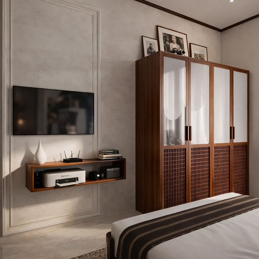
Walk through a sample flat in Action Area I or II on a January afternoon and then walk through the same layout in July, and you will understand why colour selection in New Town is genuinely different from colour selection in an older, tree-shaded part of the city. The light here is flatter and more reflective, and it comes in through bigger glass openings than most Kolkata apartments had a decade ago, so a paint that reads warm and cosy on a colour card can turn washed out and clinical by 2pm, and a shade that looked rich in a Salt Lake flat with mature trees outside can look completely different in a New Town tower with open sky on three sides.
We have briefed, sampled, and signed off colour palettes across 330+ buildings since 2014, from independent G+3 residences in Action Area I to high-rise apartment interiors near Eco Park, and the pattern we keep seeing is the same, right: people pick colours off a paint shop fan deck or a phone screen, and then the colour behaves completely differently once it is on a ten-foot wall catching New Town's reflected daylight off vitrified flooring and glass balustrades. This piece is about avoiding that gap, room by room, with the undertones, finishes, and orientation logic that actually hold up here, so you're not repainting six months in.
Why New Town's light changes what "safe" colours actually mean
Most of New Town is built on wide roads with minimal shade, and a lot of newer construction leans on large windows and glass balconies for daylighting, which is good for energy use and mood but changes how pigment reads on a wall. South and west facing rooms here get intense, high colour temperature daylight for a good part of the year, and that light pulls warm beiges toward yellow and pulls cool greys toward blue in a way a shaded Salt Lake flat with a courtyard tree simply won't experience. North facing rooms, which are common in the newer sectors given how plots along Major Arterial Road and the Action Area grids are oriented, get a cooler, more even light through the day, and that changes which whites and off-whites will look crisp instead of dull.
The other factor that people underestimate is the monsoon. New Town's humidity swings hard between April and September, and cheaper emulsion paints in that window can go patchy or develop a faint bloom on north and east facing walls that stay damp longer, so the finish you choose matters as much as the hue. We generally push clients toward a washable, low-sheen emulsion for living areas and a proper exterior-grade or damp-resistant formulation for any wall that backs onto an external face, because the colour is only as good as the film holding it there two monsoons from now.
Undertones that actually work with New Town's materials
Interiors here are built around a fairly consistent material palette now, vitrified or engineered marble flooring, engineered stone counters, and light oak or walnut veneer on plywood cabinetry, and the wall colour has to sit against that without fighting it. Warm greige and stone-grey neutrals tend to read well against the cooler, high-gloss vitrified tiles that most New Town developers use, because a straight cool grey on the wall next to a cool-toned floor can feel sterile, almost like an unfinished office. Where the flooring leans warm, which is common in independent houses that went with a warmer marble-look tile, we tend to counter it with a slightly cooler off-white or a soft sage rather than doubling down on warmth everywhere.
Deep, saturated colours, forest green, ink blue, terracotta, work far better here than most people expect, but only as accent walls or in rooms with strong artificial lighting to back them up after dark, because a whole room in a dark shade under New Town's flat daylight can feel heavier than intended. The architectural acoustics of a room don't change with paint colour obviously, but the perceived scale does, and darker colours in a compact second bedroom in a G+3 house will make it feel smaller unless there's a false ceiling with layered lighting to lift the eye upward, which is one reason we treat wall colour and false ceiling and lighting design as one decision rather than two separate ones.
| Cool-toned base | Warm-toned base |
|---|---|
| Vitrified floor, ash-grey walls, chrome fittings | Warm marble-look floor, honey-oak veneer |
| Pair with stone-grey, soft sage, or muted blue | Pair with warm greige, dusty terracotta, or soft olive |
| Works best in south/west rooms getting strong daylight | Works best in north/east rooms with cooler, even light |
| Keep metals cool (chrome, brushed steel) | Keep metals warm (brass, antique bronze) |
Room by room, what actually holds up
In the living and dining space, which in most New Town apartments and independent houses doubles as the entertaining zone and the everyday sit-down, we lean toward a warm off-white or a light greige as the primary wall, with one accent wall in a deeper tone facing the main seating so it reads well in photographs and in person. Bedrooms get more latitude, dusty blues, muted sage, warm taupe, because they're used in the evening and at night more than in harsh daylight, and a colour that feels a little flat at noon can feel genuinely restful under warm-white lighting after dark. Kitchens, especially open or semi-open ones that connect to the dining area the way a lot of Action Area II layouts do, work best with a colour that doesn't compete with cabinetry, so if you've gone for a bold cabinet finish through modular kitchen design, keep the adjoining wall neutral.
Bathrooms are their own category because of humidity and because most New Town bathrooms are small enough that colour choice reads as mood rather than statement, and this is a category we cover in more depth separately if you're renovating one through bathroom design. Balconies and utility areas that face west, which in New Town means direct glare for a good stretch of the afternoon, benefit from lighter colours and from shading, and if glare is the actual problem rather than just paint, it's worth reading up on balcony shading devices and heat and glare control before you repaint anything.
| Room | Recommended undertone | Finish | ||
|---|---|---|---|---|
| Living/Dining | Warm greige or soft stone | Washable low-sheen emulsion | ||
| Bedrooms | Dusty blue | sage | warm taupe | Matte or low-sheen |
| Kitchen (open plan) | Neutral | cabinet-matched | Washable | grease-resistant |
| Bathrooms | Light neutral or soft blue-grey | Damp-resistant / exterior-grade | ||
| West-facing balcony | Light | cool-leaning neutral | Exterior-grade | UV-stable |
Orientation, Vastu, and getting the brief right before the brush touches the wall
A good number of our New Town and Salt Lake clients want the colour scheme to work with Vastu Shastra principles as well as with the light, and the two aren't actually in conflict most of the time, because Vastu's guidance on which zones suit which tones (cooler colours in the north and east, warmer earthy tones toward the south and southwest) tends to align naturally with how the daylight behaves in those same zones anyway. Where we do get pulled in two directions is when a client wants a specific accent colour in a spot Vastu treats as sensitive, and in those cases we usually find a workaround, a different wall for the accent, a change in finish or texture instead of hue, rather than forcing a compromise nobody's happy with. If you want the fuller picture on how we approach this for New Town homes specifically, we've laid it out in our guide on interior design for New Town apartments.
- Test the swatch on your actual wall at three times of day
- Check the colour against your real flooring and cabinet samples, not memory
- Confirm finish (washable, damp-resistant, exterior-grade) by room, not one finish for the whole flat
- Decide accent walls against your seating and camera angles, not just "the biggest wall"
- Get the Vastu-sensitive zones confirmed before you commit to a dark accent there
This is also usually the point where a 3D render earns its cost, because a rendered walkthrough under simulated daylight and evening lighting tells you far more than a paint chip ever will, and it's why we run every interior colour scheme through 3D visualization and rendering before a single litre goes on the wall. It's a small step that saves a genuinely large amount of repainting, and clients who've been through a renovation before tend to ask for it unprompted the second time around.
Getting it right without three rounds of repainting
The honest answer to "which colour should I pick" is that it depends on your unit's orientation, your flooring and cabinet tones, how the room is actually used, and what finish will survive New Town's humidity, and no single trending shade answers all four at once. That's really the whole argument for architect or interior designer, who to hire first for a New Town home, because getting the sequence right, structure and layout first, colour and finishes built on top, is what keeps a project from needing to be undone and redone. We've also found that a proper AI-assisted mood board and client briefing process at the start, before any paint gets purchased, cuts down the back-and-forth considerably, because everyone is looking at the same reference rather than describing colours in words that mean different things to different people.
At the end of the day, colour is one of the cheapest changes you can make to a home and one of the easiest to get wrong at scale, and it's usually the last thing decided in a renovation that's actually gone well, not the first. If you're planning a fresh interior fit-out or a repaint as part of a larger renovation in New Town or Salt Lake, our residential interior design team handles the colour, material, and lighting brief together as one plan rather than three separate decisions made in isolation, the way we did on a recent apartment interior in Action Area II that you can see in our project gallery. Get in touch with us and we'll walk your unit's orientation and material palette with you before you buy a single tin of paint.