








Grey Modular Kitchen Ideas: 20 Shades From Dove to Charcoal
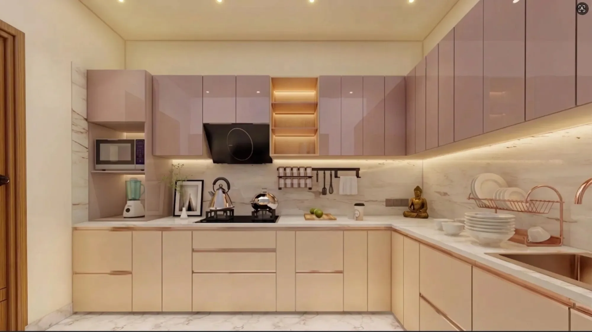
Walk into ten homes across New Town or Salt Lake right now asking for a kitchen redo, and at least six of them will open the conversation with one word, and that word is grey. Not because it is trendy in the disposable sense, but because grey solves a problem that white kitchens and dark wood kitchens both struggle with in a Kolkata household, which is that it hides the daily reality of cooking (dal splashes, turmeric fingerprints, the general chaos of a working kitchen) far better than either extreme, while still photographing beautifully for the family group that will inevitably ask to see it.
At Studio Contour we have been designing and building modular kitchens across Kolkata and West Bengal since 2014, and grey has moved from being a request maybe one client in ten made, to something closer to four in ten of our current kitchen briefs. So this piece is basically everything we tell clients in that first consultation, the actual shade logic, the materials that hold grey well versus the ones that show every scratch, how grey pairs with wood and brass and black hardware, and what it costs at different quality tiers. The goal here is that by the end you are not just picking a colour off a swatch card, you are making a decision you will still like in year six.
Grey is not one colour, and this is where most homeowners get tripped up browsing Pinterest. There are warm greys with a beige or taupe undertone that sit close to the wall colour in most Bengali apartments, cool greys with a blue or green cast that read very contemporary, and then the near-blacks like charcoal and graphite that behave more like a strong accent than a base. Getting this undertone match wrong against your flooring, your false ceiling treatment, and your existing tile is the single most common regret we see when we get called in to fix someone else's kitchen.
The dove-to-charcoal spectrum, and where each shade actually works
Dove grey, at the pale end, is basically a soft off-white with a whisper of grey in it, and it works best in kitchens that get decent daylighting since it can look slightly flat under pure artificial light. Pebble and mist greys sit a notch darker and are the safest middle-ground choice for open kitchens that flow into a living or dining area, because they read as neutral from ten feet away and detailed up close. Stone grey and slate grey move into genuinely mid-tone territory, and this is where most of our island and peninsula kitchens land, since the depth of colour hides fingerprints on handle-less shutters without going so dark that the kitchen feels smaller. Graphite and charcoal, at the far end, are dramatic and current, but we almost never recommend them for a full kitchen in a compact Kolkata flat unless there is strong natural light or a double-height ceiling to balance the weight, because in a 9x10 kitchen with one window, wall-to-wall charcoal cabinetry can visually shrink the room. The fix we use constantly is contrast banding, charcoal on the lower cabinets for grounding and grip-friendliness, a paler grey or warm wood tone up top to keep the sightline open.
| Shade Family | Undertone | Best Suited For | ||
|---|---|---|---|---|
| Dove & Mist | Warm/Neutral | Small kitchens | low-light flats | Vastu-sensitive north/east facing kitchens |
| Pebble & Stone | Neutral | Open-plan kitchens flowing into dining or living | ||
| Slate & Ash | Cool | Island kitchens | kitchens with quartz or marble counters | |
| Graphite & Charcoal | Cool/Deep | Base cabinets only | or kitchens with strong daylight and higher ceilings |
Materials that actually carry a grey finish well
The shade you pick matters less, honestly, than the material it is executed in, because the same stone grey looks completely different in laminate versus acrylic versus a matte PU lacquer, and each of those has a very different maintenance and cost profile. Laminate is the value workhorse, it takes grey well in both matte and textured finishes, resists heat and daily wear reasonably, and is what most of our budget and mid-range kitchens use for at least the base units. Acrylic gives you that glossy, almost mirror-like grey that photographs incredibly well, but it shows fingerprints and water spots aggressively, so we tend to steer clients away from it for handle-less lower cabinets that get touched constantly, and toward it for upper units and islands that see less daily contact. Matte PU (polyurethane) lacquer is where most of our higher-tier grey kitchens land now, because it gives a soft-touch, almost suede-like matte grey that genuinely hides fingerprints, though it costs more and needs a slightly more careful factory finishing process. For the counter itself, quartz in a grey-veined or plain concrete-look finish is our default recommendation over natural stone, because engineered stone is non-porous, does not need periodic sealing the way marble or granite does, and holds colour consistency across the full slab, which matters a lot when your cabinetry is already carrying a specific grey undertone you do not want the counter fighting against.
| Laminate | Acrylic/PU |
|---|---|
| Cost stays modest, wide colour range | Higher upfront cost, richer depth of finish |
| Matte or textured grip finishes hide daily marks | Glossy acrylic shows fingerprints fast, matte PU hides them well |
| Repairs are straightforward and affordable | Repairs need factory-level colour matching |
| Good for base+wall units on tighter budgets | Best reserved for islands, uppers, or full high-end kitchens |
Pairing grey with wood, brass, and black, the sub-styles that actually work
A full grey kitchen on its own can feel a little cold in a Bengal climate that already leans grey during monsoon months, so almost none of the kitchens we build are pure grey top to bottom. The most requested pairing right now is grey with warm oak or walnut-toned laminate, usually as a tall pantry unit or open shelving against grey base cabinets, because the wood grain adds the warmth grey alone lacks. Grey with brushed brass hardware is the pairing clients ask for when they want a slightly luxe, boutique-hotel feel, brass handles or a brass-framed open shelf against stone or slate grey shutters reads expensive without needing an expensive material underneath it. Grey with matte black, meanwhile, is the more masculine, industrial-leaning combination, black tap fixtures, black cabinet pulls or profile handles, and it tends to suit open-plan apartments with concrete or large-format tile flooring more than traditional layouts. If Vastu Shastra placement is a consideration for your household, and for a good number of our Kolkata clients it is, grey generally reads as a neutral, Vastu-compatible base colour, though the cooking platform orientation and fire-element positioning still need to be worked out properly, which is exactly the conversation we have as part of our Vastu-compliant design process rather than something to guess from a colour chart.
What a grey modular kitchen actually costs in Kolkata
This is the question every single client asks eventually, and the honest answer is that grey itself does not carry a cost premium, the material and finish choice underneath it does. A laminate-finish grey kitchen with standard plywood carcasses and basic soft-close hardware sits at the entry tier, functional and durable but without the handle-less, soft-touch feel higher tiers offer. The mid tier steps up to better-grade plywood, matte laminate or entry-level acrylic shutters, and branded hardware, and this is where most of our clients across Kolkata and West Bengal land. The premium tier brings in matte PU lacquer or high-end acrylic, quartz counters, integrated appliances, and full ergonomics-driven layout work, essentially a kitchen designed around the kitchen work triangle rather than just fitted into whatever footprint existed before.
Lighting, layout, and the details that make or break a grey kitchen
Grey is more light-sensitive than almost any other kitchen colour, which is the part homeowners underestimate the most. A warm 3000K colour temperature light will pull warm undertones out of a cool grey and can leave it looking slightly muddy, while a cooler 4000K light sharpens cool greys but can make warm dove or pebble tones look washed out, so we always test the actual shutter sample under the client's planned light fixtures before finalising, not under a showroom's lighting. Under-cabinet task lighting matters even more in a grey kitchen than a white one, because grey absorbs more ambient light than it reflects, so the counter and backsplash need their own dedicated light line rather than relying on the room's general false ceiling layout to carry the whole space. Layout-wise, a straight-line or L-shaped grey kitchen in a compact apartment reads calmer with fewer colour breaks, while an island or peninsula kitchen has more room to play with two-tone grey combinations, which is a big part of why our island layouts tend to be where clients experiment the most, something you can see worked through in our sleek modular kitchen project in Kolkata.
- Match the grey undertone to your existing flooring and false ceiling tone before ordering samples
- Choose matte PU or textured laminate over glossy acrylic for handle-less lower cabinets
- Test the actual shutter swatch under your kitchen's planned light fixtures, not showroom lighting
- Pick quartz or engineered stone for the counter to keep colour consistency across the slab
- Budget separately for task lighting, since grey absorbs more ambient light than white
None of this is really about picking a Pantone number off a card, it is about how a colour choice interacts with your flooring, your light, your storage habits, and your budget over a kitchen's real lifespan, which for most of our clients runs well past a decade. That is the layer of judgment a good design team brings that a catalogue cannot, and it is the same judgment we apply across every project, whether it is a single kitchen inside a larger residential interior design scope, a custom island unit through our custom furniture design team, or a full apartment fit-out for someone moving into a new apartment or flat in New Town. We also walk every kitchen through a 3D visualization pass before a single shutter is ordered, specifically so the shade, the lighting, and the material finish are agreed on screen, not discovered on-site after the plywood has already been cut. If you are somewhere in that dove-to-charcoal decision right now and want a second set of eyes from a studio that has actually built this exact kitchen dozens of times over, across New Town, Salt Lake, and the wider Kolkata and West Bengal region since 2014, get in touch with us and we will walk you through what will genuinely work for your space.