








Kitchen Colour Combinations That Suit Salt Lake's Compact Flats
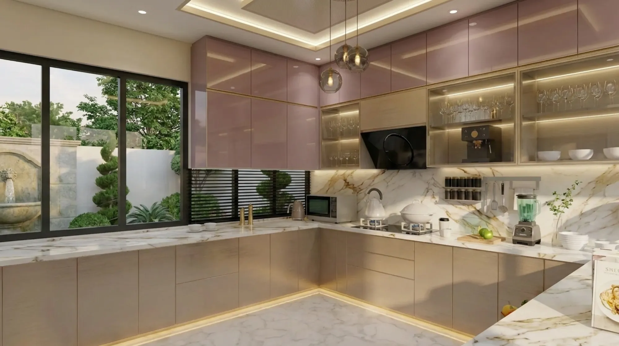
If you've stood in a Salt Lake kitchen at four in the afternoon and watched the light bounce off a west-facing window straight into a wall of glossy dark tiles, you already know why colour in a compact kitchen is not a decorating afterthought, it's a planning decision. We've worked on enough IB, AC, CJ and FD Block flats over the years to know that a Salt Lake kitchen is rarely the generous L-shaped room you see in interior design magazines, it's usually a tight 6x8 or 7x9 foot space carved out of an older cooperative building plan, often with one window, sometimes none, and a slab height and depth that was fixed decades before anyone thought about induction hobs or tall pull-out units.
That combination, small footprint, limited daylight, older structural bones, is exactly what makes colour the highest-leverage decision in a Salt Lake kitchen renovation, more than the brand of chimney you buy or the tile pattern you pick, because a well-chosen combination can make an 8-foot galley feel like it breathes, while the wrong one can make a freshly renovated kitchen feel smaller than it did before you touched it. This piece walks through the colour combinations that actually hold up in Salt Lake's flats, why they work with this specific light and this specific room geometry, and where Vastu and cooperative building constraints tend to shape the final call.
We're Studio Contour, an architecture and interior design studio based in New Town, founded in 2014, and we've delivered work across 330+ buildings in and around Kolkata, a good part of it in Salt Lake's older sectors where the light conditions and room geometry are quite different from what you get in New Town's newer towers, so this isn't theory, it's what we've actually specified and lived with client feedback on.
Why Salt Lake Kitchens Need a Different Colour Approach Than New Town
New Town kitchens, especially in the newer G+3 and G+4 residences we design around Action Area I and II, tend to get generous glazing and open kitchen-to-dining layouts, so colour choices there can afford to be bolder because there's enough natural light bouncing around to absorb it. Salt Lake is a different animal, most of the housing stock across Sectors I to V was built between the 1970s and the 2000s, kitchens sit at the back of the flat next to the service balcony, ventilation is a single window or an exhaust duct, and the room is often flanked by a neighbouring wall that blocks a chunk of the sky. When we walk into these kitchens for the first time, the first thing we're reading is not the client's Pinterest board, it's where the light actually falls across the day, because a colour combination that looks stunning under a showroom's daylighting will read completely differently under the amber cast of a single tube light at 8pm, which is when most Salt Lake families are actually cooking.
This is also why we don't hand clients a colour swatch in isolation, we test it against the kitchen's actual colour temperature of lighting, because a cool-white LED strip under the wall cabinets will make a warm beige carcass look sallow, while the same beige under a 3000K downlight looks rich and warm. Getting this pairing right at the design stage, rather than fixing it after installation, is one of the reasons clients bring us into the modular kitchen design conversation before they've picked a single tile.
The Palettes That Actually Work in a Compact, Low-Light Kitchen
The combinations that consistently perform well in Salt Lake's tighter kitchens share a logic, keep the base pale and reflective, let one element carry the contrast, and never let two saturated colours compete for attention in a room under 60 square feet. A two-tone white-and-warm-wood combination, where the upper cabinets stay off-white or a soft ivory and the base units run in a light oak or teak-toned laminate, is the single most requested and most reliable pairing we specify, because the pale upper half keeps the eye moving up and out rather than boxing the room in, while the warm base grounds the space without darkening it. For clients who want more personality without losing the light, a sage or muted olive base with white or bone uppers photographs beautifully and, more importantly, wears well against Kolkata's humidity-heavy walls where anything too stark shows grime fast.
| Combination | Best for | Watch-out | |
|---|---|---|---|
| Ivory upper + light oak base | Windowless or single-window kitchens | Avoid glossy oak finishes that mirror overhead light | |
| Sage green base + off-white upper | Clients who want colour without darkening the room | Keep countertop pale to balance the green | |
| Charcoal base + warm white upper | Larger Salt Lake kitchens with a window or balcony door | Skip in kitchens under 45 sq ft | reads heavy |
| Warm grey + brass or matte gold hardware | Cooperative flats being modernised without a full gut renovation | Pair with warm-toned lighting | cool light turns grey clinical |
A darker charcoal or deep bottle-green base with a pale upper cabinet works, but only in kitchens that get at least one real window or a service balcony door that stays open through the day, because dark lower cabinetry absorbs light and in a genuinely dark Salt Lake kitchen it will visually shrink the floor area rather than grounding it the way it does in a brighter New Town layout. We've seen clients bring us a photograph of a dramatic all-dark kitchen from Instagram and ask for the same look in a north-facing Salt Lake flat kitchen with no direct sun, and the honest answer we give every time is that the combination will read as a cave rather than a statement in that specific room, so we adjust the proportion, dark on lower cabinets only, pale on everything above eye level, rather than talking the client out of the mood they're after.
Getting Undertones Right Against Kolkata's Humid Light
This is the part that trips up even experienced homeowners doing a DIY repaint or a quick modular refresh, undertones. A white that looks clean in a hardware store sample can pick up a faint blue-grey cast under Kolkata's overcast monsoon light, or a warm yellow cast under afternoon sun bouncing off a neighbouring building's paint, and once it's on 40 running feet of cabinetry the mismatch is impossible to ignore. We always cross-check the cabinet finish, the wall paint, and the engineered stone or laminate countertop together, in the room, under the room's real lighting, because these three surfaces sit close enough together in a compact kitchen that even a subtle undertone clash becomes the first thing anyone notices.
The countertop is usually where undertone mistakes are most expensive to fix, since it's the hardest and priciest surface to replace once installed. A warm beige or off-white cabinetry base generally pairs best with a countertop that has warm undertones too, think a cream or light taupe stone rather than a stark blue-white marble-look laminate, because the contrast between warm cabinets and cool-toned countertops is one of the most common colour clashes we get called in to correct on renovation projects. If a client is set on a marble-effect countertop for its visual weight, we'll usually pull the cabinetry a shade warmer to compensate, rather than fighting the stone's natural coolness.
| Warm-toned kitchens | Cool-toned kitchens |
|---|---|
| Best with beige, oak, sage, terracotta accents | Best with grey, white-blue, charcoal, brass or chrome |
| Flatters kitchens with limited daylight | Needs a real window or strong artificial daylighting |
| Hides monsoon-season grime better on walls | Shows dust and water spots faster in humid months |
| Common in older Sector I-V renovations | More common in newer, brighter kitchen layouts |
How the Layout and the Colour Decision Work Together
Colour can't fix a bad layout, and in a compact Salt Lake kitchen the two decisions are really one decision made in two passes. Before we finalise any colour combination, we're already thinking through the kitchen work triangle, because where the sink, hob and refrigerator sit determines how much continuous cabinet run is visible from the doorway, and that visible run is what the colour combination has to work across. A galley kitchen where both walls are visible from the entrance needs its colour treatment to feel continuous, not broken into competing blocks, while an L-shaped layout with a short return can carry a slightly bolder contrast on the shorter wall without overwhelming the room.
This is also where ergonomics and colour intersect in a way most homeowners don't expect, a tall pantry unit finished in the same tone as the wall behind it visually disappears, freeing up perceived floor area, while the same unit in a contrasting dark finish becomes a visual full stop in a small room. We factor this into every custom furniture design decision for kitchen storage, because in a Salt Lake flat where every extra inch of counter and cabinet matters, the goal is often to make storage feel like it isn't there at all.
Lighting closes the loop on all of this, and a well-planned false ceiling with layered task and ambient lighting, which we cover in more depth under false ceiling and lighting design, does more to make a pale colour combination feel bright and a dark one feel intentional than almost any other single intervention. A single centre light in a kitchen with dark lower cabinets creates hard shadows across the counter exactly where you're chopping vegetables, while a cove light along the upper cabinet line plus a focused strip under the wall units removes the shadow and makes the colour combination read as designed rather than accidental.
- Test cabinet and wall colour samples under the kitchen's actual lighting at three times of day
- Match countertop undertone to cabinet undertone before ordering either
- Keep tall units and pantry cabinets close to the wall colour so they visually recede
- Plan task lighting under wall cabinets so dark lower units don't create shadow zones
- Confirm the final palette against adjoining dining or living room tones if the kitchen is open-plan
Vastu, Cooperative Flat Rules and Practical Constraints
A fair number of our Salt Lake clients ask us to keep the kitchen colour scheme aligned with Vastu Shastra guidance, and the good news is that Vastu-friendly kitchen colours, warm earth tones, soft yellows, terracotta accents, off-whites, overlap almost entirely with the palettes that work best in low-light compact rooms anyway, so there's rarely a real tension between the two once you're working with a reflective, warm-toned base. Where we do have to navigate more carefully is the physical building itself, because a lot of Salt Lake's housing stock sits in older cooperative societies with their own norms around what can be altered in a kitchen, from plumbing points to exhaust routing through shared walls, and we walk every client through that process as part of renovating a Salt Lake cooperative home before a single cabinet is ordered.
If your building falls under NKDA or Bidhannagar jurisdiction for any structural change alongside the interior work, the current rules around what needs sanction and what doesn't are worth confirming directly with the authority before finalising plans, since these figures and processes are periodically updated. For most kitchen colour and cabinetry projects in an existing Salt Lake flat there's no structural sanction involved at all, it's a straightforward interior fit-out, but we flag this distinction early with every client so nobody is surprised mid-project.
Why Homeowners Bring This Work to Studio Contour
We get asked fairly often why a client should hire a design studio for something that sounds as simple as picking kitchen colours, and the honest answer is that the colour combination is the visible outcome of a dozen quieter decisions, undertone matching, lighting layers, layout proportion, hardware finish, that are much harder to unwind after installation than to get right up front. Our process for Salt Lake projects usually starts with a site visit to read the room's actual light and constraints, moves into full 3D visualization and rendering so the client sees the exact combination under the exact lighting plan before anything is fabricated, and wraps into execution on our typical 8 to 12 week interior timeline for a kitchen-scale project. We've applied this same process across recent Salt Lake work, including a Salt Lake residential interior project where the brief was almost identical to what we've described here, a compact, low-daylight kitchen that needed to feel bigger and warmer without a full structural gut.
If you're weighing whether to bring in a full residential interior design team or handle the colour and cabinetry decisions piecemeal through a local carpenter, it's worth reading through our breakdown of architect fees in Salt Lake explained, since the cost conversation is usually the first thing that decides how a project gets structured, and getting the sequencing right, design and rendering before ordering material, tends to save far more than it costs. For anyone earlier in the process and still deciding who to bring on board first for a broader renovation, our guide on interior designer in Salt Lake Sector 5 walks through how we scope that first conversation.
At the end of the day, a kitchen colour combination that works in a Salt Lake flat isn't about chasing a trend, it's about respecting the room you actually have, its light, its width, its wall behind the neighbouring building, and building the palette around that reality rather than around a photograph shot in a much bigger, much brighter kitchen somewhere else. If you're planning a kitchen renovation anywhere in Salt Lake and want a second pair of eyes on what will actually work in your specific room, get in touch with us and we'll walk the space with you before you commit to a single tile or cabinet finish.