








Red Kitchen Cabinets: How to Make a Bold Colour Feel Timeless
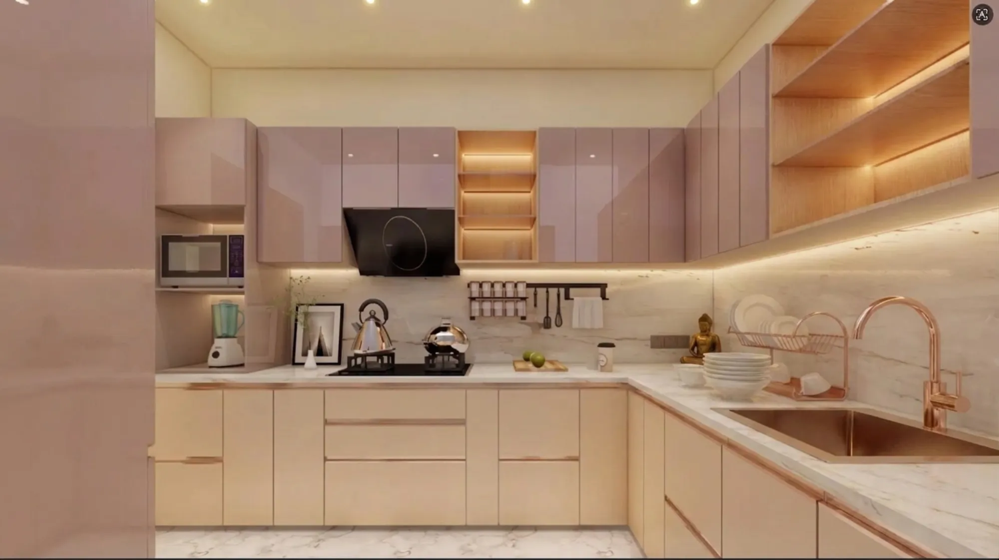
Every few months a client walks into our New Town studio with a photo saved on their phone, a deep red kitchen from Pinterest or Instagram, and the same nervous question attached to it, which is basically "will this look dated in five years or will it still feel right when we're ready to sell the flat." It's a fair worry. Red is the one cabinet colour that nobody picks by accident, and it's also the one that gets blamed first when a kitchen starts to feel loud instead of confident. We've fitted red cabinetry into duplexes in New Town, flats in Salt Lake, and a couple of full-home projects further out toward Rajarhat, and the pattern we keep seeing is that the colour itself was never the problem, it was almost always the undertone, the finish, or the fact that nobody thought about how the red would sit next to the counter and the flooring before the order went to the factory.
This piece is our working notes on how to get a red kitchen right, covering the undertone families that actually read as timeless versus trendy, the material and finish choices (laminate, acrylic, lacquer, veneer) and what each does to the colour over ten years, how to pair red with countertops, backsplashes, flooring and hardware so it doesn't fight itself, roughly what it costs across price bands in Kolkata, and the specific mistakes we see homeowners make when they commit to a bold kitchen colour without a plan for the room around it. If you're weighing a red kitchen against a safer neutral, this should give you enough to decide with your eyes open rather than your Pinterest board.
One thing worth saying upfront: a red kitchen is not a decision you make in isolation from the rest of the home, so if you're mid-way through planning a full interior fit-out, it's worth reading this alongside how the kitchen connects to adjoining spaces through our residential interior design process, because the kitchen almost never sits in a sealed box in a Kolkata flat, it opens onto the dining area or the living room more often than not.
Why red works (and why it usually goes wrong)
Red is a warm-forward colour, and warm colours advance visually, which means a red kitchen in a small galley layout is going to feel tighter than the same layout in a cool grey or white, right. That's not automatically bad, in fact in a lot of Kolkata apartments where the kitchen is compact and gets decent daylight from one window, a confident red can feel intentional and rich rather than cramped, but it only works if the rest of the palette gives the eye somewhere to rest. The catch here is that most homeowners pick the red first and figure out the countertop and flooring later, when it really needs to go the other way, because the undertone of your red has to be chosen against the undertone of whatever engineered stone or quartz you're using on the counter, or you end up with a clash that no amount of styling fixes.
There are basically three red families we work with. True brick or terracotta reds, which lean warm and earthy and pair beautifully with brass hardware and wood tones, these are the ones that age the best because they echo materials that have always existed in Bengal homes, from old red-oxide flooring to exposed brick facades. Then there's a cooler wine or maroon family, closer to burgundy, which reads more formal and works well in dining-adjacent open kitchens where you want something that photographs like a statement piece. And then there's true fire-engine or cherry red, which is the one we're most cautious about, because it's the version most tied to a specific decade of design trends and the one most likely to feel loud again in eight or ten years. If a client wants genuine boldness without the risk, we usually steer them toward brick or maroon rather than pure red, and that one recommendation alone has saved more than a few kitchens from an expensive repaint down the line.
Material and finish: what the red is actually made of
This is the part that gets skipped the most, and it shouldn't, because the same red pigment behaves completely differently depending on what it's applied to. Laminate is the budget-friendliest route and it's genuinely fine for red, matte laminates in particular hide fingerprints and scratches well and don't show the colour shift that high-gloss surfaces do over years of kitchen heat and steam. High-gloss acrylic gives you that deep, almost lacquered showroom look and it photographs beautifully, but it shows every smudge, every water spot near the sink, and it can develop a slightly uneven sheen in humid Kolkata conditions if the substrate underneath isn't properly sealed, which matters a lot given our monsoon humidity swings. True PU lacquer finishes sit at the top of the price band and they hold colour saturation the longest, they're the closest thing to a paint-shop car finish, and for red specifically this matters because red pigments are among the more prone to UV fade over time. Veneer, meanwhile, isn't really a red option at all since it's wood-grain by definition, so if a client wants a red kitchen with a wood-like texture we usually suggest a red-stained engineered wood door instead, which gives grain visibility through a translucent red rather than a flat opaque colour.
Whatever the finish, the cabinetry carcass underneath matters just as much as the door face, and this is where we see the biggest quality gap between a proper studio-executed kitchen and a local carpenter job, since plywood grade, moisture resistance, and hinge hardware determine whether that bold red door is still closing flush in three years or has started to sag at the corners. We spec BWR or marine-grade ply as standard for any kitchen carcass in this climate, red or otherwise, because Kolkata's humidity is not forgiving of shortcuts.
| Laminate | PU Lacquer |
|---|---|
| Budget-friendly, matte finishes hide daily wear well | Premium price point, best colour depth and longest-lasting saturation |
| Moderate durability, 8-10 year typical cabinet life | Excellent durability if properly cured, resists chipping better than acrylic |
| Wide colour range but limited true depth in dark reds | Can be custom-mixed to match almost any red swatch precisely |
Pairing red without it fighting the room
A red kitchen needs a counterpoint, and the counterpoint is almost always in the countertop, the wall behind the hob, and the hardware, in that order of importance. For counters, we lean toward white or cream marble-look surfaces or a warm beige granite, because a light, cool-neutral counter gives the red room to breathe, whereas a dark counter on top of a dark red cabinet just collapses the whole kitchen into one heavy block, especially under the kind of false ceiling cove lighting that's standard in most of our fit-outs now. Backsplash tile in plain white subway or a soft warm-white ceramic tile does the same job at a smaller scale, giving the eye a breather between the cabinet colour and the wall above.
Hardware is where a lot of red kitchens either earn their timelessness or lose it. Brushed brass or antique gold handles warm the red up and tie it to a more classic, almost heritage look, which is the direction we push clients toward if they want the kitchen to still feel considered a decade from now. Matte black hardware gives a red kitchen a sharper, more contemporary edge, but it's a harder look to soften later if trends shift, so we treat it as the bolder of the two choices rather than the safer default. And colour temperature of your under-cabinet and overhead lighting genuinely changes how the red reads at night, warm 2700-3000K light deepens red toward brick and maroon, while cooler 4000K light can push it toward a slightly artificial, almost plasticky tone, so this is a decision we make jointly with the electrical layout rather than as an afterthought once the cabinets are already fitted. Getting this sequencing right, cabinet then counter then lighting then hardware, is really the whole game, and it's a big part of why we push clients toward getting proper 3D visualisation and rendering done before a single panel gets cut, because seeing the full palette together in a render catches clashes that swatches on a table never will.
What it costs, roughly, across bands
Cost for a red modular kitchen in Kolkata tracks almost entirely with the finish and hardware choice rather than the colour itself, red doesn't cost more than white or grey in the same material, but the finishes that hold red best tend to sit in the mid-to-premium band. A laminate-finish red kitchen with standard BWR ply carcass and basic soft-close hardware lands in a modest, accessible range and suits a smaller apartment kitchen well. Step up to acrylic or PU lacquer with better German-hinge hardware and the number moves up meaningfully, and that's usually where we see clients land once they've actually seen the depth difference in a sample door. At the top end, full custom cabinetry with mixed materials, say a red lacquer base with a contrasting light-oak or marble-look upper unit, plus integrated appliances and stone counters, sits in the premium bracket and is really a full custom furniture design exercise rather than an off-the-shelf modular order.
| Finish | Best For | Longevity |
|---|---|---|
| Matte Laminate | Budget kitchens & rentals | 8-10 years |
| High-Gloss Acrylic | Statement showroom look | 10-12 years with care |
| PU Lacquer | Long-term primary residence | 15+ years |
Common mistakes we see, and how to avoid them
Most red-kitchen regrets trace back to one of a handful of decisions, and almost all of them are fixable at the planning stage rather than after the cabinets are installed. Picking the red from a small physical swatch or a screen instead of a full door sample under real room light is the biggest one, since red is unusually sensitive to light source. Ignoring the kitchen work triangle because the colour decision took over the planning conversation is another, a beautiful red kitchen that's inconvenient to cook in gets resented fast regardless of how it photographs. Choosing a trend-cycle cherry red instead of a brick or maroon family when the goal is a ten-plus year kitchen is a third, and it's the one we push back on most gently but most consistently. And going all-red on every surface, upper and lower cabinets both, tall units included, with no neutral counterpoint anywhere in the room, which is really an execution and layout problem more than a colour problem, and it's exactly the kind of thing good AI-assisted furniture layout planning or a proper design pass catches before it becomes a full kitchen's worth of regret.
- Test the exact swatch under your kitchen's actual daylight and evening light
- Choose finish (laminate, acrylic, PU lacquer) based on maintenance tolerance, not just budget
- Lock countertop and backsplash undertone before finalising cabinet colour
- Decide hardware finish (brass vs matte black) as part of the same decision, not after
- Confirm BWR/marine-grade ply carcass regardless of door finish
If it helps to see how a considered kitchen palette actually reads in a finished home rather than in swatches, our sleek modular kitchen project is a decent reference point for how we sequence colour, counter, and hardware decisions together rather than one at a time. And if you're planning this as part of a larger renovation rather than a standalone kitchen swap, it's worth reading up on architect fees in Kolkata so the budgeting conversation happens with the full scope in view, not just the cabinet quote.
Where Studio Contour fits into this
We've been doing this since 2014, out of New Town, across more than 330 buildings now spread through Kolkata and further out into West Bengal, and if there's one thing that pattern has taught us it's that bold colour choices need more upfront planning than neutral ones, not less, because there's less room for the room to correct a mistake on its own. A red kitchen that's been planned properly, undertone matched to counter, finish matched to maintenance reality, hardware and lighting decided in the same breath as the cabinet colour, is genuinely one of the more satisfying rooms we build, and it tends to be the room clients photograph most and regret least. If you're weighing this for a flat in New Town or a home anywhere else in Kolkata or West Bengal, our team can walk the palette through a proper 3D render before anything gets fabricated, which is really the cheapest insurance there is against a colour decision you can't easily undo once 15 cabinet doors are hanging on their hinges. Get in touch through our contact page and we'll start with a straightforward conversation about your space, your light, and whether red is actually the right call for your kitchen, or whether a close cousin of it might serve you better.