








Beige and Cream Kitchen Colour Schemes That Never Look Boring
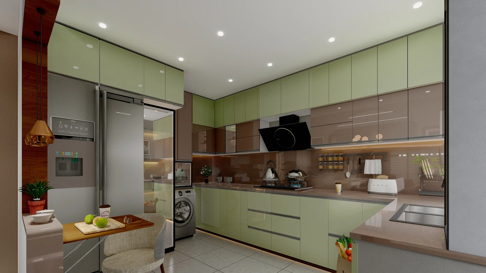
We hear the same worry in almost every kitchen consultation we sit through across New Town, Salt Lake and the rest of Kolkata, and it goes something like this: the client loves the idea of a beige or cream kitchen because it feels calm and it will not date the way a bold colour might, but they are scared it will end up looking like every other builder-flat kitchen in the city, flat and forgettable under a plain tube light. That fear is fair, because a neutral palette done lazily is genuinely one of the more boring things you can put in a home, and we have walked into enough finished kitchens done by other contractors to know exactly what goes wrong when beige gets treated as a safe default instead of an actual design decision.
The good news, and the reason we are writing this out properly instead of handing you a five-point Instagram caption, is that beige and cream kitchens that hold up over years are not an accident, they come from a handful of specific choices around undertone, material contrast, layered lighting and hardware that most homeowners never think to ask about until someone points them out. This piece walks through the warm-versus-cool undertone question that decides whether your kitchen feels inviting or clinical, the cabinetry finishes and countertop pairings that actually survive Kolkata's humidity and monsoon-season grease, the texture and contrast moves that stop a neutral kitchen from reading as flat, and the sub-styles a beige palette can genuinely stretch across, from minimal contemporary to a warmer traditional Bengali-home feel. At the end of the day, this is one of the most requested colour directions we get at Studio Contour, and after 330+ buildings delivered since 2014 we have a pretty firm view on what separates a beige kitchen that ages well from one that gets repainted in three years out of sheer boredom.
Warm beige, cool cream and everything greige in between
The first mistake we see, and honestly the one that causes the most regret, is treating beige as one colour rather than a whole family with very different personalities. Warm beiges lean yellow or golden, they pull toward sand and wheat tones, and they tend to feel cosy and sunlit, which works beautifully in kitchens that get strong natural light through east-facing windows, the kind common in duplex layouts around New Town. Cool creams and off-whites lean grey or blue at the base, they read crisp and a little more formal, and they suit kitchens with less daylight or ones paired with steel, glass and chrome fittings where you want a cleaner, almost gallery-like feel. Then there is greige, the beige-grey hybrid that has become genuinely popular over the last few years because it splits the difference and reads as sophisticated rather than either too warm or too cold, though it is also the trickiest to get right because a poorly chosen greige can drift muddy under Kolkata's ambient light, which tends to be warmer and more golden than in a lot of reference photos shot in cooler climates.
| Warm Beige Direction | Cool Cream Direction |
|---|---|
| Best with sunlit east-facing kitchens | Best with lower-light or north-facing kitchens |
| Pairs naturally with warm wood, brass, cane | Pairs naturally with steel, chrome, matte black |
| Reads cosy, traditional, inviting | Reads crisp, minimal, formal |
| Undertone risk: can drift yellow/dull under LED | Undertone risk: can feel clinical without warm accents |
The practical fix, and something we insist on with every client, is never picking a beige or cream off a small paint chip or a laminate catalogue swatch under office lighting. We always get a sample panel made up and view it in the actual kitchen at three different times of day, because the same shade of cream can look warm and lovely at 4pm and flat grey by 9pm under a cool-white bulb, and this single step prevents more repaint regret than any other piece of advice we give.
The materials that make a neutral kitchen actually work
A beige or cream kitchen lives or dies on what sits next to the cabinetry, not the cabinetry colour alone, and this is the part most DIY renovations skip entirely. For countertops, we lean toward engineered stone in a warm-toned quartz for most beige schemes because it resists staining from turmeric and oil far better than natural stone, which matters enormously in a Bengali kitchen doing daily wet cooking, though for clients who want a softer traditional cream-on-cream look we do still use honed granite in warmer tones as an alternative. For cabinetry finishes, matte and low-sheen laminates hold up better in humid weather than high-gloss, which shows every fingerprint and water spot within a week, and we generally recommend BWP-grade plywood carcasses regardless of the surface finish because Kolkata's monsoon months are simply too punishing for anything less. Backsplashes are where a lot of the visual interest can live without breaking the neutral theme, and we regularly use a fluted or textured cream tile, a warm travertine-look porcelain, or occasionally a thin marble strip behind the hob to add depth without introducing a competing colour.
Hardware is the detail people underestimate the most. A beige kitchen with plain beige-toned handles disappears into itself, whereas the same cabinetry with brushed brass, matte black or antique bronze pulls suddenly reads intentional and layered, and this is one of the cheapest upgrades in the entire renovation that makes the biggest visual difference. For homeowners planning custom units rather than modular boxes, our custom furniture design team builds this hardware selection into the drawings from day one rather than treating it as an afterthought once the cabinets are already installed.
Why beige kitchens go flat, and how to actually avoid it
The single biggest reason a neutral kitchen ends up boring is that everything sits at the same value and the same sheen, so the eye has nowhere to rest and the whole room reads as one undifferentiated block. The fix is contrast within the neutral family rather than abandoning it for a bold colour, and this is a nuance a lot of budget renovations miss entirely.
- Vary the tone: pair a lighter cream upper cabinet with a deeper taupe or warm-grey lower run
- Mix at least two finishes: matte cabinetry against a honed or lightly veined countertop
- Add one natural material break: open wood shelving, a cane-front pantry unit, or a stone niche
- Layer the lighting: under-cabinet task lighting plus a warmer accent above the island or breakfast counter
- Introduce texture through the backsplash rather than pattern through paint colour
Lighting deserves its own mention because it changes a neutral palette more than almost any other single factor, and this is where a lot of otherwise well-designed beige kitchens fall apart. Warm colour temperature lighting, generally in the 2700K to 3000K range, keeps beige and cream feeling inviting rather than sterile, and we always specify layered lighting, meaning ambient ceiling light, under-cabinet task lighting near the counters, and a warmer accent fixture over the island or breakfast bar, rather than relying on one flat overhead source. Our false ceiling and lighting design work on kitchens almost always includes a cove or recessed detail specifically to hide these layers cleanly, because a beautifully chosen cream shade under a single harsh cool-white tube light will look tired within a year regardless of how good the material selection underneath it actually is. Where the layout allows it, we also push hard on daylighting, because natural light is genuinely the best flattering light any neutral palette will ever get, and even a modest window redesign near the sink or prep counter changes how the whole room reads across the day.
Sub-styles: how far a beige palette actually stretches
One thing we tell clients early is that beige and cream are not a single style, they are a base that can carry several distinct looks depending on what you pair them with, so the choice is not really beige versus something else, it is which version of beige matches the rest of the home. A minimal contemporary kitchen uses flat-front cream cabinetry, handleless or push-to-open fronts, and a single stone or quartz feature, and this suits the newer apartment stock going up around Rajarhat and New Town where the rest of the flat already leans toward clean lines. A warmer traditional direction, closer to what a lot of established Bengali households actually ask us for, pairs a golden beige cabinetry tone with warm wood open shelving, brass hardware, and sometimes a small temple or puja niche worked into the layout, and this reads far richer without ever leaving the neutral family. A transitional middle ground, which honestly is what most of our clients end up choosing, mixes a taupe-grey lower cabinet run with a lighter cream upper run and a warm wood island or breakfast counter, giving a kitchen that photographs modern but still feels lived-in rather than showroom-cold. For a real sense of how this plays out in a finished home, our warm wood modular kitchen project is a useful reference point for exactly this kind of layered neutral approach.
- 01Site measurement and undertone sampling in real daylight
- 02Layout and the kitchen work triangle finalised with material board
- 03Cabinetry, countertop and hardware execution, typically 8-12 weeks
- 04Lighting layers and final styling walkthrough before handover
The layout underneath all of this still has to work on its own terms, which is where the kitchen work triangle between the stove, sink and refrigerator matters as much as any colour decision, because no palette rescues a kitchen where you are constantly crossing your own path while cooking. We increasingly see this paired with smarter storage planning too, and our internal design process now leans on tools like the approach covered in our AI furniture layout optimisation piece to test multiple cabinet and island configurations against a client's actual cooking habits before a single panel gets cut. If you are renovating an older flat rather than starting fresh, it is also worth reading our notes on aging in place home retrofits, since a good number of the beige-kitchen briefs we get come bundled with parents moving in and needing lower counters or wider clearances, which changes the cabinetry plan even when the colour scheme stays the same.
One detail people forget until it bites them is that a beige kitchen adjoining an open balcony or semi-outdoor dining nook needs its material palette thought through together, because monsoon spray and dust behave very differently on an enclosed versus exposed surface, and our piece on the before-and-after of balcony glass enclosures is worth a look if your kitchen opens onto that kind of space, since sealing it properly protects the exact cream cabinetry and stone countertop you have just spent money getting right.
A neutral kitchen also has to earn its keep through smart 3D planning before anything gets built, because undertone and lighting decisions are genuinely hard to judge from a flat sample board alone, which is why our 3D visualisation and rendering process exists, letting a client walk through the cream-on-taupe or warm-beige-on-wood combination virtually, under the actual lighting scheme we are proposing, before a single sheet of laminate is ordered.
None of this is complicated once someone walks you through it, but it is also not the kind of thing most modular kitchen showrooms will bother explaining, because their business model runs on selling a standard cabinet run rather than solving your specific light, layout and material problem. That gap is basically the entire reason Studio Contour exists as a full architecture and interior design studio rather than a kitchen retailer, and it is why our beige and cream kitchens tend to look distinctly different from one project to the next even though the base palette is technically the same family of colours. If you are planning a kitchen renovation or a full home interior anywhere in Kolkata or West Bengal and want a neutral scheme that still has real personality in five years, get in touch with us and we will start with an actual site visit and a real daylight sample, not a swatch under a showroom bulb.