








Burgundy Kitchen Cabinets: 12 Rich Colour Ideas for Bold Homes
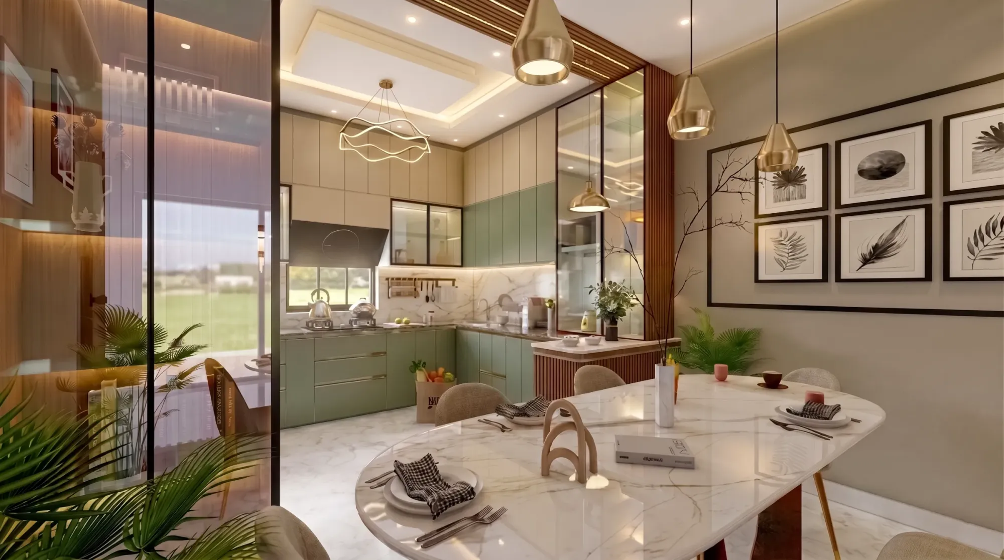
We get a version of this question every few weeks, usually from a homeowner who has just walked out of three kitchen showrooms in Salt Lake or New Town, seen the same fifteen shades of white and grey, and wants to know if colour is actually allowed. Burgundy kitchen cabinets are, in our experience, the single most requested "bold" colour in Kolkata right now, and for good reason, because it sits in that rare zone where a colour reads as dramatic in photographs and still feels liveable at 7am on a Tuesday when you are making tea.
The trouble is that burgundy is not one colour, it is a family, and the difference between a cabinet that looks like a wine bar and one that looks like a dated 2009 showroom comes down to exactly which shade you pick, what finish it sits in, and what you pair it against. So this piece is not a moodboard, it is the actual decision framework we walk clients through at Studio Contour when someone says "I want a burgundy kitchen" and we need to figure out which of the twelve real variants of that idea will actually work in their specific flat.
We have delivered 330+ buildings since we set up in New Town back in 2014, and a good chunk of those have been modular kitchens where the client wanted something with more personality than the standard grey-on-white palette, so this is grounded in what has actually held up in Kolkata homes, not what looks good in a rendering.
The burgundy spectrum: twelve shades and where each one belongs
Burgundy is basically red pushed through brown and black until it stops being loud, and depending on how far you push it, you land in a different mood entirely. True burgundy, the classic wine shade, sits right in the middle and works as an all-rounder for both upper and lower cabinets. Oxblood leans darker and browner, closer to aged leather, and we tend to use it only on lower cabinets paired with a lighter upper so the kitchen does not feel like a cave. Maroon is warmer and slightly more matte in feel, a good fit for traditional Bengali homes that want colour without going contemporary. Merlot has a violet undertone that photographs beautifully under warm lighting but can look almost black under cool white LEDs, so we always test it against your actual colour temperature setup before committing. Wine red is brighter and more saturated, best kept to an island or a feature wall of cabinetry rather than the whole run. Deep garnet, brick burgundy, aubergine-burgundy, plum, cranberry-burgundy, cherrywood burgundy and a near-black burgundy we jokingly call "midnight wine" round out the palette, each one shifting slightly toward brown, purple, or black. For a first-time bold colour buyer, we usually steer toward true burgundy or maroon, since both forgive a wider range of countertops and lighting mistakes than the more saturated ends of the spectrum.
Matte, gloss, or textured: the finish decides the mood
This is the part homeowners underestimate the most. The same exact burgundy in a high-gloss lacquer finish reads as sleek and almost jewel-toned, catching light and bouncing it around a small kitchen, which is great if your kitchen is compact and needs to feel bigger. That same shade in a matte or soft-touch laminate reads completely differently, more grounded, more like furniture than fittings, and it hides fingerprints and daily smudges far better, which matters if you have young kids or do a lot of hands-on cooking. Then there is textured or woodgrain-effect burgundy, which is having a real moment in our project briefs, where the plywood base is finished to show grain through a tinted burgundy lacquer rather than a flat opaque colour. It is more expensive to execute well because the grain has to be consistent across every shutter, but it gives a warmth that flat colour cannot.
| Gloss Burgundy | Matte Burgundy |
|---|---|
| Best for compact or dim kitchens, bounces light, shows fingerprints more | Best for daily-use family kitchens, hides smudges, feels more grounded |
| Higher shine, more maintenance, reads jewel-toned | Softer look, easier upkeep, reads more furniture-like |
| Works well with chrome or brass hardware | Works well with brushed brass or matte black hardware |
Material choices behind the colour
The colour is only as good as what it is applied to. Most of our burgundy cabinet work in Kolkata falls into three material tracks. MDF with a lacquer or PU paint finish gives the truest, most even colour and the smoothest surface, and it is what we recommend when the client wants that clean, almost automotive-paint look on the shutters. BWP-grade plywood with a laminate finish is the more budget-conscious and moisture-resistant route, especially relevant given how much monsoon humidity Kolkata kitchens deal with every year, and it holds up well in wet-zone areas near the sink. Acrylic-faced shutters give the deepest, most reflective gloss burgundy but scratch more easily and cost more, so we tend to reserve those for a feature island rather than the full run of cabinets, where daily wear is heaviest. Whatever the shutter material, the carcass underneath should still be moisture-resistant board, because a beautiful burgundy front means nothing if the box behind it swells in July.
| Material | Finish Options | Best Use | Approx. Price Tier |
|---|---|---|---|
| MDF + PU Lacquer | Matte/gloss/satin | Full kitchen or feature wall | Mid-to-premium |
| BWP Plywood + Laminate | Matte/textured | Budget-conscious full kitchen | Entry-to-mid |
| Acrylic-faced | High gloss only | Island or accent panels | Premium |
What to pair burgundy with, and what to avoid
Burgundy is a strong personality, so the rest of the kitchen needs to either support it quietly or contrast it deliberately, never compete with it. For countertops, we lean toward warm white or cream engineered stone or a light granite, which keeps the kitchen from feeling heavy, and we generally avoid black countertops with burgundy because the combination reads more funeral parlour than dining room. Brass or aged-gold hardware is the classic pairing and it works because burgundy has enough brown in it to sit naturally against warm metals, while brushed black hardware gives a more masculine, moody contemporary look if that is the direction the rest of the home is going. Backsplash-wise, a pale marble-effect tile or plain white ceramic tile lets the cabinets stay the hero, and we have seen clients try patterned backsplashes against burgundy and regret it within a year because two loud elements in one room is one too many. Flooring should stay light to mid-tone, since dark cabinets over dark floors closes a room in visually, which matters more than people expect in the smaller kitchen footprints common across New Town and Salt Lake apartments.
Layout and lighting: where the colour actually earns its keep
A burgundy kitchen lives or dies on lighting, more than almost any other colour choice, because dark saturated tones absorb light rather than bounce it, and a poorly lit burgundy kitchen just looks murky by 6pm. We always design the false ceiling and lighting layout around the cabinet colour rather than as an afterthought, layering warm under-cabinet task lighting along the kitchen work triangle with a warmer overhead wash, so the colour reads rich rather than dim. If you are only using burgundy on the lower cabinets with a lighter upper run, which is our most-requested layout by far, daylighting from a kitchen window becomes even more important, and we factor window placement into the cabinet colour decision at the design stage, not after the shutters are ordered. For open-plan kitchens that flow into the living or dining space, which is common in the newer apartment layouts we see across New Town and Rajarhat, we also think about how the burgundy reads from the sofa, since a kitchen viewed from fifteen feet away needs a slightly different value of the colour than one viewed up close.
- Test the exact shade under your kitchen's actual lighting, not the showroom's
- Confirm carcass material is moisture-resistant regardless of shutter finish
- Decide gloss vs matte before finalising hardware colour
- Keep countertop and backsplash light to let cabinets stay the focal point
- Plan lighting layout around the colour, not as an afterthought
Budget bands and where the money actually goes
Clients often assume burgundy costs more than white or grey simply because it looks premium, but the colour itself rarely moves the price much, it is the finish and material that do. A laminate-finish burgundy modular kitchen in BWP plywood typically sits in the same entry-to-mid price band as any other laminate kitchen of comparable size. Move to a lacquered MDF finish and the price climbs into the mid-to-premium band, largely because PU lacquer application is a slower, more skill-dependent process that needs a controlled spray environment to avoid an uneven sheen. Acrylic-faced burgundy, especially in high gloss, sits at the top end, and we usually recommend it selectively rather than across an entire kitchen run for exactly that reason. Hardware, soft-close mechanisms, and any custom cabinetry detailing like fluted panels or integrated handles add on top of the base material cost, and this is where we sit down with clients early and map out what actually needs the premium touch versus where a simpler detail does the job just as well.
Working with an interior designer who gets colour right
The catch here is that a bold colour like burgundy is genuinely harder to design around than a neutral, and it is exactly the kind of decision where having an experienced hand matters, because the difference between a burgundy kitchen that looks intentional and one that looks like a mistake usually comes down to five or six small calls made early, the shade, the finish, the countertop pairing, the lighting temperature, none of which are obvious until you have seen a few dozen of them go right and wrong. At Studio Contour we run every colour-forward kitchen through 3D visualisation before a single shutter is ordered, so clients see exactly how the burgundy behaves under their actual room's light and layout rather than guessing from a sample chip. We also factor Vastu Shastra preferences into kitchen placement and colour orientation for families who want that alignment, which is a fairly common ask across the Bengali households we work with, and our Vastu-compliant design service folds that in without compromising the aesthetic. If your kitchen sits within a larger renovation rather than a fresh build, our renovation and remodeling team handles the sequencing so the rest of the home is not disrupted longer than it needs to be. You can see how a warm-toned modular kitchen comes together in practice in our warm wood modular kitchen project, which shares a lot of the same lighting and pairing logic we apply to burgundy builds.
A few things homeowners get wrong the first time
The most common mistake we see is choosing the shade off a phone screen or a Pinterest board without accounting for how different burgundy looks under Kolkata's typical LED lighting versus the warmer tungsten tones in a lot of reference photography, so what looked rich online arrives looking almost brown or, worse, almost black. The second is going full burgundy on every surface, upper and lower cabinets, island, and pantry unit, which overwhelms even a large kitchen, when a mixed approach with a neutral upper run almost always reads better and costs less. The third, and this one we cannot stress enough, is skipping a physical sample panel because the digital rendering looked convincing enough, when in reality lacquer sheen, laminate texture, and even the grain direction on a woodgrain-effect finish all read differently in person than on a screen. If you are also reconsidering your broader kitchen layout, our guide on apartment and flat interiors in New Town covers how kitchen zoning typically works within the space constraints of newer builds in the area, and it is worth a read before locking in cabinet colour, since layout and colour decisions genuinely feed into each other.
- 01Shade + finish selection and sample panel testing
- 02Material and hardware finalisation
- 033D visualisation and layout lock
- 04Fabrication and on-site fitting (8-12 weeks typical)
- 05Final styling and handover
At the end of the day, a burgundy kitchen is one of those projects where the idea is easy to fall in love with and the execution is where most people stumble, which is basically the entire reason a design studio exists in the first place. We have been doing this across Kolkata and West Bengal since 2014, from compact New Town flats to larger bungalow kitchens, and if you are weighing a bold colour move for your own kitchen, get in touch with Studio Contour and we will walk you through what specific shade, material, and layout combination actually makes sense for your space, your light, and your budget, before you commit to anything.