








Olive Green Modular Kitchen Ideas and the Colours to Pair Them With
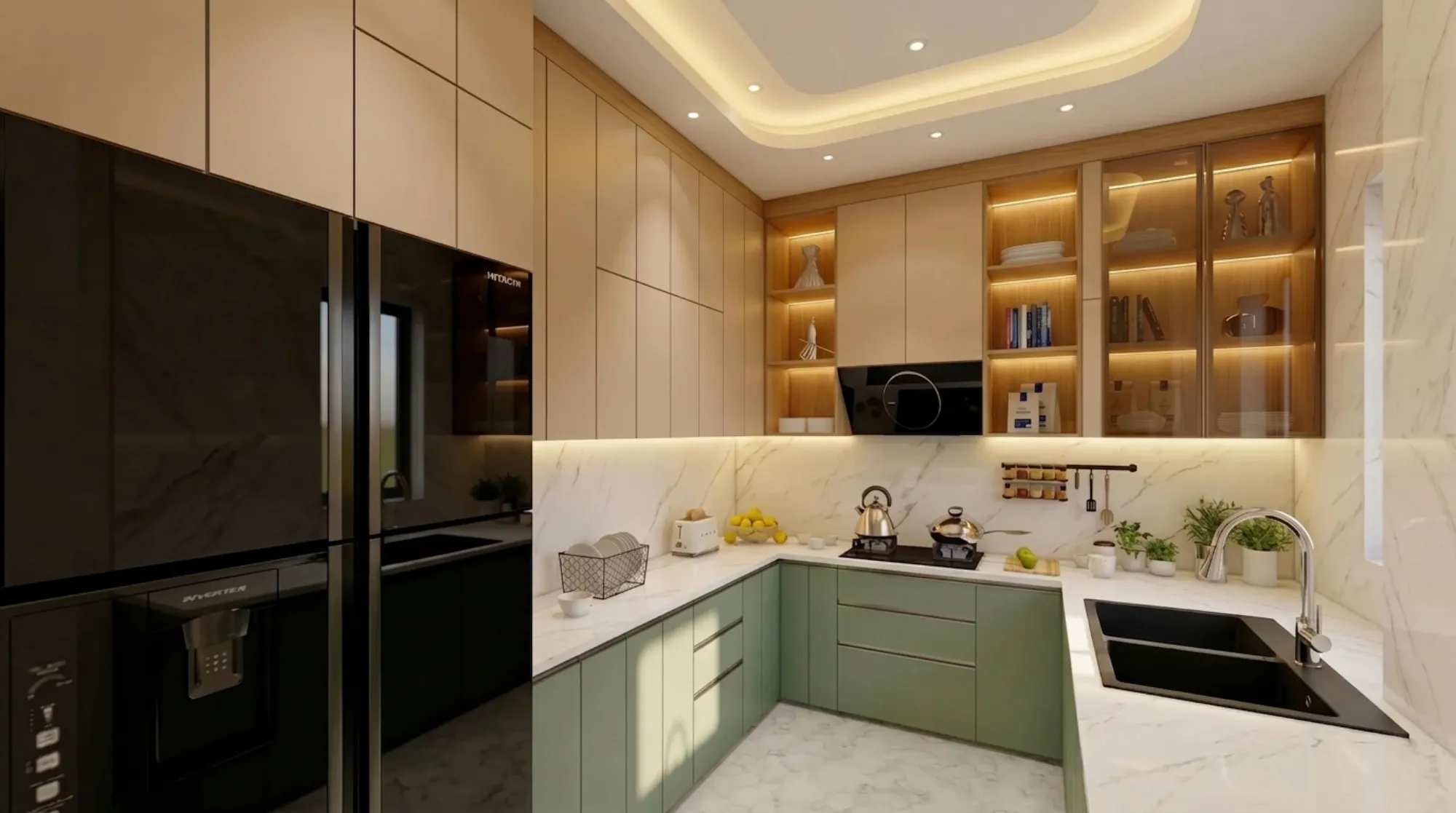
Olive green modular kitchens have gone from a niche request to one of the most searched kitchen colours across Kolkata and West Bengal in the last two years, and once you have stood in front of a few sample shutters in this shade, you understand why, because it does something most kitchen colours cannot, which is sit warm and earthy under daylight and then turn moody and sophisticated the moment the evening lights come on.
At Studio Contour we have been specifying olive green cabinetry for homes across New Town, Salt Lake, Rajarhat, Behala and further out into the districts for a few years now, and the questions we get are almost always the same, right, which undertone of olive actually works in a Kolkata flat with limited daylight, what colours to pair the green with so the kitchen does not end up feeling like a single dark box, which countertop and hardware combinations photograph well but also survive a working Bengali kitchen with daily fish frying and turmeric staining, and roughly what this costs compared to a standard white or grey modular setup.
This piece is basically our answer to all of that in one place, covering the different olive undertones and where each one works best, the wall, countertop, flooring and hardware colours that genuinely pair well, matte versus gloss versus textured finish choices, layout and lighting considerations specific to darker cabinetry, and the budget bands you should actually plan around, so that by the end you are not just picking a colour off a shutter card but making a decision that holds up in your specific kitchen, on your specific floor plan, for the next decade or more.
The Different Shades of Olive Green, and Why the Undertone Matters More Than the Name
The catch here is that "olive green" on a laminate sample book can mean at least four genuinely different colours, and picking the wrong one for your kitchen's light exposure is the single most common regret we see. A warm, yellow-leaning olive reads almost mustard-adjacent and works beautifully in kitchens that get strong afternoon sun, which describes a lot of west and south facing flats in Salt Lake and Behala, because the warmth in the cabinet balances the harsh daylight instead of fighting it. A cooler, grey-leaning olive, sometimes labelled sage-olive or moss on catalogues, is the safer pick for north facing kitchens or ones lit mostly by artificial light, since it does not turn muddy the way a warm olive can under a cool white tube light. Then there is deep bottle-olive, almost forest green, which we tend to reserve for larger kitchens or for just the base cabinets in a two-tone layout, because on every wall of a small galley kitchen it will visually shrink the room. For an open-plan apartment layout, which is now the norm in most New Town and Rajarhat towers we work in through our apartment and flat interior projects in New Town, the undertone you choose in the kitchen also needs to sit comfortably next to whatever is happening in the adjoining living space, so we usually pull the wall paint and the living room's dominant tone into the sample comparison before anyone signs off on a shutter colour.
Colours That Actually Pair With Olive Green Cabinetry
This is where most kitchen mood boards go wrong, because people pick a striking green and then surround it with more strong colour, and the kitchen ends up fighting itself. Olive is a grounded, earthy colour, so the pairings that work best are the ones that let it stay the hero. Warm white and off-white walls remain the most reliable pairing across every project we have delivered in this palette, because they lift the room and stop the olive from reading heavy, especially in kitchens under 100 square feet. Warm wood tones, whether that is a walnut-finish tall unit, a teak-look breakfast counter, or oak laminate flooring, are the second most common pairing we specify, and if you want to see this combination in a completed home rather than just described, our warm wood modular kitchen project in Kolkata is a good reference for how the two tones sit next to each other in real cabinetry rather than a rendering. Brass and antique gold hardware, handles, and tap fittings genuinely transform an olive kitchen, because the warm metal against the earthy green reads expensive without the cost of expensive material, and it is one of the cheapest single upgrades a client can make to lift the whole kitchen. Terracotta and burnt orange work as accent colours in small doses, a runner, a set of bar stools, open shelving accessories, but we would not recommend them on a full wall or backsplash because two earthy tones at that scale compete rather than complement. Black, in a thin frame, a tap, a handle profile, or a single black-and-brass pendant light, sharpens the whole palette and stops it from feeling too soft.
| Pairs Well With Olive Green | Use With Caution |
|---|---|
| Warm white or ivory walls | Bright white walls with cool undertone |
| Brass, antique gold, or brushed bronze hardware | Chrome or bright silver hardware |
| Warm wood tones, walnut, teak, oak | Cool grey wood tones like ashwood or wenge |
| Cream, beige, or light travertine-look flooring | Dark grey or black flooring in a small kitchen |
| Terracotta or rust as a small accent | Terracotta as a full backsplash or wall colour |
| Warm-white or 2700K to 3000K lighting | Cool 6500K lighting throughout |
Matte, Gloss or Textured, and Why Finish Changes Everything
The finish you choose on olive green shutters matters almost as much as the shade itself, and this is a conversation we have on nearly every modular kitchen design brief. Matte PU and matte laminate are what most of our clients land on, because olive in a matte finish looks natural and grounded, closer to the actual colour of the plant, and it hides fingerprints and daily smudges far better than gloss, which for a kitchen that gets real daily cooking use matters more than people expect going in. High-gloss acrylic in olive green looks stunning in a showroom and in photographs, since the sheen catches light beautifully, but it shows every fingerprint, water spot, and oil smudge almost immediately, so we generally recommend it only for kitchens with domestic help managing daily upkeep or for a smaller accent section rather than the full run of cabinetry. Textured and matt laminate finishes with a soft-touch or fabric-like grain are the newer option gaining traction in our 2026 projects, because they add depth to the colour without the maintenance burden of gloss, and they photograph almost as well as acrylic while wearing considerably better over five to seven years of daily use.
| Finish | Look and Feel | Maintenance | Typical Use | ||||
|---|---|---|---|---|---|---|---|
| Matte PU | Rich | velvety | closest to natural olive | Low | hides smudges well | Full kitchen runs | most common choice |
| High-Gloss Acrylic | Reflective | vivid | photographs brilliantly | High | shows every fingerprint | Accent panels or low-touch households | |
| Textured Laminate | Soft-touch grain | subtle depth | Low to moderate | Full kitchen runs | budget-conscious | ||
| Membrane Foil | Smooth | seamless | moulded edges | Moderate | can peel at edges over years | Curved or edge-heavy cabinet designs |
Countertops, Backsplash and the Details That Tie the Kitchen Together
Once the cabinet colour and finish are locked, the countertop decision is what most clients underestimate, because it is the surface that gets the most daily contact and the most visual weight after the cabinetry itself. White or cream engineered stone remains the most versatile countertop against olive green, since it keeps the kitchen bright and does not compete with the cabinet colour, and unlike natural marble it resists the turmeric and oil staining that a Bengali kitchen's daily cooking produces. For clients who want more visual interest, a honed granite in a warm beige or a light quartz with subtle veining both work well, and for the backsplash specifically, plain white or cream ceramic tile in a simple subway or handmade-look pattern lets the green do the talking rather than adding a second competing pattern into the room. Where budget allows, we have also used a warm travertine-look tile for backsplashes in a few recent projects, and it pairs particularly well with brass hardware and warm wood open shelving. This is also the stage where lighting decisions matter enormously, because olive green absorbs more light than a white or light grey kitchen does, so under-cabinet lighting and a well-planned false ceiling and lighting design with warm colour temperature fixtures around the 2700K to 3000K range stops the kitchen from reading dim or cave-like, which is a genuine risk with darker cabinetry in Kolkata flats that already have modest window openings.
Layout, Ergonomics and Making a Dark-Toned Kitchen Feel Larger, Not Smaller
A well-planned layout matters more in a darker colour kitchen than in a light one, because poor spacing and cramped circulation are far more visible against olive green than against white. We always start layout conversations by mapping the kitchen work triangle, the distance between the stove, sink, and refrigerator, because in an olive green kitchen every extra unnecessary step is a step the eye also has to travel across a heavier colour, and tightening that triangle genuinely makes the room feel more efficient and less closed in. For galley and L-shaped kitchens under 80 square feet, which describes a large share of the New Town and Salt Lake apartments we work in, we generally recommend keeping olive green on the base cabinets only and running the wall units in a lighter warm white or a matching laminate, which keeps the sightline open above counter height while still giving you the full character of the colour where it is seen most. Open shelving in a warm wood finish, rather than full-height wall cabinets, is another trick that works particularly well here, since it breaks up the mass of colour and gives the kitchen a lighter, layered feel. Good ergonomics also means thinking about counter height, drawer depth, and pull-out storage rather than fixed shelving, and this is where working with a studio that treats the kitchen as one connected system, cabinetry, appliances, lighting, and storage together, rather than a shutter colour picked off a catalogue, actually shows up in daily use.
- Confirm undertone against your kitchen's actual daylight direction, not showroom lighting
- Choose matte or textured finish if the household does daily cooking without domestic help
- Keep countertop and backsplash light to balance the cabinet colour
- Plan warm 2700-3000K lighting, especially under-cabinet strips
- Sample brass or antique gold hardware before committing to chrome
- Tighten the work triangle in kitchens under 80 square feet
What It Actually Costs, and Where the Money Goes
Olive green modular kitchens do not have a fixed premium over any other colour, since the colour itself adds negligible cost, what actually moves the budget is the finish, the plywood grade behind the shutter, and the countertop material you pair it with. A matte laminate olive kitchen on BWP-grade plywood carcasses typically sits in the same band as any other mid-range modular kitchen in Kolkata, while moving to matte PU shutters or high-gloss acrylic pushes the cost up meaningfully, largely because of the additional coating and finishing process rather than the colour itself. Countertop choice swings the budget more than people expect, engineered stone and quartz sit at the higher end but resist staining far better over a ten-year horizon, while granite offers a more moderate middle ground with slightly more maintenance. Hardware, soft-close hinges, drawer channels, and pull-out units add up faster than most homeowners plan for, and this is usually where we sit down with a client and walk through where to spend and where to hold back, because a beautifully coloured shutter on cheap hinges is a kitchen that looks tired within eighteen months. If you are still at the stage of comparing what a full interior fit-out costs across different scopes, our broader guide on architect fees in Kolkata is a useful starting point before you get into kitchen-specific line items.
Bringing It Together With the Right Design Partner
None of this, the undertone, the finish, the countertop pairing, the lighting temperature, the layout tightening, is a decision you should be making shutter sample by shutter sample without someone mapping it against your actual floor plan and daylight direction, and that is exactly the gap our studio exists to close. We have been designing and delivering interiors and full residential projects across Kolkata and West Bengal since 2014, with 330+ buildings completed, and modular kitchens in this exact olive-and-warm-wood palette have been a recurring, well-loved request across our residential interior design and custom furniture design work over the last two years. Whether you are furnishing a new flat in New Town, renovating an older kitchen in Behala or Tollygunge, or simply trying to move past a mood board into a working plan with real material and cost numbers, we would rather walk you through actual samples and a proper layout than let you guess from a catalogue photo. Our design process typically moves from concept to a working 3D visualization within the first couple of weeks, and full interior execution generally runs 8 to 12 weeks depending on scope, so if an olive green kitchen has been sitting on your Pinterest board for a while now, get in touch with Studio Contour and let us turn it into a kitchen you actually cook in every day.