








Two-Tone Kitchen Ideas Popular in Rajarhat and New Town Homes
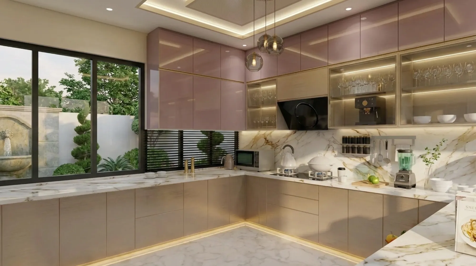
Walk into ten kitchens across Rajarhat and New Town right now and you will notice something odd: barely any of them are one flat colour anymore. Homeowners in Action Area I, II and III, and further up toward Eco Park, have moved on from the all-white or all-wood kitchen that dominated the last decade, and they are asking us for two-tone setups instead, where the base cabinets carry one colour and the wall units carry another, or the island breaks away entirely from the rest of the run.
We have designed enough kitchens across New Town's mid-rise flats and independent G+2, G+3 builds to say this with some confidence: two-tone works here specifically because of how these homes are built. Open kitchens that spill into the living and dining area are common in newer New Town flats, so the kitchen is no longer a closed room you can paint however you like and shut the door on, it is on display all day, and a two-tone palette gives it enough personality to hold its own against the living room without shouting.
This piece walks through the colour pairings we actually specify for New Town and Rajarhat clients, the materials that survive Kolkata's humidity and monsoon without warping or staining, how layout changes what two-tone should even look like in your kitchen, and the small hardware and lighting decisions that separate a kitchen that photographs well from one that also works at 7am on a Tuesday.
Why two-tone reads so well in New Town's open-plan kitchens
The open kitchen is basically the default now in New Town's newer apartment stock and in the independent houses we build across Action Area II and III, and it changes the design brief completely. A closed kitchen can be loud, moody, whatever you want, because nobody sees it except the person cooking. An open kitchen has to sit inside a sightline that includes your sofa, your dining table, sometimes your entrance hallway, and a single strong colour across every cabinet in that view tends to flatten the whole space into one note.
Two-tone solves this without turning the kitchen into a design statement that fights the rest of the house. Typically we keep the lower cabinets in a deeper, grounded colour, charcoal, bottle green, a warm terracotta, or a matte navy, because that is the zone that takes daily wear, spills, trolley scuffs, the works. The upper cabinets and any open shelving go lighter, often a warm white, a soft sand, or a pale sage, which keeps the ceiling line from feeling heavy and helps the kitchen bounce whatever daylighting it gets, and New Town flats generally get decent daylight given the wider road setbacks compared to older parts of the city.
For clients doing a full residential interior design package with us, the kitchen palette usually gets decided alongside the living and dining finishes precisely because of this sightline issue, not in isolation. It is one of the first things we flag in the interior designer in New Town conversations we have with new clients, because getting this sequencing wrong means redoing the kitchen colour after the living room is already finished, which nobody wants.
The colour pairings we keep coming back to
A handful of combinations show up again and again in our New Town and Rajarhat projects, and there is a reason each one keeps getting picked rather than it just being trend-chasing.
Charcoal with warm white is the safest and most requested, mostly because it photographs well and ages well, the charcoal hides fingerprints and daily grime on the lower units while the white keeps the upper half from feeling like a cave. Bottle green paired with sand has become the one clients specifically ask for after seeing it somewhere else in New Town, and it works particularly well in flats with wooden or wood-look flooring since the green sits comfortably next to warm tones. Terracotta with off-white leans into a slightly more regional, warmer palette that a lot of independent house clients in Action Area III gravitate toward, and navy with light oak tends to get picked by younger couples doing their first flat who want something that reads modern without going stark.
The mistake we see people make on their own, before they come to us, is picking both tones purely off a Pinterest image without checking how either colour behaves under their kitchen's actual lighting and against their chosen countertop. A deep bottle green that looked rich in a north-facing kitchen in someone else's flat can look almost black under the warmer colour temperature lighting common in a lot of New Town kitchens, so we always test finishes under the client's actual fixtures before locking anything in, which is part of why we push clients toward our 3D visualization and rendering service before cabinetry orders go in.
Materials that actually survive Kolkata's humidity
Two-tone only looks good for as long as both finishes hold up, and Kolkata's monsoon and general humidity are unforgiving on the wrong material choice, so this is not a purely aesthetic decision.
- Choose exterior-grade laminate or PU finish over paint on MDF for lower cabinets facing water splash
- Specify BWP-grade plywood carcasses, not just for the sink unit but across the whole run, given Kolkata's ambient humidity
- Ask for edge-banding on every visible cut edge, this is where [plywood](https://en.wikipedia.org/wiki/Plywood) swells first if it is skipped
- Pick a countertop material, engineered stone generally, that will not stain or etch against the darker of your two cabinet tones
- Confirm hinge and channel hardware is rated for humid conditions, not the base-grade fittings some contractors default to
We lean on engineered stone for countertops in most of our two-tone kitchens because it takes colour contrast well against both a dark and light cabinet run and does not need the periodic sealing that natural stone does in this climate. On cabinetry itself, the finish matters more than the substrate in a two-tone setup, because a matte PU finish on the darker tone hides water spotting far better than a high-gloss laminate, which is exactly the surface where every fingerprint and grease mark shows against a dark colour. If your kitchen is part of a larger renovation rather than a fresh build, this is also where our renovation and remodeling team usually finds the existing carcass needs replacing entirely rather than just refacing, because older New Town kitchens built a decade ago were rarely specified with BWP-grade ply to begin with.
Layout decides where the two tones actually go
Two-tone is not just a colour decision, it is a layout decision, because the whole point is using colour to separate zones, and that only works if the zones themselves are laid out sensibly. This is where the kitchen work triangle, the relationship between your stove, sink and refrigerator, still matters even in an open-plan New Town kitchen, because the darker tone should generally sit along the wet and heat zone, sink, hob, prep counter, while the lighter tone frames the drier storage and display zone.
| Kitchen shape | Where the darker tone works best | Where the lighter tone works best |
|---|---|---|
| L-shaped (most common in New Town 2-3BHK flats) | Base run along sink and hob wall | Tall unit and upper cabinets on the return wall |
| Island or peninsula (larger Action Area II/III villas) | Entire island in the deeper tone as an anchor | Perimeter cabinets in the lighter tone |
| Galley (older Salt Lake and compact New Town flats) | Lower cabinets both sides | Upper cabinets and open shelf |
In the L-shaped layouts that dominate New Town's 2 and 3BHK flats, we usually run the darker tone along the wet wall and let the lighter tone take over on the drier return, which also happens to be where most clients want open shelving for display. In the larger independent houses we build across Action Area II, where an island or peninsula is possible, the island itself becomes the natural home for the darker, more dramatic tone since it is the piece of furniture in the room, not just storage, and the surrounding perimeter cabinets stay lighter so the room does not feel boxed in. We detailed a similar layout logic on one of our recent New Town builds, which you can see in our Salt Lake residential interior project writeup, where the same colour-zoning principle was applied to separate the cooking wall from the dining-facing storage.
Custom cabinetry helps here too, because off-the-shelf modular systems rarely give you the flexibility to run two different finishes across a layout that is not a standard straight or L-run, which is one reason clients doing anything beyond a basic rectangular kitchen usually end up talking to our custom furniture design team alongside the modular kitchen design scope.
Lighting and hardware, the details that make or break it
A two-tone kitchen lives or dies on its lighting, because the whole contrast effect disappears under flat, single-source overhead light. We almost always specify a layer of under-cabinet lighting along the upper units in these kitchens, which does two things at once, it lights the countertop where you actually need task light, and it creates a visible line of separation between the two tones that reads as intentional rather than a paint job that ran out halfway.
A false ceiling with a recessed cove above the kitchen zone, tied into our false ceiling and lighting design scope, lets us wash the upper cabinets in a slightly warmer light than the under-cabinet strip, which flatters both the lighter tone and whatever wall finish continues into the living area. Hardware is the other detail people underestimate, matte black or brushed brass handles tend to work across both tones without picking a side, while chrome can look slightly cold against warmer palettes like terracotta or sand. If your household includes small children or ageing parents, it is also worth reviewing handle height and drawer soft-close specs early, something our Vastu compliant design and general planning conversations often surface anyway when we discuss kitchen orientation against Vastu Shastra preferences that a lot of our New Town clients still want factored in, even in an otherwise contemporary kitchen.
- 01Colour and material shortlist against your actual lighting
- 023D visualization of both tones in your layout
- 03Cabinetry and countertop fabrication
- 04Site install with under-cabinet and cove lighting
- 05Final walkthrough and hardware adjustment
Bathrooms attached near the kitchen zone in some New Town duplex layouts sometimes pick up the same palette for visual continuity, and if that is on your mind alongside the kitchen work, it is worth a quick look at our bathroom design page as well, since matching grout and fixture tones across two adjacent wet areas is a common ask we get once the kitchen palette is locked.
At the end of the day, a two-tone kitchen is a small decision on paper and a fairly involved one in practice, colour, material, layout, lighting and hardware all have to agree with each other, and with your home's actual light and the way your household actually cooks. We have run this exact conversation across enough kitchens in New Town, Rajarhat and Salt Lake over the last decade, more than 330 buildings delivered since 2014, that we can usually tell within the first site visit which pairing and which layout is going to hold up for you long-term rather than just looking good in the render. If you are planning a kitchen, or a full interior fit-out, and want to talk through what would actually work for your flat or plot, get in touch with us and we will walk you through it.