








Which Kitchen Colours Hide Stains and Fingerprints Best?
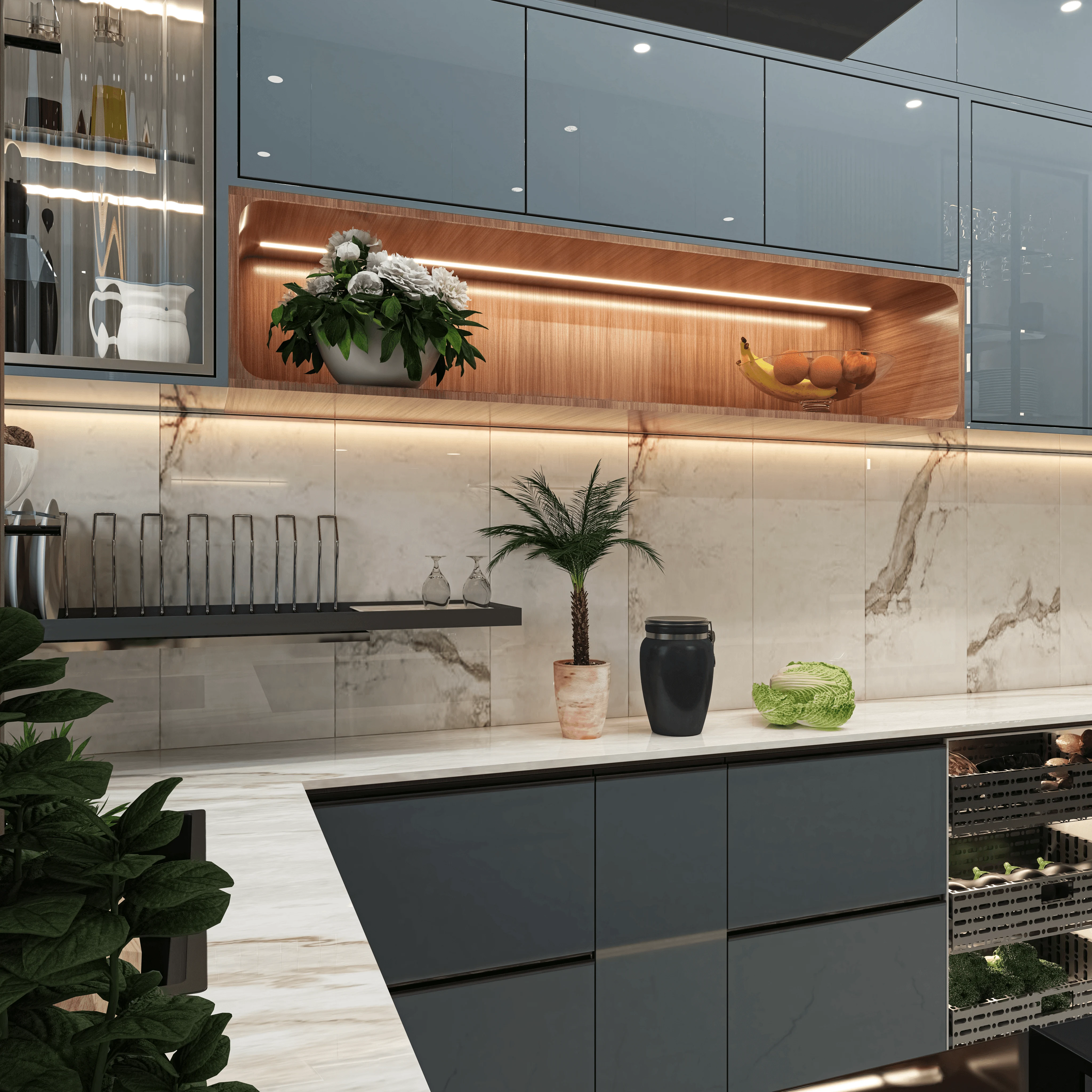
We get this question in almost every kitchen consultation, usually right after the client has picked a cabinet colour off a Pinterest board and then asked, almost as an afterthought, "but will this show every fingerprint by Friday." It is a fair worry. A kitchen in Kolkata gets more daily abuse than any other room in the house, between the mustard oil splatter, the humidity that leaves a faint film on every surface by evening, and the number of hands that touch the same cabinet door forty times a day. The colour and finish you choose is not a cosmetic decision here, it is a maintenance decision that you will live with for the next ten to fifteen years.
So this piece is going to go deeper than a simple list of "dark colours hide stains, light colours don't." That is true in a narrow sense but it misses the bigger picture, because sheen, material, lighting, and even the direction your kitchen window faces all change how visible a smudge actually is. We have delivered 330+ buildings since we started Studio Contour in 2014, working out of New Town and across Kolkata and West Bengal, and the modular kitchen is very often the single most re-touched room in any project we do, right up there with the modular kitchen design briefs where the client changes their mind on colour at least once before finalising material.
Below we walk through the colour families that genuinely perform well against grease and fingerprints, the finishes that matter as much as the colour itself, the countertop and backsplash pairings that either help or sabotage your cabinet choice, and roughly what each option costs to execute well in this market.
Matte and honed finishes beat glossy ones almost every time, regardless of colour
This is the part people skip past because they are so focused on the colour swatch, and it is basically the single biggest lever you have. A high-gloss acrylic or PU finish in any colour, including black, will show fingerprints and water spots because the sheen reflects light and any disruption to that flat reflective surface becomes visible from across the room. A matte or satin finish in the exact same colour absorbs light instead of bouncing it back at you, so a light grease smudge or a kid's handprint simply does not register the same way. We have had clients insist on high-gloss white for the "5-star hotel" look and then call us back within three months asking why the cabinet fronts look permanently dirty, right after we told them upfront that gloss and daily-use kitchens are a difficult combination in a humid city. The catch here is that gloss finishes are not wrong for every application, they just need to go somewhere with less hand contact, like a display unit or a false ceiling cove edge, not the main door panels people touch every time they open the fridge or reach for a spice jar.
| Matte / Satin Finish | High-Gloss Finish |
|---|---|
| Hides fingerprints and light grease well | Shows every touch and smudge instantly |
| Easy to wipe with a dry or lightly damp cloth | Needs frequent glass-cleaner style wiping |
| Slight texture masks minor scratches | Any scratch is highly visible under light |
| Works in almost any colour, light or dark | Only really forgiving in darker tones |
| Slightly higher cost on acrylic ranges | Marginally cheaper on standard laminate |
The colour families that actually perform well in daily use
Once finish is sorted, colour does still matter, and a few families consistently outperform the rest in the kitchens we have handed over. Warm mid-tone woods, the kind that sit between honey oak and walnut, are probably the single best-performing option because natural wood grain already has variation built into it, so a fingerprint or a light stain just blends into the existing pattern instead of standing out as a flat mark on a flat colour. We used exactly this logic on a recent warm wood modular kitchen project where the client specifically wanted something that would not need daily wiping down given how often the household cooks. Deep, muted colours in the charcoal, bottle green, and navy family come next, they read as elegant and intentional rather than "dark for the sake of it," and because they already sit low on the value scale, grease marks and fingerprints do not create the same stark contrast that they would against a pale surface. Terracotta, olive, and warm greige tones are the third strong category, and they happen to suit Bengal light particularly well, since the colour temperature of natural daylight coming through most New Town and Salt Lake apartment windows tends to be warm rather than cold, so warm cabinet tones look richer and any marking gets visually absorbed rather than highlighted.
White is the colour we get asked about most and it deserves an honest answer rather than a blanket yes or no. Pure bright white in any glossy finish is genuinely the worst combination for stain and fingerprint visibility, full stop. But an off-white or warm ivory in a matte or textured finish behaves completely differently, because it is close enough to white to still feel bright and open in a small kitchen, while the slight warmth and texture do a lot of the same forgiving work that wood grain does. If you love the light, airy look, go warm-white matte rather than stark-white gloss, and you will get most of the aesthetic without most of the maintenance headache.
Material choice changes the equation almost as much as colour does
The base material under the colour and finish decides how the surface ages, not just how it looks on day one. Laminate over plywood is still the most common and cost-effective route for cabinetry in this market, and a textured or matte laminate in a mid-tone colour genuinely resists fingerprints better than a smooth laminate does, because the micro-texture scatters light the same way a matte paint finish would. Acrylic gives you that ultra-smooth, high-shine look people associate with modern kitchens, but as covered above, that shine is exactly what makes marks visible, so we generally steer clients toward acrylic only for accent panels or islands rather than full wraparound cabinetry in a busy family kitchen. PU (polyurethane) finish sits in between, it can be specified matte, and a matte PU in a deep colour is one of the more premium-feeling, low-maintenance combinations available, though it does sit at a higher price point. Veneer, real wood veneer specifically, behaves almost like solid wood in terms of hiding marks, thanks to natural grain variation, but it needs more careful sealing given Kolkata's monsoon humidity, and it is not the budget option.
| Material | Best For | Fingerprint Resistance | Typical Price Band | |
|---|---|---|---|---|
| Textured Laminate | Everyday family kitchens | High | Budget to Mid | |
| Matte Acrylic | Small accent areas or islands | Medium | Mid to Premium | |
| Matte PU | Full cabinetry | premium feel | High | Premium |
| Wood Veneer | Warm-tone statement kitchens | High | Premium |
Countertop and backsplash pairing matters more than people think
A dark, forgiving cabinet colour can still end up looking messy if the countertop and backsplash above it are the wrong pairing, so this is not a decision you make in isolation. Engineered stone and quartz countertops with a fine, speckled pattern hide water spots and flour dust far better than a single flat colour slab, and this holds true whether your cabinets are light or dark. Solid dark granite hides oil stains extremely well but shows dried water rings under certain kitchen lighting, so a honed rather than polished finish on the granite solves most of that. For backsplash, glossy subject tile is where a lot of otherwise well-planned kitchens fall apart visually, because the splash zone behind the stove and sink is exactly where grease lands most, and a glossy tile there magnifies it the same way a glossy cabinet door would. A matte or textured ceramic tile backsplash, or a slab in a similar tone to the countertop, keeps that zone looking clean between cleanings. We coordinate all of this at the concept stage through 3D visualization and rendering before anything gets ordered, specifically so a client can see how a cabinet colour, countertop pattern, and backsplash finish sit together under actual kitchen lighting rather than guessing from three separate sample chips.
- Choose matte or satin over high-gloss for main cabinet fronts
- Pick warm wood, deep muted, or warm-white tones over stark white or black gloss
- Match countertop pattern (speckled stone) to camouflage water spots
- Keep backsplash matte or textured, especially behind the stove
- Get lighting and [daylighting](https://en.wikipedia.org/wiki/Daylighting) checked at concept stage, not after install
Where budget actually goes, and why layout still comes first
Clients sometimes assume the colour and finish decision is the expensive part, when in our experience the layout and hardware decisions usually cost more and matter more for daily livability. That said, the finish upgrades do carry a real cost difference worth planning for. Standard textured laminate in a mid-tone colour typically sits at the lower end of a modular kitchen budget, matte PU or acrylic accents push the number up meaningfully, and full veneer cabinetry sits at the premium end. None of this should be decided in isolation from the rest of the kitchen's function though, and we always tell clients to lock the kitchen work triangle, the storage plan, and the ergonomics of counter heights before finalising colour, because a beautiful low-maintenance finish on a poorly planned layout is still a kitchen people struggle to cook in every day.
A note for older homes and full renovations
If you are working within an older Kolkata flat rather than a fresh build, the colour decision often gets tangled up with a bigger renovation scope, structural changes, replumbing, sometimes even a full layout reset. We handle this regularly under our renovation and remodeling work, and it is worth reading through what a comparable wet-area renovation actually costs before you fix a budget in your head, our piece on bathroom renovation cost breakdown in Kolkata is a useful reference point even though it is a different room, because the underlying cost logic of material tiers and labour scheduling carries over almost directly to kitchens. On the planning side, if you are also weighing what an architect versus a straight interior designer should be doing on your project, our guide on interior designer in Kolkata walks through that distinction plainly. And increasingly we are running kitchen and storage layouts through AI-assisted tools before finalising cabinet runs, which our note on AI furniture layout optimization covers if you want the technical side of how that speeds up iteration.
At the end of the day, the colour that hides stains and fingerprints best is the one that matches your actual cooking habits, your kitchen's light exposure, and a finish that was chosen deliberately rather than picked off a catalogue cover. We have run this exact conversation with families across New Town, Salt Lake, and every corner of Kolkata and West Bengal for over a decade now, and the kitchens that age well are almost always the ones where colour, material, and layout got decided together rather than bolted on separately at the end. If you are planning a new kitchen or rethinking an existing one, our team at Studio Contour is happy to walk through your specific layout, lighting, and budget, get in touch with us and we will help you land on a colour and finish combination that actually holds up to how your household cooks, not just how it photographs on day one.