








20 Kitchen Colour Combinations That Make a Small Kitchen Look Bigger
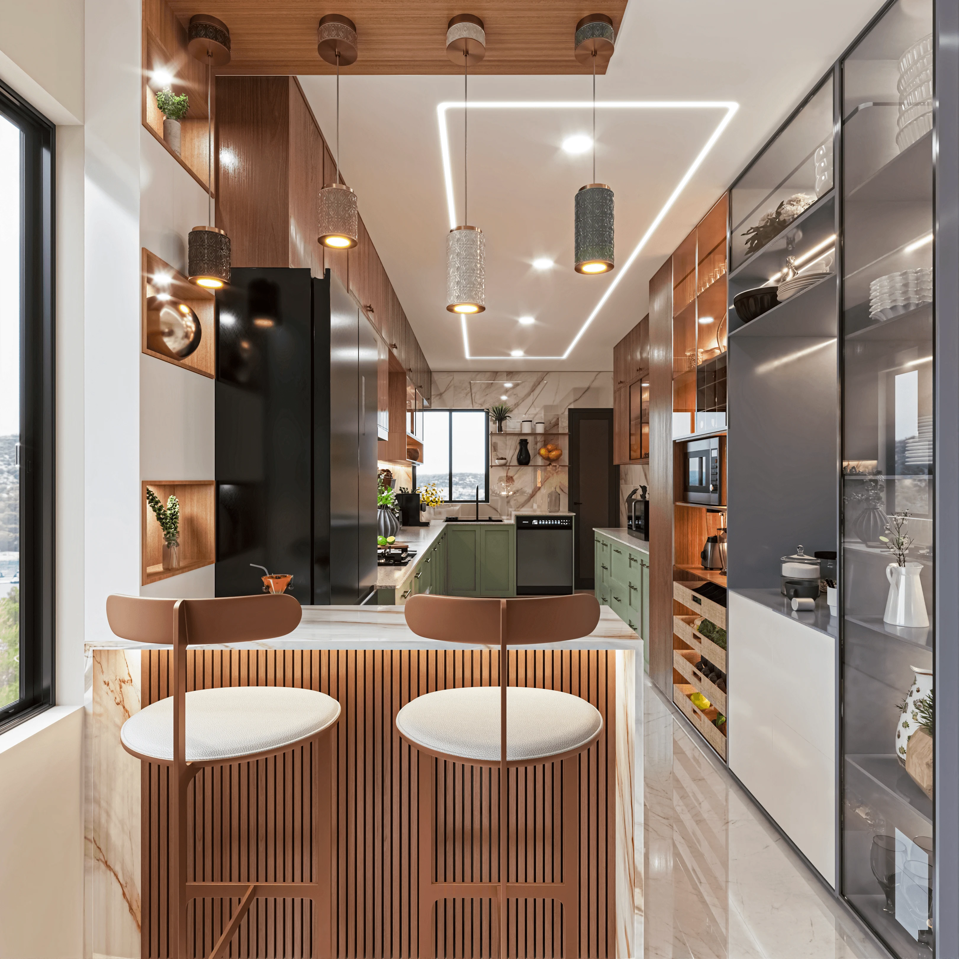
Most homeowners we meet in Kolkata assume that a small kitchen needs a small renovation budget and a small amount of thinking, and that is usually where things go wrong, because the colour combination you choose does more to change how a compact kitchen feels than almost any structural change you could make. We have walked into 8x6 feet kitchens in Salt Lake apartments that felt genuinely cramped under a dark laminate and a single tube light, and we have walked into kitchens the exact same size in New Town that felt open and easy simply because the cabinet colour, the backsplash, and the counter were chosen to work together instead of fighting each other.
This piece is basically a working reference, the kind of thing we hand a client during the design brief stage, covering 20 specific colour combinations that consistently make small kitchens read larger, along with the material logic behind each one, the finish choices that either help or hurt, and where Vastu Shastra preferences fit into the picture for families who care about it. We have delivered 330+ buildings since 2014 and modular kitchens are one of the categories we get asked about most, so this is drawn from what actually gets specified on site, not a generic colour wheel exercise.
Why colour does more work than layout in a small kitchen
A small kitchen is fighting two things at once, limited floor area and usually limited daylighting, and colour is the lever that addresses both without moving a single wall. Light, reflective surfaces bounce whatever daylight or artificial light exists around the room instead of absorbing it, so the kitchen reads brighter and the boundaries of the room become harder for the eye to pin down precisely, which is the actual mechanism behind "looks bigger." The colour temperature of your lighting matters just as much as the paint or laminate shade, because a cool white LED over a warm beige cabinet will fight the cabinet's undertone and make the whole room look muddy, while the same cabinet under a warmer 3000K light reads calm and cohesive. This is also where the kitchen work triangle comes in, because a well-planned triangle reduces visual clutter in the workflow zones, and less clutter reads as more space even before you touch colour at all.
The 20 combinations that actually work
We have grouped these by the logic that makes them work rather than by trend, because a client picking colours off Pinterest usually skips the reasoning and ends up with a kitchen that photographs well and lives badly. The core categories are light monochrome, two-tone with a grounding lower cabinet, warm wood-led palettes, and controlled bold accents used in restraint. Within those, the combinations we specify most in Kolkata homes are white with light oak, ivory with pastel sage, off-white with dusty blue, warm grey with brushed brass hardware, soft beige with walnut-toned lower units, all-white with a single glass-front accent shelf, cream with terracotta accents, light grey with matte black tapware, pale mint with white marble-look counters, blush with warm wood, powder blue with white cabinetry, sand with charcoal island (where floor area allows one), white with sage green open shelving, warm taupe with white grout lines, off-white with olive lower cabinets, soft yellow with white uppers for east-facing kitchens that get strong morning light, light grey with warm wood flooring underfoot, ivory with rose gold accents, white with a single navy lower run, and pale grey with brushed steel appliances left visible rather than panelled in.
| Combination | Best Suited For | Cabinet Finish |
|---|---|---|
| White + Light Oak | North/east-facing flats with limited daylight | Matte laminate or veneer |
| Ivory + Dusty Blue | Family kitchens wanting a soft accent | Semi-gloss lacquer |
| Warm Grey + Brass Hardware | Contemporary full-home interiors | Matte PU |
| Beige + Walnut Lower Units | Open kitchen-dining layouts | Laminate + veneer mix |
| Pale Mint + Marble-look Counter | South-facing kitchens with strong light | High-gloss acrylic |
| Cream + Terracotta Accents | Traditional Bengali households | Matte laminate |
| Sand + Charcoal Island | Larger compact kitchens (100+ sq ft) | Mixed matte/gloss |
Notice the pattern across nearly all twenty, the upper cabinets and ceiling stay light almost without exception, while colour and depth get introduced lower down or as a single accent, because a heavy colour at eye level or above visually lowers the ceiling and closes the room in, whereas the same colour at counter height or below reads as grounding rather than confining.
Materials and finishes change the outcome as much as the colour name does
The mistake we see most often on second visits, where a client renovated once with a contractor and then called us to fix it, is choosing the right colour in the wrong finish. A matte white reads calm and slightly warm, a gloss white reads sharp and bounces light aggressively, and in a genuinely small kitchen with limited natural light we usually push clients toward semi-gloss rather than full high-gloss, because full gloss shows every water spot and fingerprint under LED lighting and starts looking worse within a year, not better. On counters, engineered stone in a light veining pattern gives you the brightness of marble without marble's staining and maintenance issues, which matters in a Kolkata kitchen that sees daily use of turmeric, mustard oil, and hard water. Quartz counters in off-white or pale grey pair with almost every combination on the list above and remain our default recommendation for budget-to-mid-range projects, while natural granite in a lighter shade like Kashmir white works for clients wanting a premium finish without going to marble. For cabinet carcasses, we specify BWP-grade plywood as the base almost universally now, since it holds up to Kolkata's monsoon humidity far better than particle board, regardless of what colour or laminate finish sits on top of it.
| Light-forward palette | Colour-forward palette |
|---|---|
| Feels larger under low daylight | Needs colour-forward's warmth to avoid feeling clinical |
| Shows dirt and wear less on lower cabinets | Shows scuffs faster on white lower cabinets |
| Works in almost any orientation | Works best in south or west-facing kitchens with strong natural light |
| Lower long-term touch-up cost | Slightly higher touch-up cost near hob and sink |
Layout, lighting, and what these combinations cost to actually build
Colour and layout are not separate decisions, and this is where a lot of DIY planning falls apart, because a two-tone combination with a lower colour band only works if the lower cabinet run is continuous and not broken up by odd appliance gaps, and an all-light palette only reads as spacious if you have committed to a false ceiling with proper task lighting under the wall units, not just a single central fixture. In our experience across modular kitchen design projects in Kolkata and New Town, a straightforward light-palette modular kitchen in the 60-100 sq ft range typically runs in the mid-budget band once you include quartz counters and decent hardware, while combinations involving book-matched marble-look counters or brass detailing move into the premium band. Timelines follow our usual 8-12 week interior delivery window for a kitchen-only scope, assuming civil work is already complete, and that window barely changes based on which of the twenty combinations you pick, since it is driven more by carpentry lead time and counter fabrication than by paint or laminate selection.
For clients building or renovating a full flat rather than just the kitchen, we increasingly recommend running the colour decisions through quick 3D visualization before committing, because a combination that looks right on a sample board under showroom lighting can read completely differently once your actual colour temperature of ambient light and window orientation come into play, and catching that mismatch on screen is far cheaper than catching it after the laminate is pressed. Our 3D visualization and rendering service exists specifically for this gap between sample and reality.
Vastu, orientation, and a few mistakes worth avoiding
A meaningful share of our Bengal clients want their kitchen colour choices to sit comfortably with Vastu Shastra preferences, and the good news is that the palettes which make small kitchens look bigger and the palettes generally favoured in Vastu overlap heavily, since both lean toward light, warm-toned schemes over heavy dark ones. Where we do see conflict is when a client wants a strong red or black accent for aesthetic reasons in a kitchen that traditionally sits in the southeast corner, and our approach is usually to move the bold colour to a small, contained element like door handles or a single open shelf rather than a full wall or cabinet run, which satisfies both the visual ambition and the orientation preference.
- Keep the ceiling and upper cabinets in the lightest tone of the palette
- Match LED colour temperature to the cabinet's undertone before finalising laminate
- Reserve bold or dark colour for lower cabinets, a single island, or hardware only
- Choose matte or semi-gloss over high-gloss if the kitchen gets limited daylight
- Confirm counter and backsplash colour together, not the counter alone
- Walk the combination through a 3D render before ordering carpentry
The mistakes worth naming plainly, since we see them repeat across almost every second renovation brief that lands on our desk from a previous contractor: picking a dark laminate because it photographed well online without checking it against the kitchen's actual window orientation, matching cabinet colour to counter colour so closely that the whole kitchen becomes one flat plane with no visual depth, and skipping the backsplash decision until the very end so it gets whatever tile was in stock rather than something chosen to extend the palette upward. Each of these is fixable at the planning stage for close to nothing and expensive to fix once cabinets are installed.
Getting the combination right for your kitchen specifically
- 01Site visit and orientation study
- 02Palette shortlist against your daylight and layout
- 033D render and material sign-off
- 04Carpentry and counter fabrication
- 05Installation and final styling
None of the twenty combinations above is a universal answer, the right one for a north-facing flat in Salt Lake with modest daylight is genuinely different from the right one for a south-facing duplex in New Town getting strong afternoon sun, and that is exactly the kind of judgment call that a site visit settles in twenty minutes but a colour chart alone cannot. If you are also weighing broader layout decisions for the flat, our guide on apartment and flat interiors in New Town and our notes on hiring an interior designer in New Town cover the adjacent decisions that usually come up alongside a kitchen renovation, and our piece on AI-assisted furniture layout optimisation is relevant if you are trying to squeeze more storage out of the same footprint. For a sense of how a light, wood-led palette plays out on an actual compact kitchen, our sleek modular kitchen project in Kolkata is a fair reference point, and if you are further along and thinking about the full interior rather than just the kitchen, our residential interior design team scopes both together so the palette carries through cleanly.
At the end of the day, a small kitchen that looks bigger is not a trick of paint, it is a set of coordinated decisions about light, colour temperature, finish, and layout made early enough that carpentry and lighting can actually support the palette rather than undercut it, and that coordination is the part we get hired for again and again across Kolkata and West Bengal. If you have a kitchen you are trying to open up, whatever the size or budget, get in touch with Studio Contour and we will walk the space with you and tell you honestly which of these combinations, or which variation of them, will actually work for your light, your layout, and your build.