








Dark vs Light Kitchen Cabinets: Which Is Better for Indian Kitchens?
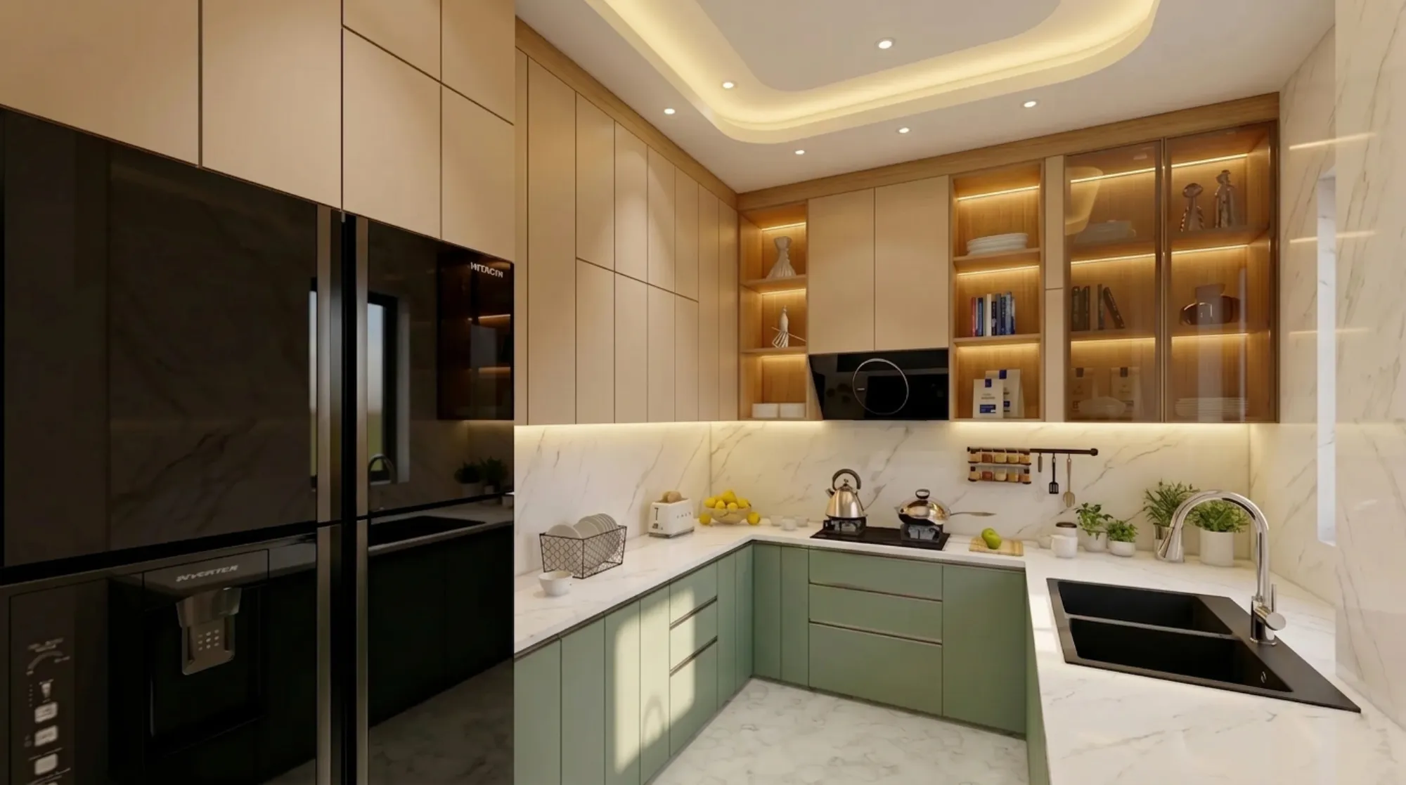
Nine times out of ten, when a client walks into our New Town studio with a Pinterest board of matte-black kitchens, the very next question they ask is whether that look will actually work in their flat in Salt Lake or their independent house in Rajarhat, and the honest answer is that it depends on things the Pinterest board never shows you, like which direction your kitchen window faces, how many hours a day someone is actually cooking in that room, and whether your domestic help is going to be wiping down those cabinet fronts with a wet cloth twice a day.
This is genuinely one of the most common decisions we walk clients through at Studio Contour, and it is also one of the most misunderstood, because most people frame it as a pure aesthetic choice when it is really a functional one dressed up in colour. Dark cabinetry photographs beautifully and reads as expensive and current, light cabinetry photographs as clean and timeless, but the kitchen you actually live in every single day behaves very differently depending on which one you pick, especially in a climate like ours where humidity, cooking oil, and dust are constant variables rather than occasional guests.
So in this piece we are going to go past the surface-level "dark is dramatic, light is safe" framing and actually get into the material choices, the finish types, the price bands, the maintenance reality, and the specific situations across Kolkata and West Bengal homes where one clearly beats the other, plus a few hybrid approaches that our clients end up loving more than either extreme.
The Real Question Isn't Colour, It's Light and Layout First
Before we even get to colour, we walk every client through their kitchen's actual light profile, because a dark cabinet in a north-facing galley kitchen with one small window behaves completely differently from the same cabinet in an open-plan kitchen with a large sliding door onto a balcony. Kolkata flats, especially in older buildings around Ballygunge and Jadavpur, tend to have smaller kitchen footprints with limited natural light, and in those spaces dark cabinetry can genuinely make the room feel like a box, no matter how good the daylighting design looks on paper. Newer developments in New Town, Rajarhat, and Salt Lake tend to have more generous kitchen dimensions and better window placement, and that is exactly where dark cabinetry starts to earn its keep, because the room has enough ambient light to absorb the depth of colour without swallowing it whole.
The other factor we look at is colour temperature of your artificial lighting, because a dark navy or charcoal cabinet under warm 2700K lighting reads completely differently than the same cabinet under a cooler 4000K task light over the counter, and this is a detail that gets decided at the false ceiling and lighting stage, not after the cabinets are already installed. We handle this jointly through our modular kitchen design work and our false ceiling and lighting design service, because trying to fix a lighting mismatch after the cabinets are up is basically starting the project over.
Dark Cabinets: Materials, Finishes, and Where They Actually Shine
Dark cabinetry in Indian kitchens today generally falls into a handful of camps, and each behaves differently on maintenance and cost. Matte laminate in charcoal, graphite, or deep espresso tones is the most popular entry point because it hides fingerprints reasonably well and sits at a moderate price band. PU (polyurethane) painted finishes in navy, bottle green, or near-black go a step up in both look and cost, giving you a smoother, more furniture-grade surface that takes detailing like brass or matte-black handles beautifully. High-gloss acrylic in dark tones looks stunning in showroom photography but is, frankly, the highest-maintenance option we offer, because every water spot and oil splash shows up under kitchen lighting, and in a working Bengali kitchen with regular tempering and frying, that gloss surface needs wiping down constantly to stay looking sharp.
Where dark cabinets genuinely win is in larger, well-lit kitchens, open-plan layouts where the kitchen is visually connected to a dining or living area, and homes going for a more contemporary, hotel-lobby aesthetic rather than the traditional bright Bengali kitchen look. They also hide daily wear better than people expect on lower cabinets and around the hob, where scuffs and handle marks accumulate fastest, though upper cabinets in dark tones can visually lower a ceiling if your false ceiling height is already tight. If you're leaning dark, we'd usually also nudge you toward a lighter countertop in engineered stone or a pale quartz to keep the kitchen work triangle visually legible and the counter surface easy to spot stains on before they set.
Light Cabinets: The Practical Default for Most Kolkata Kitchens
Light cabinetry, whether that's off-white, warm ivory, soft grey, or a pale oak laminate that mimics plywood grain, remains the practical default for most of the homes we work on across the city, and there is a real reason for that beyond tradition. Light cabinets bounce available light around a room instead of absorbing it, which matters enormously in the compact kitchens common in Behala, Tollygunge, and older Garia properties where the kitchen often doesn't get a full window's worth of daylight. They also read as larger on camera and in person, which matters if you're planning to sell or rent the property eventually, since light kitchens photograph more neutrally for listings than a strongly dark or trend-driven palette.
The trade-off, and we tell clients this directly rather than letting them find out the hard way, is that light cabinetry shows oil splatter, turmeric stains, and handle grime faster and more visibly than dark tones do, especially around the hob and handles. The fix isn't to avoid light cabinets, it's to spec smarter: a textured matte laminate hides marks far better than a flat gloss white, and a slightly warm off-white or greige tone is more forgiving than a stark, cold white that shows every smudge under kitchen lighting. For families with young kids or households where the kitchen sees heavy daily use, we often recommend anti-fingerprint laminate finishes specifically for this reason, and we've detailed a similar warm-toned approach in one of our recent builds, a warm wood modular kitchen project where we balanced a light cabinet body against warmer wood-tone accents for exactly this durability reason.
| Dark Cabinets | Light Cabinets |
|---|---|
| Best in large, well-lit, open-plan kitchens | Best in compact or lower-light kitchens |
| Hides scuffs and handle marks well | Shows oil and turmeric stains faster |
| Can visually lower ceiling height | Bounces light, makes room feel bigger |
| Pairs well with brass, matte-black hardware | Pairs well with warm wood or pastel accents |
| Higher-maintenance in high-gloss finishes | Textured matte finishes hide marks best |
The Middle Path: Two-Tone Kitchens
A large share of the kitchens we design now aren't purely dark or purely light at all, they're two-tone, and honestly this is often the smartest answer to the whole debate rather than a compromise. The most common version we build is dark lower cabinets paired with light upper cabinets, which grounds the kitchen visually, keeps the upper zone bright and airy near eye level, and hides the lower cabinets' daily wear exactly where it happens most, around the hob, sink, and bin. The reverse, light lower with a dark accent block on an island or a single run of overhead cabinets, works well in larger kitchens where you want a focal point without committing the whole room to one mood.
Two-tone also gives you room to be more adventurous with colour without the risk, since a bold sage green or deep terracotta accent panel on one bank of cabinets reads as intentional design rather than an entire kitchen you might tire of in three years. This is one of the areas where we lean heavily on 3D visualization and rendering before a single panel is ordered, because a two-tone split that looks balanced in a render can look oddly chopped up in person if the proportions aren't right, and it's a much cheaper mistake to catch on screen than after the custom furniture design work is fabricated.
| Finish Type | Approx. Price Band | Maintenance Level |
|---|---|---|
| Matte laminate | Entry to mid | Low to moderate |
| PU painted | Mid to premium | Moderate |
| High-gloss acrylic | Mid to premium | High |
| Two-tone laminate + PU mix | Mid | Moderate |
Climate, Cost, and the Questions We Actually Ask Clients
West Bengal's humidity and monsoon months add a layer most cabinet colour guides never mention, which is that moisture exposure affects darker MDF and particleboard cores faster than it affects the surface colour itself, so the real durability conversation should be about core material and edge banding quality, not the paint or laminate colour sitting on top. We spec moisture-resistant boards as standard on any kitchen project regardless of the finish colour chosen, because a beautiful dark PU finish over a poor-quality core will swell and fail at the joints within a couple of monsoons, and no amount of colour choice saves that. If you're renovating an older kitchen rather than building fresh, this is doubly important, and it overlaps with a lot of what we cover in our broader renovation and remodeling work where we're often replacing failed cores behind perfectly fine-looking old cabinet doors.
Budget is the other honest conversation. Dark PU and high-gloss finishes generally sit fifteen to twenty-five percent above an equivalent light matte laminate kitchen once you factor in the extra coats, buffing, and touch-up work dark high-gloss surfaces need to look right, and that's before hardware, which tends to get upgraded to match on darker kitchens, since cheap-looking handles show up far more obviously against a dark, premium-feeling cabinet front than they do against a light one. We always walk this through against the client's full home budget rather than the kitchen in isolation, the same way we approach overall project costing in our architect fees guidance, because a kitchen that eats an outsized share of the interiors budget usually means compromises elsewhere that clients regret more than the cabinet colour ever mattered.
- Check your kitchen's natural light at three times of day
- Decide if you're renovating existing units or building fresh
- Confirm moisture-resistant core material regardless of finish colour
- Match hardware finish and door colour before ordering
- Get a 3D render of any two-tone split before fabrication
How We Land on the Right Answer at Studio Contour
By the time we're specifying cabinet colour, we've usually already walked the client through their kitchen's ergonomics, traffic flow, and storage needs as part of our broader residential interior design process, so colour becomes the last decision layered on top of a layout that already works, rather than the first decision that everything else has to bend around. That ordering matters more than people expect, because a client who falls in love with a dark cabinet photo and then tries to retrofit their existing layout to match it usually ends up compromising on storage or workflow to chase a look, when flipping the order gets them both.
We also factor in things that are specific to Bengali households, like whether the kitchen sees heavy daily tempering and frying, whether there's a separate wet kitchen or utility area taking pressure off the main cooking zone, and whether the household follows any Vastu Shastra preferences around kitchen orientation and colour, which we handle through our dedicated Vastu-compliant design service when it's relevant to a family's brief. None of these are things a generic style guide can answer for you, which is exactly why this decision benefits from sitting down with someone who has actually built the kitchen type you're imagining, not just looked at pictures of one.
At the end of the day, dark versus light isn't really a trend question, it's a fit question, and getting it right comes down to reading your specific kitchen's light, layout, household habits, and budget honestly before you fall for a finish. That's the conversation we have with every client who walks into our studio, whether they're in an apartment interior in New Town, a bungalow in Rajarhat, or an older flat anywhere in Kolkata that's due for a proper renovation, and if you're at that stage of figuring out what will actually work in your space rather than just what looks good online, our team at Studio Contour would be glad to walk through it with you, so get in touch and we'll take it from there.