








Upper and Lower Cabinet Colour Combinations: 18 Pairings Ranked
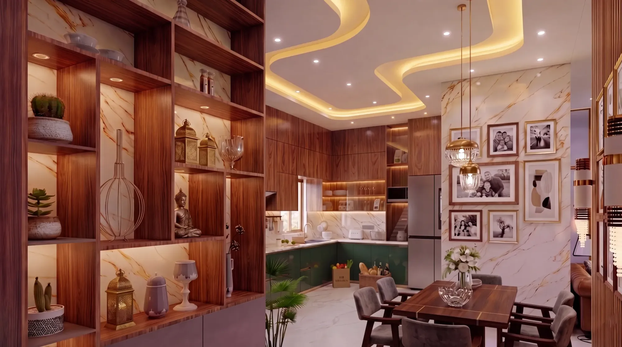
Walk into ten kitchens across New Town and Salt Lake right now and you will find that the ones people actually compliment almost never have a single colour running floor to ceiling on the cabinets. They have a lower bank in something grounded and a wall bank in something lighter, and the contrast is doing more work for the room than the flooring, the countertop or the lighting combined. We get asked about this constantly at site visits, homeowners will point at a photo on their phone and say "we want that, but for our kitchen" without quite being able to name why the photo works, and nine times out of ten the answer is the upper-lower colour split.
This piece is our attempt to actually answer the question properly rather than hand you a Pinterest board. We have ranked 18 upper and lower cabinet colour pairings based on what we see holding up in real Kolkata homes over years, not just what photographs well on day one, and we have gone deeper into the materials, finishes, price bands and room conditions that decide whether a pairing you liked in a catalogue will actually look right in your specific kitchen. Because the catalogue photo was shot under studio lighting in a kitchen twice the size of yours, and that changes everything.
We will also get into where two-tone cabinetry makes sense outside the kitchen, because the same logic applies to wardrobes, TV units and bathroom vanities, and into the practical stuff, plywood grades, laminate versus PU versus acrylic, and how Vastu Shastra considerations sometimes nudge a colour choice one way or another for families who care about it. At the end of the day this is a decision you will look at every single morning for the next fifteen years, so it is worth getting right the first time.
Why the Two-Tone Split Works Better Than It Should
The basic physics of it is simple, and once you see it you cannot unsee it. A dark lower cabinet grounds the room visually the way a dark floor or a heavy rug does, it reads as stable and doesn't show daily scuffs, spills and the general wear that happens at hand height. A lighter upper cabinet keeps the sightline open and bounces available light back into the room instead of absorbing it, which matters enormously in Kolkata flats where kitchens are frequently the smallest, most enclosed room in the plan with a single window if you are lucky. Run the same dark tone top to bottom and a modest 8x10 kitchen starts to feel like a cupboard. Flip it and lighten the top, and the same room reads taller and airier without moving a single wall.
There is also a maintenance argument that nobody puts on the mood board but every homeowner rediscovers around year two. Lower cabinets near the sink and hob take the brunt of grease, water and general contact, and darker, matte or textured finishes hide that far better than pale gloss does. Upper cabinets, by contrast, rarely get touched, so you can afford a lighter, more delicate finish up there without it ageing badly. This is one of the quieter reasons our modular kitchen design briefs default to darker-below, lighter-above unless a client has a strong reason to go the other way.
The 18 Pairings, Ranked
We have ranked these on how consistently they perform across different kitchen sizes, lighting conditions and budgets in the homes we have actually delivered, not on trend cycles. The top entries are close to foolproof, the lower ones need a specific context to work.
| Rank | Pairing | Best For | |
|---|---|---|---|
| 1 | Charcoal grey lower + off-white upper | Almost every kitchen size and light condition | |
| 2 | Deep navy lower + warm white upper | South-facing kitchens with strong natural light | |
| 3 | Walnut-tone lower + white upper | Homes wanting a warmer | less clinical look |
| 4 | Forest green lower + cream upper | Statement kitchens with generous counter space | |
| 5 | Matte black lower + light oak upper | Compact kitchens needing bold contrast | |
| 6 | Terracotta lower + white upper | Bengal-flavoured warm palettes | breakfast nooks |
| 7 | Slate blue lower + grey upper | North-facing | cooler-toned rooms |
| 8 | Espresso lower + pale grey upper | Dark | moody schemes with good artificial lighting |
| 9 | Olive lower + ivory upper | Earthy | biophilic-leaning interiors |
| 10 | Burgundy lower + white upper | Small statement kitchens | single accent wall |
| 11 | Grey-green lower + white upper | Transitional or Scandi-adjacent schemes | |
| 12 | Rust lower + off-white upper | Warm | south Kolkata bungalow-style kitchens |
| 13 | Two-tone grey (dark lower | light lower cabinet on parallel wall) | Galley kitchens with two working walls |
| 14 | Mustard lower + white upper | Accent-only | small footprint or breakfast counters |
| 15 | Deep teal lower + cream upper | Statement islands paired with neutral perimeter | |
| 16 | Taupe lower + white upper | Resale-focused | broadly neutral appeal |
| 17 | Black lower + black upper with brass hardware | Large kitchens with excellent lighting only | |
| 18 | All-white with tonal grain variation | Minimalist briefs | needs disciplined lighting |
The ones ranked lowest are not bad colours, they are simply less forgiving, all-black cabinetry for instance genuinely needs a well-lit, larger room to avoid feeling like a box, and all-white needs disciplined daylighting and careful colour temperature selection in the fittings or it reads flat and clinical rather than clean. This is exactly the kind of call we walk through during 3D visualization and rendering before anything gets fabricated, because a swatch under a showroom spotlight and the same swatch under your kitchen's actual window light are two different colours.
Materials and Finishes That Decide Whether a Pairing Actually Works
The colour is maybe forty percent of the decision, the finish and substrate carry the rest. Laminate is the honest workhorse here, it is durable, wipes clean, comes in an enormous range of the colours listed above, and sits at the accessible end of the price band, which is why it shows up in the overwhelming majority of the cabinetry we specify for value-conscious briefs. PU (polyurethane) finish gives you a smoother, slightly softer-touch surface and takes matte tones like charcoal or olive beautifully, but it costs more and needs a slightly more careful maintenance routine around harsh scrubbing. Acrylic is the glossiest, most reflective option and it makes lighter uppers genuinely glow under good lighting, but any scratch shows immediately, so we tend to reserve it for upper cabinets that see less contact rather than the lower bank that takes daily abuse.
Underneath all of it, the substrate matters more than most homeowners realise until something goes wrong. Plywood carcasses with a BWP or BWR grade hold up far better against Kolkata's humidity and the annual monsoon than cheaper MDF alternatives, and this is where we see the most corners cut in budget renovations, a gorgeous colour combination sitting on a carcass that swells within two monsoons. If you are pairing cabinet colours with a countertop, engineered stone in a neutral white or grey tends to be the safest bridge between almost any two-tone combination on this list, since it does not compete with either cabinet colour for attention.
| Laminate | PU / Acrylic |
|---|---|
| Lower upfront cost, huge colour range | Higher cost, richer matte or gloss finish |
| Very durable, easy to clean | PU needs gentler cleaning, acrylic scratches visibly |
| Slight visible grain/texture in some finishes | Smoother, more uniform surface, especially acrylic |
| Ideal for both upper and lower | Acrylic best reserved for uppers, PU works well on either |
Getting the Proportions and Room Fit Right
A colour pairing that looks stunning in a photograph can still fail in your kitchen if the proportions are wrong for the room, and this is genuinely the single most common mistake we correct at the design stage. In a narrow galley kitchen, a heavy dark lower bank on both parallel walls can visually close the corridor down, so we will often push the contrast further, going lighter on the uppers than we normally would, to keep the eye moving. In an open-plan kitchen that faces into the living area, the cabinet colours also need to hold a conversation with the rest of the residential interior design palette, not just look good in isolation, which is a coordination step people planning a DIY renovation frequently skip.
Ceiling height and lighting placement change the calculus too. A kitchen with a dropped false ceiling and warm-toned cove lighting will make a navy or charcoal lower cabinet read noticeably richer than the same colour under cool white tube lighting, and this is a detail we coordinate directly with our false ceiling and lighting design team so the two decisions are made together rather than the lighting being an afterthought bolted on after the cabinets are already fabricated. If Vastu compliance matters to your family, certain directions favour warmer earth tones like terracotta or rust over the kitchen's south-east zone, and we build that constraint into the palette from the first sketch rather than trying to retrofit it later.
- Confirm the pairing under your actual kitchen's daylight, not a showroom sample
- Match the substrate grade (BWP/BWR ply) to Kolkata's humidity, regardless of colour
- Keep at least 15-20% lightness contrast between upper and lower banks
- Coordinate cabinet tone with countertop material before finalising either
- Check the combination against your lighting plan, not in isolation
What These Combinations Cost and How Long They Take
Budget conversations get easier once you separate the colour decision from the material decision, because the colour itself rarely moves the price, laminate in charcoal grey costs roughly the same as laminate in mustard yellow. What actually moves the number is the finish tier (laminate versus PU versus acrylic), the hardware (soft-close hinges, drawer channels, handle-less profiles), and the carcass grade. A full kitchen replacement including cabinetry, countertop and basic lighting typically runs through our standard 8-12 week interior delivery window, the same timeline we hold across most residential projects regardless of the specific colour scheme chosen, since the colour is a specification decision and the timeline is driven by fabrication and site sequencing.
If your cabinet decision is part of a larger scope, say a full kitchen alongside a bathroom renovation or new custom furniture elsewhere in the flat, it is worth planning the palette across the whole home in one pass rather than room by room, both for cost efficiency in ordering materials and for a home that reads as one considered design rather than a series of disconnected decisions. Families in Salt Lake and New Town flats in particular tend to underestimate how much a coordinated palette across the apartment interior adds to resale value down the line, since a scattered mix of trend colours from different years is one of the fastest ways to date a home.
Where AI-Assisted Layout Tools Fit In
We increasingly use layout software during the concept stage to test how a given cabinet pairing sits against different counter and flooring combinations before a single panel is cut, which cuts down dramatically on the expensive mistake of realising a colour reads wrong only after fabrication. If you are curious how that process works more broadly across furniture and cabinetry planning, we have written about it in more detail in our piece on AI-assisted furniture layout optimisation. It does not replace a designer's eye, but it does mean fewer surprises between the render you approve and the kitchen that gets installed.
For a sense of how a warmer wood-and-white pairing actually reads once it is built and lived in rather than rendered, our warm wood modular kitchen project is a useful reference point, it sits comfortably in the top tier of the rankings above and has held up well in daily use.
This is genuinely one of those decisions where getting an experienced eye involved early saves money rather than costing it, because correcting a cabinet colour mistake after fabrication means re-ordering panels, not repainting a wall. We have been designing and delivering homes across Kolkata and West Bengal since 2014, with more than 330 buildings behind us now, and cabinet colour pairing is one of those small-seeming calls we walk through carefully on every project, whether it is a compact flat in New Town or a full bungalow renovation. If you are weighing a kitchen upgrade, a full renovation, or simply want a second opinion on whether the pairing you have picked out will actually work in your space and light, get in touch with our team and we will walk you through it before anything is finalised.