








Blush Pink Kitchen Ideas: How to Make the Colour Look Grown-Up
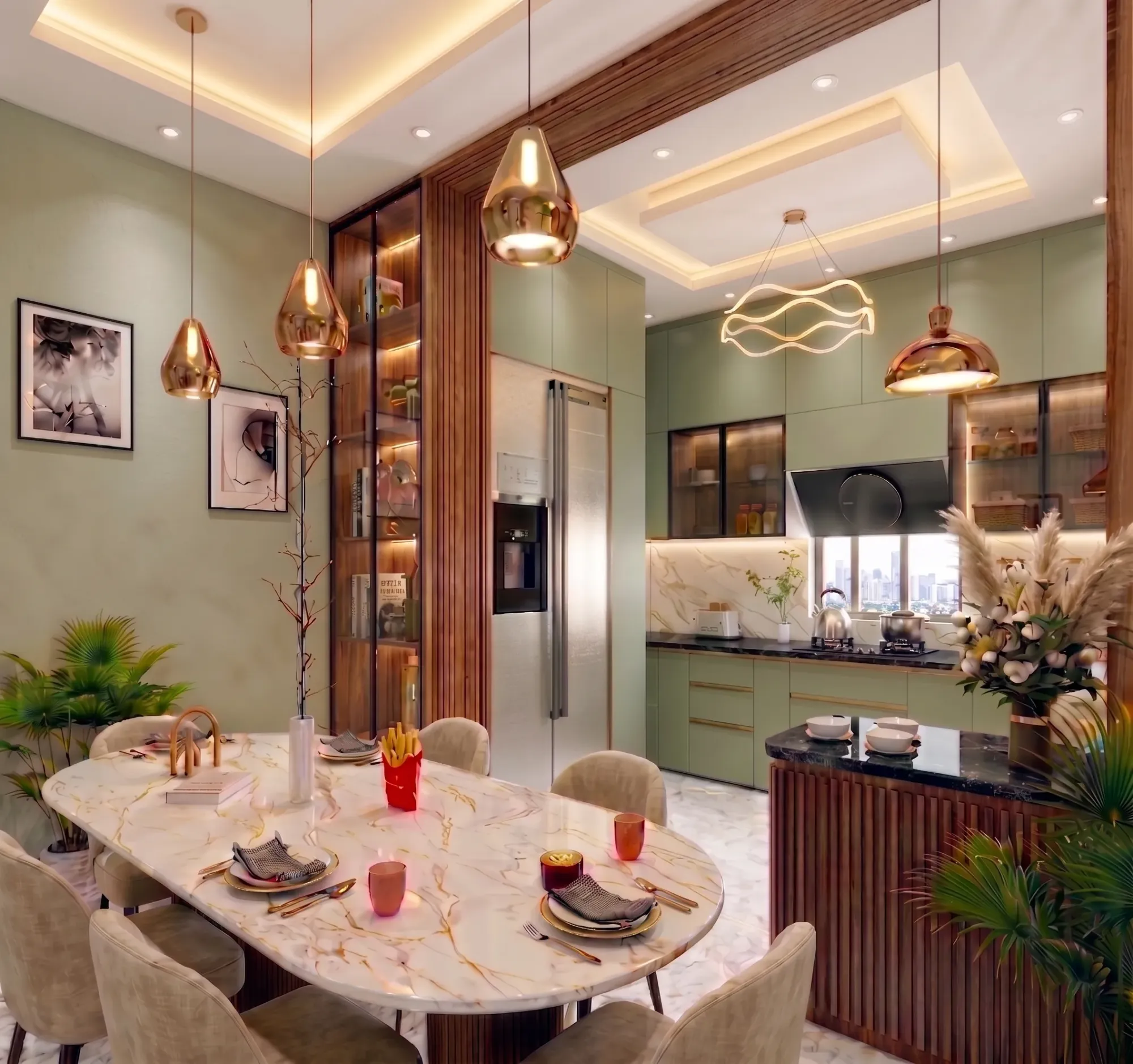
Blush pink has a reputation problem in kitchen design, and honestly, it is not entirely undeserved. Done wrong, a pink kitchen reads like a child's playroom that grew cabinets, all bubblegum and no gravity to it. Done right, though, it is one of the more sophisticated colour moves a Kolkata home can make right now, and we say that having actually built a fair few of them across New Town, Salt Lake and Rajarhat over the last decade.
The difference between a pink kitchen that looks grown-up and one that looks like an afterthought basically comes down to five decisions, and we are going to walk through all five here, so this reads as a real answer and not a mood board. Which undertone of pink you pick, what finish and material you pair the cabinetry with, how you balance it against darker or metallic accents so it does not just float on its own, what your lighting plan does to the colour between morning and evening, and roughly what each price band actually buys you in the Kolkata market. We have delivered 330+ buildings since founding the studio in 2014, and dusty-rose and blush palettes have quietly become one of our more requested asks for modular kitchen design over the last two years, so this is not theory, it is what we see working on site week after week.
One thing worth saying upfront, right, the reason blush pink is having a moment at all is that it sits at the intersection of two things Kolkata homeowners want at the same time, warmth and restraint. It is warmer than the greys and whites that dominated the last decade of interior design here, and it is calmer than the jewel tones that show up on aspirational boards but rarely survive contact with an actual working family kitchen. That balance is exactly why it needs careful handling to land as mature instead of trendy, and why so many DIY attempts at it end up feeling flat within a year.
Getting the undertone right before anything else
The single biggest mistake we see, often before a homeowner has even called a designer, is picking a pink swatch under showroom lighting and assuming it will read the same way in their own kitchen. Blush pink is not one colour, it is a family, and the undertone underneath the pink is what decides whether it looks grown-up or looks like it wandered in from a nursery. Warmer, peachier blushes with a hint of terracotta underneath tend to read as earthy and mature, especially against warm woods, while cooler blushes that lean slightly mauve or grey read as more contemporary and work beautifully with marble and chrome. The mistake is a pink with too much white mixed in and no undertone discipline at all, which is the one that ages badly and starts looking chalky within a couple of years under Kolkata's humidity and daylight.
Our advice on site is always the same, test the actual paint or laminate sample in the kitchen itself, at the hour the family cooks most, because daylighting through an east-facing window at 8am and a west-facing one at 6pm will shift the same pink by a visible margin. This is also where working with someone who has actually built in this climate matters, because a lot of the pink palettes that look right in a Mumbai or Bangalore catalogue shift subtly warmer or cooler once they hit Bengal's particular light and monsoon humidity, and a good architect in Kolkata or interior team will flag that before the cabinets get ordered, not after.
Materials and finishes that keep it from looking sugary
This is where most of the actual design work happens, and where a pink kitchen either earns its grown-up reputation or loses it entirely. Matte finishes are doing almost all of the heavy lifting in the blush kitchens we build today, because a high-gloss pink laminate reads candy-shop fast, while a matte lacquer or matte laminate in the same shade instantly reads considered. We typically steer clients toward matte or satin-finish cabinetry in either painted MDF for a smoother, more contemporary look, or a textured laminate for a household that wants the colour without the higher maintenance a lacquer finish demands, since lacquer shows fingerprints and needs more careful cleaning in a working Bengali kitchen where mustard oil and turmeric are part of daily cooking.
The other lever is restraint in where the pink actually goes. We rarely recommend pink on every cabinet face, top to bottom, because that tips the whole room toward theme-park territory fast. What works far more consistently is pink on the lower cabinetry with a neutral, usually white or warm off-white, on the uppers, or the reverse with pink on a single feature wall of open shelving or a kitchen island while the run of base units stays in a warm wood tone. This is also where custom furniture design earns its keep, because a bespoke pink island or breakfast counter, sized and detailed for the actual room rather than picked off a catalogue, tends to be the single element that makes a pink kitchen feel like it was designed rather than decorated.
| Reads Grown-Up | Reads Juvenile |
|---|---|
| Matte or satin lacquer finish | High-gloss glossy laminate |
| Pink on lower cabinets, neutral above | Pink on every single surface |
| Warm walnut or oak flooring underneath | Bright white glossy flooring |
| Brass or brushed bronze hardware | Chrome or plastic pulls |
| Pink paired with black or charcoal accents | Pink paired with pastel blue or mint |
What to put on the counters and walls next to it
Blush pink cabinetry needs a countertop and backsplash that ground it, and this is genuinely where a lot of otherwise good kitchens go wrong, because people pick a busy white marble with heavy grey veining and it fights the pink instead of framing it. What actually works, based on what we have installed across our residential projects, is either a quiet, low-veining engineered stone countertop in warm white or soft grey, which gives you the durability a real kitchen needs without competing visually, or a honed natural marble in a similarly restrained pattern for households willing to invest in the upkeep. For the backsplash, we have had strong results with a simple handmade-look ceramic tile in a warm off-white or a subtle terracotta, laid in a classic running bond rather than anything with a busy pattern, since the pink cabinetry is already doing the visual work and the backsplash's job is to support it, not compete with it.
If the budget allows a bolder move, a single slab of veined quartz or even granite with a warm grey or taupe base can be a striking pairing with blush, but we would only recommend it on an island or a smaller run, not the full counter, because too much stone pattern against too much pink colour starts to read busy rather than curated. This is one of the calls we walk clients through with actual material boards and 3D visualization and rendering before anything is fabricated, because a swatch on a laptop screen and a full slab under kitchen lighting are two very different things, and getting this wrong is an expensive mistake to reverse once the stone is cut.
Balancing pink against metals, woods and darker accents
A pink kitchen that has nothing else going on in the room almost always reads flat, no matter how well you have chosen the pink itself. The kitchens that actually look sophisticated pair blush with one dominant grounding element and one accent metal, not five competing ideas at once. Warm walnut open shelving or a walnut breakfast table against blush cabinetry is one of our most reliable combinations, because the wood grain adds texture and warmth that pink alone cannot provide. Black steel-framed cabinet doors or a black tap fixture against blush is another combination that consistently reads as intentional and current rather than soft, since the black adds the visual weight and contrast the eye needs to take the pink seriously.
On hardware, brass and brushed bronze pulls do more for a blush kitchen than almost any other single decorative decision, because they warm the pink up rather than cooling it the way chrome or steel hardware tends to. We would generally steer a client away from cool silver or stainless hardware on a warm blush palette unless the rest of the kitchen is deliberately cool-toned throughout, marble counters, grey flooring, the whole scheme, because mixing warm pink with cool metal without a bridging element in between is one of the more common ways these kitchens end up looking unresolved.
Lighting, layout and the practical bones underneath the colour
Colour is only half the job, and a blush pink kitchen that has poor task lighting or an awkward workflow will feel wrong no matter how well the palette is chosen. We pay close attention to colour temperature in these kitchens specifically, because a cool 6000K tube light will wash pink out and make it look sickly by evening, while a warm 2700K to 3000K light under the cabinets and in a coffered false ceiling makes the same pink glow rather than fade. This is a detail our false ceiling and lighting design team gets asked about constantly on pink and blush projects, because the wrong colour temperature undoes a lot of the material and finish decisions upstream.
Layout matters just as much. We still plan every kitchen, pink or otherwise, around the kitchen work triangle between the stove, sink and refrigerator, because a beautiful colour scheme on an inefficient layout is still an inefficient kitchen at the end of the day, and Bengali households in particular tend to run heavier daily cooking loads than a lot of catalogue kitchen layouts account for. If you are renovating an existing flat rather than building fresh, our renovation and remodeling team typically starts with the plumbing and electrical points before a single cabinet colour gets discussed, since moving a sink or a gas line changes the whole layout budget.
- 01Undertone and material selection, 1-2 weeks
- 02Layout finalisation and 3D visualisation, 1-2 weeks
- 03Cabinet fabrication and stone cutting, 4-6 weeks
- 04Installation, hardware and lighting fit-out, 2-3 weeks
What it actually costs across the price bands
Budget conversations around blush pink kitchens in Kolkata tend to split into three fairly clear tiers, and being upfront about this saves everyone time later. At the entry tier, a laminate-finish blush kitchen with standard modular carcasses and an engineered stone counter is the most accessible way in, and it holds up well as long as the laminate is a matte or textured finish rather than gloss. The mid tier moves into painted MDF or acrylic-matte cabinetry with better hardware, soft-close mechanisms, and a marble or higher-grade stone counter, which is where most of the grown-up blush kitchens we build actually land. The top tier adds fully custom cabinetry, bespoke islands, integrated appliances and layered lighting design, and this is where a project starts to feel less like a kitchen renovation and more like a piece of residential architecture in its own right.
Whichever tier you are working in, the architect fees in Kolkata and design fees tend to be a smaller share of the overall number than most first-time homeowners expect, and the bigger cost swings almost always come from cabinetry material and stone selection rather than the design process itself. If you are also weighing a broader renovation, our breakdown of bathroom renovation costs in Kolkata is a useful reference point for how material tiers scale across a home, since the same logic of matte-versus-gloss, standard-versus-custom applies almost identically in a kitchen.
A few sub-styles worth knowing before you commit
Not every blush kitchen looks the same, and it is worth being specific about the sub-styles we actually build, because the name you search for online rarely maps cleanly to what a Kolkata fabricator can deliver. A Scandinavian-leaning blush kitchen keeps the palette pale and warm, pairs it with light oak and minimal hardware, and works best in smaller apartment kitchens where you want the room to feel larger, not busier. A more maximalist art-deco-adjacent take pushes the pink darker toward a true dusty rose, pairs it with black steel, brass, and a bolder geometric tile, and tends to suit larger drawing-cum-kitchen layouts in independent houses rather than compact flats. A third, increasingly popular option we are seeing requested for apartment and flat interiors in New Town is a soft transitional style, warm blush cabinetry against a mostly neutral shell, which reads sophisticated without committing the whole kitchen to a strong colour statement, useful for families who are not sure a bold palette will still feel right in five years.
- Confirm undertone against your kitchen's actual daylight, not a showroom sample
- Choose matte or satin finish over high gloss
- Limit pink to one dominant zone, not every surface
- Pair with one warm wood or dark metal accent, not several
- Specify warm 2700-3000K lighting under cabinets and in the ceiling
- Get the countertop and backsplash sampled together with the cabinet finish before ordering
One more thing that is easy to overlook, if the household follows any Vastu Shastra guidelines for the kitchen's placement or the stove orientation, that conversation needs to happen at the layout stage, not after the colour and cabinetry are finalised, since shifting a stove wall late in the process can undo weeks of design work. Our Vastu-compliant design team folds this into the layout brief from day one on projects where it matters to the family, so it never becomes a retrofit problem.
Where we come in
At the end of the day, a blush pink kitchen that looks grown-up is not really about the paint colour at all, it is about a dozen smaller decisions around undertone, finish, metal, wood, lighting and layout all pulling in the same direction, and that kind of coordination is genuinely hard to get right buying cabinets, counters and lighting from three separate vendors on your own timeline. We have been doing exactly this kind of coordinated interior work out of New Town since 2014, across 330-plus buildings and counting, with typical turnkey interior timelines running 8 to 12 weeks depending on scope, and we recently completed a project that put a lot of this thinking into practice, a blush modular kitchen in Kolkata that walks through the undertone, material and lighting choices in more detail than we can cover here. If your household is anywhere in Kolkata or West Bengal and you are weighing a blush pink kitchen, or honestly any colour-forward interior move that you want to actually hold up in five years rather than look dated in two, get in touch with our team and we will walk you through what your specific space, light and budget can support.