








Blush Modular Kitchen
Kolkata
A compact L-shaped modular kitchen in Kolkata where high-gloss blush acrylic shutters sit over matte beige base units, tied together with a marble-look counter, rose gold hardware and warm layered lighting, delivered end to end by our studio.
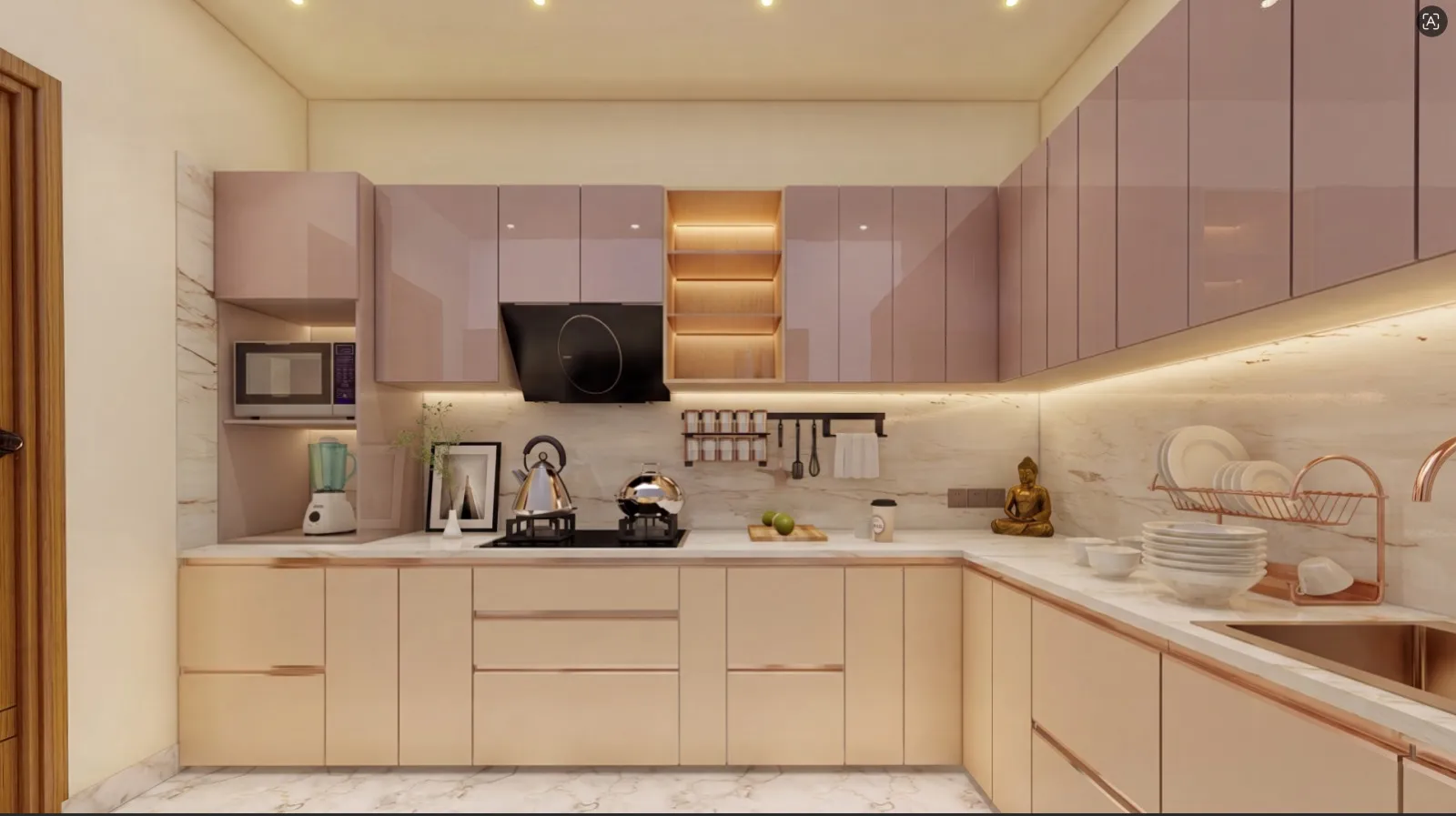
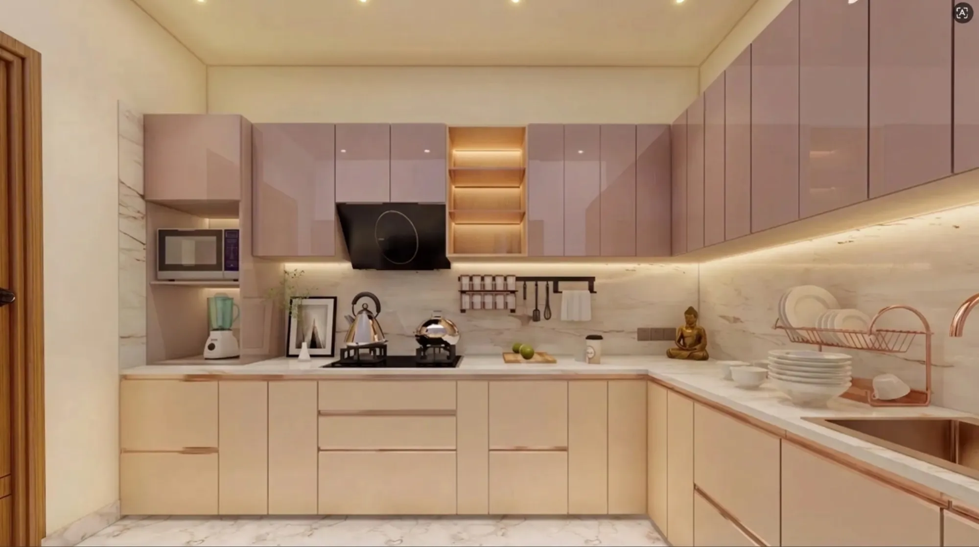
This is an L-shaped modular kitchen we designed and delivered for a family in Kolkata, and the whole project basically came down to one line the client gave us in the first meeting, which was that the kitchen should feel soft. Not white, not grey, not the glossy showroom red that half the city was sold five years ago, but soft, and that one word ended up driving every decision on this page, from the blush acrylic shutters on the wall cabinets to the rose gold sink and tap on the far leg of the L. What you are looking at in these images is the result, a two-tone kitchen where dusty blush uppers float over pale beige base units, a marble-look counter and full-height backsplash run the whole way around, and a warm band of LED light stitches the two levels together.
The reason we treat kitchens this seriously is that in most Kolkata flats the kitchen is the hardest working room in the house, right, it gets used three times a day, it takes the most heat and moisture, and it is usually the first room where cheap material decisions start showing. So when we take on modular kitchen design as a studio, we are not just picking shutter colours, we are engineering carcasses, hardware, lighting and ventilation for a decade of daily cooking, and that mindset is a big part of why families searching for an interior designer in Kolkata end up shortlisting us over the big-box brands.
On this page we will walk through the actual design the way we presented it to the client, wall by wall, and explain why each call was made, because we think that is more useful to you than adjectives. And if you are currently comparing quotes and wondering whether a branded factory kitchen or an independent studio is the smarter buy, our breakdown of budget versus premium modular kitchen brands covers that exact question in detail, so keep it open in another tab while you read this one.
Project gallery
Key Spaces
The Blush and Beige Two-Tone Cabinetry
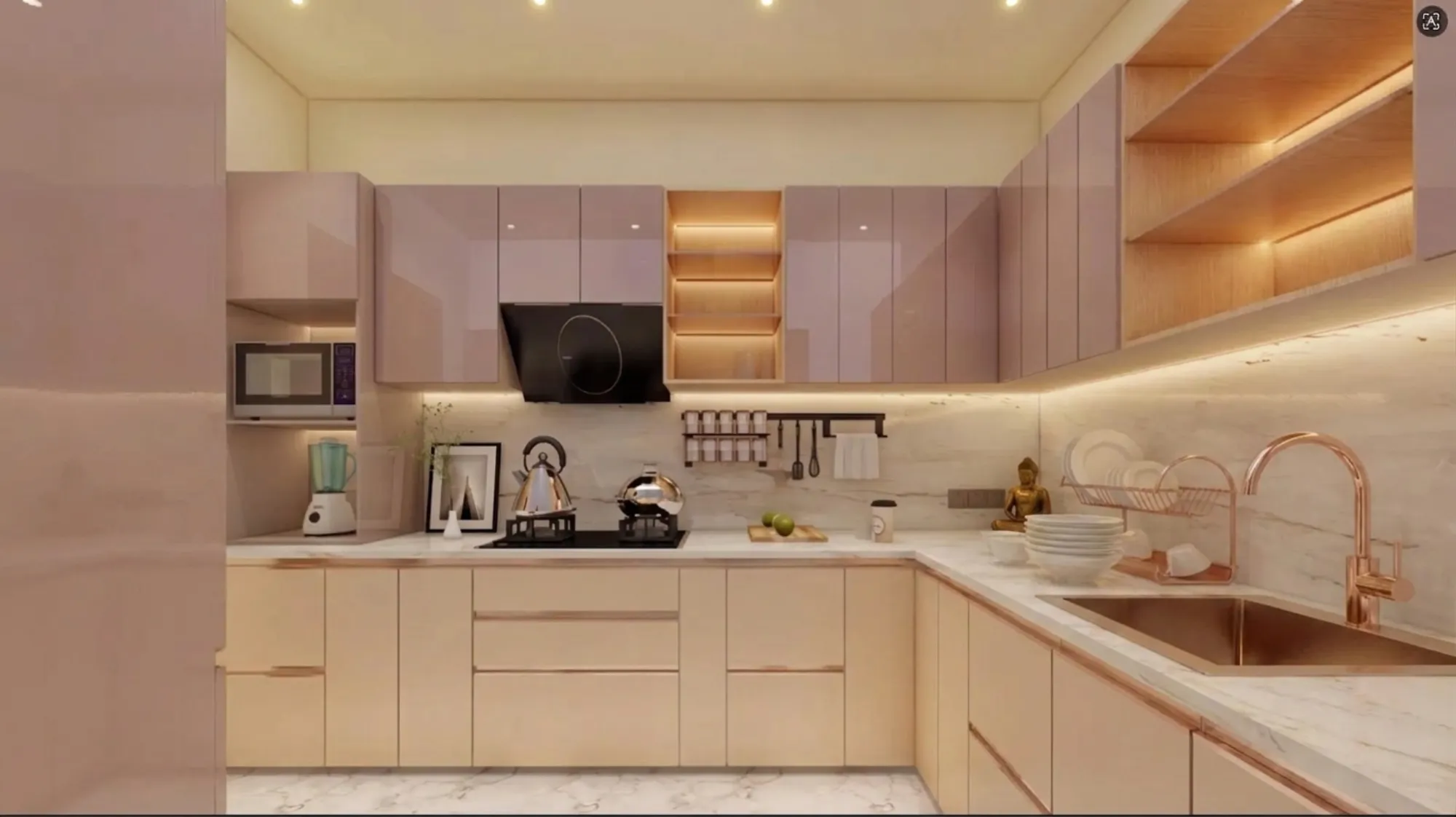
The defining move in this kitchen is the two-tone split, and it is doing more work than it first appears to. The wall cabinets are finished in a high-gloss blush acrylic, a dusty rose with a slight mauve cast that reads warm under the lighting, and they run all the way up to the ceiling drop so there is no dust shelf on top and no dead air above the storage. The base units go the other way, a matte pale beige with a fine grain, and the catch here is that the split is not just aesthetic, gloss up top bounces light around at eye level and makes the room feel taller, while the matte base hides the fingerprints, splashes and knee-level scuffs that daily cooking in a busy household actually produces.
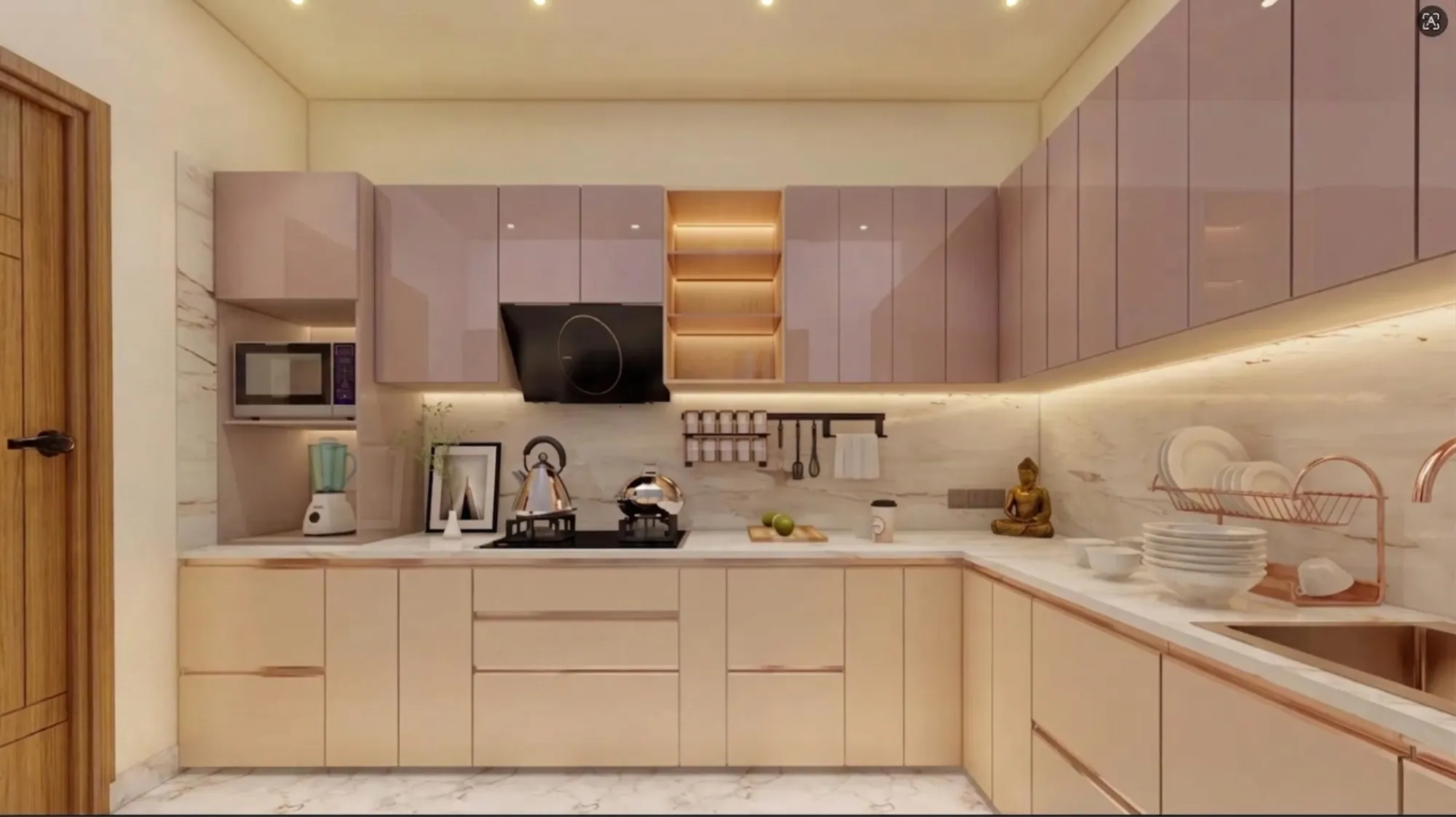
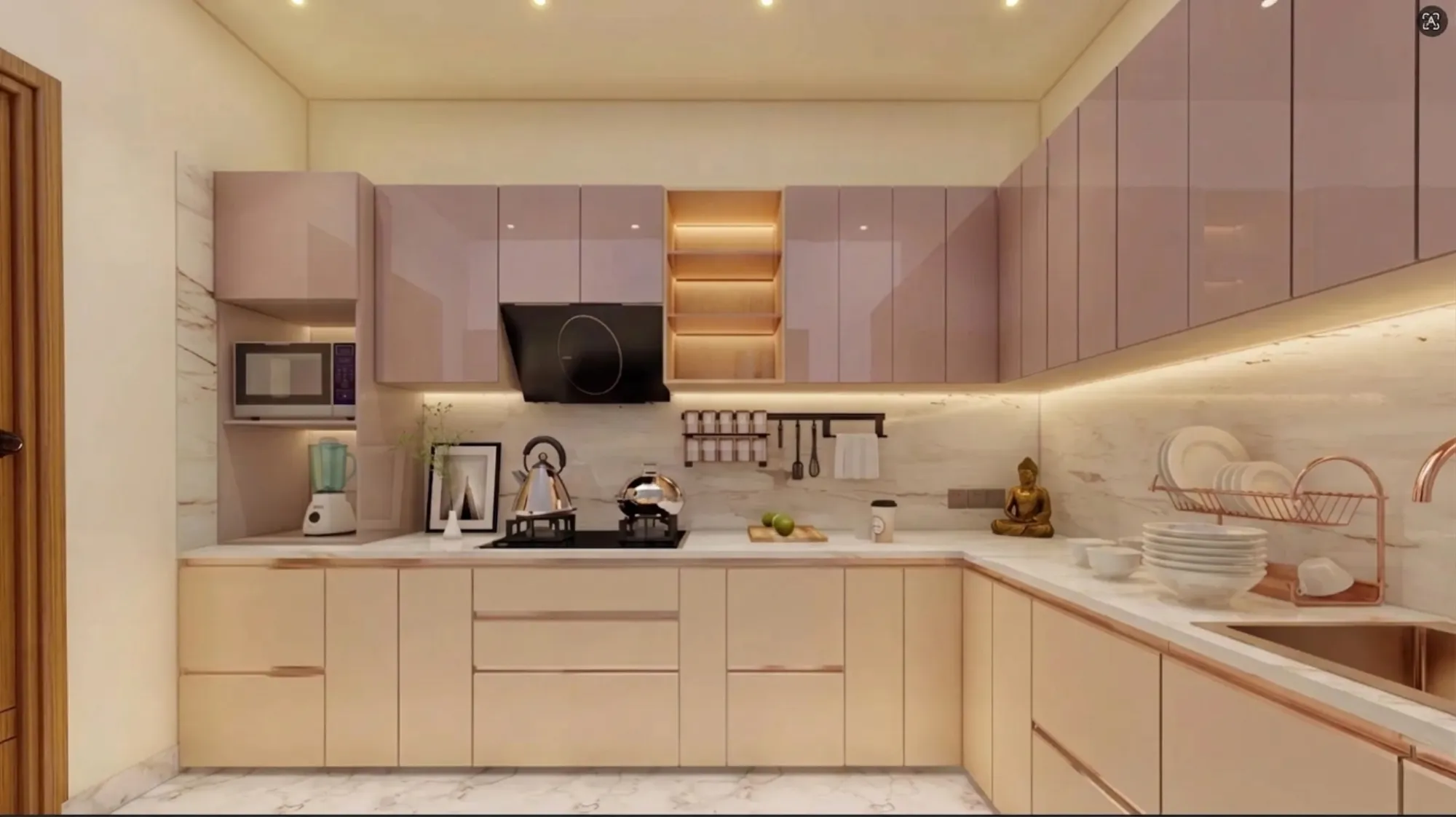
Every shutter is handleless in the conventional sense, with slim rose gold edge-pull profiles routed into the panels instead of protruding hardware, so nothing snags a dupatta or a hip in a kitchen this size, and the same rose gold line repeats on the tall unit, the drawers and the counter trim so the whole composition reads as one piece of cabinetry rather than a collection of boxes. On the left wall we built a full-height tall unit that swallows the microwave into its own lit niche with the blender parked below it, which keeps both appliances off the counter permanently. All of this is bespoke to the millimetre, and that is the core of our custom furniture design work, we build storage around how a specific family cooks, not around a catalogue module that almost fits.
The Cooking Wall: Hob, Hood and the Backlit Niche
The main run of the L holds the cooking zone, and we deliberately made it the darkest point in the room. The angled black chimney hood and the black hob form a single vertical stack against the pale marble-look backsplash, so your eye goes straight to the centre of the wall, and everything else stays quiet around it. The backsplash itself runs full height from counter to wall cabinet with no tile grid and no grout lines, which matters twice over, once because the veined stone pattern reads continuous and calm, and once because a groutless surface wipes down in seconds after frying, which anyone who cooks Bengali food daily will appreciate.
To the right of the hood we broke the blush shutter line with an open niche in a warm wood finish, three backlit shelves that hold the everyday jars and give the wall a glowing focal point in the evening, and below it a black rail carries the spice jars, hooks and hand towel so the most-reached-for items live between hip and shoulder height. None of this placement is accidental, the hob, sink and refrigerator positions were set first using the kitchen work triangle as the starting logic, and then adjusted for how this specific family divides cooking between two people, because at the end of the day a kitchen that photographs well but makes you walk six extra steps per meal is a failed kitchen.
The Sink Run in Rose Gold
Turn the corner of the L and the material story pays off. The sink is an undermounted single bowl in a rose gold finish, the tall gooseneck tap matches it, and even the freestanding dish rack on the counter carries the same copper tone, so what is normally the ugliest corner of an Indian kitchen, the wet zone with its dripping utensils, becomes the most photogenic corner of this one. We placed the sink on the shorter return leg on purpose, it keeps wet work out of the main cooking lane, it sits under its own wash of light from the LED strip above, and the dish rack drains toward the bowl rather than onto the counter.
The counter itself is a marble-look engineered stone, and this is one of those decisions where we will happily talk a client out of the romantic option, because real marble stains with turmeric and etches with lemon within months of Indian cooking, while a good quartz surface gives you the same soft veining with none of the maintenance anxiety. The same visual language continues onto the floor in large-format marble-look tile, so counter, backsplash and floor all belong to one family and the blush cabinetry gets to be the only colour statement in the room, which is exactly how a strong palette should be handled.
Lighting, Ceiling and the Warm Layer
The lighting in this kitchen is doing half the design work, and it is the layer most people never notice consciously. There are three levels running here, recessed warm spots in the ceiling for general light, a continuous LED strip under every wall cabinet washing the backsplash and task surface so you never chop in your own shadow, and accent lighting inside the open niche and the microwave recess so the storage itself glows after dark. The catch here is discipline, every single source in the room sits at the same warm white temperature, because the fastest way to ruin a soft palette like this is to mix a cool white tube into it and turn the blush grey.
The ceiling above is kept deliberately simple, a clean peripheral drop that conceals the wiring and holds the spots in a neat grid, with no cove drama competing with the cabinets, and that restraint is a choice we make often, right, the ceiling should serve the room below it. If you want to see how far we push this thinking in living and dining spaces, where the ceiling does become the feature, our false ceiling and lighting design service page walks through that side of our work, but in a kitchen the rule is simpler, light the task, light the display, and get out of the way.
Details
The Brief and the Site
The site came to us as a standard developer-finished kitchen shell in a Kolkata apartment, bare walls, a utility point, a window, and the usual awkward proportions that builders leave behind, and the family had already seen enough catalogue kitchens to know what they did not want. They did not want white and grey, they did not want fussy classical shutters, and they specifically wanted a kitchen that would feel calm and a little bit personal, hence the Buddha figure they asked us to give a home on the counter. The blush and beige palette came out of that conversation, tested first against the light the room actually gets, because a pink that looks right on a sample chip can go bubblegum under the wrong lamp.
This kitchen was one part of a larger home we worked on, and that matters, because the palette here was tuned to flow with the rooms around it rather than exist in isolation, which is the discipline that full-home residential interior design forces on a project, every room negotiated against its neighbours instead of designed in a vacuum.
How We Delivered It
Our process on this project ran the way it runs on every interior we take on. We measured the shell, locked the layout around the work triangle and the family's cooking pattern, and then produced photoreal 3D renders of exactly what you see on this page, so the client approved the blush acrylic, the rose gold hardware and the niche lighting on screen before a single board was cut. That approval step is basically our insurance policy for the client, there were no surprises on handover day because they had already lived with these images for weeks.
Fabrication ran on moisture-resistant plywood carcasses with factory-pressed shutters, because Kolkata humidity is brutal on cheap boards and a kitchen that swells in its third monsoon is money burned, and installation on site was sequenced so the counter, backsplash and cabinets went in without the client living inside a construction zone for months. Our typical interior timelines run 8 to 12 weeks depending on scope, and we hold that by doing the thinking up front rather than improvising on site. If you are trying to understand what a well-run process should look like before you hire anyone, our guide on how to hire an interior designer in New Town and Kolkata lists the exact questions we think you should be asking every studio you meet, including us.
Why Clients Hire Studio Contour
Studio Contour has been designing and building since 2014, and across those years we have delivered work on 330+ buildings, which is the kind of repetition that teaches you things no moodboard can, for instance which laminates survive a decade of steam, which hinges rattle loose by year three, and which contractors actually show up in week six. We are based in New Town and work across Salt Lake and the wider city, and for families settling into new flats there our turnkey home interiors in New Town guide explains how we take a bare developer handover to a finished home under one contract, one team and one point of accountability.
The honest pitch is this, if you are weighing modular kitchen brands in Kolkata against hiring a designer, the brand sells you a kitchen, and we design you one, tuned to your flat, your palette and the way your family actually cooks, and then we build it to the same factory standard. You can see how the same thinking plays out at full-home scale in our DE Block residence in New Town, and the rest of our portfolio of projects covers everything from compact flats to villas across the city.
If this kitchen is close to what you have been imagining for your own home, whether that is a single kitchen or a complete interior, the next step is simple, reach out through our contact page, tell us about your flat and your timeline, and we will come back to you with how we would approach it, because at the end of the day the best way to judge a studio is to put your own brief in front of it.
RELATED PROJECTS
Boutique Salon Interior
Kolkata
Compact TV Unit & Media Wall
Kolkata
Contemporary Full-Home Interiors
Kolkata
Dental Clinic Interior
Kolkata
Explore more of our architecture and interior projects, our design services, and practical guidance in our blog across the areas we serve. For background on residential architecture, see the reference overview. Ready to start? Talk to Studio Contour.