








Countertop Colours That Work in New Town's Naturally Lit Kitchens
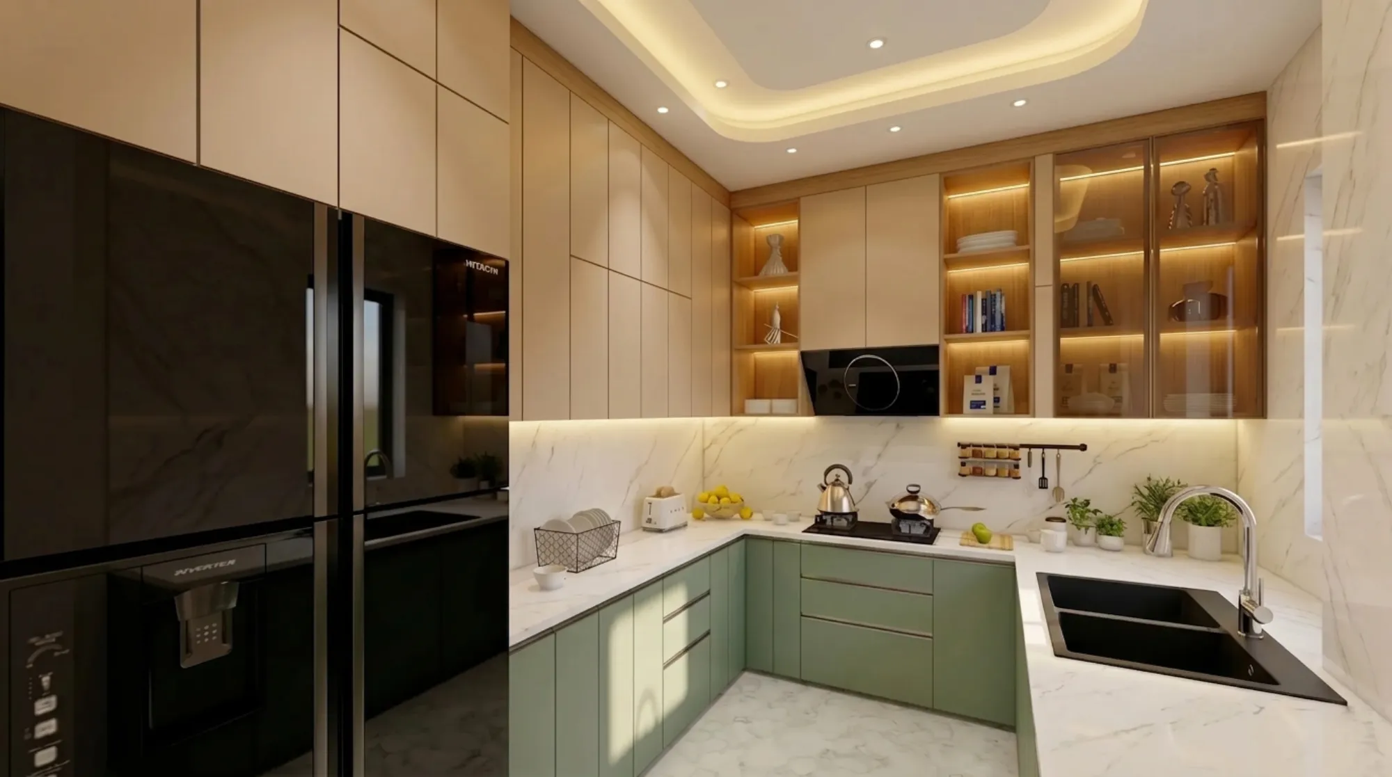
If you've ever stood in a New Town kitchen around eleven in the morning and watched the light come in flat and white off an open plot next door, you already know why countertop colour here behaves differently than it does in an older, tighter part of Kolkata. Most of our clients in New Town are building or renovating homes on plots that back onto wide roads, unbuilt neighbouring plots, or generous setbacks, and that means kitchens get a volume of daylight that a lot of countertop samples were never really tested against in a showroom.
We've delivered interiors across 330-plus buildings since we started this studio in 2014, and countertop colour is one of those decisions that looks trivial on a sample chip and then turns into the thing a client messages us about six months after handover, because the slab that looked warm and inviting under showroom LEDs is throwing back glare at 1pm and looking oddly grey by 6pm. This piece is about getting that call right the first time, specifically for New Town's light conditions, not generic advice lifted from a kitchen magazine shot in a studio with controlled lighting.
We'll go through how orientation actually changes what a colour does on your counter, which finishes hold their character through a New Town day, how to pair the counter with your cabinetry and flooring so the kitchen reads as one composed room rather than a pile of samples, and where we'd draw the line room by room. None of this is about picking a trendy colour, it's about picking one that still looks like what you chose a year from now.
Why New Town's Light Changes the Countertop Conversation
Older Kolkata neighbourhoods tend to have kitchens tucked between walls, shaded by neighbouring buildings, lit mostly by tube lights and a small window. New Town plots, especially the ones we work on in Action Area I, II and III and the residential sectors near Salt Lake, are different, plots are wider, boundary walls are lower, and a lot of our clients ask for larger kitchen windows or an open kitchen-dining layout that pulls in daylight from two sides. That's genuinely good daylighting, and it's one of the nicer things about building here, but it means a countertop is under direct, high-intensity, shifting light for six to eight hours a day rather than dim ambient light for two.
The practical effect is that pale colours amplify glare at midday, dark colours show every water spot and dust particle the moment the sun hits them at a low angle in the evening, and anything with a busy, high-contrast pattern starts to look visually loud rather than premium once you're looking at it under full sun instead of a 3000K showroom bulb. We map every kitchen's window orientation before we recommend a slab, because a north-facing kitchen and a west-facing one in the same New Town block genuinely need different colour strategies.
Reading Your Kitchen's Orientation Before You Pick a Slab
North-facing kitchens in New Town get soft, even, slightly cool light through most of the day, which is genuinely the easiest light to design against, warm-toned countertops in beige, sand, or soft taupe tend to sit well here because the cool ambient light balances the warmth instead of fighting it. South and west-facing kitchens, which are common on the corner plots we see a lot of in Action Area II, get harsher, more direct light in the afternoon, and that's where we steer clients away from stark white or high-gloss black, because both throw back enough glare to make the counter genuinely uncomfortable to work at for an hour either side of noon.
East-facing kitchens get a short, strong burst of morning light and then settle into shade, so the counter reads one way at breakfast and another way by dinner, we usually recommend a mid-tone here specifically because it's the one orientation where the colour has to look convincing in two very different light qualities in the same day. If your kitchen is genuinely enclosed with no direct window, which does happen in some flat layouts, colour temperature of your artificial lighting matters more than any of this, and that's a conversation we usually fold into our false ceiling and lighting design work rather than treating it separately from the counter decision.
| Orientation | Light Quality | Countertop Direction | ||||
|---|---|---|---|---|---|---|
| North-facing | Soft | even | cool | Warm tones like sand | beige | soft taupe work well |
| South/West-facing | Harsh | direct | glary | Avoid stark white or high-gloss black; go mid-tone matte or honed | ||
| East-facing | Strong AM burst | then shade | Mid-tone that reads consistently across both conditions | |||
| Enclosed/no window | Artificial light dependent | Match counter warmth to your fixture colour temperature |
The Colours and Finishes That Actually Hold Up
Pure white countertops are the single most requested colour we see from New Town clients, and they photograph beautifully, but in a bright New Town kitchen with real daylight hitting it for most of the day, white shows every smudge, every bit of turmeric or oil splash, and every bit of hard-water residue almost immediately, which means it demands a wipe-down routine most households don't actually keep up. If a client insists on white, we push them toward a subtly veined engineered stone rather than a flat solid white, because the veining does the job of hiding minor marks that a flat surface can't.
At the other end, jet black and very dark charcoal counters look genuinely striking in renders and in dim evening light, but under strong afternoon sun coming off a west-facing window they show dust, water spots, and fingerprints within minutes of cleaning, and honestly in a working Bengali kitchen with regular oil-based cooking, that maintenance burden gets old fast. The colours that consistently hold up best across New Town's light conditions are warm greys, soft taupe, muted sage-adjacent stone tones, and mid-depth beige with fine texture or subtle veining, all of which diffuse glare, hide daily wear, and still look considered rather than flat.
Finish matters just as much as colour here. A high-gloss finish in a bright New Town kitchen behaves like a mirror for the sky and the window frame, which sounds nice until you're actually trying to chop vegetables and staring at a reflected glare band. We steer most clients toward a honed or matte finish for exactly this reason, it costs nothing extra in most engineered stone ranges, and it makes the same colour behave far better under direct daylight.
- Confirm your kitchen's window orientation before shortlisting slabs
- Ask for the sample under both daylight and your actual kitchen light fixture, not just showroom lighting
- Choose honed or matte finish for south or west-facing kitchens
- Pick a slab with fine veining or texture rather than a flat solid colour if you cook daily
- Test how the colour reads next to your chosen cabinetry finish, not in isolation
Matching the Counter to Cabinetry, Flooring and the Rest of the Kitchen
A countertop is never really a solo decision, it sits between your cabinetry below and your backsplash and lighting above, and in a lot of the kitchens we've reworked, the counter itself was fine in isolation but clashed badly with everything around it. Warm-toned counters generally pair well with matte wood-finish or warm-white cabinetry, while cooler grey counters need a slightly cooler cabinet tone or they start to look mismatched rather than layered. We handle this pairing as one decision inside our modular kitchen design process rather than choosing the counter and the cabinets separately, because doing it separately is exactly how clients end up with a kitchen that looks assembled rather than designed.
The layout matters too, not just the colour. A counter that looks good on a sample board can still make daily cooking awkward if it's not laid out around the kitchen work triangle between your stove, sink, and refrigerator, so we always walk clients through the layout and the colour together rather than treating the aesthetic and the ergonomics of the space as separate conversations. For clients who want to see the whole thing before committing, we run the full kitchen, counter, cabinetry, and lighting through 3D visualisation and rendering under lighting conditions that actually match their window's orientation, which is a genuinely different exercise from a generic render shot in flat studio light, and it's usually the step that settles a colour debate a client has been going back and forth on for weeks.
- 01Map window orientation and daylight hours
- 02Shortlist 2-3 slab options in matte or honed finish
- 03Render the kitchen under your actual lighting conditions
- 04Physically sample the shortlist against cabinetry and flooring on site
- 05Finalise colour, finish and fabrication
What We'd Actually Recommend, Room by Room
For a north-facing kitchen in a typical New Town duplex or independent house, we lean toward warm sand or soft taupe with a honed finish, it plays nicely with the cool, even daylight and doesn't need constant wiping to look decent. For south or west-facing kitchens, which cover a lot of the corner plots we've built on in Action Area II and along the wider New Town roads, we go mid-tone warm grey with fine veining, because it absorbs glare instead of throwing it back at you during the worst hour of the afternoon. For compact apartment kitchens in Salt Lake-style layouts where daylight is more limited and artificial lighting does most of the work, colour temperature of the fixture ends up mattering more than the slab itself, and we've written more on getting that daylight-and-fixture balance right for the wider region in our guide on luxury interiors near Eco Park.
If you're still weighing whether to bring in an architect or an interior designer first for a build that includes this level of decision-making, we've laid out how we sequence that with clients in our piece on who to hire first in New Town. And if you want to see how we actually pull a kitchen colour scheme together with a client before fabrication starts, our note on building the mood board during client briefing walks through the process we use, and for clients who like seeing the space before it's built, our walkthrough rendering piece covers how we let people stand in a kitchen digitally before a single slab is cut.
None of this is guesswork on our end, it comes from having actually built and finished kitchens across enough New Town and Salt Lake plots to know which colours survive a real Bengali summer and a real Bengali kitchen, not just a showroom demo. One of the residences we recently completed in Action Area II worked through exactly this orientation-first approach, and you can see how the counter, cabinetry and lighting came together in that project. We're a residential interior design studio based right here in New Town, so this isn't advice we're translating from a different city's light and climate, it's what we see on our own sites every week. If you're planning a kitchen and want the colour, layout and lighting worked out together rather than picked in isolation off a sample chip, get in touch with us and we'll walk your orientation, your daily use, and your budget through the same process before you commit to a slab.