








Kitchen Colour Psychology: What Your Cabinet Colour Does to the Room
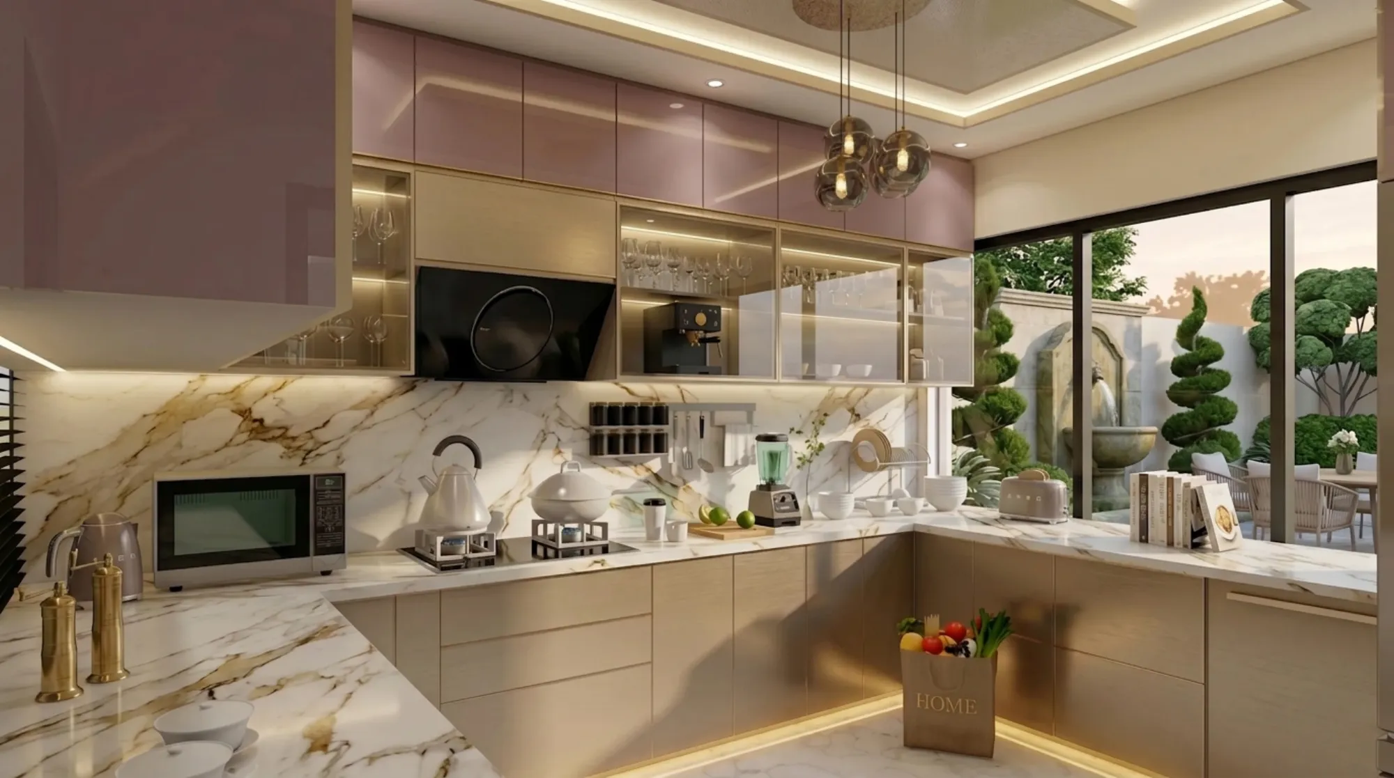
Walk into ten different kitchens in Kolkata and you will feel ten different moods before you notice a single appliance, and that reaction is almost entirely down to one decision the homeowner made early and often without much thought: the cabinet colour. We have sat through enough client meetings at Studio Contour to know that colour gets treated as the last decision in the kitchen brief, something picked off a laminate sample book in the final week, when really it should be one of the first, because the cabinet colour is doing more work on how the room feels than the layout, the countertop, or the lighting plan combined.
This piece is about what actually happens when you choose sage green over classic white, or matte charcoal over a warm walnut veneer, and why the choice is never purely aesthetic in a Kolkata home. Our humidity, our light angles, our joint-family cooking habits, and our NKDA-era apartment floor plans all pull the colour decision in specific directions, and we want to walk through those in enough detail that you can actually make the call with confidence rather than guessing off a Pinterest board.
We have delivered 330+ buildings since we started in 2014 out of New Town, and a good chunk of those have been kitchens where the client came in wanting one colour and left with a completely different, better-reasoned one after we walked them through light, material, and maintenance trade-offs together. So consider this the version of that conversation, written down.
Why Cabinet Colour Carries So Much Psychological Weight
The kitchen is the one room in most Bengali homes that gets used at every hour, morning tea through late dinner prep, and unlike a bedroom or living room, you are almost always standing close to the cabinets rather than viewing them from across a room, so their colour fills your peripheral vision constantly. That proximity is the reason colour psychology hits harder here than almost anywhere else in the house. A dark, saturated cabinet colour in a small galley kitchen reads as heavy and closing-in because you are inches from it while you cook, whereas the same colour on a feature wall six metres away in a living room would read as dramatic and grounding, not oppressive.
Warm tones (think terracotta, mustard, warm wood grains) trigger appetite and comfort associations, which is part of why they have stayed popular in Indian kitchens for decades regardless of trend cycles. Cool tones (sage, sea blue, slate grey) read as calm and clean but can feel clinical if overused without a warm counterpoint in the flooring or countertop. Neutral whites and off-whites do the most visual work of any colour family because they bounce available light around the room, which matters enormously in Kolkata flats where the kitchen is frequently the smallest, least-daylit room in the plan, tucked behind the dining area with a single ventilator window facing an internal shaft.
The Major Colour Families and What Each One Actually Does to a Room
White and off-white cabinetry remains the safest recommendation we give first-time clients, not because it is boring but because it is the most forgiving choice against Kolkata's variable daylight and against whatever countertop or backsplash gets added later. The catch here is that pure white shows grease and fingerprint marks faster than an off-white or warm ivory, so for a family kitchen with regular staff or joint-family cooking volume, we usually steer clients toward a warm off-white or bone shade instead of a stark white, purely on maintenance grounds.
Sage and olive greens have become the most requested colour shift we have seen over the last three years, and they earn it, because green sits at a genuinely useful middle point, warm enough not to feel clinical, cool enough not to feel heavy, and it pairs well with both brass and matte black hardware. Where it goes wrong is in kitchens under 80 square feet with limited natural light, where a deep forest green can swallow the room; a soft sage or pistachio holds up far better at that scale.
Navy and slate blue cabinetry, usually on a lower bank with white or light stone above, gives a kitchen genuine visual weight and a sense of intentional design, and it photographs beautifully, but it is the colour family most likely to date a kitchen within five to seven years if the client picks a very saturated, trend-driven shade rather than a muted, classic slate. We generally recommend saving strong blue for an island or a single bank of base cabinets rather than the full run.
Warm wood tones, walnut veneer or wood-finish laminate, remain the default in a large share of Kolkata homes because they read as durable and premium without needing constant upkeep, and they hide daily wear better than almost any painted finish. The trade-off is that an all-wood kitchen in a north-facing flat with limited daylight can feel dim by early evening, which is why we frequently pair a wood-toned base run with a lighter upper cabinet bank purely to keep the eye-level sightline bright.
Charcoal, graphite, and matte black have moved from restaurant kitchens into homes over the last five years, and done well, with a strong task-lighting plan and a light-coloured countertop or backsplash to break it up, it reads as genuinely sophisticated. Done without that lighting compensation, it is the single colour choice most likely to make a small kitchen feel smaller, so we treat it as an advanced choice that needs a proper false ceiling and lighting layout alongside it, not a standalone laminate order.
| Light Cabinet Colours (white, off-white, sage, warm oak) | Dark Cabinet Colours (navy, charcoal, espresso, matte black) |
|---|---|
| Reads larger and airier in compact Kolkata kitchens | Reads richer and more intentional but needs strong task lighting to avoid feeling cramped |
| Forgives limited daylight and internal-shaft-facing windows | Amplifies limited daylight if lighting plan is not upgraded alongside it |
| Shows fingerprints and grease faster on true white | Hides daily wear and staining better on most finishes |
| Lower resale-neutral risk, appeals to widest buyer pool | Higher visual impact but narrower buyer appeal if reselling within 5-7 years |
Material and Finish Change the Colour's Effect as Much as the Colour Itself
This is the part clients underestimate most: the same shade of green in a matte acrylic finish and a high-gloss PU finish will read as two visually different colours in the room, because gloss reflects ambient light and bounces the surrounding kitchen's colours back into itself, while matte absorbs light and shows the pigment more truly and more consistently across the day. High-gloss finishes make a colour feel more saturated and more contemporary, and they are easier to wipe clean, but they also show every smudge and water spot instantly under kitchen strip lighting, which is a real consideration in a working Bengali kitchen with daily tempering and frying.
Laminate remains the most budget-friendly and durable option for cabinet shutters, holding colour well over a decade with minimal fading, and it works across almost the full colour range we have discussed. Acrylic gives the deepest, most saturated colour and the highest gloss but costs meaningfully more and is less forgiving of scratches over time, which matters if you have young kids or frequent domestic help turnover. PU (polyurethane) finish sits in between, offering a smoother matte-to-satin look that has become the preferred choice for the sage, olive, and muted blue trend, at a price point between laminate and acrylic. Veneer, real wood sliced thin over a ply base, is the only option among these that genuinely deepens and improves with age rather than just holding steady, but it needs periodic resealing in Kolkata's monsoon humidity or it will show grain lifting at the edges within a few years.
The cabinetry box itself, meaning the carcass under the shutter, should always be moisture-resistant plywood rather than MDF or particleboard in this climate, regardless of what colour or finish you choose on the outside, because a beautiful sage-green shutter on a swelling MDF carcass is a problem waiting eighteen months to happen. This is one of the reasons we run every modular kitchen design project through the same carcass specification regardless of the client's colour brief, because the finish is the visible 10% and the carcass is the 90% that determines whether the kitchen still looks good in year six.
- Test your shortlisted colour under morning, noon, and night lighting before ordering
- Match carcass material to plywood grade, not just shutter colour
- Pair dark or saturated cabinet colours with an upgraded task-lighting plan
- Choose matte finishes for high-fry-frequency kitchens, gloss for low-mess showpiece kitchens
- Keep at least one light surface (countertop, backsplash, or upper cabinet) if going dark on the base run
Kolkata Light, Humidity, and Vastu: The Local Layer Most Guides Skip
A generic colour psychology article written for a US or UK audience assumes abundant daylight and central air conditioning, and neither assumption holds for most Kolkata apartments, where kitchens are frequently the smallest room in the plan, positioned away from the main facade, and running on a single window or ventilator into a light well. That single fact should shift your colour decision more than any trend report, because a kitchen getting two hours of indirect daylight a day behaves completely differently under a deep colour than a north-facing open kitchen in a New Town villa with full-height glazing. We always ask clients to walk us through their actual daylight hours before finalising a shade, and where the room genuinely has daylighting constraints, we push toward the lighter half of whatever colour family they have fallen in love with, plus a warmer colour temperature LED strip under the wall cabinets to compensate.
For clients building or renovating in line with Vastu Shastra, the kitchen is traditionally placed in the southeast corner, associated with the fire element, and the colour guidance that follows from that tends to favour warm tones, reds, oranges, and warm woods, over cool blues in the immediate cooking zone, while still allowing cooler accents in storage or prep areas further from the stove. We handle a fair number of these briefs through our Vastu-compliant design service and through the specific Vastu and NKDA compliant home guidance we give New Town clients navigating both the traditional principles and the municipal plan approval process at the same time.
What Colour Choices Cost, and Where the Money Actually Goes
Clients frequently assume colour itself carries the price difference, but the real cost driver is finish and material, not the pigment. A basic laminate kitchen in almost any colour sits at the lower end of the budget band, mid-range PU finishes step up from there, and full acrylic or veneer work sits at the top, with roughly the same spread whether you choose white or charcoal. Two-tone kitchens, a different colour on base versus wall cabinets, add a modest premium over single-tone runs purely because of the extra shutter batch and hardware coordination, not because of the colour combination itself.
This is also where working with a single studio for the full residential interior design scope pays off, because colour, countertop material, false ceiling and lighting design, and even adjacent custom furniture design for a breakfast nook or dining unit all get planned as one palette rather than four separate vendor decisions that only get compared once everything is installed and it is too late to change.
- 01Colour and material shortlist against your actual daylight
- 023D visualisation across two to three finalists
- 03Sample panel tested in-kitchen for 48 hours
- 04Carcass, shutter, and hardware order confirmed
- 05Install within the standard 8-12 week window
Getting the Full Picture Before You Commit
One thing we always push clients toward before finalising any cabinet colour is a proper 3D visualisation and rendering pass, because a laminate swatch in your hand and a full kitchen wall in a rendered light study are genuinely different experiences, and it is far cheaper to change a render than to reorder shutters. We also point people toward material choices beyond the cabinet itself when the budget allows it, engineered stone countertops in particular hold colour and pattern consistency far better than natural stone over a decade of daily use, which matters when you are trying to keep a specific cabinet-to-counter contrast intact for the long run. If you want a sense of how this plays out finish by finish, our warm wood modular kitchen project shows the wood-tone route we discussed above, done at full scale with the lighting compensation baked in from day one.
For homeowners renovating an existing kitchen rather than starting fresh, colour decisions also intersect with layout, and it is worth reading our note on AI-assisted furniture layout optimisation alongside your colour shortlist, since a colour that works in an open-plan kitchen can read completely differently once you tighten the kitchen work triangle in a smaller footprint. And if you are weighing whether to hire an architect or a dedicated interior designer for this stage of the project, our breakdown on architect fees in Kolkata covers how that scope and cost typically splits.
At the end of the day, cabinet colour is not a decor detail you bolt on at the finish line, it is a structural decision about how a room you will stand in every single day is going to feel, and getting it right takes someone in the room who has actually seen how a given green or grey performs against Kolkata daylight, Kolkata humidity, and Kolkata cooking habits across hundreds of kitchens, not just a catalogue. That is the exact judgment call we bring to every project out of our New Town studio, whether it is a compact flat kitchen or a full villa build, and if you are somewhere in the decision process right now, from shortlisting shades to finalising the carcass spec, we would genuinely enjoy walking through it with you, so feel free to get in touch and we can start with a quick look at your kitchen's actual light and layout before anyone commits to a single laminate sample.