








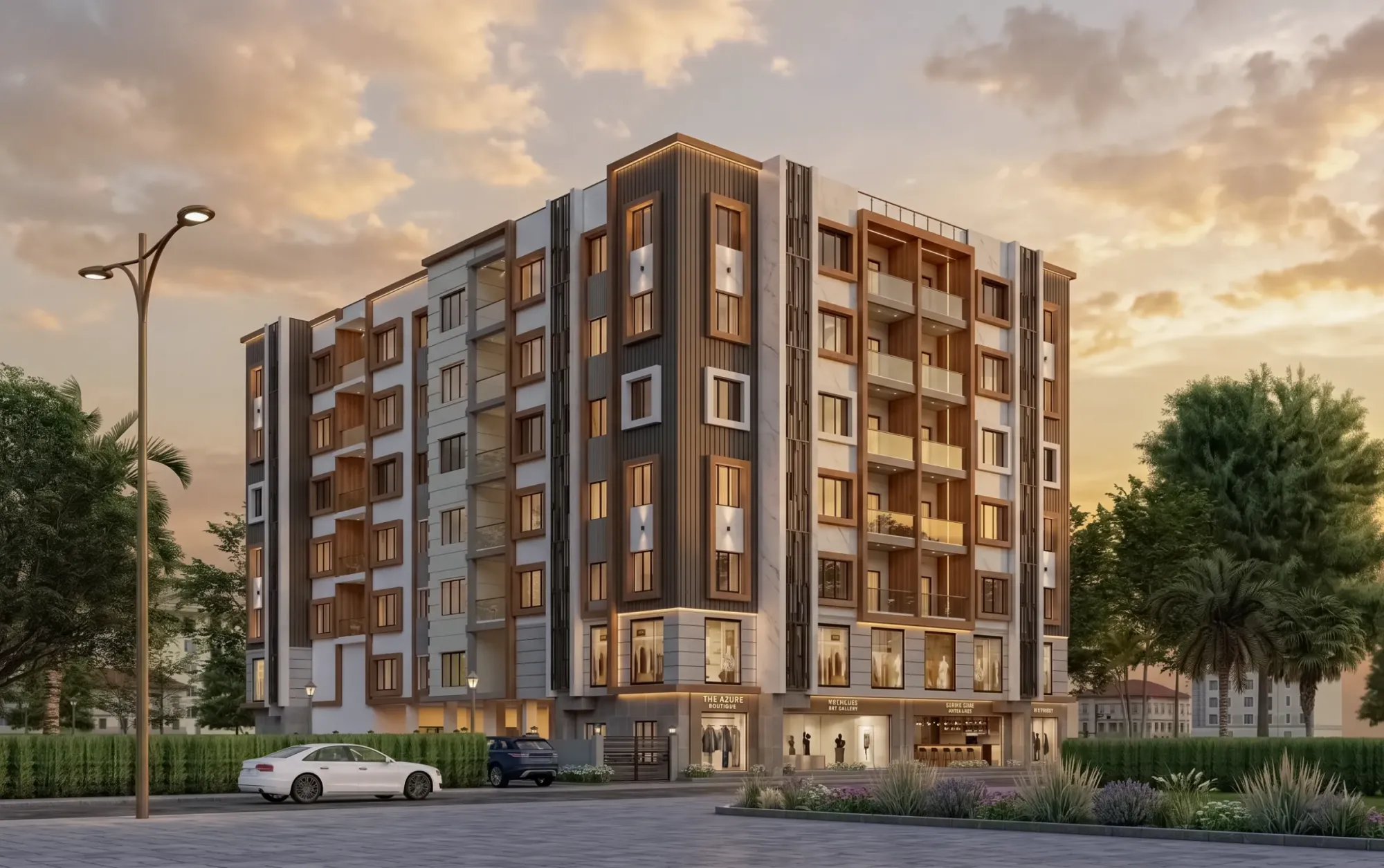
The Sal Court
Dandapath, Jhargram, West Bengal
A G+6 mixed-use building on a corner plot along Dandapath, Jhargram, where a double-height retail plinth of boutiques and a cafe carries five floors of private, balcony-fronted homes above, all wrapped in a warm palette of brick, stone and timber that belongs to a forest town.
The Sal Court sits on a corner plot along Dandapath in Jhargram, and when the owner first walked us through the brief the ask was easy to say and hard to build, one address that could hold ground-floor shops pulling footfall off the main road and homes above that still felt private and quiet, so we designed this G+6 mixed-use development as a single deliberate object rather than a retail box with flats parked on top of it.
Jhargram is not New Town, and that difference shaped nearly every decision we made, because here the street is lower and greener, the neighbours are villas and two-storey houses set behind clipped hedges, and a seven-storey building has to earn its height instead of just taking it, so we broke the mass down, softened the corner, and used a warm material palette of brick, stone and wood that reads as a forest-district building and not a glass-and-aluminium business tower dropped in from somewhere else.
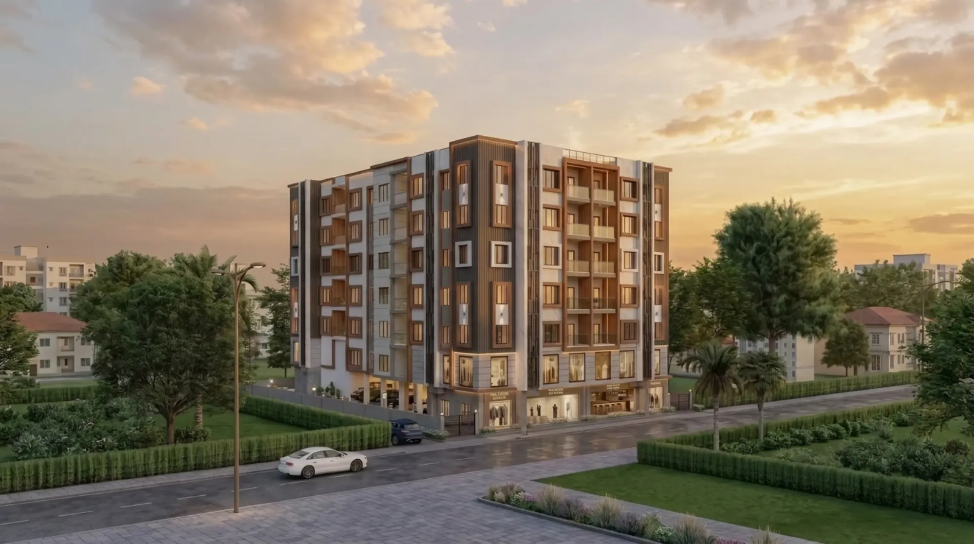
The building works commercially at grade and residentially above, and we carried it the whole way from the first massing sketch through to the final 3D visualisation and rendering you see on this page, so the owner could stand at the junction at dusk, in the render at least, and sign off on exactly how the corner would feel before a single column was cast.
Project gallery
Key Spaces
Massing and the Corner
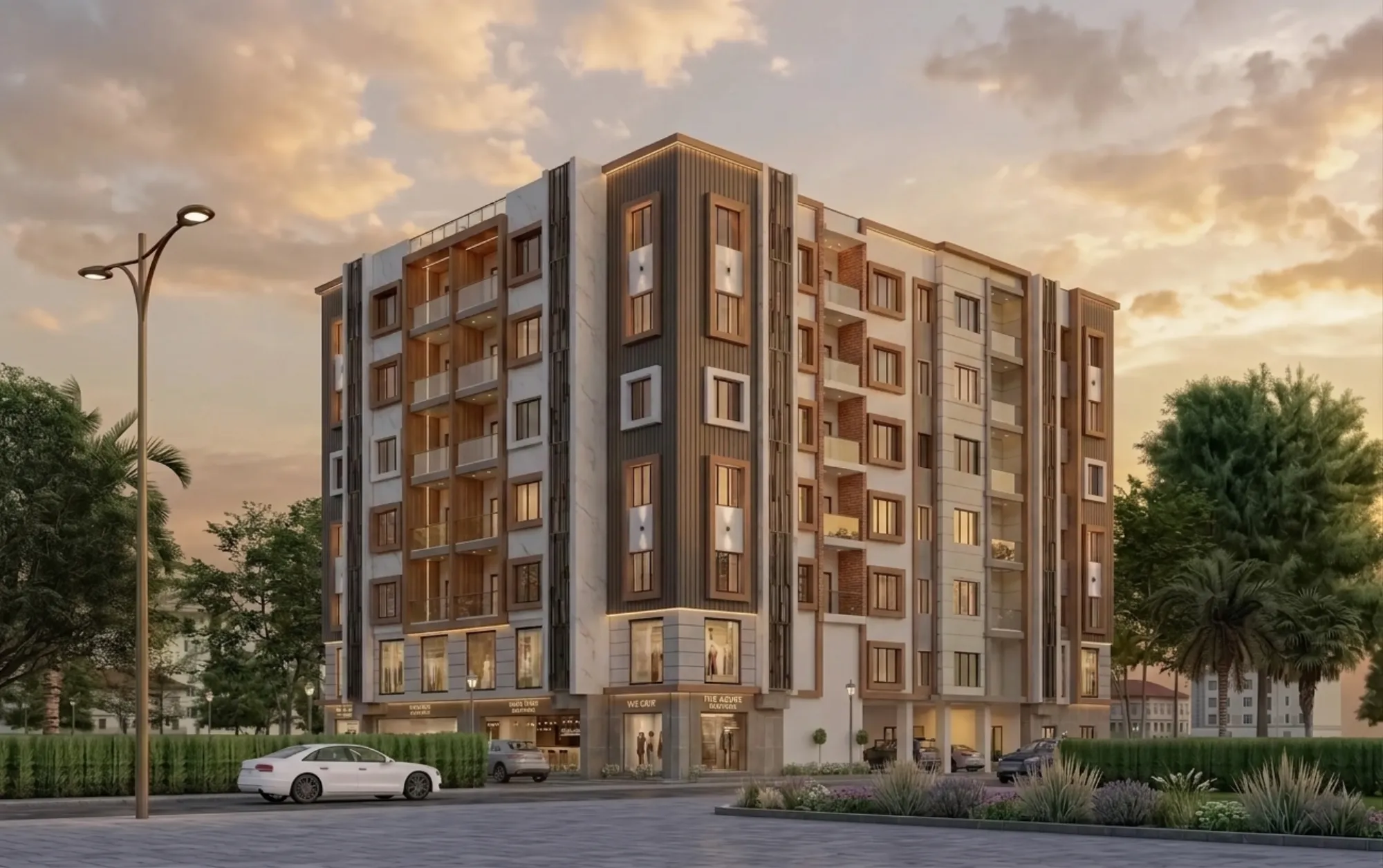
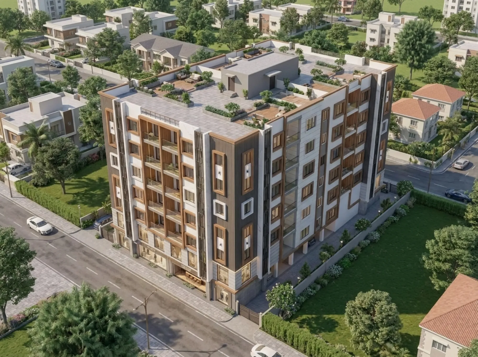
The plot sits on a road junction, so the corner is the face almost everyone sees first, and we treated it as the hinge of the whole composition, pulling a slim vertical tower up past the roofline with fluted grey fins and a quiet cornice cap so the eye lands on a clear top rather than a flat cut-off edge, and then we let the two street elevations step forward and back off that corner in shallow projections so the long facade never reads as one blank wall.
The catch on a corner plot is that the building has two public fronts and no back to hide behind, right, so every bay had to be composed on both faces, and we carried the same rhythm of framed windows, recessed balconies and vertical fins around each elevation so the building holds up whether you approach it head-on from the main road or along the quieter side lane. In the aerial view you can read how the plan hugs the corner and keeps a landscaped setback on the two inner boundaries, which is what buys the homes their light and the ground floor its breathing room.
The Facade and Its Layers
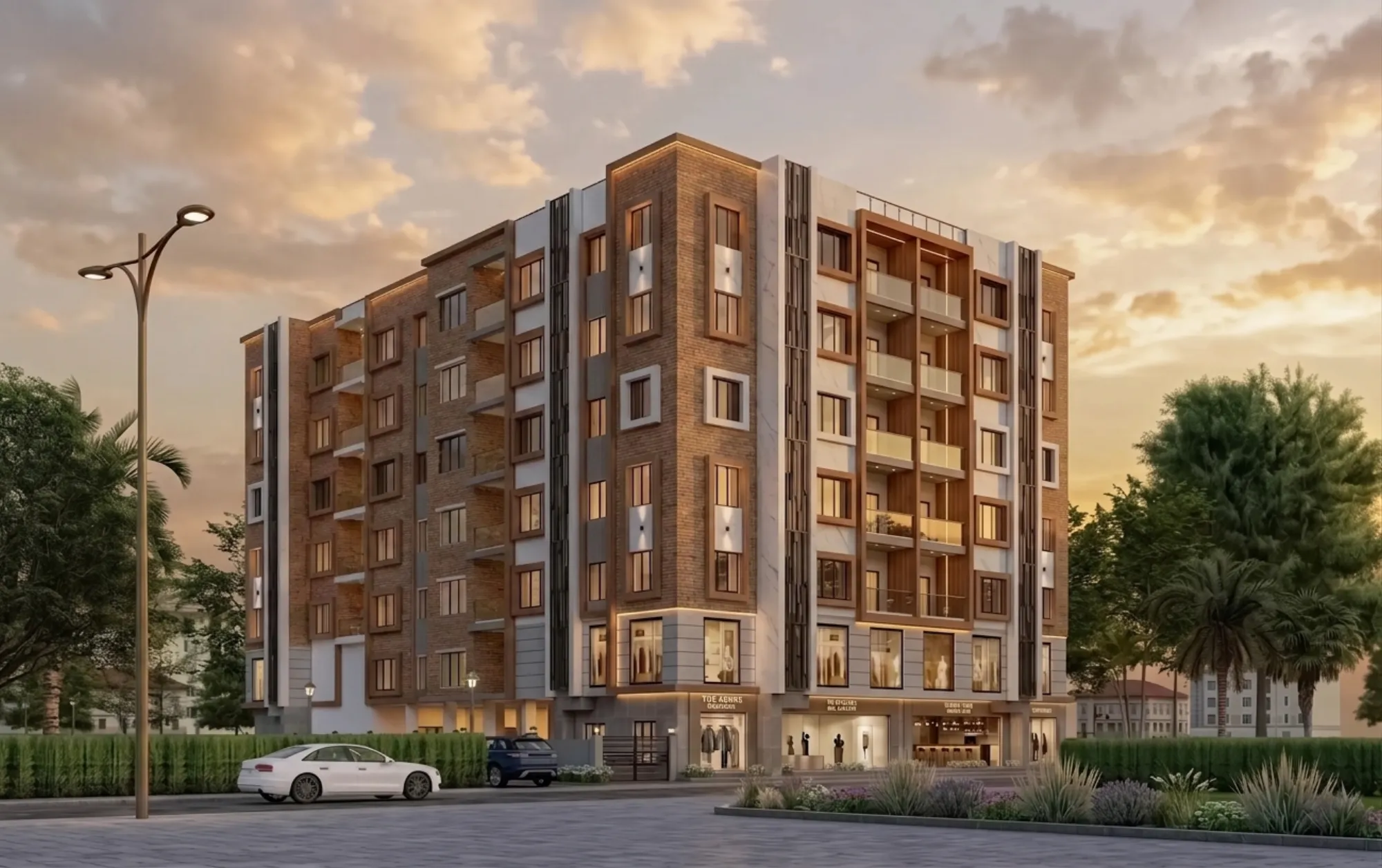
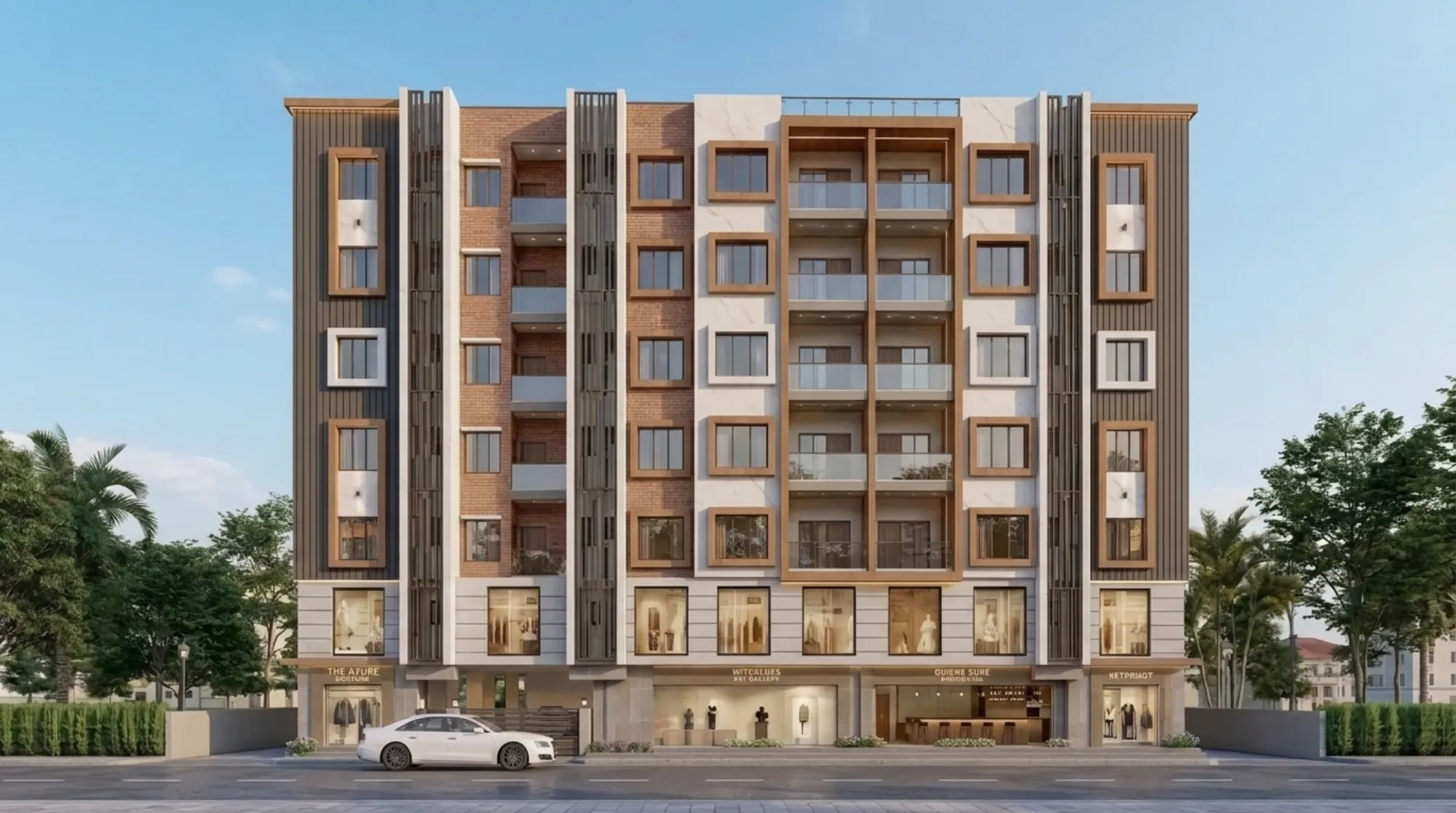
We built the elevation out of three materials each doing a different job, exposed brickwork in a warm red-brown that grounds the building and nods to the clay-and-laterite tones of the region, white marble-look stone that brightens the vertical circulation spines and the shopfront band, and timber-toned cladding in vertical battens that wraps the balcony bays and warms everything up at eye level.
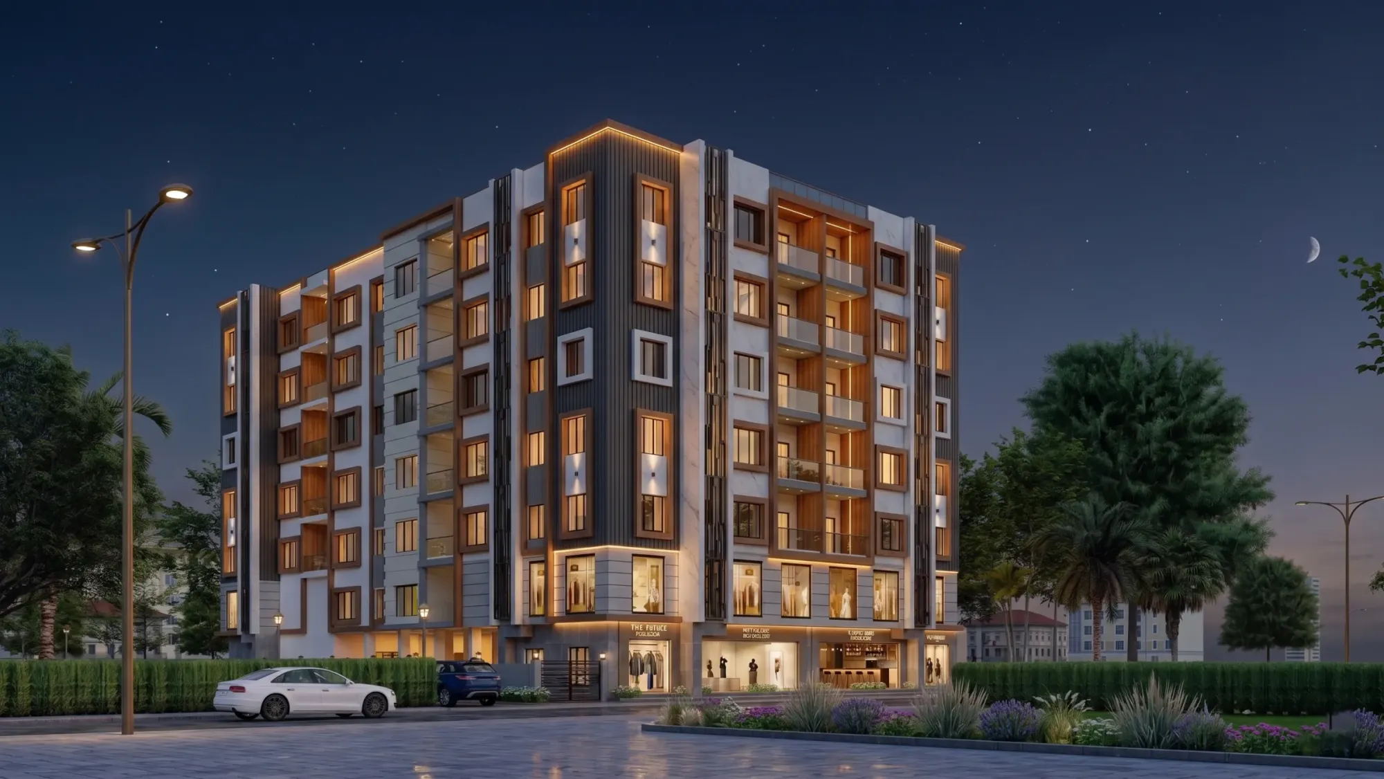
Over that base we added a layer of projecting window surrounds, some as deep white frames that pop off the brick like picture frames and some as full-height louvered screens that filter the harsh afternoon light and give the homes privacy from the road, so the facade carries real depth and throws its own shadow across the day rather than sitting flat. At night the whole logic flips and reads as light, with warm strips grazing the fins, the balcony soffits glowing, and the retail band turning into a lit ribbon at the base, which is exactly why we rendered the building in both daylight and dusk before finalising the scheme.
Balconies, Light and the Homes
Every apartment gets a balcony you can actually use, not a token ledge, so we ran deep recessed balconies with slim glass railings and warm timber soffits, wide enough for two chairs and a few planters, and we set them into the mass rather than hanging them off it so they stay shaded and feel like a room with the wall removed instead of a shelf bolted to the outside.
Orientation drove the window sizing, so the bays facing the softer light carry larger glazing and open balconies while the harder west and south faces get the louvered screens and framed punched windows, which keeps rooms bright without cooking them through the afternoon, and it lets us set up honest cross ventilation through each unit. We planned the internal layouts on Vastu-compliant principles from the start, because in this market that is not a nice-to-have, it is the first question a buyer asks, and it is far cheaper to get the entrance, kitchen and bedroom placement right at the plan stage than to argue about it later. The residential shell here is the same residential architecture discipline we bring to standalone houses, just stacked and repeated with care.
The Retail Plinth and the Rooftop
The ground floor is where the building has to work commercially, so we gave it a generous double-height plinth of framed glazed shopfronts, a boutique on the corner, an art gallery, a cafe and a jewellery unit, each with its own clean signage band and a stone frame that lifts it above the usual roll-shutter parade you find on a mofussil main road. We detailed these shopfronts alongside the tenants' commercial interior design so the display windows, the lighting and the entrances actually pull people in off the street instead of just sitting there dark.
Up top we did not waste the roof, so instead of a bare slab with water tanks we designed a landscaped terrace with raised planters, a pergola, paved seating zones and a green edge, which gives the residents a shared garden in a town where a private lawn is a real luxury, and it also caps the building with something soft when you look down on it from the surrounding low-rise. It is a small move on the drawing but it changes how the whole scheme feels to live in.
Details
The Site and Its Setting
Jhargram sits in the southwest of West Bengal, a district town wrapped in sal forest and open country, and Dandapath has become one of its growing addresses, a widening road with new villas and plotted houses coming up behind hedges and boundary walls. That context is the whole reason the building looks the way it does, because the neighbours are two and three storeys, the streets carry more trees than traffic, and dropping a slick corporate tower here would have felt tone-deaf.
So we read the setting honestly and answered it, keeping the material palette earthy and tactile, holding the retail energy tight to the main junction where footfall actually is, and setting the taller residential mass back off the quieter edges with planting between it and the road. The building is genuinely the tallest thing around, which is exactly why the massing had to be broken up and the corner had to be resolved, so that from a neighbour's window it reads as a considered piece of the street rather than a wall that blocked the sky.
Our Design Approach
We work as operators on these projects, not just image-makers, so we started from the numbers, the plot lines, the setbacks, the saleable area the owner needed to make the ground-plus-six stack viable, and only then moved to how it should look, because a mixed-use building that is beautiful and unbuildable helps nobody. A large part of the early work was simply getting the split right between commercial grade and residential floors, and the same tension shows up on regulated urban plots too, which we have written about in our guide to mixed-use plot rules.
From there it was a tight loop of massing, elevation and render, testing the corner tower, the fin spacing and the brick-to-stone ratio in 3D until the dusk view held together, and running the layouts against Vastu and ventilation at the same time so nothing had to be unpicked later. We are upfront with owners about where the money goes and why, which is the same reason we published our note on architect fees in Kolkata, and the work we do in smaller towns like this draws on the same studio we bring to projects across New Town and beyond. If you are weighing a mixed-use plot of your own, the honest first step is a conversation, so tell us about the site and we will tell you what it can realistically hold.
The Result
What The Sal Court delivers is a building that does two jobs without either one feeling like an afterthought, a retail street level that gives Dandapath a proper high-street corner and five floors of light, ventilated, balcony-fronted homes above it that keep their privacy from all the activity below.
The renders are the deliverable the client actually approved from, the daytime view that shows the brick, stone and timber reading in full sun, and the dusk view that shows the fins and shopfronts turning to warm light, so there was no guessing about the finished feel, and at the end of the day that is what the visualisation is for, to let an owner in a forest town see their corner finished before they commit to building it.
RELATED PROJECTS
Aranya Arcade
Jhargram, West Bengal
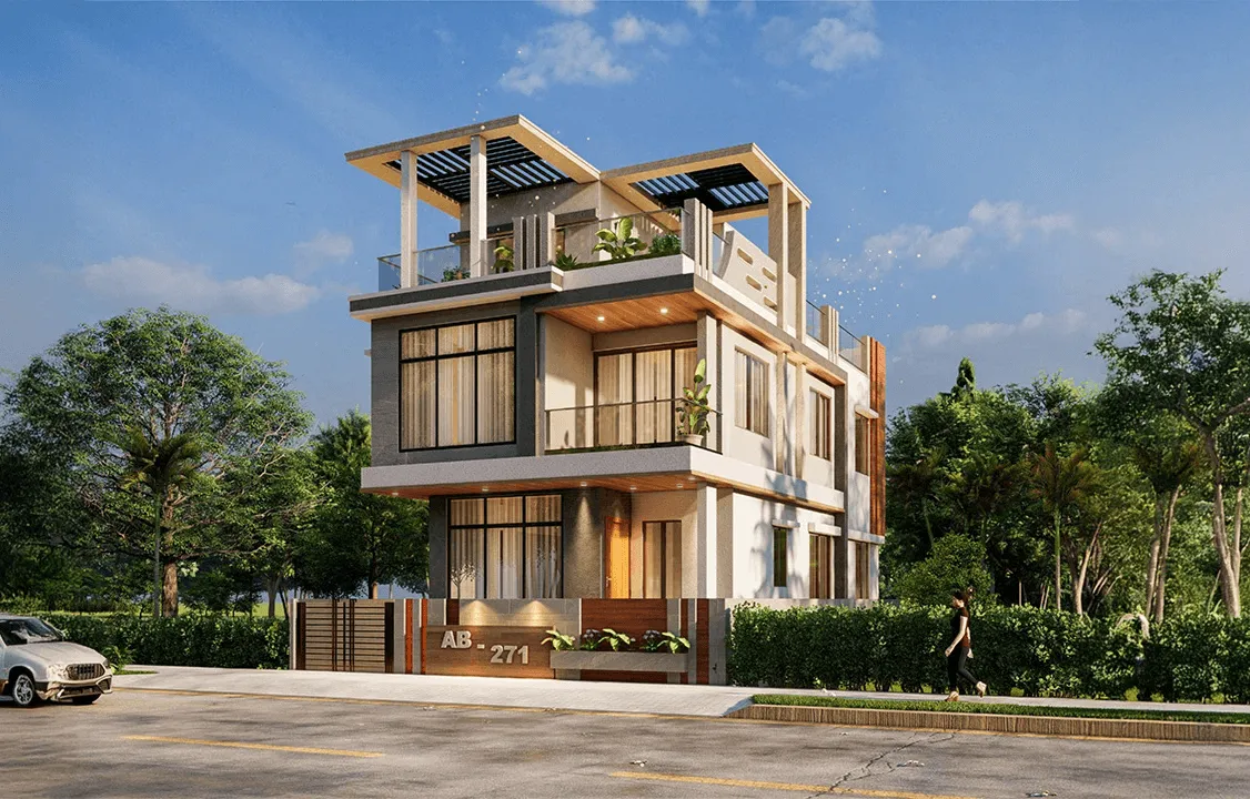
Residential Building Project
Salt Lake, Kolkata
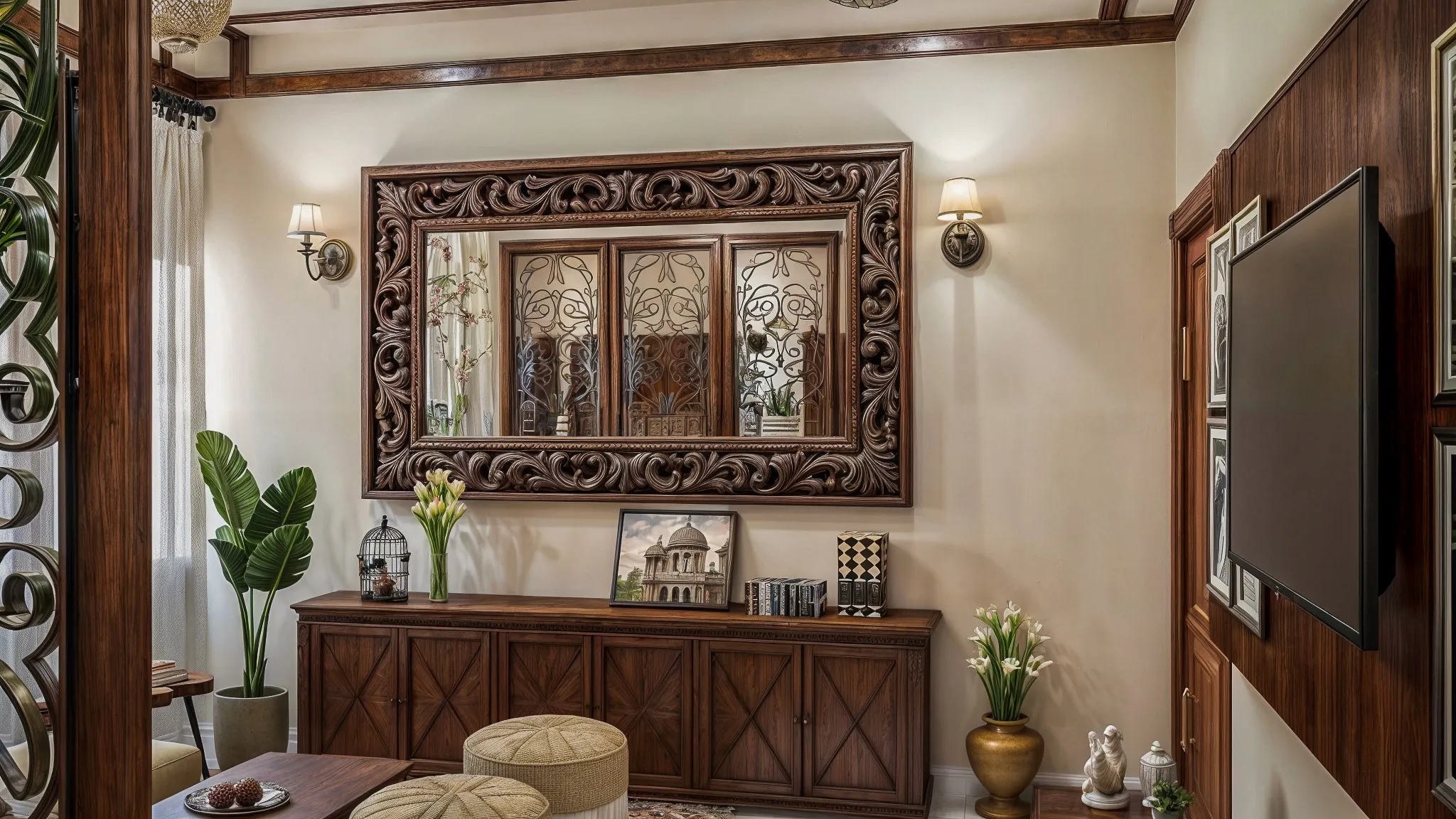
Classical Interior Design Project
Newtown, Kolkata
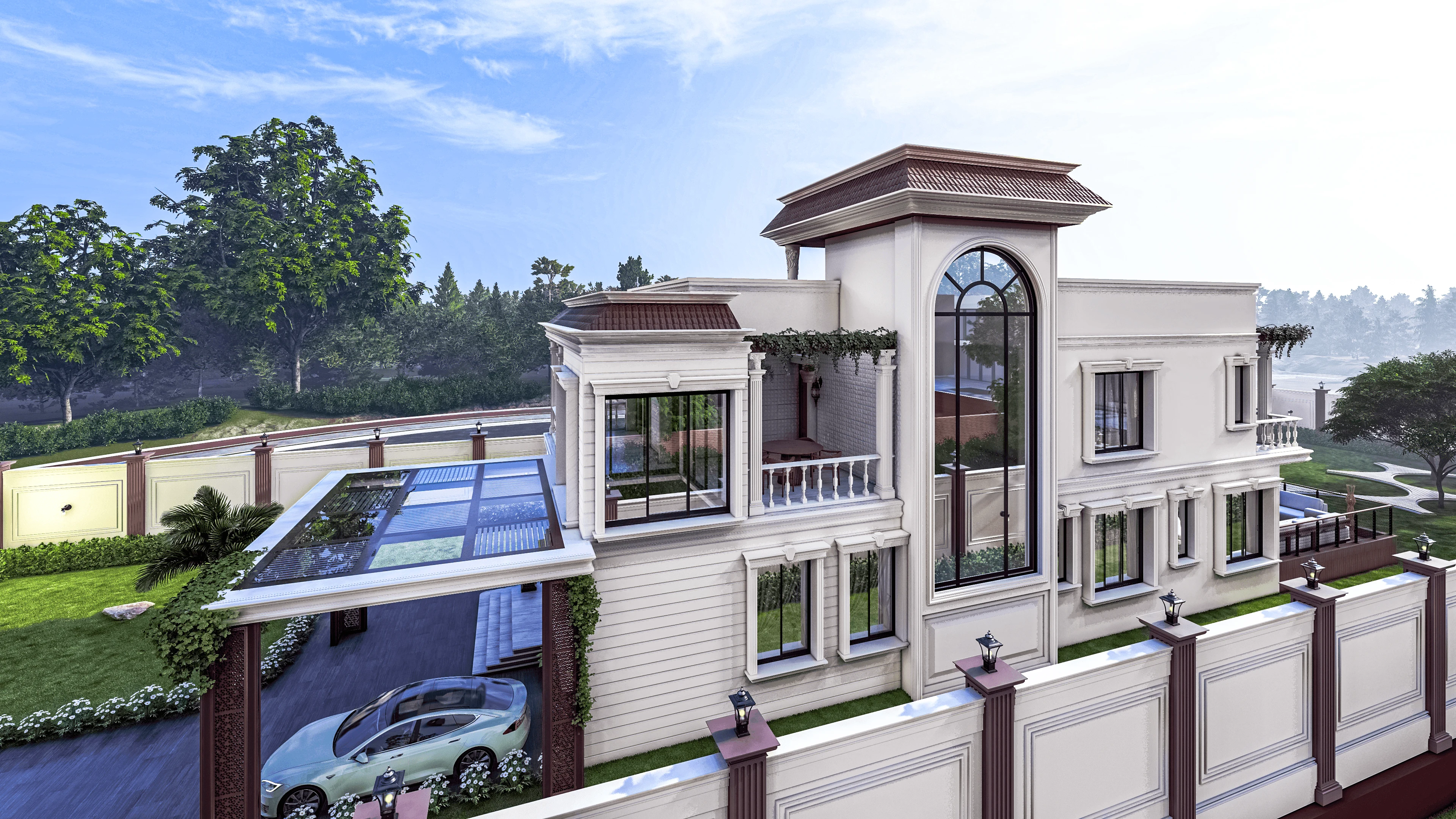
Classical Residential Design Project
Dharbhanga, Bihar
Explore more of our architecture and interior projects, our design services, and practical guidance in our blog across the areas we serve. For background on mixed-use development, see the reference overview. Ready to start? Talk to Studio Contour.