








25 Two-Tone Modular Kitchen Colour Combinations That Always Work
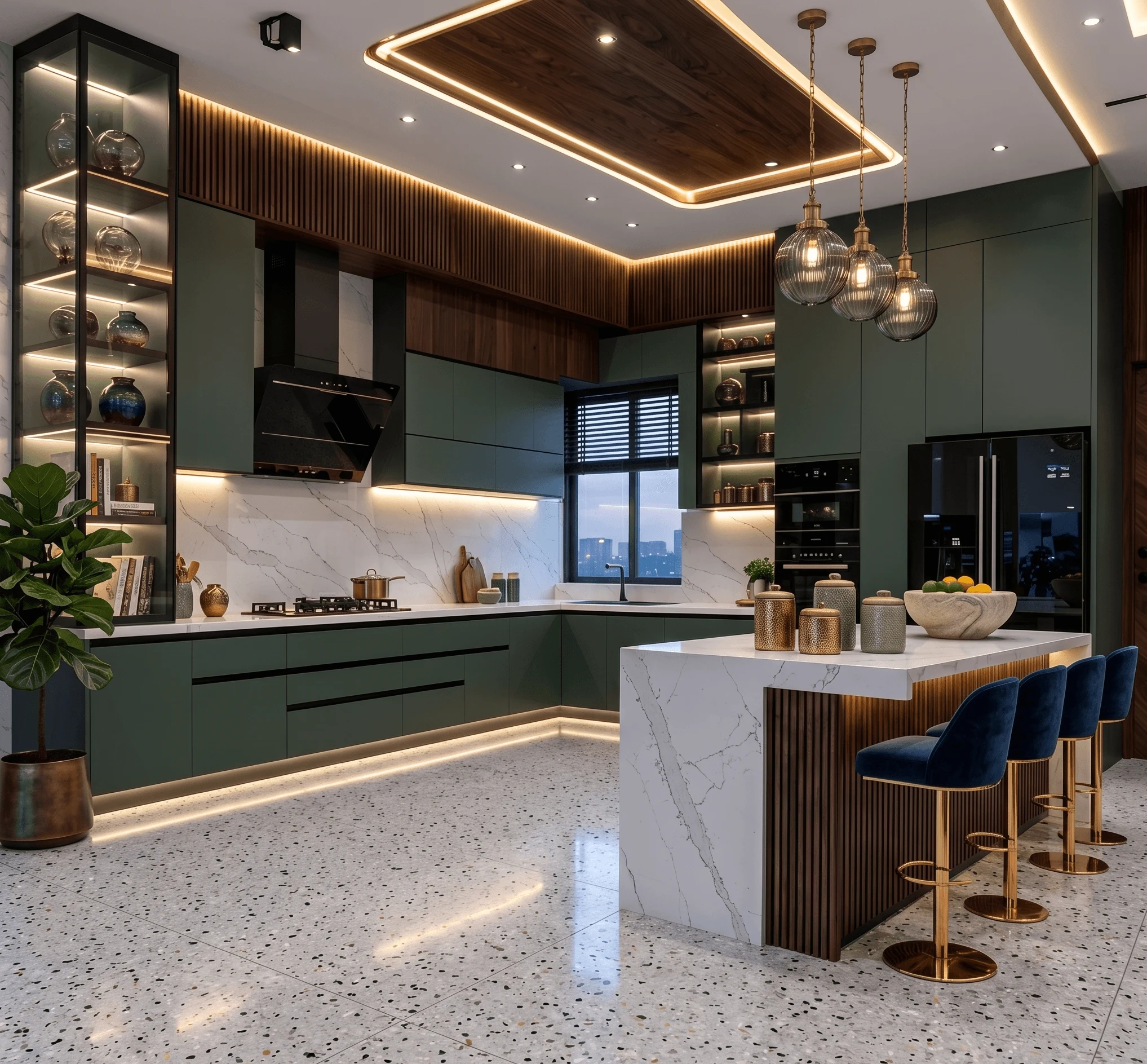
Ask any homeowner who has actually lived with a modular kitchen for a few years and they will tell you the same thing, right, the single-colour kitchen that looked so clean on the catalogue page starts to feel flat within about eighteen months, while a well-planned two-tone kitchen keeps earning compliments a decade later because it was built around contrast, depth and a bit of visual tension rather than just one safe shade repeated on every shutter.
At Studio Contour we have been designing and executing interiors out of New Town, Kolkata since 2014, and modular kitchens make up a large share of the 330+ buildings we have delivered across Kolkata and West Bengal, so this list is not fifteen minutes on Pinterest dressed up as an article, it is the actual pattern we see working across small 8x10 galley kitchens in South Kolkata flats, mid-size parallel kitchens in Salt Lake and Rajarhat, and large island kitchens in New Town villas.
This piece covers 25 two-tone combinations organised by the logic that actually matters, which is base-versus-wall contrast, material pairing, and how each combination behaves under Kolkata's daylight and humidity, plus the price bands, the layout-specific advice, and the practical checklist we walk every client through before shutters get ordered. If you are researching a modular kitchen design for your own home, treat this as the reference, not the final word, because your kitchen's orientation, cabinet run length and lighting plan will shift what works for you specifically.
Why two-tone kitchens outperform single-colour ones, and the rule that actually governs it
The reason two-tone works so consistently comes down to something designers call visual weight distribution, and it basically means darker or bolder tones belong low, on the base units, where they ground the room and hide daily wear like footmarks and splashes, while lighter tones go up top, on the wall units, where they keep the ceiling line from feeling heavy and help bounce whatever daylighting the kitchen gets. We break this rule occasionally, for instance in a kitchen with very tall wall units where an all-dark run above eye level would swallow the room, but as a starting principle it holds in probably eight out of ten homes we design for.
The second thing that matters more than colour choice itself is how the two tones interact with the kitchen work triangle, meaning the sink, stove and refrigerator zone, because a busy two-tone pattern right at the primary work zone reads as clutter under task lighting, while the same contrast used to separate the tall unit bank from the cooking run reads as intentional design. We plan this at the layout stage as part of residential interior design, well before finish selection, because retrofitting the right contrast onto a poorly zoned kitchen never quite works.
25 combinations that hold up in real Kolkata kitchens
Rather than listing 25 colour names with no context, here they are grouped by the logic homeowners actually search for, dark-base classics, warm wood pairings, cool-toned modern picks, monochrome-with-accent, and a few bolder statement pairs for open-plan kitchens that face the living area.
| Family | Combination | Best suited to | |
|---|---|---|---|
| Dark base classic | Charcoal grey base + off-white wall | Compact galley kitchens needing depth without heaviness | |
| Dark base classic | Bottle green base + ivory wall | South Kolkata apartments with warm ambient light | |
| Dark base classic | Navy blue base + light grey wall | Parallel kitchens in Salt Lake and Rajarhat flats | |
| Dark base classic | Deep maroon base + cream wall | Traditional Bengali households wanting warmth | |
| Dark base classic | Black matte base + white wall | Small kitchens where you want maximum tonal contrast | |
| Warm wood pairing | Walnut veneer base + white lacquer wall | Open kitchens visible from the living room | |
| Warm wood pairing | Oak-finish base + sage green wall | New Town villas with garden-facing kitchen windows | |
| Warm wood pairing | Teak-tone base + terracotta wall | Homes leaning into a Bengal-classic material palette | |
| Warm wood pairing | Rosewood base + beige wall | Larger island kitchens needing warmth at scale | |
| Warm wood pairing | Wenge base + pale grey wall | Contemporary flats wanting understated richness | |
| Cool modern | Slate grey base + powder blue wall | North-facing kitchens needing a cooler visual balance | |
| Cool modern | Steel grey base + white wall | Compact apartment kitchens in Behala and Jadavpur | |
| Cool modern | Graphite base + mint wall | Younger households wanting a fresher palette | |
| Cool modern | Denim blue base + light wood wall | Kitchens paired with wood flooring in adjoining spaces | |
| Cool modern | Charcoal base + duck-egg blue wall | Kitchens with limited natural light needing visual lift | |
| Monochrome plus accent | Two-shade grey with a single yellow accent panel | Small kitchens wanting one bold focal point | |
| Monochrome plus accent | Black and white base-wall split with brass hardware accent | Premium finishes on a controlled budget | |
| Monochrome plus accent | White base + grey wall with a wood-tone tall unit | Kitchens needing a visual break in a long run | |
| Monochrome plus accent | Off-white and taupe with matte black handles | Understated luxury for larger homes | |
| Monochrome plus accent | Beige base + white wall with copper accent strip | Warm-toned kitchens wanting metallic contrast | |
| Statement pairs | Emerald green base + champagne gold wall | Open-plan kitchens facing a formal living area | |
| Statement pairs | Rust orange base + charcoal wall | Bold choices for confident | design-forward homeowners |
| Statement pairs | Burgundy base + dove grey wall | Kitchens wanting a jewel-tone anchor | |
| Statement pairs | Teal base + warm white wall | Coastal-adjacent palettes that still feel grounded | |
| Statement pairs | Mustard base + ash grey wall | Accent kitchens meant to be seen from the dining table |
A pattern worth noticing across all 25 is that we almost never pair two saturated colours against each other, because in Kolkata's humid, often overcast months the light is softer than in drier cities, so two strong tones competing for attention tends to read muddy rather than rich, while one strong tone anchored against a neutral reads considered.
Materials and finishes change what a colour combination actually looks like
The exact same charcoal-and-white combination looks completely different depending on whether it is executed in laminate, acrylic, PU or veneer, and this is the part most online colour guides skip entirely. Laminate is the budget-friendly workhorse, durable and available in almost any two-tone pairing, though it shows seams more visibly at panel joints. Acrylic gives that high-gloss, almost lacquered look that makes lighter tones especially pop, but it shows fingerprints fast, so we generally steer it toward wall units rather than base cabinets that get handled constantly. PU, or polyurethane finish, sits between the two, giving a soft-matte, fingerprint-resistant surface that has become our default recommendation for dark base units in family kitchens. Veneer, real wood sliced thin over plywood or MDF, is what gives the warm-wood pairings their authenticity, and it ages with a patina rather than looking dated the way some synthetic wood-print laminates do after five or six years.
| Finish | Best for |
|---|---|
| High-gloss acrylic | Wall units, small kitchens needing light bounce |
| Matte PU | Base units, family kitchens with daily handling |
| Laminate | Budget builds, rental-adjacent flats |
| Real wood veneer | Feature tall units, premium two-tone builds |
Countertops deserve a separate note here because they are the third tone in every two-tone kitchen whether homeowners plan for it or not. A dark base with a light engineered stone or quartz counter creates crisp separation, while pairing a dark base with dark granite tends to visually merge the two into one heavy block, which is a mistake we correct often when clients arrive with a counter already chosen before the cabinet colours are locked. Marble-look counters work beautifully with the monochrome-plus-accent family but need sealing given Kolkata's monsoon humidity, so we usually recommend quartz for anyone who wants the marble look without the maintenance.
What these combinations actually cost, layout by layout
Two-tone does not automatically mean expensive, the cost swing comes almost entirely from finish choice and cabinet configuration rather than the colours themselves. A straightforward laminate two-tone in a compact galley kitchen sits at the lower end of the spectrum, while a full acrylic-and-veneer two-tone island kitchen with soft-close hardware and integrated appliances sits considerably higher.
Layout changes the two-tone logic as much as budget does. In a galley kitchen, the two facing runs should generally mirror each other in tone placement, dark low and light high on both sides, otherwise the narrow corridor feels visually lopsided when you stand in the middle of it. In a parallel kitchen, we often use the two-tone split to distinguish the wet zone from the cooking zone, so the sink run gets one tone family and the hob run gets the complementary one. Island kitchens have the most freedom, since the island itself can carry a third accent tone entirely, the emerald-and-champagne or rust-and-charcoal statement pairs from the table above tend to look their best on an island precisely because it is viewed from every angle rather than tucked against a wall.
For anyone building a kitchen inside a larger home renovation, this is also the point where we loop in custom furniture design for matching crockery units or a breakfast counter, and 3D visualization rendering so the client sees the actual colour combination under their kitchen's real lighting before a single shutter is ordered, because a swatch under showroom light and the same swatch under a north-facing Kolkata window can read noticeably different.
Lighting, orientation and a few practical checks before you commit
Colour temperature is the variable that quietly wrecks more two-tone kitchens than any wrong colour choice, because a warm-wood-and-white combination lit with cool 6000K strip lighting looks clinical and slightly off, while the same combination under warm 3000K under-cabinet lighting looks exactly like the render. We spec lighting temperature alongside colour selection as part of every false ceiling and lighting design scope precisely because the two decisions are inseparable in practice.
Orientation matters too, kitchens facing east or south in Kolkata get strong direct light for part of the day, which suits cooler tones like the slate-and-powder-blue or graphite-and-mint pairings since they balance the warmth coming through the window, while north-facing kitchens that stay in softer, more diffuse light all day tend to suit the warm-wood and terracotta pairings better since they compensate for the room's naturally cooler cast. If Vastu Shastra placement matters to your household, colour choice sits downstream of the fire-and-water zoning decisions, and we handle that through our dedicated Vastu-compliant design process before finishes ever get discussed, so the layout is correct first and the two-tone palette is chosen to suit it rather than the other way round.
- Confirm base and wall tones under your kitchen's actual daylight, not showroom light
- Match hardware finish, chrome, brass or matte black, to whichever tone carries more visual weight
- Choose finish (PU, acrylic, laminate, veneer) by contact frequency, not just look
- Get the countertop tone locked before shutters are ordered, not after
- Check lighting colour temperature against the palette, ideally 3000-3500K for warm pairings
If your kitchen sits inside a wider renovation or remodeling project rather than a fresh build, two-tone modular work is also one of the fastest ways to modernise a flat without touching structure, and it is worth reading up on what a Kolkata renovation actually costs before you lock a scope, since fee structures for interior-only work differ from full architectural projects. Homeowners planning a complete flat interior in New Town specifically will also find our apartment and flat interior guide for New Town useful for sequencing the kitchen alongside the rest of the home.
One more thing worth knowing before you finalise a combination is how layout software has changed this process on our end. We now run early kitchen layouts through AI-assisted furniture placement to stress-test cabinet runs and clearances before a designer ever touches the final drawing, and if you are curious how that actually works in practice, our piece on AI furniture layout optimization walks through it, though the final colour and material call in every project we deliver still comes from a human designer sitting with the client and the actual site conditions, not the software alone.
At the end of the day, a two-tone kitchen is a fairly small decision on paper, two colours and a split point, but it is one of the highest-visibility choices in the entire home, and getting the base-versus-wall logic, the finish, the countertop pairing and the lighting temperature all working together is genuinely a coordination problem more than a taste problem. That coordination is exactly what a good interior designer in Kolkata is for, and it is the kind of detail work you can see in a completed project like our warm-wood modular kitchen, where the base-wall split, hardware and countertop were all locked together before execution began rather than adjusted piecemeal on site.
If you are in New Town, Salt Lake, Rajarhat, or anywhere else across Kolkata and West Bengal and you are at the stage of picking a kitchen palette, we would rather look at your actual floor plan and window orientation than have you guess from a colour chart, so feel free to get in touch and we will walk you through what will genuinely work in your kitchen's light, not just what looks good in a catalogue photo.