








Trending Modular Kitchen Colour Palettes for 2026
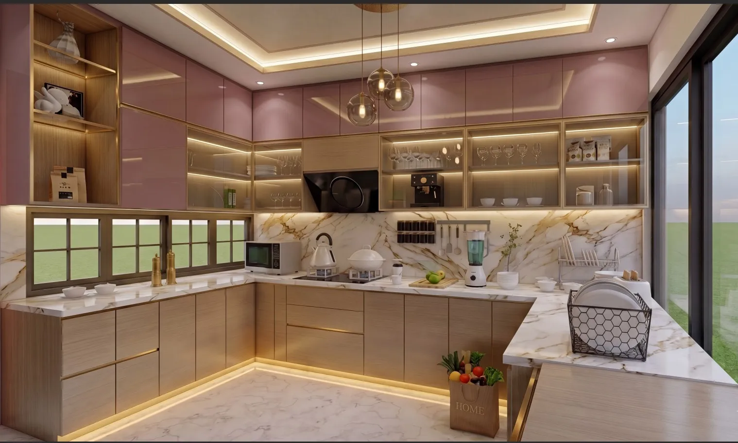
We get some version of the same brief on almost every modular kitchen project that comes through our New Town studio right now, and it usually starts with a photo pulled off Pinterest or Instagram of a kitchen in muted olive or warm walnut, followed by the question of whether that colour will actually work in a Kolkata flat, in Kolkata light, with Kolkata humidity to contend with. It's a fair question, because a palette that looks stunning in a European catalogue shoot can go flat or feel heavy the moment it meets our actual daylight, our actual ceiling heights, and our actual monsoon-driven moisture levels.
This piece is basically our attempt to lay out what's genuinely trending in modular kitchen colours for 2026, and why, without turning it into a generic listicle of hex codes that ignores how these colours perform in real homes across Kolkata and West Bengal. We'll get into the specific palette families we're seeing requested most, the materials and finishes that actually carry those colours over a 10-15 year kitchen life, how layout and light should steer your colour choice, and what these different looks cost at a rough level, so you walk away with something you can actually plan around rather than just admire.
Since 2014 we've delivered interiors across more than 330 buildings in this region, and kitchens are where colour decisions get second-guessed the most, because unlike a living room wall you can repaint in an afternoon, a kitchen palette is locked into cabinetry, countertops, and backsplash for the long haul. So getting it right the first time, right down to how a shade reads under your specific window orientation, matters more here than almost anywhere else in the home.
What's actually driving the 2026 shift in kitchen colour
The single biggest change we're seeing versus even two or three years back is a move away from stark, glossy white-and-chrome kitchens toward tonal, textured palettes that don't try quite so hard to look showroom-perfect. Homeowners are asking for kitchens that feel warmer and more lived-in, and a lot of that is coming from the same instinct driving interest in interior design more broadly right now, where the goal is a home that photographs well but also doesn't feel cold to actually cook and eat in every day. The other driver, frankly, is maintenance. A lot of our clients who did stark white or high-gloss kitchens five to seven years ago come back wanting a redo precisely because fingerprints, oil splatters, and hard water spots show up mercilessly on those finishes, and a mid-tone or textured palette hides daily wear far better.
There's also a practical daylighting angle that gets underrated. Most Kolkata apartments, especially in denser pockets of the city, don't get the kind of generous, even daylighting that a lot of Pinterest kitchens are shot in, so colours that depend on strong natural light to look their best can end up looking muddy under our typical mix of north-facing windows and tube lighting. That's precisely why our modular kitchen design process always starts with a site visit to actually measure light before we lock a palette, not after.
The palette families we're actually specifying in 2026
Rather than chasing a single "colour of the year," what we're seeing hold up across real installations is a handful of distinct families, each suited to a different kind of home and lifestyle. Earthy neutrals, think warm taupe, greige, and soft clay tones, are the single most requested base right now because they sit comfortably next to almost any flooring or wall colour a client already has, and they age gracefully instead of dating fast the way a trend colour can. Deep, moody tones like bottle green, charcoal, and ink blue are the second big category, usually specified for a lower cabinet run paired with a lighter upper run, because a full kitchen in a dark tone can feel closed-in in a compact Kolkata layout unless the room has real height and light to spare.
Warm wood-forward palettes, essentially a return to visible timber grain rather than flat painted colour, are having a genuine moment too, and we've executed several of these where the wood tone itself does the colour work rather than a paint or laminate shade. Two-tone combinations, most commonly a warm wood or neutral lower unit against a contrasting lighter or darker upper unit, remain the most requested single configuration overall because they let a homeowner get visual interest without committing an entire kitchen to a bold colour. And a smaller but growing group of clients, usually younger couples or clients doing a full residential interior design package, are asking for a single jewel-tone accent, terracotta, deep rust, or muted teal, on an island or a run of open shelving rather than the whole kitchen.
| Palette Family | Best Suited For | Typical Base Material | |||
|---|---|---|---|---|---|
| Earthy neutrals (taupe | greige | clay) | Most home types | low-maintenance living | Laminate or PU on MDF |
| Deep moody tones (bottle green | charcoal | ink blue) | Larger kitchens with good natural light | Acrylic or PU shutters | |
| Warm wood-forward | Homes wanting a natural | textured look | Veneer or wood-grain laminate | ||
| Two-tone combinations | Compact and mid-size kitchens alike | Mixed laminate/acrylic runs | |||
| Jewel-tone accents | Islands | open shelving | feature runs | Lacquered or PU accent panels |
Materials matter as much as the colour itself
A colour is only as good as the surface carrying it, and this is where a lot of DIY-planned kitchens run into trouble a few years down the line. Laminate remains the most budget-friendly way to get a rich colour or wood-grain look, and modern laminates have genuinely improved in scratch and heat resistance, but they can chip at edges over time if the underlying board isn't good quality plywood or moisture-resistant MDF. Acrylic and high-gloss PU finishes deliver a much deeper, more saturated colour with a mirror-like sheen, which is why they're popular for the deep jewel and moody tones, but they show fingerprints and water spots more readily and need a slightly more disciplined wipe-down routine. Matte PU and soft-touch laminate finishes have become the sweet spot for a lot of our 2026 briefs specifically because they hide daily fingerprints far better than gloss while still delivering a rich, saturated colour.
| Laminate | Acrylic/PU |
|---|---|
| Budget-friendlier per running foot | Higher cost per running foot |
| Good scratch resistance | Superior colour depth and sheen |
| Matte finish hides fingerprints well | Glossy finish shows fingerprints and water spots |
| Wide colour and wood-grain range | Best for bold, saturated colours |
| Easier site repair if chipped | Chips are harder to touch up on site |
Countertops carry just as much colour weight as the shutters do, and this is where we push clients toward engineered stone over natural stone for most colour-forward kitchens, because engineered surfaces give you a far more consistent, controllable tone that won't clash with a carefully chosen shutter colour the way natural stone's veining sometimes can. Backsplash tile, cabinet hardware finish (matte black, brushed brass, and gunmetal are all trending alongside these palettes), and the false ceiling treatment above the kitchen all need to be planned as one system, not chosen independently, which is exactly the kind of coordination our false ceiling and lighting design team handles alongside the kitchen brief rather than as an afterthought.
Layout, light, and Vastu all shape which colour actually works
The kitchen work triangle between your stove, sink, and refrigerator still governs how a kitchen functions day to day, and it also quietly governs colour, because the runs that get the most visual attention (usually the run facing the dining or living area in an open-plan flat) are worth investing your boldest colour choice in, while the enclosed prep and storage runs can stay in a calmer, more neutral tone. For clients building in New Town or Rajarhat with genuinely open, well-lit kitchens, we'll often push a deeper or bolder palette because the room can carry it, whereas in an older, more compartmentalised Kolkata flat with a single window, we generally steer toward lighter neutrals so the space doesn't read smaller than it is. If your home follows Vastu Shastra principles, the traditional guidance toward warm, fire-associated tones in the southeast kitchen zone actually lines up naturally with the earthy and warm-wood palettes trending right now, and our Vastu-compliant design service builds that alignment into the layout from day one rather than retrofitting it later.
- Measure your kitchen's natural light at two different times of day before shortlisting a shade
- Get a physical shutter sample, not just a digital swatch, against your actual wall
- Decide your work triangle first, then assign your boldest colour to the most visible run
- Match hardware finish (matte black, brass, gunmetal) to the palette before ordering shutters
- Confirm your countertop and backsplash tone against the shutter sample together, not separately
What these palettes actually cost
Budget is where a lot of colour conversations get derailed, because the same visual look can cost meaningfully different amounts depending on the material carrying it. As a rough guide across the projects we've delivered, a laminate-based neutral or two-tone kitchen sits at the more accessible end, a matte PU or acrylic kitchen in a deep or jewel tone runs meaningfully higher per running foot because of the finish and touch-up complexity, and a veneer-based warm-wood kitchen typically lands in between, depending on the grain and sealant quality you choose. None of these figures include appliances, plumbing, or electrical work, which we always scope separately during the design phase.
For most of our clients doing a full kitchen replacement or a broader home renovation, we're able to complete design, material finalisation, and execution within our typical 8-12 week interior timeline, though a full renovation and remodeling scope that includes structural changes around the kitchen will run longer. We also strongly recommend seeing your palette in a proper 3D visualization and rendering before a single shutter is cut, because colour decisions that look fine as flat swatches can read completely differently once modelled against your actual cabinet proportions and lighting plan, and it's a far cheaper mistake to catch on screen than on site.
A few specific looks worth knowing about
A handful of sub-styles keep coming up in client conversations that are worth naming directly. Sage and olive-adjacent greens paired with brass or matte black hardware have become the most requested "safe but not boring" choice this year, working well in both compact flats and larger duplex kitchens alike. Charcoal-and-oak two-tone, where a dark lower run meets a warm oak upper run, is our most requested combination for open-plan homes because it grounds the space without swallowing the light. And for clients drawn to a more natural, tactile material story, some are exploring bamboo's structural and decorative use in Bengal homes as an accent alongside their cabinetry, which pairs surprisingly well with the warm-wood palette family. If you're planning layout and colour together as part of a fuller flat renovation, our guide on apartment and flat interiors in New Town walks through how kitchen decisions fit into the broader floor plan, and increasingly we're also using AI-assisted furniture layout optimisation early in the process to test how a given palette and cabinet configuration will actually feel in your specific footprint before anything gets fabricated.
At the end of the day, a modular kitchen colour palette isn't really a standalone decision, it's the visible skin over a set of choices about material, light, layout, and how you actually cook and live, and the kitchens that still look good five years on are the ones where all of that was worked out together rather than picked off a mood board in isolation. If you're weighing a palette for a new build or a full kitchen redo anywhere in Kolkata or West Bengal, our team would rather walk your actual site and light conditions with you than guess from photos, and you can see how we approach a full brief through our interior designer in Kolkata guide or look at a completed example like this warm wood modular kitchen we delivered. Reach out through our contact page and we'll set up a site visit, no obligation, just an honest read on what will actually work in your kitchen.