








The Cypress House
New Town, Kolkata
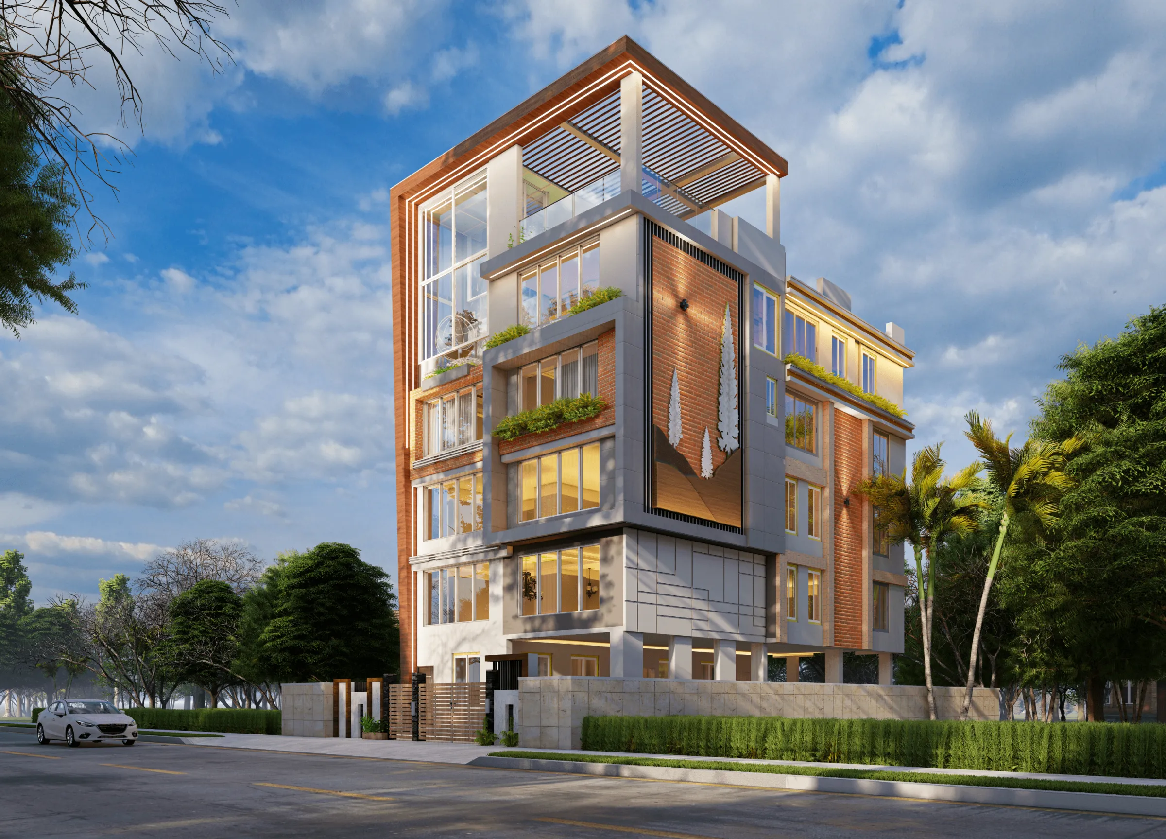
A corner-plot G+4 residence in New Town, Kolkata, where terracotta brick, grey stone cladding and full-height corner glazing stack into a tall, quietly confident vertical home wrapped in cantilevered planter balconies and topped by a slatted-pergola terrace.
The Cypress House sits on a corner plot in New Town, Kolkata, and the brief that came to us was the one we hear most often on these Action Area streets, which is that the family wanted a tall independent home on a fairly narrow footprint, they wanted real daylight on every floor even though one long edge sits close to the neighbour, and they did not want the usual flat plastered box that reads as just another builder floor, so from the first sketch we treated the plot corner as the whole opportunity and pushed the glazing, the brick and the balconies to work the two street-facing faces as hard as they could.
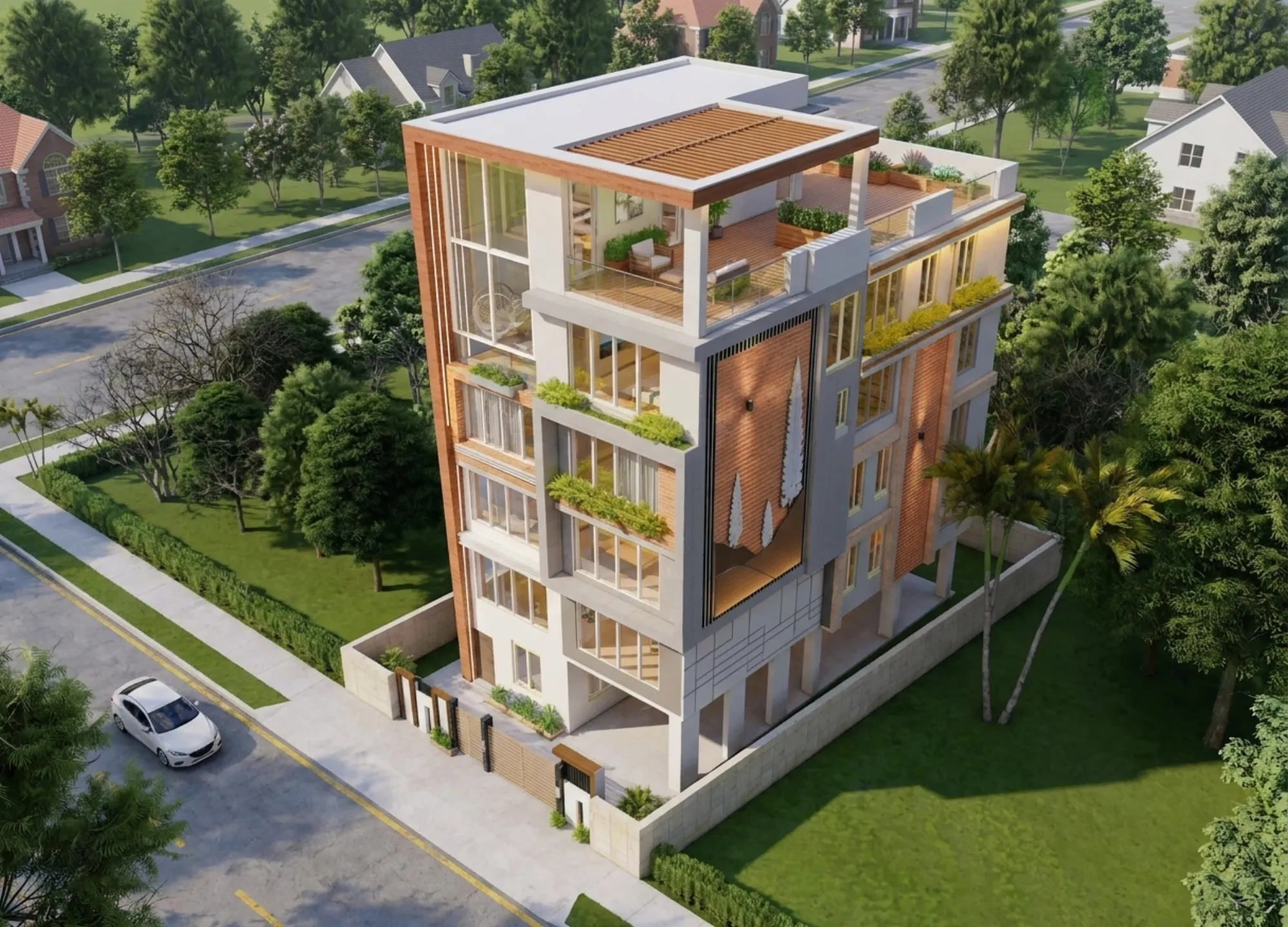
What you see across these renders is a G+4 massing, so a ground level lifted on a stone-clad plinth with parking and service tucked under, then four full residential floors above, and a set-back terrace level crowned by a timber pergola, and the reason the building looks taller and calmer than its actual height is that we ran a continuous timber-toned frame right up the front corner, and we let that frame carry the eye vertically past every slab edge instead of letting each floor announce itself. This is the kind of vertical single-family home the 2400 sqft independent house layouts around New Town are built for, and the whole scheme was resolved as a piece of ground-up residential architecture rather than a facade dressed onto a standard plan.
Kolkata sits in a hot and humid belt that takes a hard monsoon every year, so a home that photographs well but bakes in May is a failure by our standard, and much of what follows is about how the brick, the deep balcony reveals and the corner glass are doing quiet environmental work, not just styling the elevation.
Project gallery
Key Spaces
The Facade and Its Two Faces
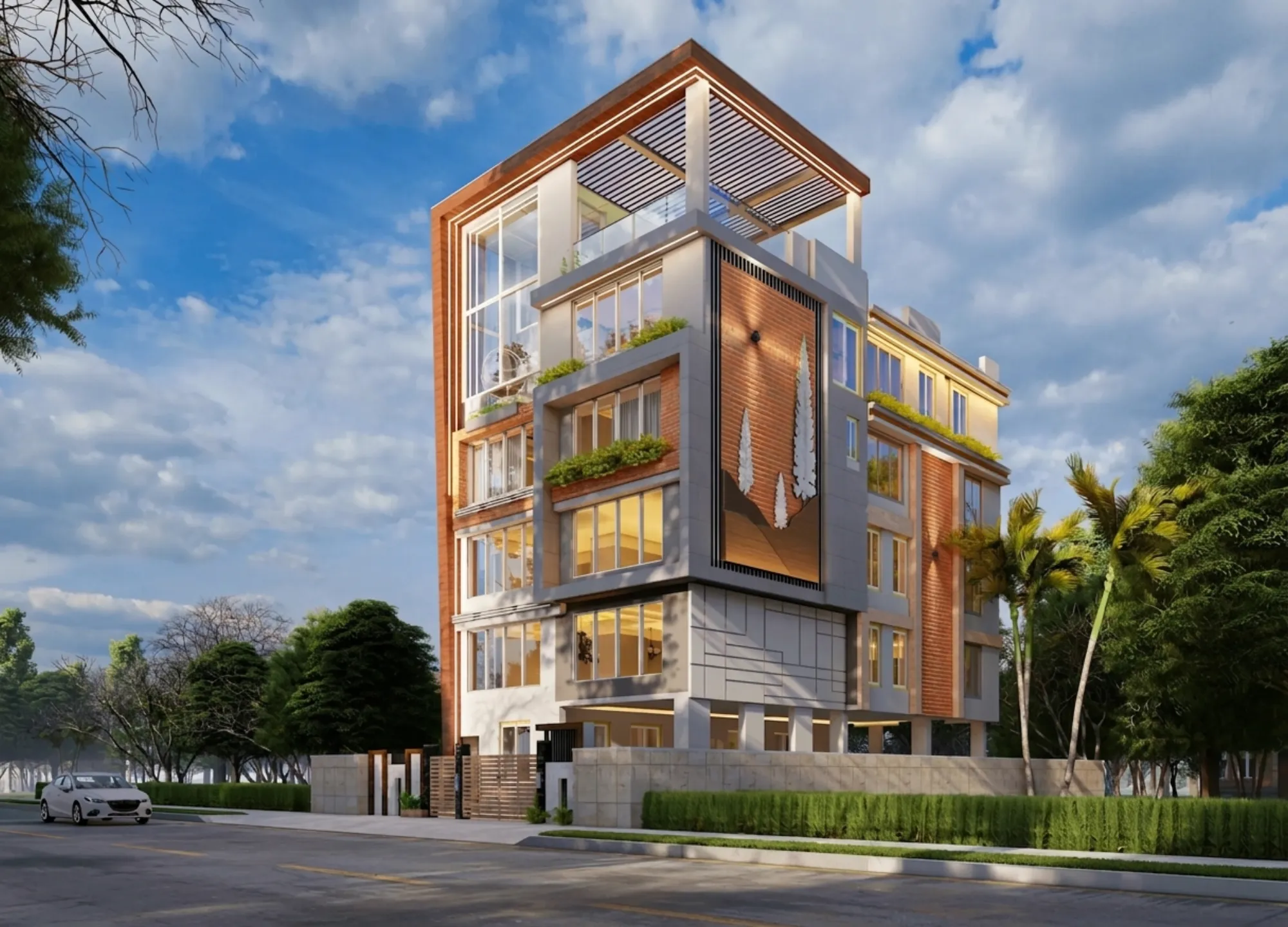
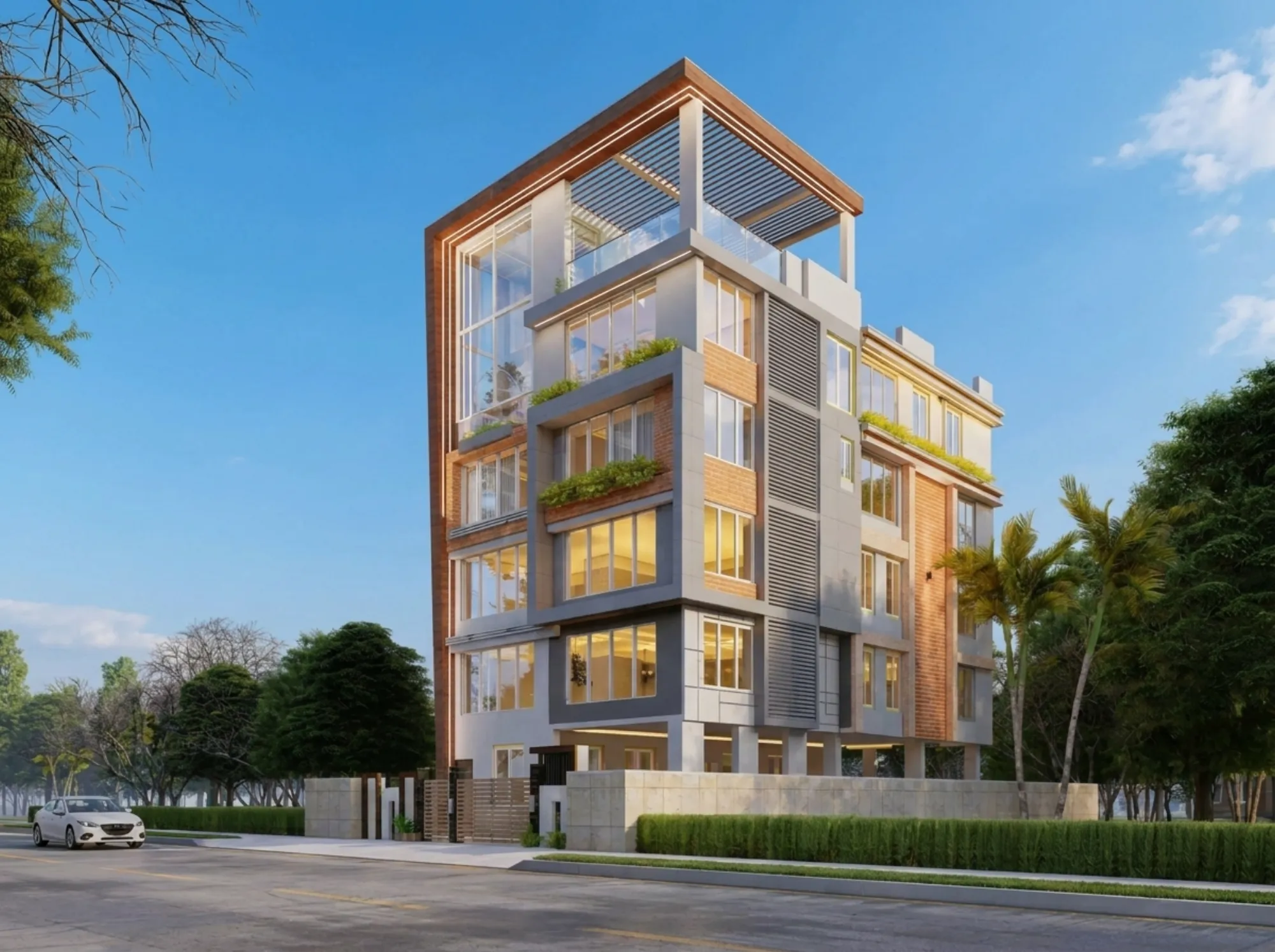
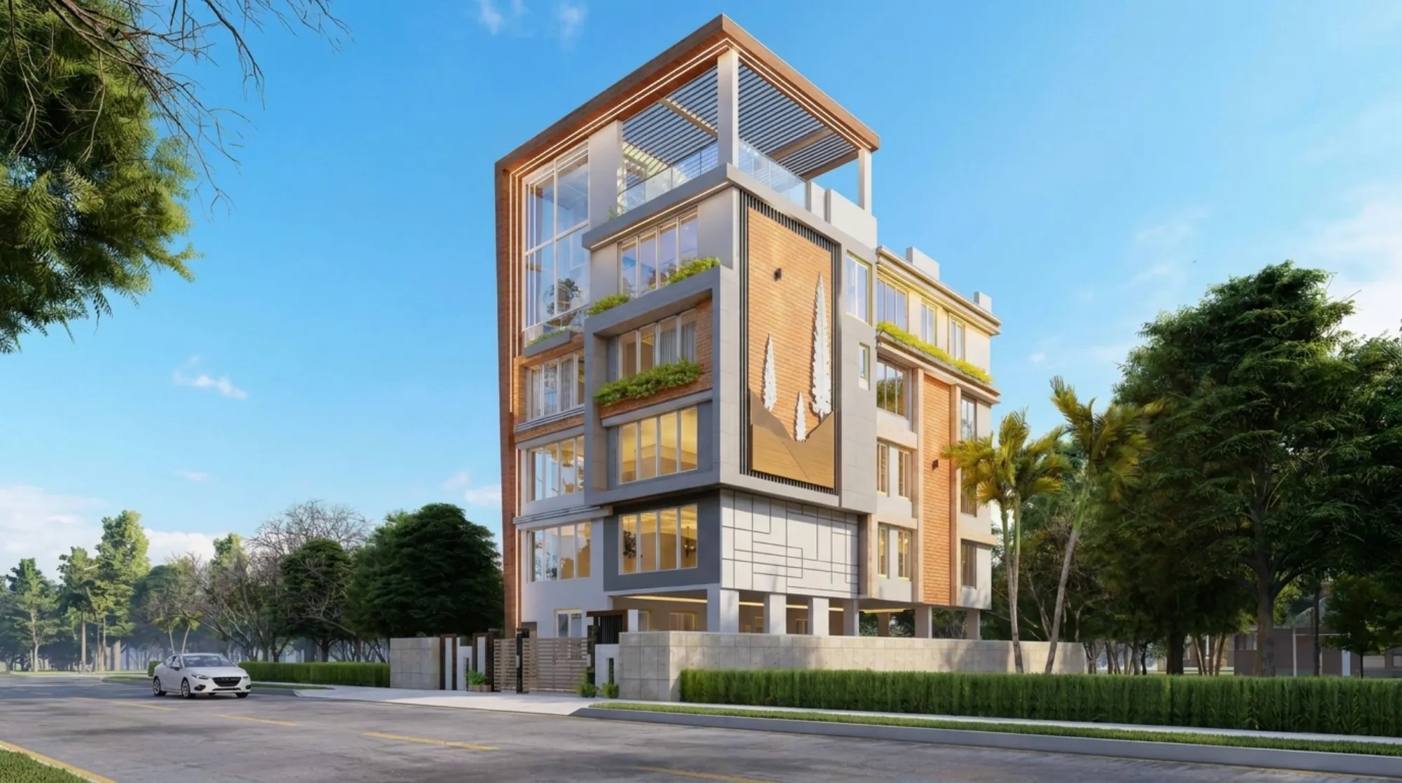
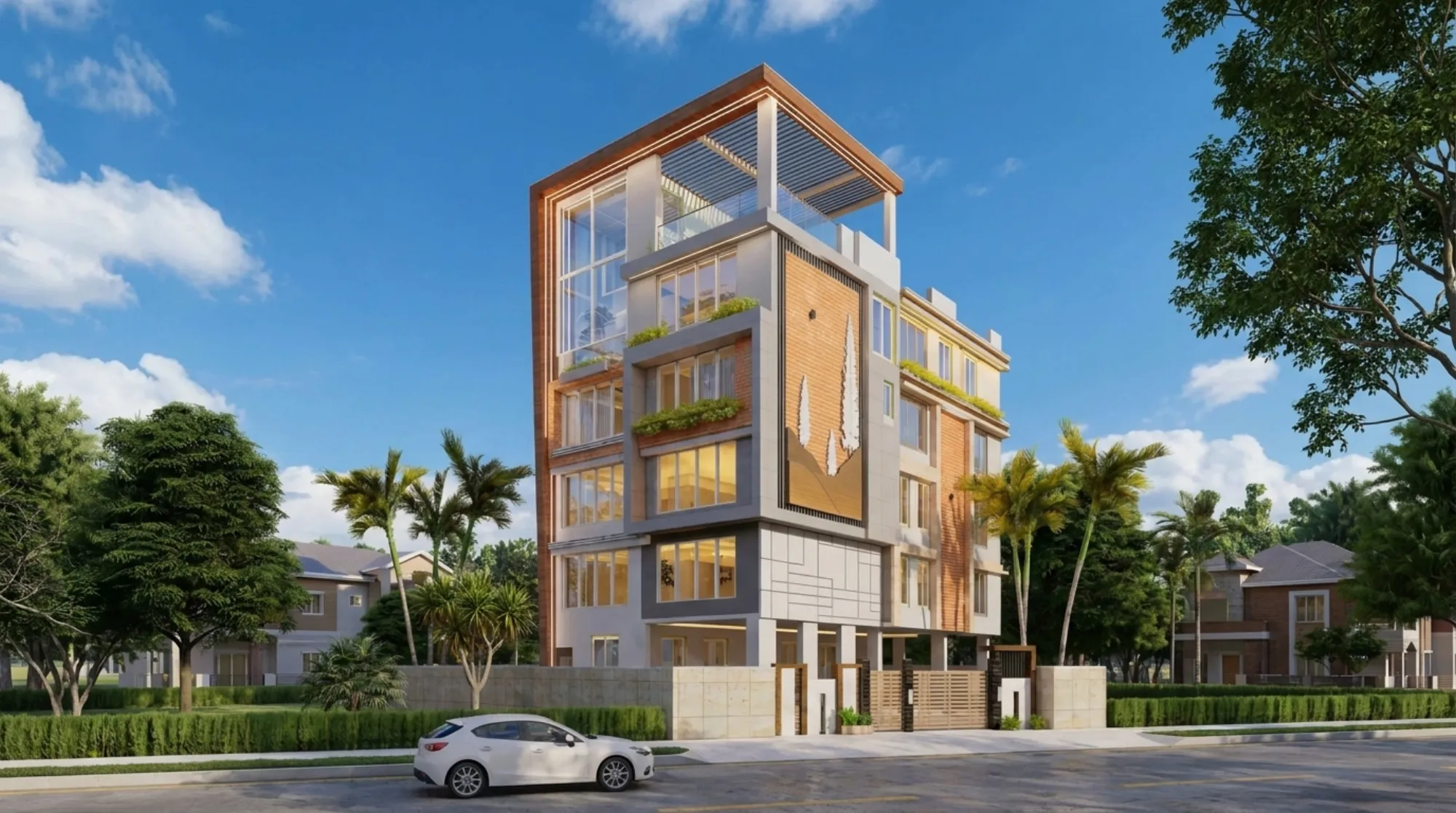
The front elevation is really a conversation between three materials, and we kept it to exactly three on purpose, so there is the warm terracotta brickwork that runs as a tall panel and as the vertical corner frame, there is the cool grey stone and composite cladding that forms the solid mid-block and the plinth, and there is the glass, which we pushed to full height at the corner so the stair and living volumes read as a lantern, and the trick that holds it together is that the brick and the grey never fight, the brick always leads the vertical and the grey always fills the horizontal, so the whole face has a clear grain to it.
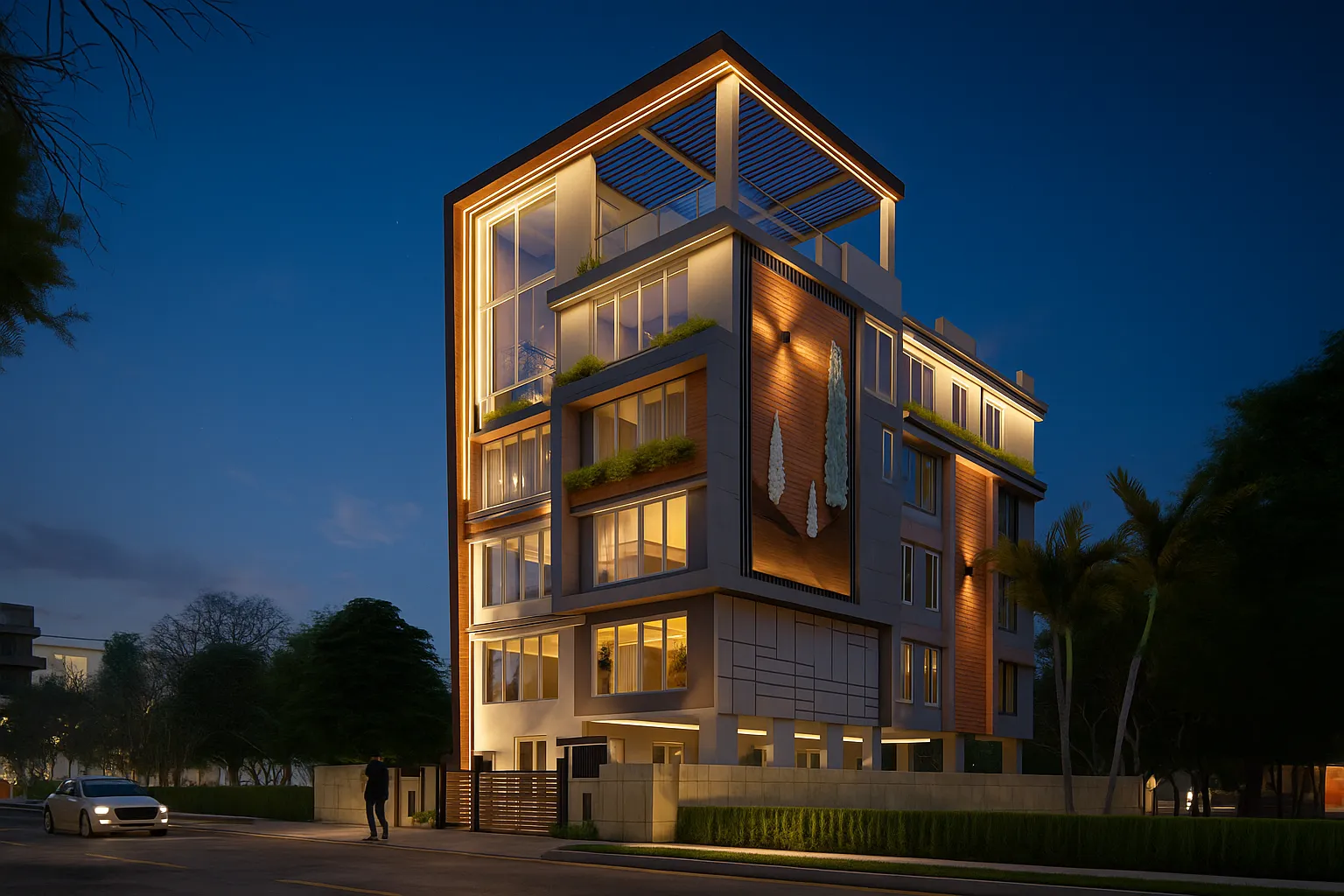
The signature move is the recessed brick feature panel on the side face, framed in black fins, carrying a pair of sculpted cypress trees in relief against a warm backlit ground, and that panel is where the house gets its name and also where it earns its identity on a street of otherwise plain party walls. At night, and you can see this in the dusk render, the concealed cove lighting traces that timber frame and the cypress panel glows, so the building has a completely different second personality after dark, which is exactly the kind of layered result we plan for at the lighting design stage rather than bolting on at the end.
Massing, Form and the Corner Strategy
Because the plot is a corner and fairly tight, we did not want a symmetrical block, we wanted the massing to lean into the junction, so the front-left volume is pulled forward and wrapped in that floor-to-ceiling glazed frame while the right-hand volume steps back in grey stone, and that push-and-pull gives the house depth from the street and, more practically, it lets us open the glazed corner to the north-east light and the road view while keeping the deeper rooms shaded behind the solid mid-block.
Every floor also carries a cantilevered planter balcony that projects past the slab line, and these are not decorative, they are doing three jobs at once, so they throw shade onto the glass below them through the harshest part of the day, they give each floor its own pocket of greenery which softens the whole vertical mass, and they let the family step out at every level without eating into internal carpet area. Stacking those cantilever planters up the front is a big part of why the building feels alive rather than sheer, and the greenery reads from both the street and the aerial view.
Materials and Palette
The palette is deliberately narrow and warm, so terracotta brick, honey-toned timber accents, a family of greys from the stone cladding, and a lot of clear glass, and we chose exposed brick partly for how it ages, because a plastered face in this climate streaks and stains within a couple of monsoons whereas good brick just weathers, so the material choice is also a maintenance decision the owner will thank us for in ten years.
The grey stone plinth wraps the ground level and the boundary wall in the same stone, which ties the compound and the house into one object rather than a building behind a fence, and the boundary itself uses horizontal timber-slat gates and screens that echo the roof pergola, so even the street edge carries the material story. Getting these tones and reflections to read correctly before a single brick was laid is why we take the 3D visualisation and rendering stage seriously, and the images on this page are the same models we used to sign off the material palette with the family.
Living Spaces, Glazing and the Terrace
Behind the glass the plan is organised so the living and family volumes take the bright glazed corner on each floor while bedrooms and services sit against the deeper, more sheltered side, and the double-height glazed bay on the upper front floors pulls light deep into the stair and the main living space, so the interiors stay bright without needing artificial light through the day, which is real passive cooling and daylight logic doing the work rather than a gadget.
The whole thing is capped by a set-back terrace floor with a timber slatted pergola, and this is the reward level, so a covered lounge, open deck, planters and glass balustrades that give the family a private garden in the sky well above the street, and the pergola slats filter the harsh overhead sun into striped shade so the terrace stays usable through most of the year. We handled the interiors as a continuous scope with the shell so the warm timber and stone language you see outside carries indoors, which is how our residential interior design work stays consistent with the architecture instead of arguing with it.
Details
The Site and Its Setting
New Town is a planned township, so the streets are wide, the plots are regular and, crucially for a project like this, there are height and setback rules that actually get enforced, and this particular plot sits at a corner with a broad road on one side and a quieter cross street on the other, which is what let us treat the building as a two-faced object rather than a single flat frontage. The mature street trees and the low neighbouring houses in the aerial view also told us early that our upper floors and the terrace would get clean sky and long views, so it was worth spending the height allowance on tall, glazed upper volumes.
The one constraint we always check first on these plots is the sanctioned envelope, because parts of New Town sit under real height limits, and anyone building here should read up on the airport funnel-zone height restrictions before finalising floor counts, so we confirmed our G+4-plus-terrace scheme sat comfortably within the permissible envelope for this address, and you can see more of our neighbourhood context on the New Town locality hub.
Our Design Approach
Our approach here was to solve the environment and the identity with the same moves, so instead of designing a pretty box and then adding sun-shading, we made the sun-shading the architecture, which is why the planter balconies, the deep brick reveals and the pergola are structural and formal decisions rather than add-ons. We also worked the corner hard because on a tight plot the corner is where you win, so pushing the glass and the vertical frame to the junction gave the family light, view and a genuine street presence from a footprint that is not actually large.
Through the whole process we ran the design as coordinated visual models so the family could stand inside the material and lighting decisions before committing, and that same model set drove the day and dusk studies you see here. If you are planning something similar on a New Town or Rajarhat plot, this is exactly the sort of brief we like to take from first sketch to handover, and the fastest way to start is simply to get in touch.
The Result
What we ended up with is a home that reads as tall, warm and confident from the street, that stays bright and shaded at the same time because the balconies and brick are doing their environmental job, and that has a genuine second life at night when the cove lighting and the cypress panel come on. For a corner plot of this size in New Town, that is a strong outcome, and it is the kind of result that comes from treating the facade, the light, the planting and the interiors as one continuous decision rather than four separate ones.
RELATED PROJECTS
Chhaya Residence
New Town, Kolkata
Kanchan House
New Town, Kolkata
The Ivory Ledge
New Town, Kolkata
The Filigree House
New Town, Kolkata
Explore more of our architecture and interior projects, our design services, and practical guidance in our blog and the homes we design in New Town. For background on residential architecture, see the reference overview. Ready to start? Talk to Studio Contour.