






Exterior CGI for Reading Architects and Developers, From Studio Contour
Exterior CGI for Reading Architects and Developers, From Studio Contour
If you are looking for exterior CGI for a scheme in Reading, you are most likely holding a set of drawings that already work on paper, and somebody, whether a client, a planning consultant, a sales agent or a funder, now needs to see that building standing in a real Reading street before they will commit to the next step. The whole value of the image rests on whether people who know the town look at it and believe it, and Reading has a look that is easy to recognise and surprisingly easy to get wrong, with its red and grey Victorian brickwork, its slate roofs and long runs of bay windows, the river light along the Thames and the Kennet, and a sky that is soft and grey far more often than it is hard and blue.
Studio Contour is an architecture, interior design and 3D visualisation studio based in New Town, Kolkata, and we work for UK clients remotely, from the drawings, specification and reference photographs they send us. We have no office, address or representative in Reading or anywhere else in the UK, and we have no Reading projects to show you, so rather than dress that up, we would rather be plain about how we would actually approach an exterior here, what the town's materials and light ask of a render, who tends to commission these images and why, and where a different kind of provider would genuinely suit you better, so that you can decide for yourself whether our way of working fits your scheme.
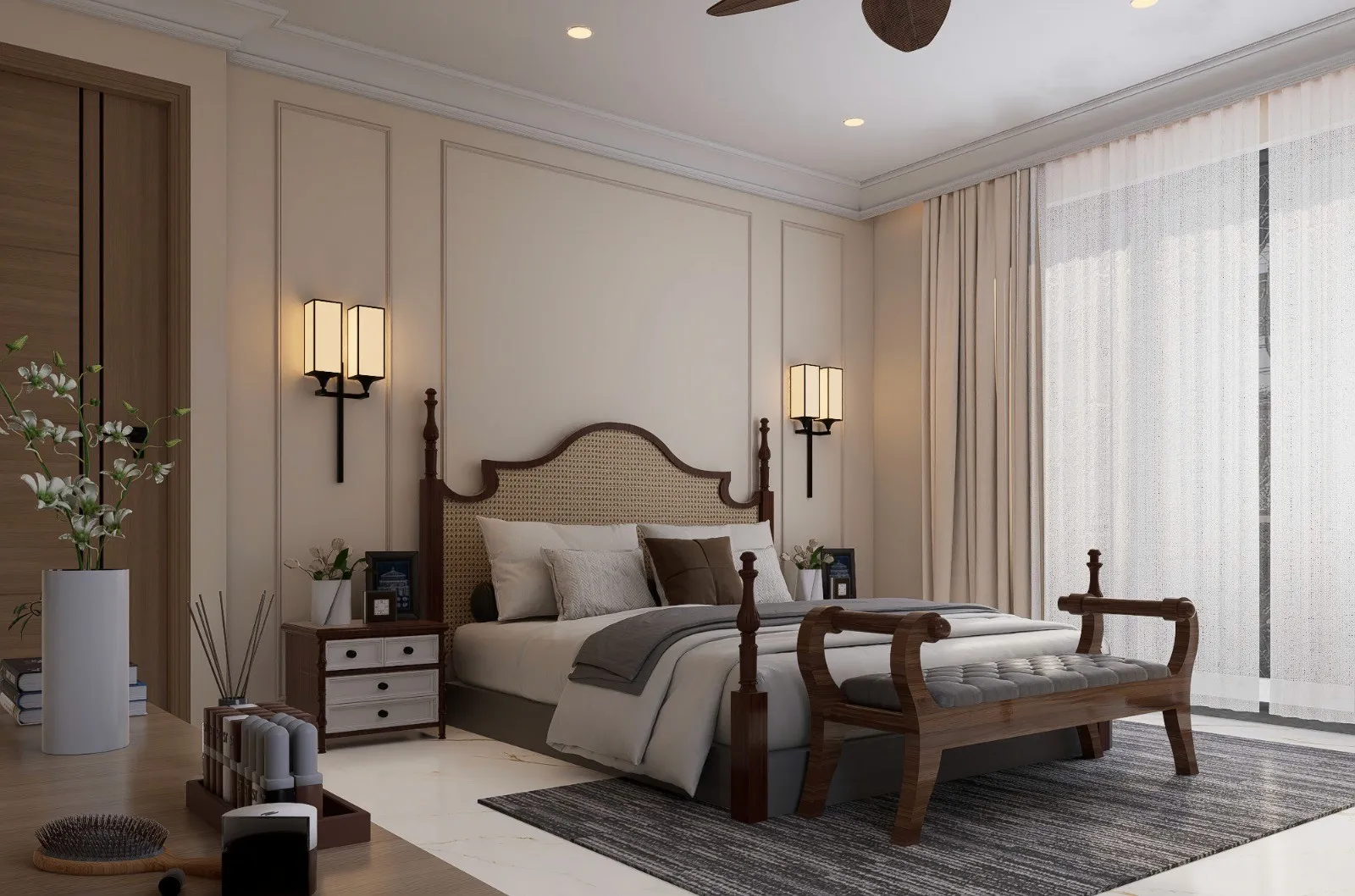
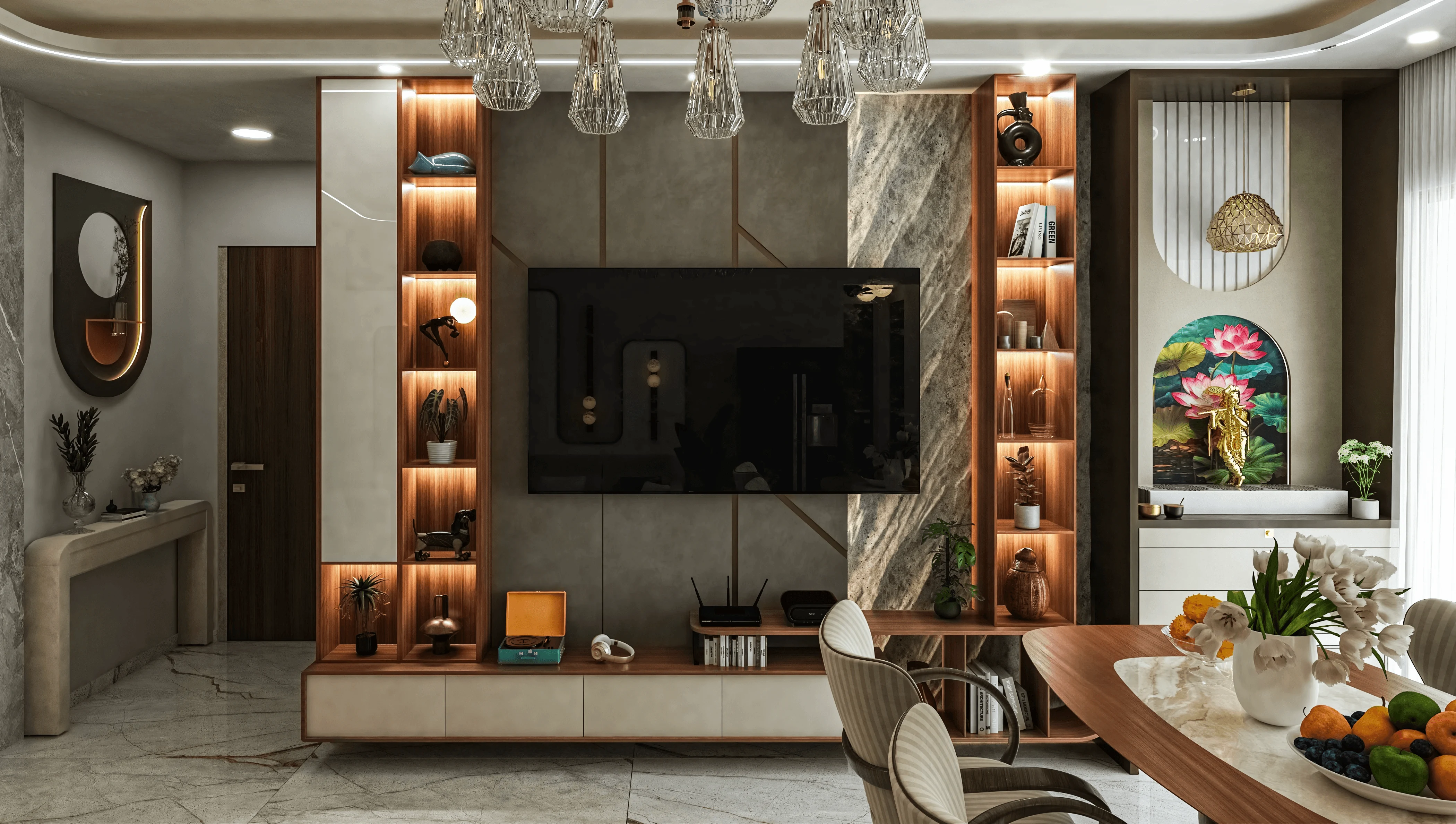
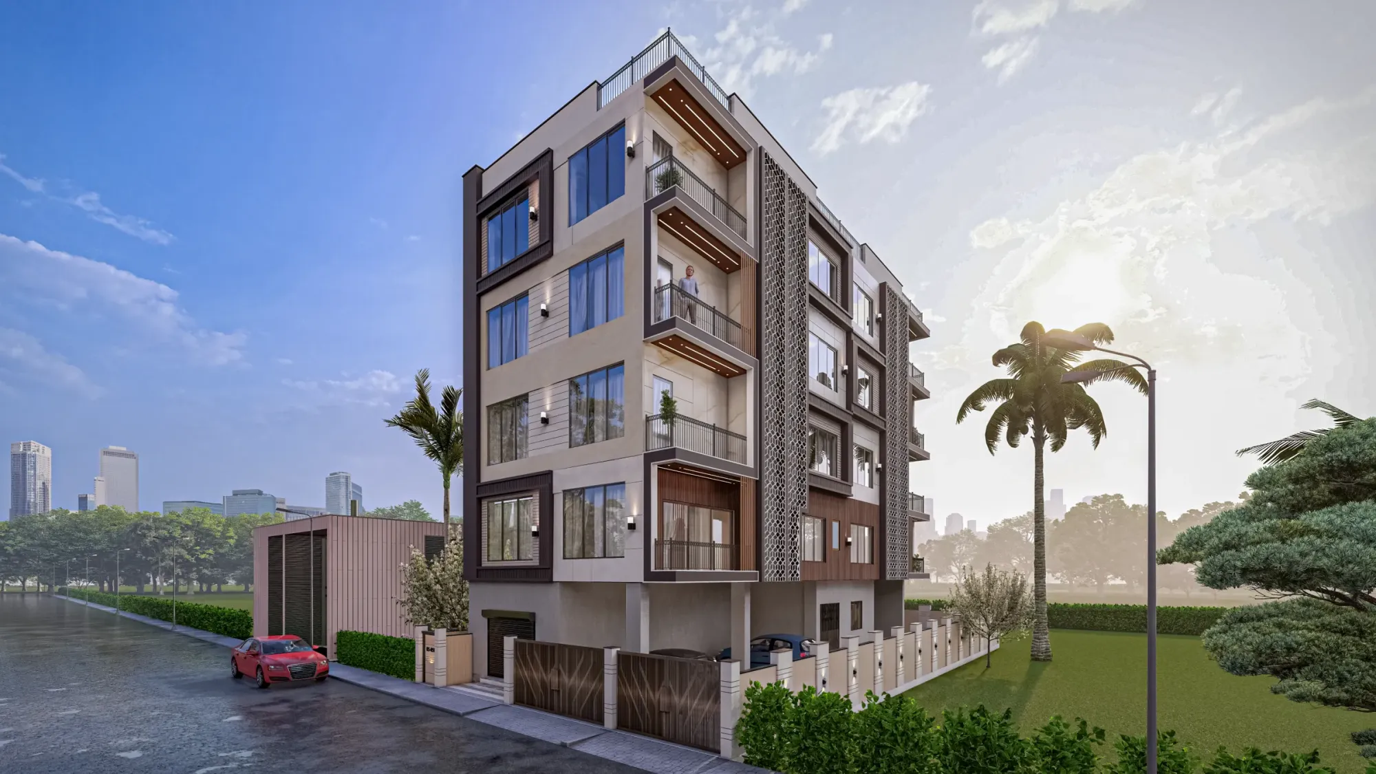
An exterior render basically lives or dies on brick, sky and street rather than on furniture and finishes, and if you want the wider picture of how we take on visualisation for clients abroad, our main guide, Outsourcing 3D Visualisation to Studio Contour: A Guide for UK Architects, covers it from the beginning. The image below comes from our own portfolio rather than from Reading, and it is there to show the standard of finish we work to.
Reading's brick, and why it is the hardest part of the render
Most of what makes a street in Reading look like Reading is the brick. The town's Victorian builders worked with locally made red brick and laced it with silver-grey headers, bricks whose exposed ends were burnt hard until they took on a glassy, slightly lustrous grey face, and they laid those headers in bands, diamonds and chequerboard patterns across the fronts of terraces, schools, chapels and warehouses, so that whole streets in Katesgrove, Newtown, Redlands and East Reading carry the same quiet two-tone rhythm that a local eye registers without ever thinking about it.
For a render, the important thing is how that brick behaves in light. The grey headers are vitrified, so they carry a faint sheen that the matte red stretchers around them do not, which means a single brick texture tiled across a wall flattens the pattern into something that looks printed on, and the two kinds of brick have to be set up as separate materials with their own reflectance, their own slight variation from one brick to the next, and a mortar whose colour and joint profile match what the specification calls for. The pattern also depends on bond, because the chequer effect comes from Flemish bond, where headers and stretchers alternate along every course, and that is a solid-wall bond, so when an architect wants a new cavity-wall building to pick up the Victorian rhythm next door, the question of snap headers or a different expression is a design decision we raise with you, right, rather than a texture we quietly fake, since a render that shows headers the wall cannot have is promising something the builder will not deliver.
Around those walls sit the details that give the terraces their depth, gauged brick arches over sash windows, canted bays with stone or painted dressings, slate roofs with clay ridge tiles, chimney stacks punctuating the skyline at regular intervals, and here and there the flint rubble that survives in the Abbey ruins and in older boundary walls. More than a century of weather has softened all of it, so the old brick beside your new elevation should look its age, slightly uneven and darker in the joints, and the new brick should look new, because a render that ages everything to match, or freshens everything to match, loses the one comparison a client or a buyer is actually trying to make when they look at it.
Facades beyond the Victorian terrace
Reading is not only terraces, and an exterior brief here can land in very different building stock depending on the street. Across the river, Caversham has larger Victorian and Edwardian villas set back behind deeper front gardens, and on the higher ground of Caversham Heights and Tilehurst there are long stretches of interwar semis with hipped clay tile roofs, rendered or pebbledashed upper storeys and brick ground floors, with post-war estates further out again. The town centre mixes it all up, with Victorian commercial frontages standing beside mid-century concrete and newer glass and brick apartment and office blocks around the station and along the waterfronts, so the palette a render has to handle runs from hand-made brick to curtain walling within a short walk.
Each of these asks something different of the image, so pebbledash and roughcast need texture at a scale the eye can read from across the road or they turn into flat paint, and clay tile roofs need the slow drift in colour and the faint lichen that real ones carry after a few winters. Glazing is the most commonly mishandled element of all, because under a typical Thames Valley sky a large window reflects soft grey cloud and the street opposite, so it reads darker and quieter than the bright blue mirror that so many renders default to. When the scheme is an infill plot or the conversion of a large Victorian house into flats, the facade also has to hold the street's rhythm of plot widths, eaves lines and bay spacing, which is something we check in the model before a single material goes on, and a related piece on this site, The Interior CGI Studio for Reading Projects, Delivered Remotely, is worth reading alongside this section.
Matching the Thames Valley sky and light
Light is where an exterior either convinces or does not, and Reading's light is close to the opposite of the light outside our own window in Kolkata, which is exactly why we treat it as a deliberate setting and never as a default. The Thames Valley sky is overcast for much of the year, giving a bright, even, diffuse light that softens shadows and lifts the undersides of eaves and bays, and when the sun does come through in winter it stays low, skimming along the brick from the south, while in high summer it rises north of east and sets north of west, so a terrace front that faces north sees no direct sun at all through the winter months and then catches early morning and late evening light around midsummer.
That has real consequences for colour temperature and white balance. An overcast English sky is cool, and if the image is balanced naively the red brick drifts towards a dull brown and the grey headers disappear into it, so we balance each view so that the brick keeps the warmth it has when you stand in front of it, and we resist the saturated blue sky and hard overhead shadows that make a Reading street look as though it has been relocated somewhere much further south. Wet pavements, damp brick that darkens after rain and the slight haze that settles over the river valley on a still morning are all honest choices too, and sometimes they make the most believable image of the set. We go further into how lighting decisions affect accuracy in 3D Interior Visualisation Services in New Town Kolkata.
Streetscape, trees and what surrounds the building
A building floating on a white background tells a buyer very little, and a building dropped into a generic street tells them something false, so we model the immediate context from the site plan, photographs and street references you send, with the neighbouring houses at their proper height, the low brick front walls and railings, the privet and laurel hedges, the pavements and kerbs, the street trees, and the parked cars that are part of almost every Reading street whether a developer would like them there or not.
Planting needs the same care. The older streets are lined with London planes, limes and horse chestnuts, front gardens carry flowering cherries and birches, beech hedges hold their brown leaves through the winter, and along the river and canal towpaths it is willows, alders and long grass, so we choose species that belong there and show them at the size your landscape drawing actually specifies, because a render full of mature trees that will take decades to grow sets an expectation the scheme cannot meet on handover. Season is a genuine decision as well, since full summer canopy can hide half a facade, bare winter branches reveal it honestly but can look bleak, and late spring is usually the sensible compromise, with fresh leaf, green lawns and a sky that has some movement in it.
Who commissions exterior CGI in Reading, and what each needs
The people who ask for exterior visuals for a Reading scheme tend to fall into a handful of groups, and the brief changes a great deal from one to the next. Architects use them during design development and to get a client to sign off a direction, and very often to support a planning application, where the architect or the planning consultant decides what is submitted and owns that whole process, and our part is simply to make the images match the drawings faithfully. Developers and housebuilders want them for off-plan marketing on the website, in the brochure and on the site hoarding, where a dusk view with the windows lit carries most of the weight, while smaller developers converting large Victorian houses or building on backland plots need the new work to look settled in its street, homeowners planning a replacement house or a large extension want to see it before they commit to detailed design, and owners of older office buildings want to show a reworked frontage to prospective tenants.
| Who commissions | What they usually need | Views that tend to work |
|---|---|---|
| Architects | Design sign-off and planning support | Eye-level street views from real positions |
| Developers and housebuilders | Off-plan marketing and brochures | Dusk hero views and approach walkthroughs |
| Small developers | Conversions and infill that sit in the street | Street views showing the neighbours either side |
| Homeowners | A clear picture before detailed design | Front and garden views at human height |
| Commercial owners | A reworked frontage for tenants | Corner views and entrance walkthroughs |
Choosing the camera is part of the brief, because a view from a position nobody could ever stand in makes a building look smaller and more polite than it will feel from the pavement, so we show you the honest eye-level view first, and another post on this site, 3D Exterior Visualisation for Milton Keynes Projects: Why Studio Contour, picks up some of these threads.
How a remote exterior commission runs from Kolkata
The process is simple to describe, and the detail lives in our guides. You send the drawings in whatever form you have them, 2D plans and elevations, DWG files or sketches, along with the specification, the site plan with its north point and photographs of the street, and we build an accurate 3D model, check it against every elevation and query anything that does not reconcile, then apply materials matched to your specification, calibrate lighting and white balance, set the sun to the site's real orientation, and send draft stills for comment before the finals and any walkthrough. Two guides, Choosing Furniture and Finishes Remotely: How Studio Contour Runs It and Video-Call Design Reviews: How Studio Contour Runs a Remote Project, walk through file formats, review rounds and how comments are handled.
- 01Drawings, specification and street photographs received
- 02Model built and checked against every elevation
- 03Materials, lighting and sun set with draft stills shared
- 04Comments applied and final stills or walkthrough delivered
The time difference works more in your favour than people tend to expect. Kolkata keeps Indian Standard Time, which runs four and a half hours ahead of the UK while British Summer Time is in force and five and a half hours ahead through the winter, so a UK morning falls in our afternoon and there is a shared part of every working day when a review call is easy to arrange, and that is when we walk you through a draft on screen.
Why an architecture practice makes better exterior renders
The case for us rests on one structural fact, which is that Studio Contour is an architecture and interior practice first and a visualisation studio second. We have delivered more than 330 buildings since 2014, so the people building your model are used to drawings as instructions for construction rather than as pictures to copy, and that changes what they notice. When a window head does not land on a brick course, when a parapet on the section contradicts the elevation, or when a balcony as drawn has no visible means of support, we raise it with you before it turns into a beautiful image of something that cannot be built, and that is worth more to an architect presenting to a client, or a developer selling off plan, than any amount of polish.
Sumana Kumar, our principal architect, stays involved in the work rather than handing it off after the first call, which matters most at the moments when a judgement is needed about how a material should read or whether a detail in the drawings is intended. You can see the standard we work to in Palash Court project in Jhargram, West Bengal, one example from our own portfolio, and in Boutique Salon Interior project in Kolkata, another example of the same care with materials and light, neither of them in Reading, and there is more in our project portfolio. What we deliver, photorealistic stills and 3D walkthroughs, is set out on our exterior and architectural visualisation page, and our 3D rendering service page covers the wider offer.
| Studio Contour | A freelance renderer working alone |
|---|---|
| Architects who query details that cannot be built | Construction checks rest on one person's background |
| A team so work carries on through holidays and illness | A single point of availability |
| The principal architect reviews key judgements | Review rests with the person who made the image |
Set against a freelance renderer working alone, the difference is structural and has nothing to do with talent, and against a large high-volume render studio the difference is that your drawings are read by architects who are close to the judgement calls, rather than passed along a production line built for throughput, while an in-house junior knows your practice well but is usually pulled between visualisation and everything else on the project, so the renders take whatever time is left over.
When a different kind of provider suits you better
There are briefs where we are the wrong choice, and it is better to say so here than after the drawings arrive. If your planning consultant needs verified views, sometimes called accurate visual representations, those depend on survey-grade photography from fixed, measured positions and a specialist methodology, and that is a specialist service this studio does not claim to provide, so you need a firm that does that as its core work. The catch here is that nobody from Studio Contour will ever be on site in Reading either, so if you need someone to walk the street, photograph the plot, take measurements or look at the neighbouring buildings in person, a visualisation studio within reach of the town is simply better placed.
The same goes for in-person design workshops around a table, and for projects where you want to sit beside the artist and change a render several times within a single UK working day, because although our hours overlap with yours for part of each day they do not overlap for all of it, and if same-day iteration inside your own office hours is central to how your team works, a local provider will fit that rhythm better than we can. Where we fit is the large middle ground, a scheme with good drawings and a clear specification, a client who wants the image to be right about materials and light, and a team comfortable reviewing on a call and in writing, and at the end of the day that covers most exterior briefs for architects and developers, though not every one of them.
What to ask any studio before you commission exterior CGI
Whoever you choose, a few plain questions separate the studios that will give you a believable Reading image from the ones that will give you a generic one.
- Ask how they will match your specified brick and mortar
- Confirm the sun is set from your site plan north point
- Check that context buildings and trees come from your references
- Get the views, draft rounds and deliverables in writing
Every brief is priced individually after we have gone through the drawings, because a single detached house and a mixed-use block beside the river are not the same job, and the quote sets out the views, any walkthrough and the review rounds before work starts. If you are still shaping the brief, Architectural Visualisation for Southampton: Exterior CGI That Reads Like the Real Street is a related post on this site that may help.
Talk to us about your Reading scheme
If you have drawings for a Reading project and want exteriors that read true to the town's brick, sky and streets, send them with the specification and a few photographs of the site, and get in touch so we can set up a first call in the shared part of our working day.